Posts
Welcome to my blog! Its original title, “pars pas les mains vides!” which translates as “don’t leave empty-handed!”, conveys what I’m aiming to do: capture things I’ve picked up along the way in the weird and wonderful worlds of #rstats, data science and dataviz, and share them with others who may find them useful for their own adventures.
This is a mix of blog posts, “tweetorials” and LinkedIn posts I wrote as I was discovering fun things, and talks. It’s fully searchable through the search function in the nav bar.
Feel free to pinch the best bits and reuse them for your own purposes - that’s what these articles are here for! And if you want to say hello, get in touch!
Make it your own - Tips and tricks for stand-out dataviz with R and ggplot2
RiskyViz - Dataviz tips, tricks and traps to avoid when parameterising graphs about risk

Beautifully reproducible: (mis)adventures in automating data-to-viz pipelines

Creating compelling visualisations in R with ggplot2
On-brand accessible dataviz
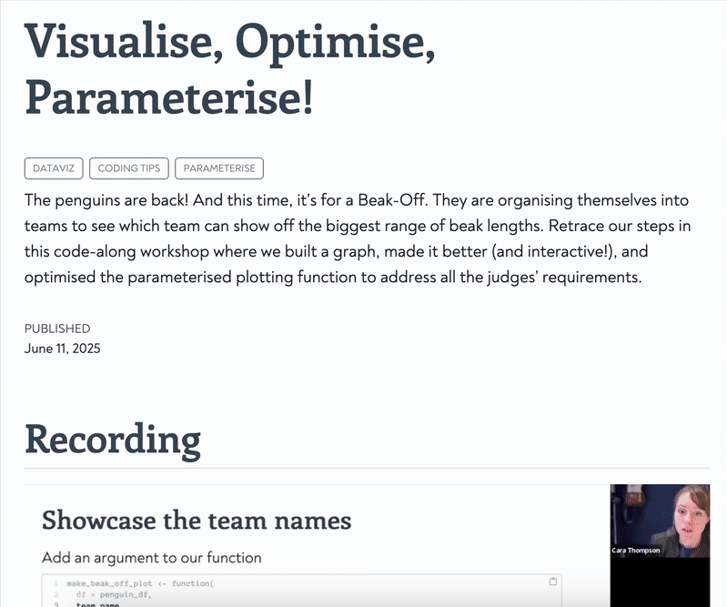
Visualise, Optimise, Parameterise! New code-along workshop video
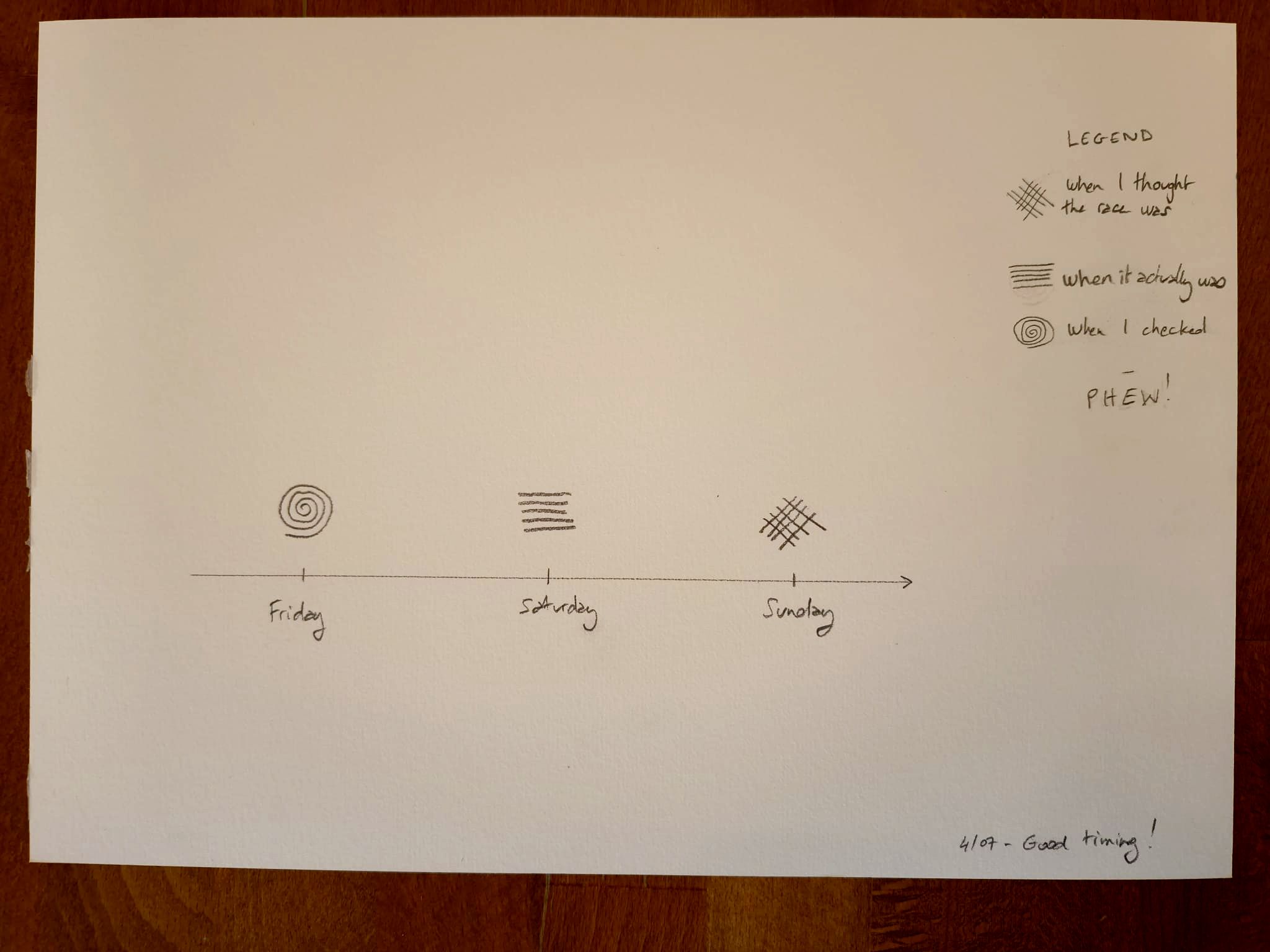
Today’s #unpluggedViz. A calendar check just in time.
A dataviz re-do from the Nordic Society of Human Genetics and Precision Medicine conference
Two #unpluggedViz contributions from the weekend
Today’s slightly mad idea: how about an ad hoc hashtagunpluggedViz club this summer?
Visualise, Optimise, Parameterise!
Fixing awkward backgrounds in ggplot2
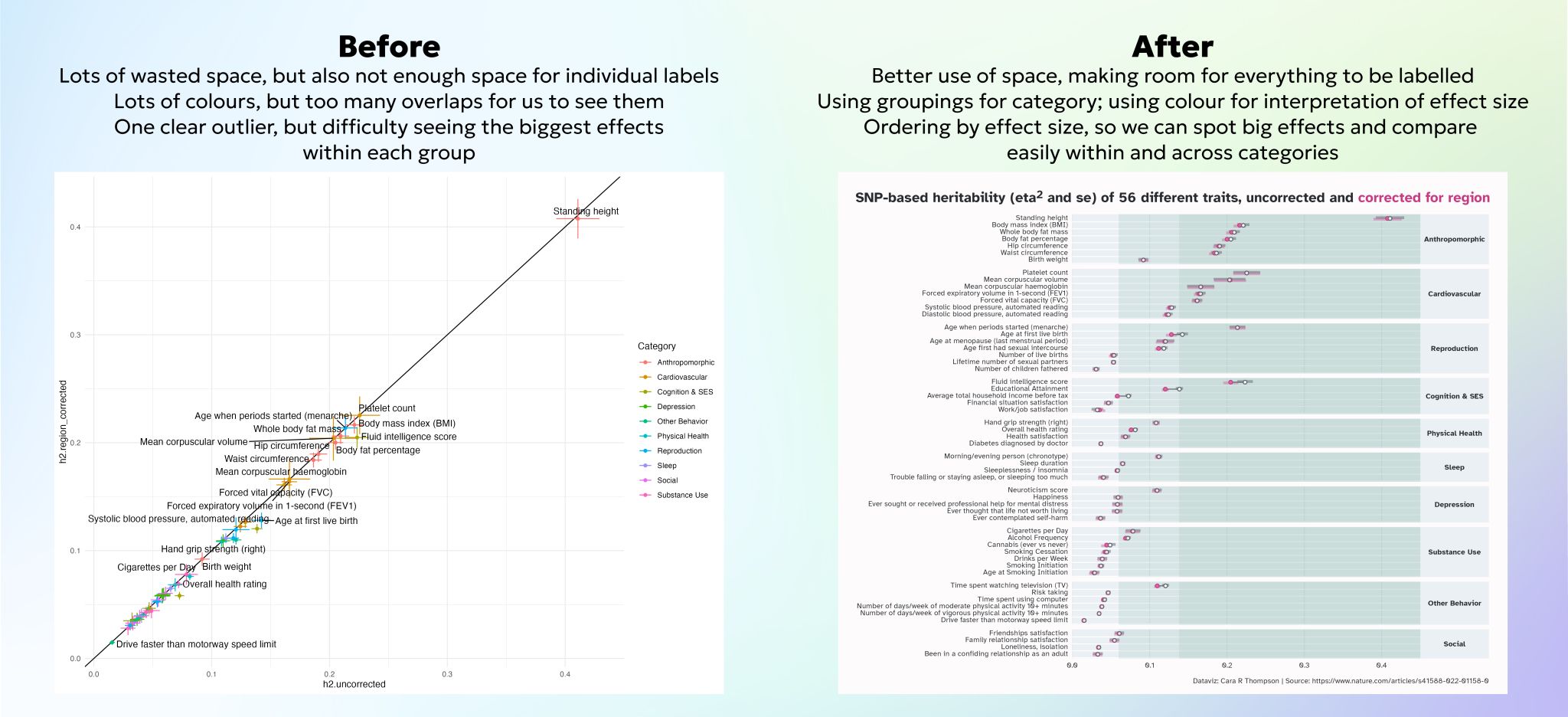
Optimising the use of colours for storytelling in a spaghetti plot


Level up your plots - Shiny in Production 2024 Edition

From alright to all ready to publish

Parameterising a multi-part plot

“So much more than pretty graphs”: Recent adventures in automating dataviz solutions
A quick experiment with WebR: how much can I do in under an hour?
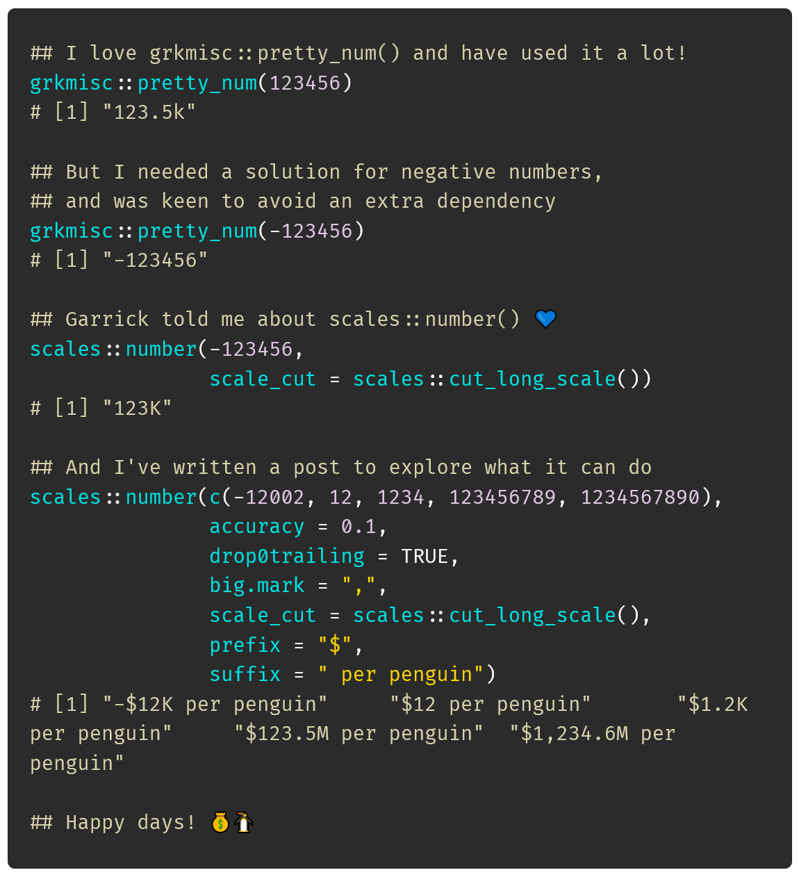
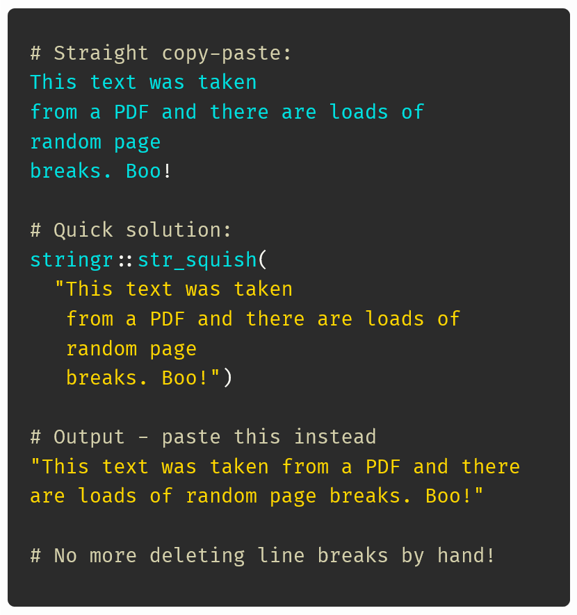
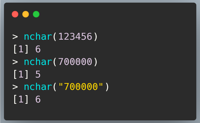
Formatting numbers for easy readability in R
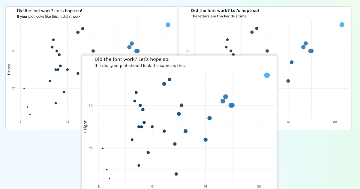
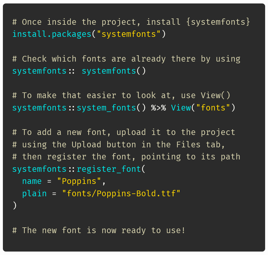
Getting fonts to work in R
Ten tips for better text: Typography meets ggplot and friends
Dynamic annotations: 10 tips for better text
So much more than pretty graphs: The value of creating and implementing a dataviz design system in R
Level Up Your Plots: Using colour, annotations, text hiearchy and other tricks to make your data story stand out
Building a Dataviz Design System for a Medical Research Project

Level up your plots: Using colour, text hierarchy and annotations to create compelling and memorable data visualisations
R-Ladies Edinburgh | Level up your plots
Using colour and annotations for effective storytelling
Beautifully Annotated: Enhancing your ggplots with Text
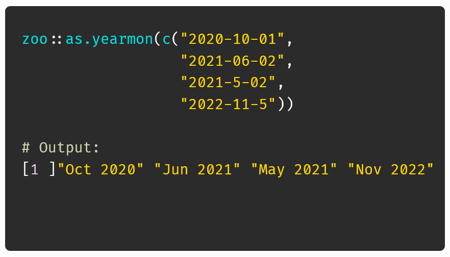
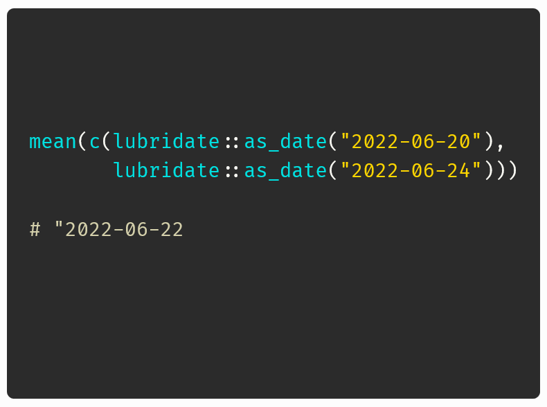
Dates in R, the easy way
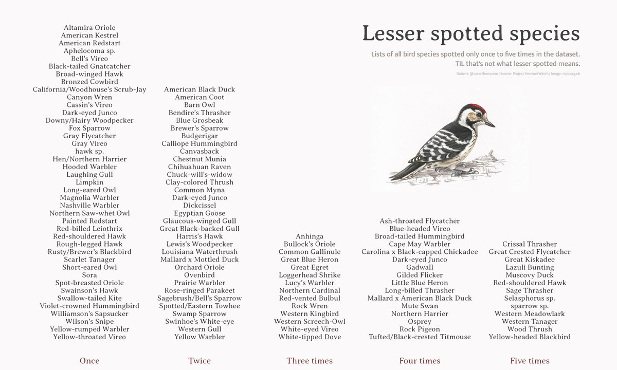
This week’s #TidyTuesday: ‘lesser spotted’ birds
One solution to make text stand out against most backgrounds
Adding a function which detects the client’s OS and silently loads fonts accordingly

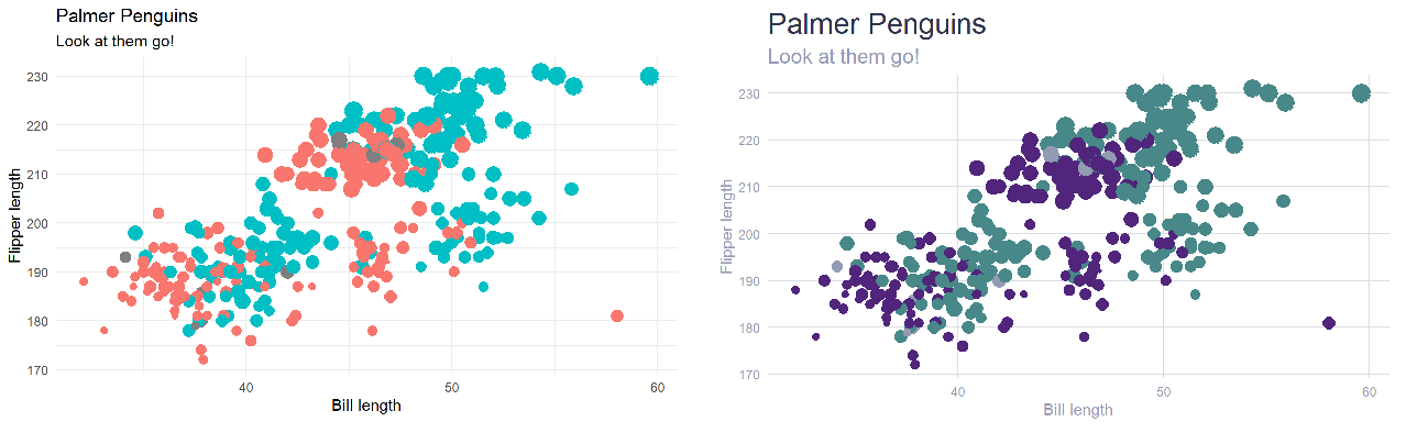
Palatable Palettes: Five tips for creating and applying bespoke colour schemes
Variations on a ggtheme: Applying a unifying aesthetic to your plots
Take a string and return a nicely formatted quote
Level Up Your Plots: A Code-along Workshop

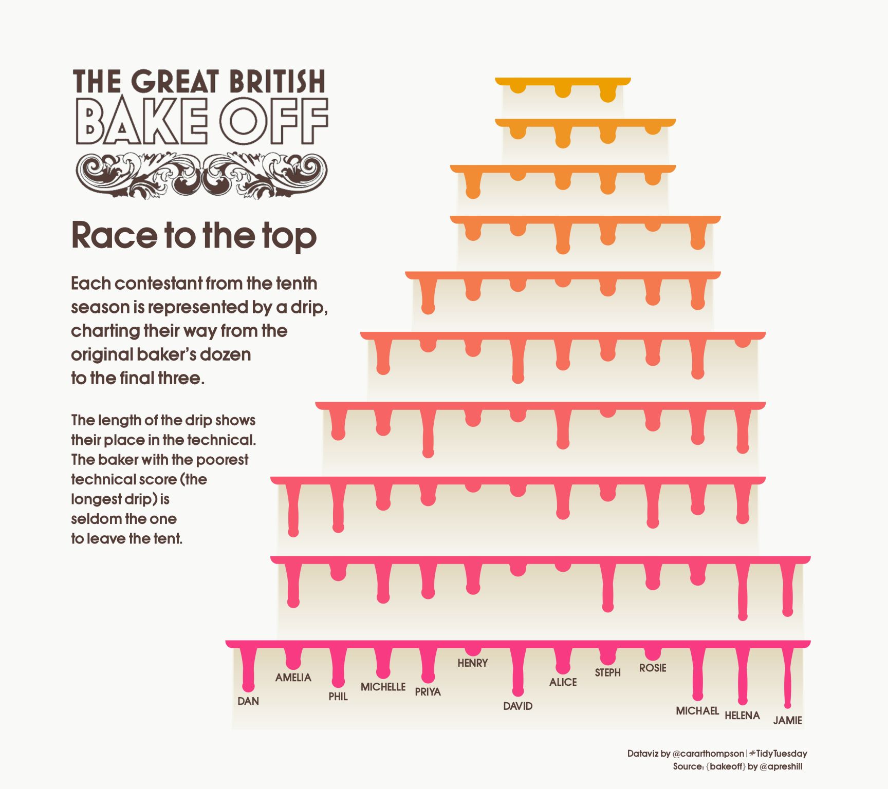
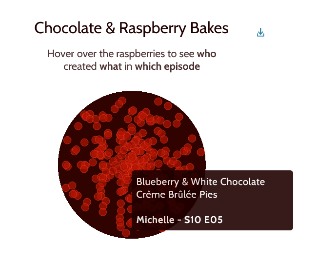
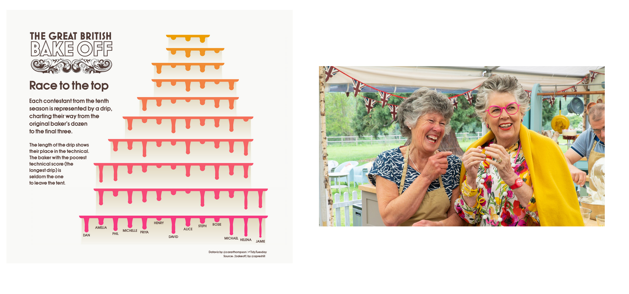
Recreating one of Janusz’s iconic drip cakes using data from the #GBBO
For this week’s #TidyTuesday Technical Challenge, I decided to recreate one of januszbakes’s iconic drip cakes using data from the #GBBO.

Crafting a data-driven fundraising campaign
I made it onto the Information is Beautiful long list 🥳

Level Up Your Plots: Enhance the story telling capabilities of your datavisualisations

Automating sentences with R
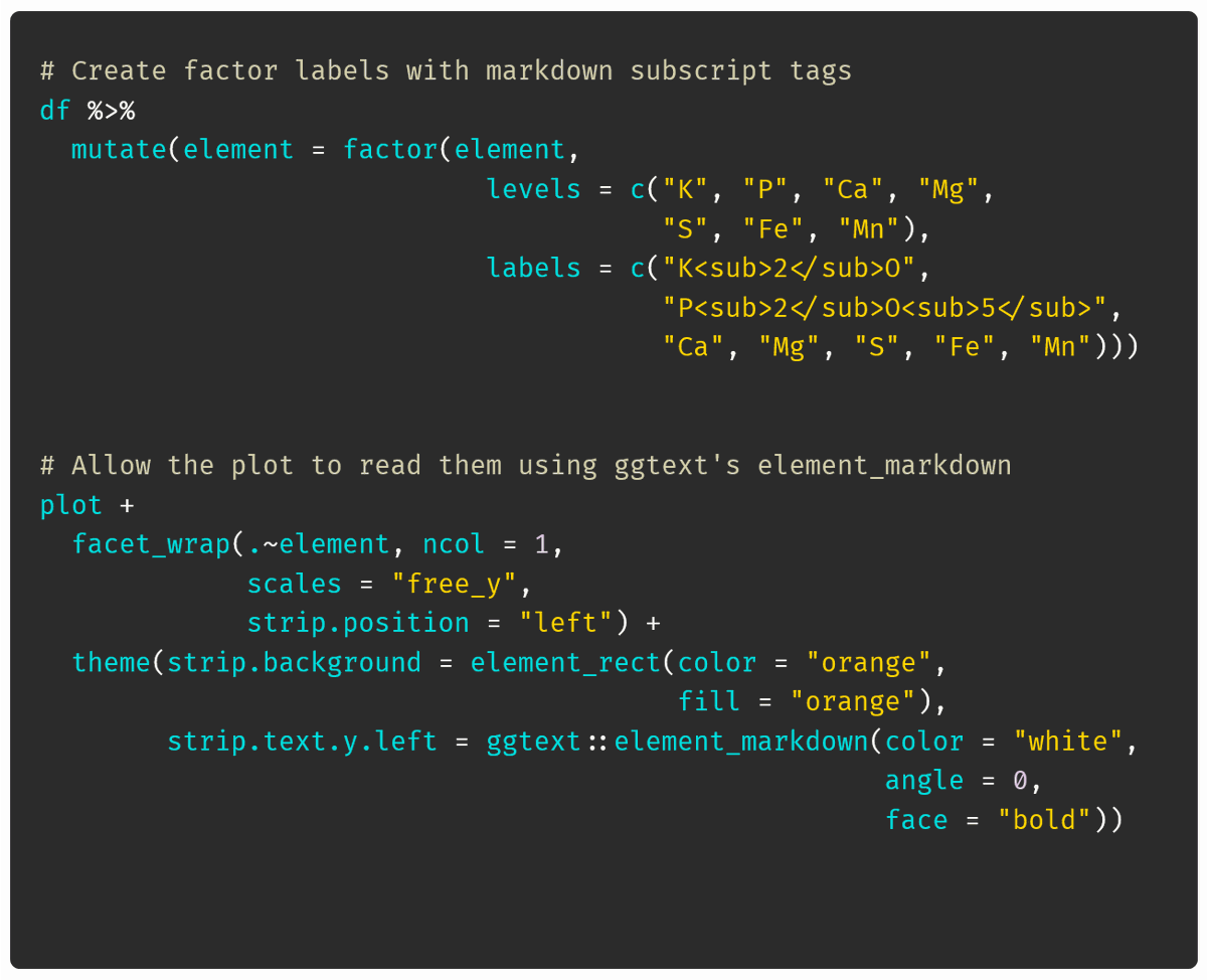
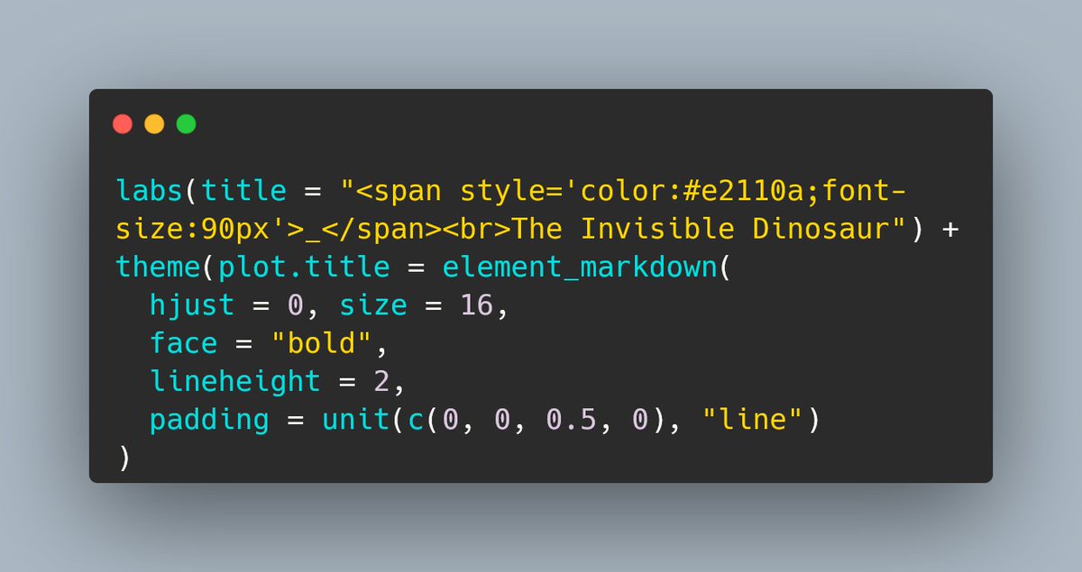
Formatting subscripts using 📦{ggtext}’s element_markdown()
Annotation and axis label tweaks in ggplot2

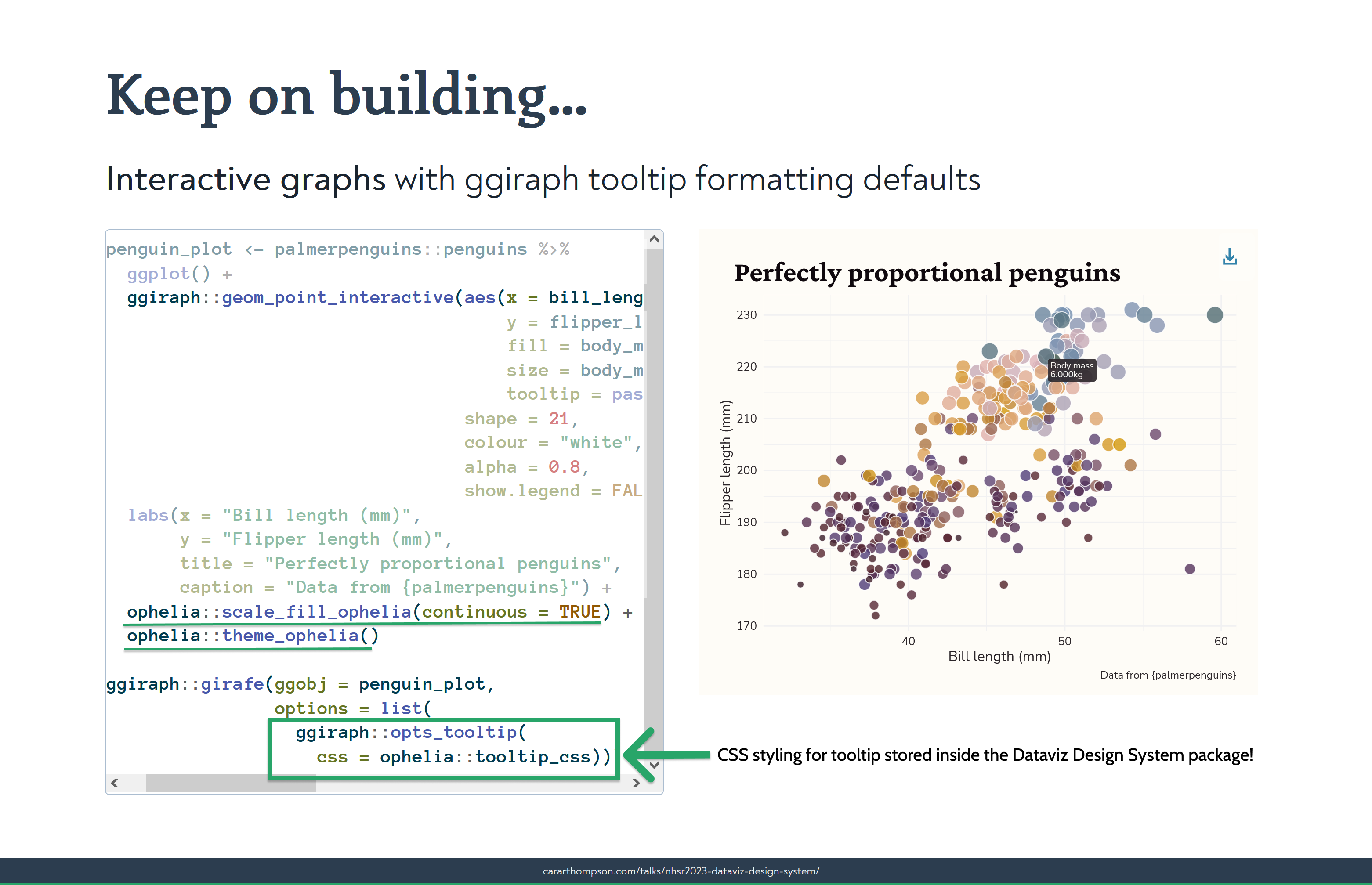
Building the Ophelia package
Using transparency to emphasise the story arc
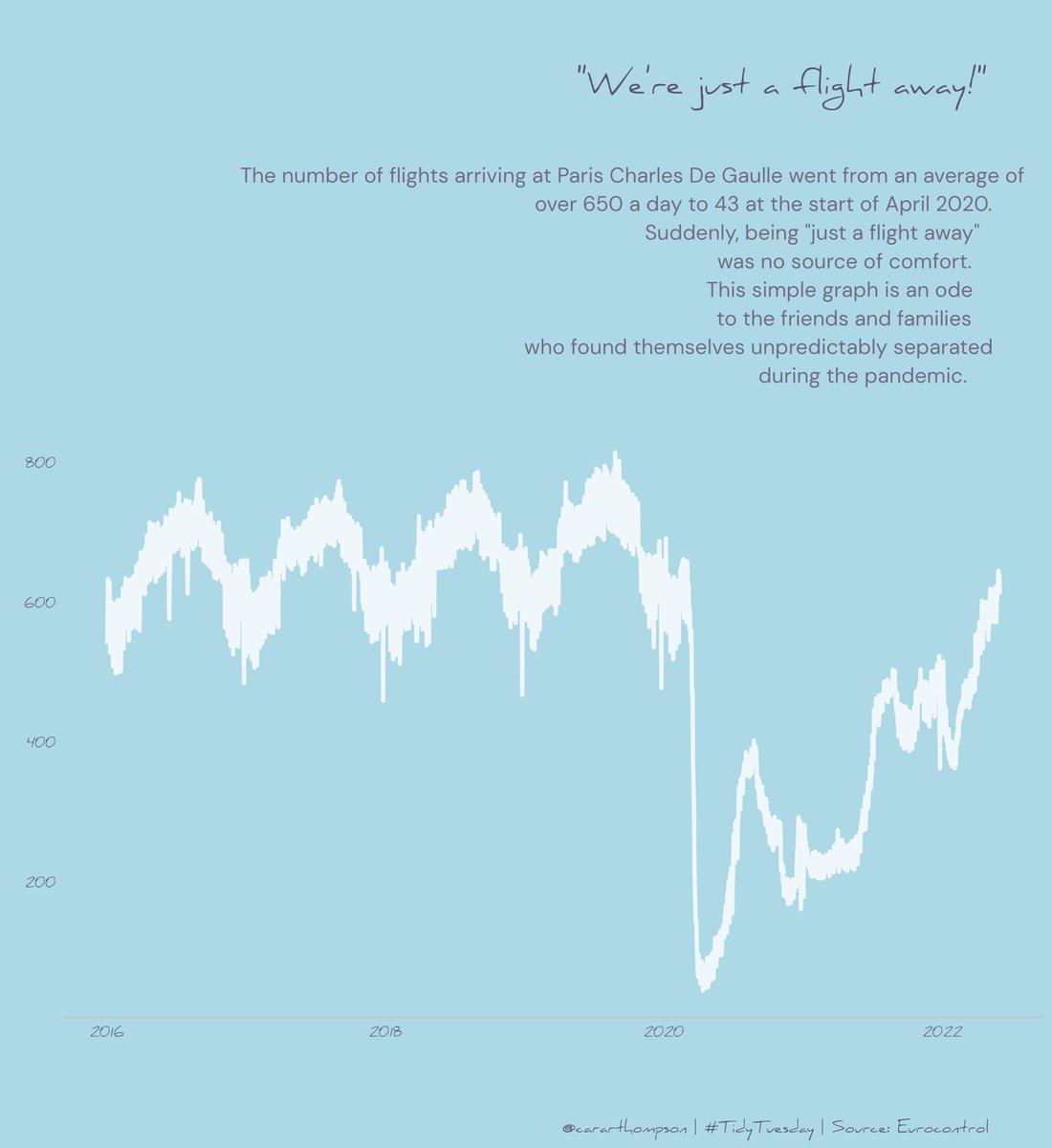
Just a flight away
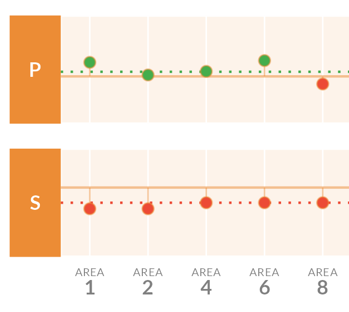
Align your axes
Accessibility in dataviz
Finally got a chance to catch up with MineDogucu’s #user2022 talk on accessibility. Some great tips within a wide-ranging framework, from making resources open and accessible to using example data on a range of topics to coding tips.
Level Up Your Labels
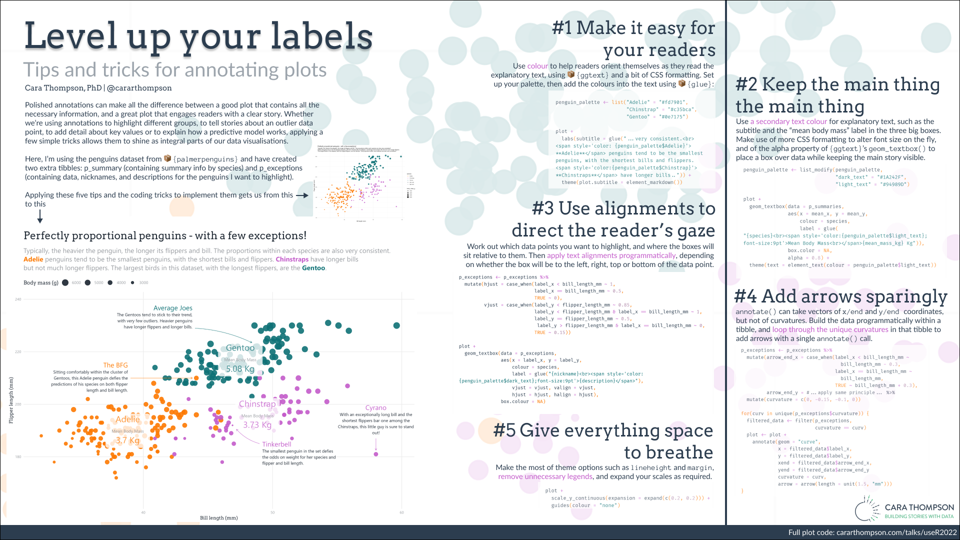
Level Up Your Labels: Tips and Tricks for Annotating Plots
Docker, taking notes, and a brilliant tutorial
Brilliant tutorial this morning at _useRconf by rami_krispin and rsangole on using #docker for #rstats users.
Building a textbox to highlight the difference between two points
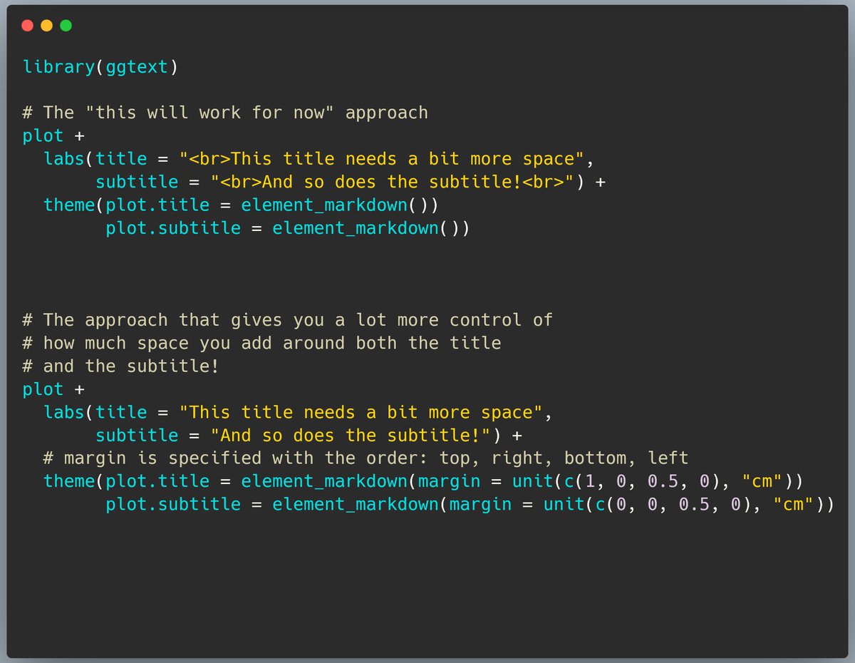
How to add space around the title of a ggplot the better way

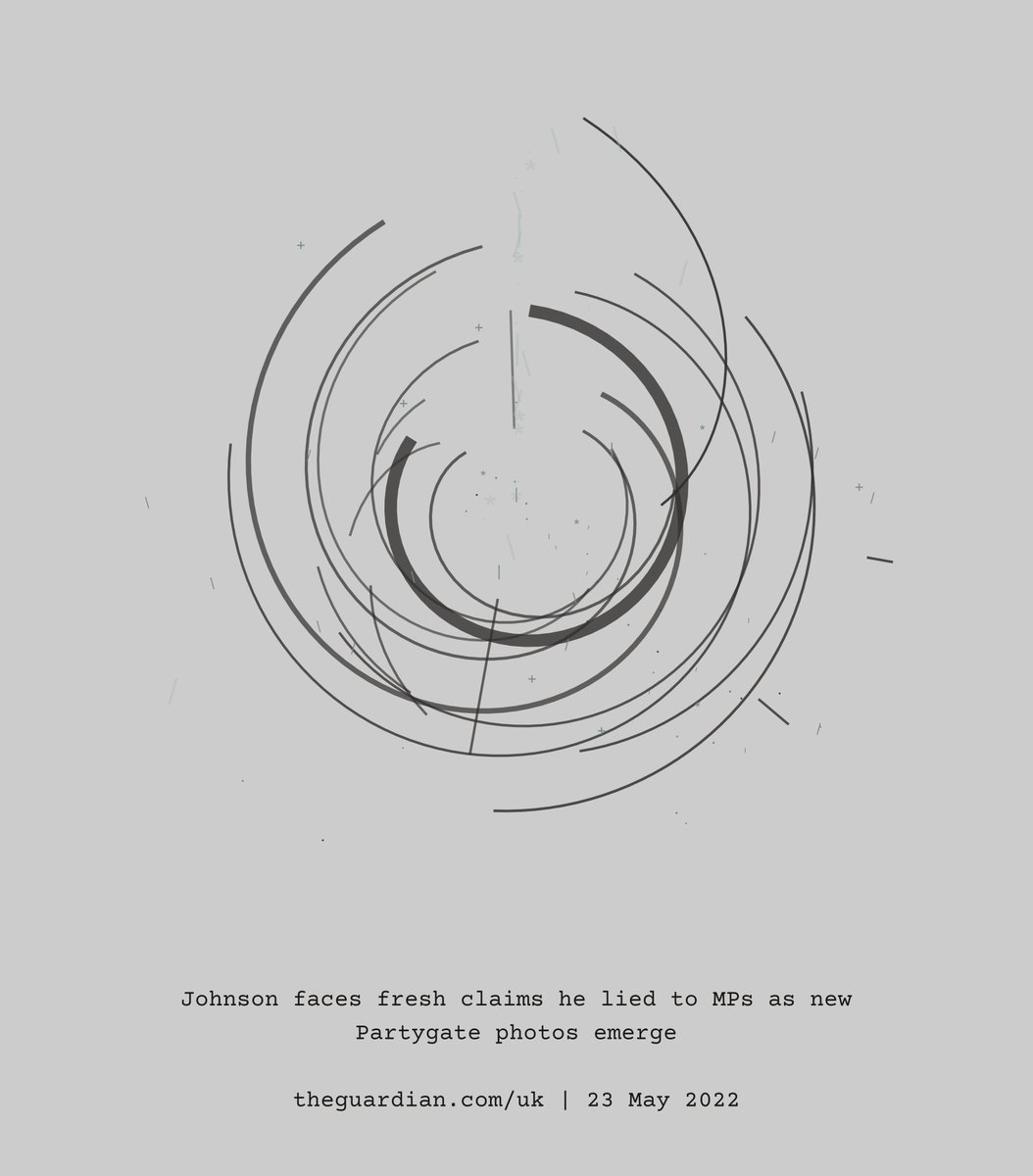
Generative Art for today’s headline
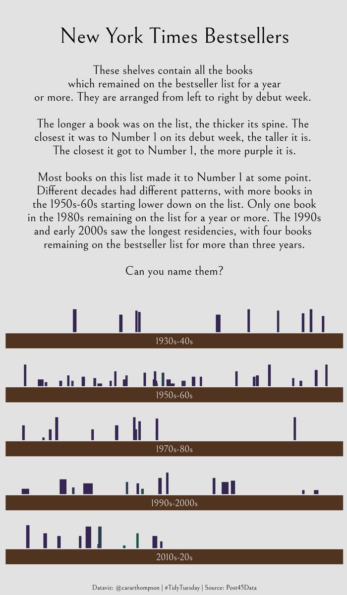
Visualising the NYT Bestsellers in this week’s #TidyTuesday
This week’s #r4ds #TidyTuesday is about the nytimes Bestsellers. I created some shelves containing the books that stayed on the list for at least 1 year. Which 4 books were there for 3+ yrs?
Five quick #rstats tips I’ve picked up in the plots I made for my second #30DayChartChallenge
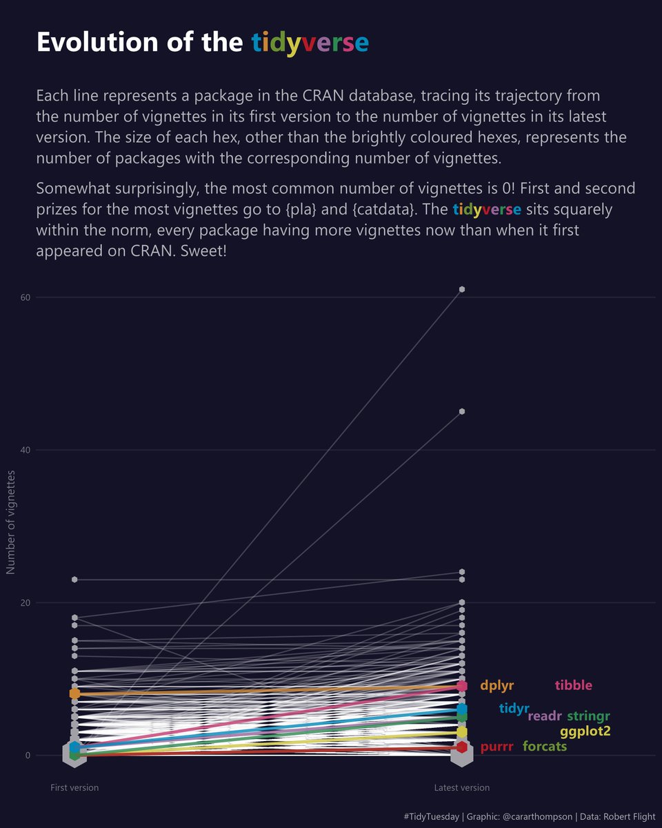
My contribution to this week’s #TidyTuesday is a tribute to the #tidyverse!
How to make data viz that matches your organisation’s branding
My first #TidyTuesday of 2022: Chocolate!

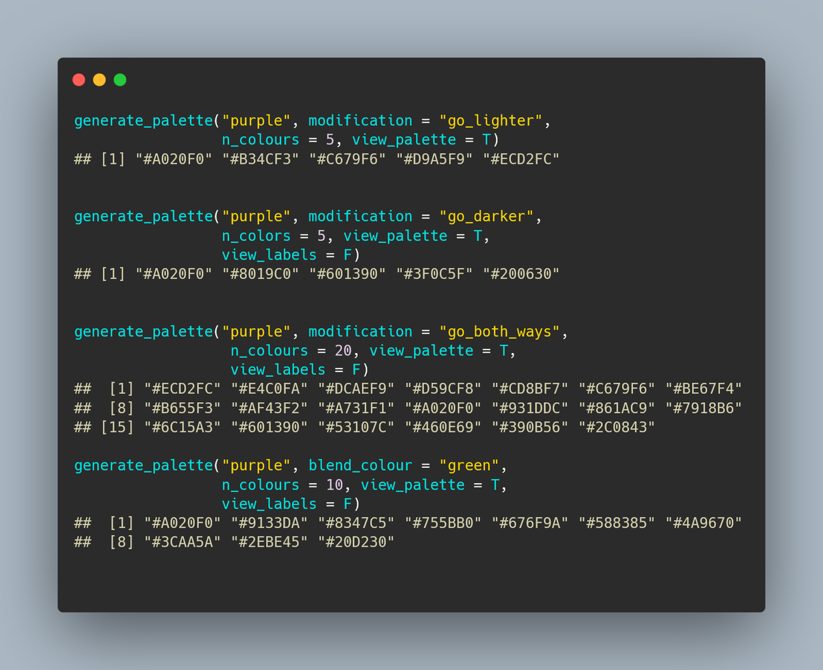
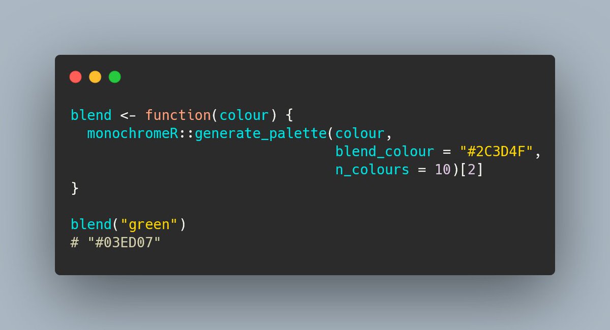
Introducing my new #rstats 📦: {monochromeR}

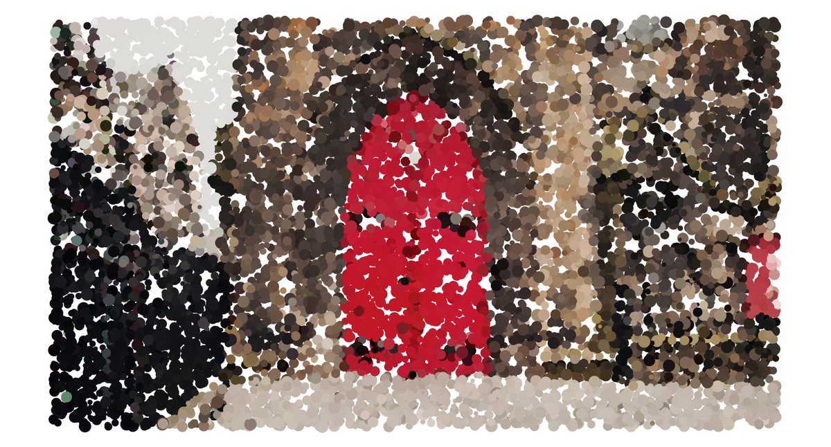
Turning photos into paintings with R
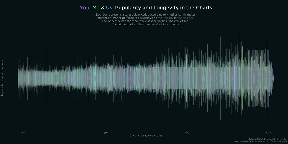
Visualising data from Billboard and Spotify

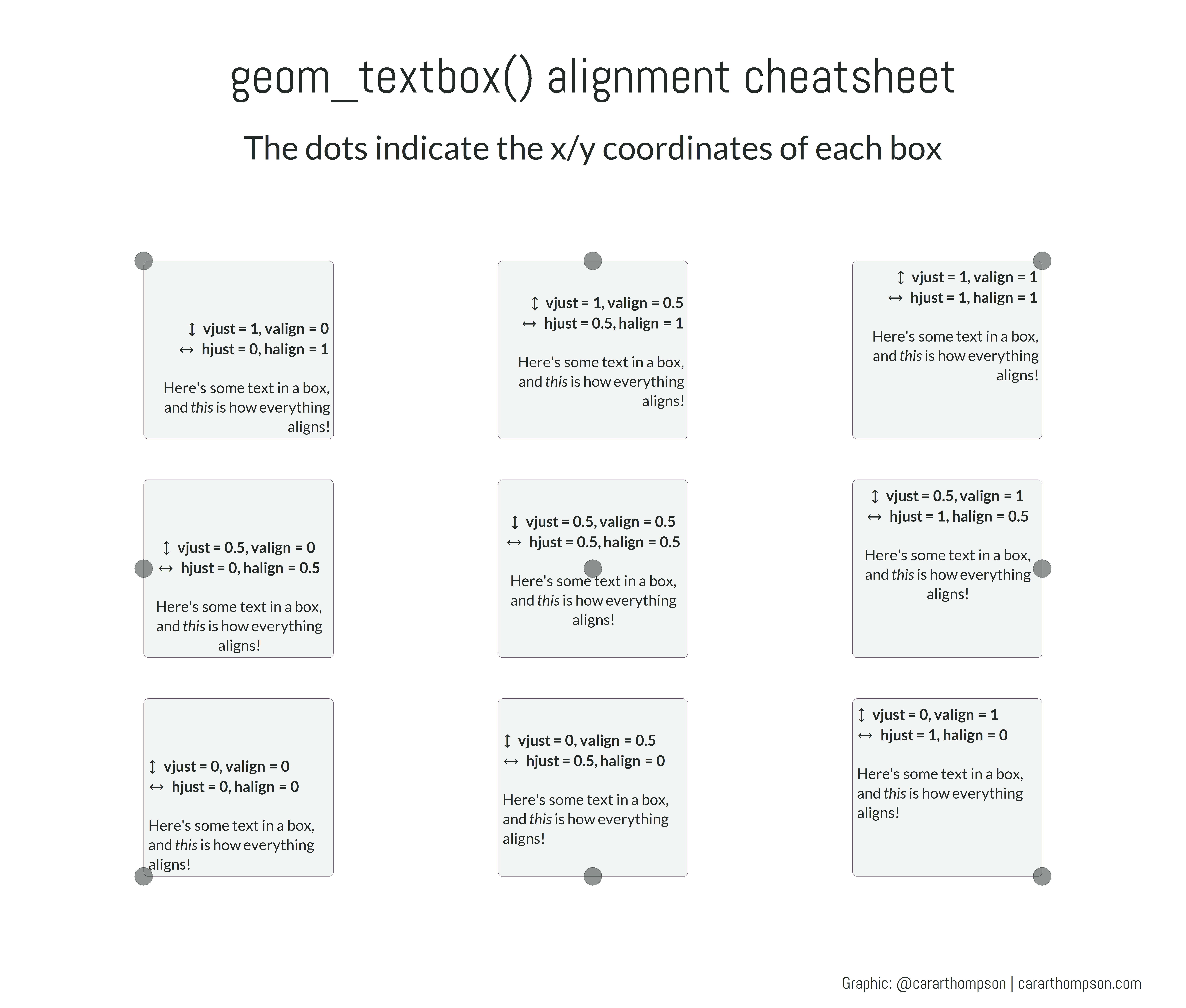
Alignment cheatsheet

Welcome to Pars pas les mains vides!
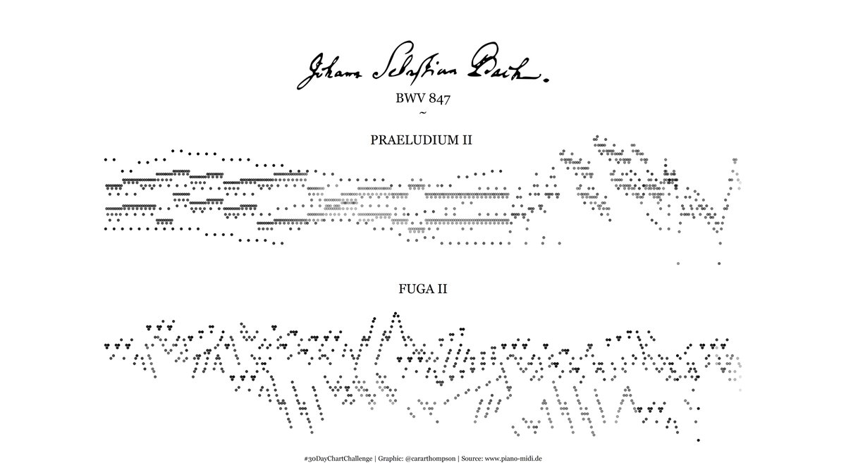
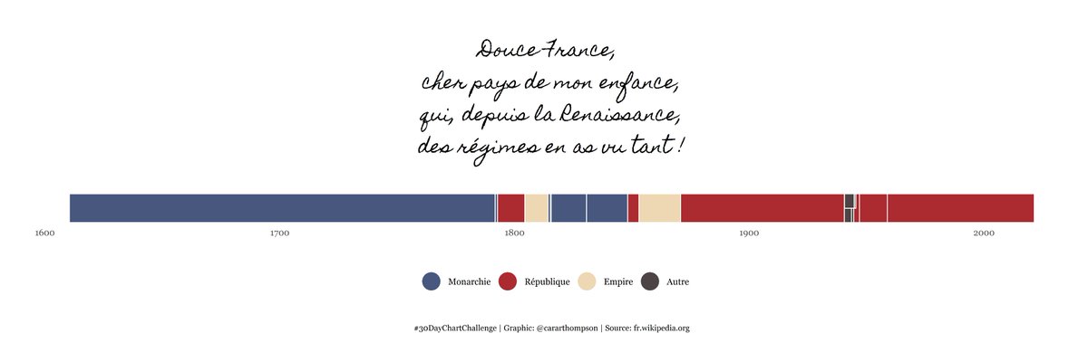
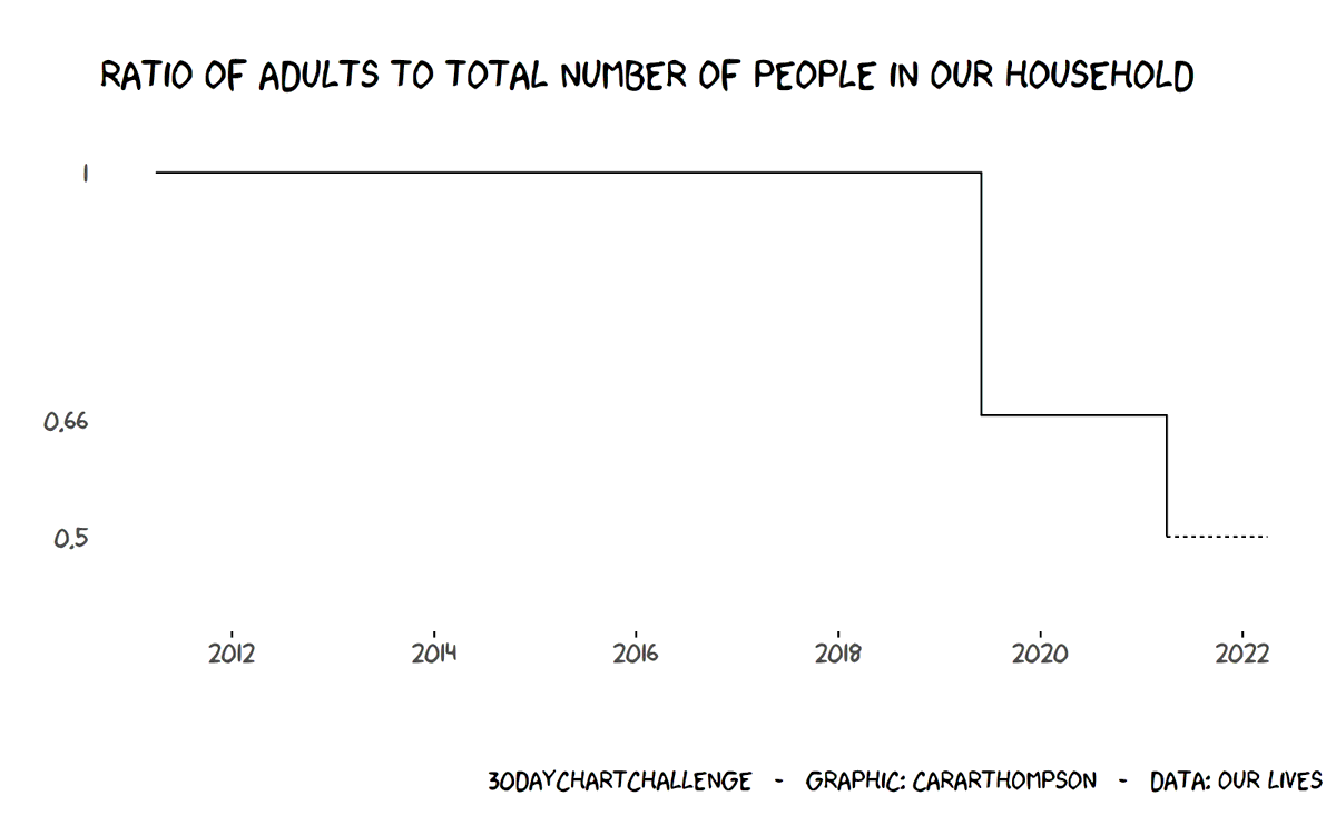
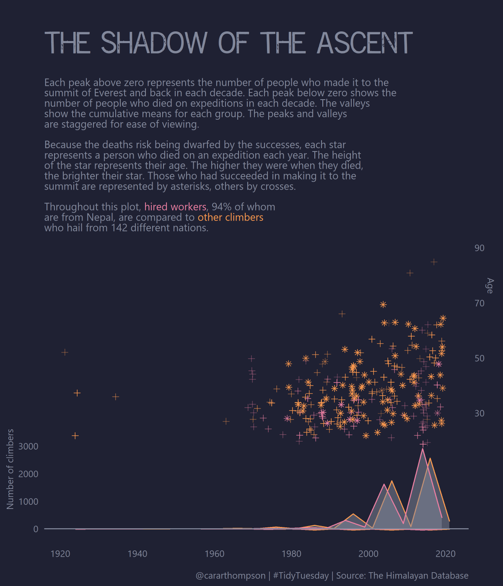
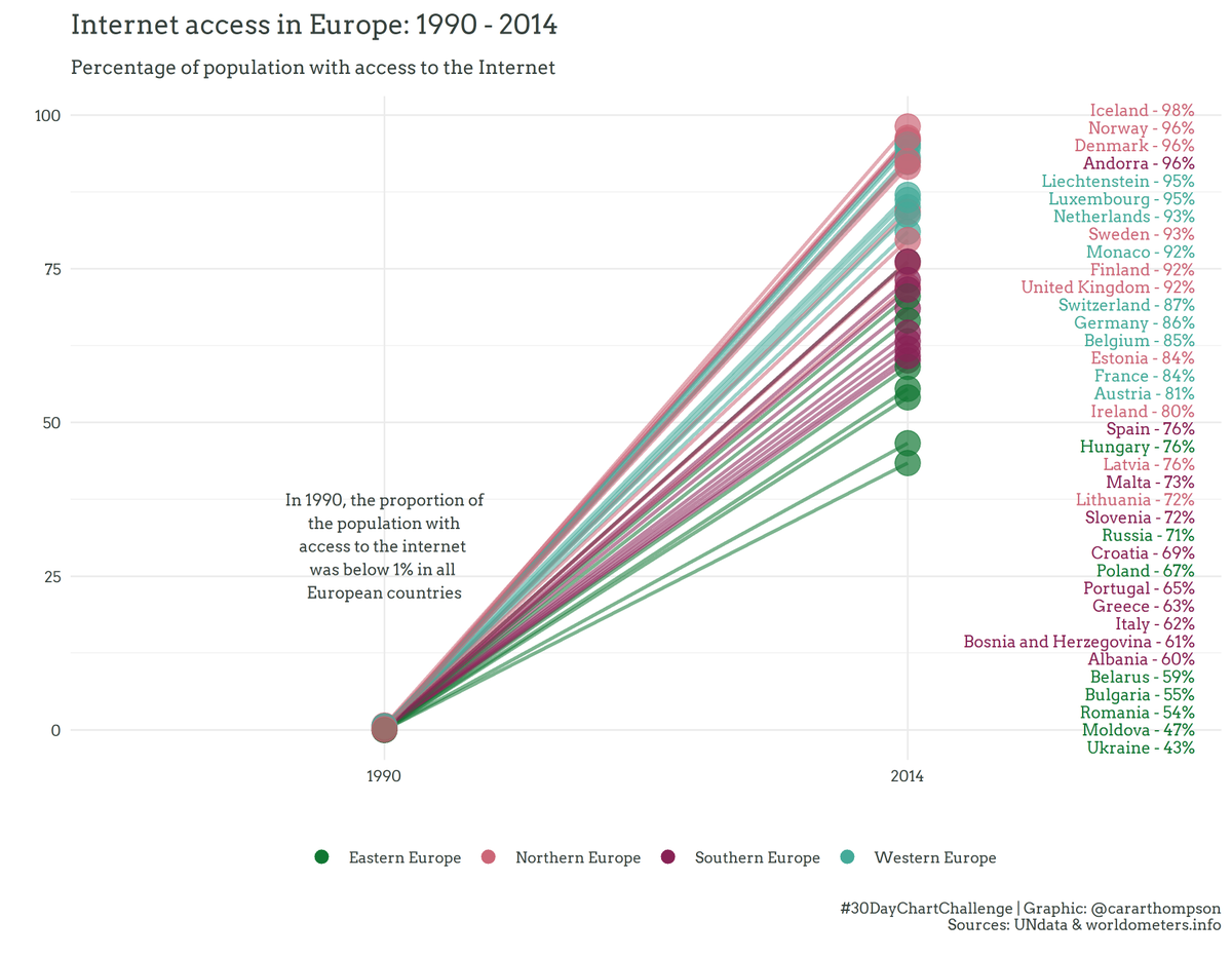
30DayChartChallenge - Day 21: Time series | Downwards
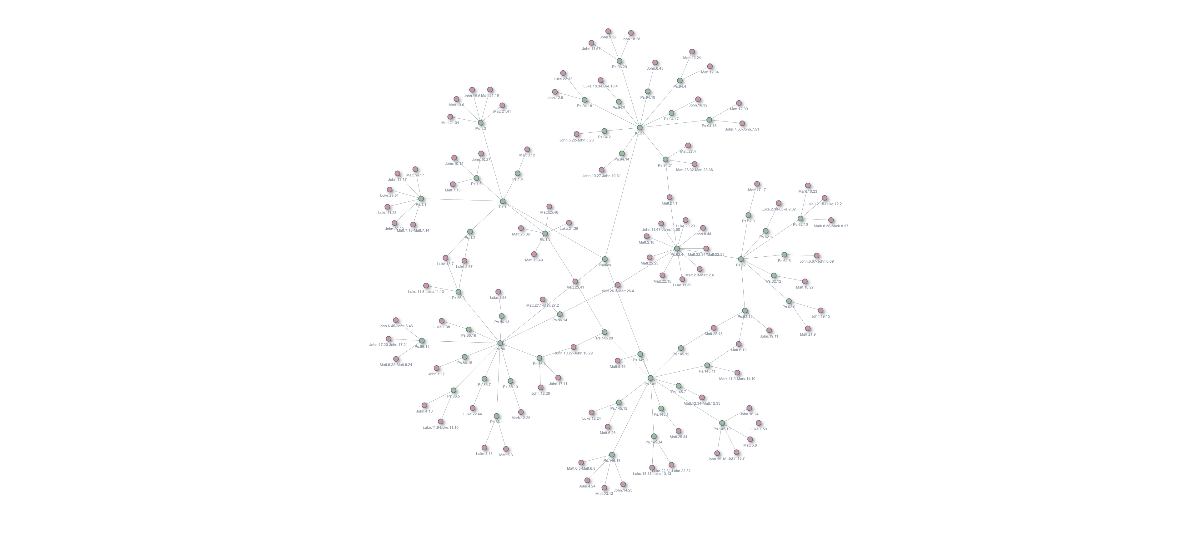
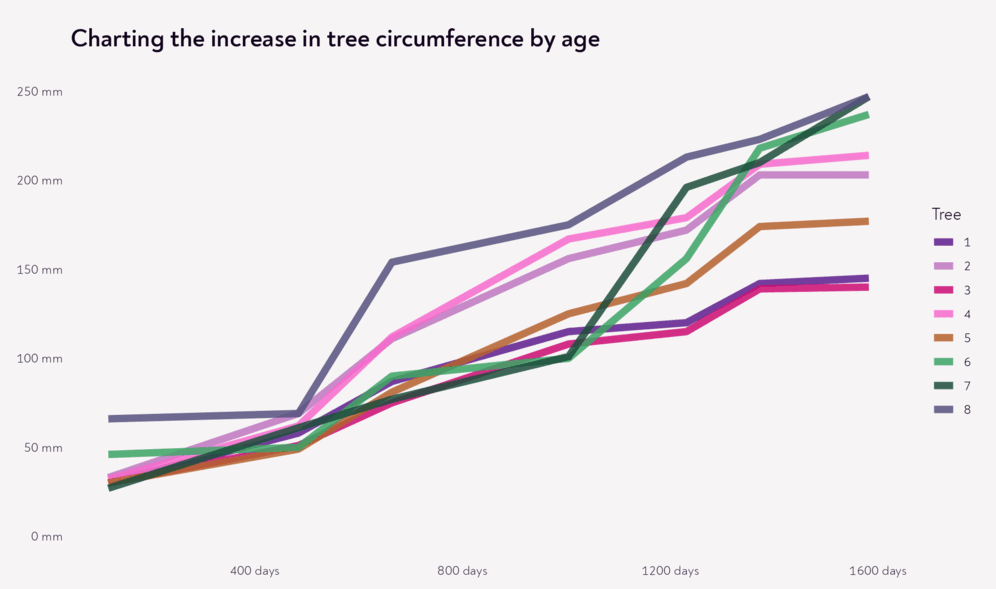
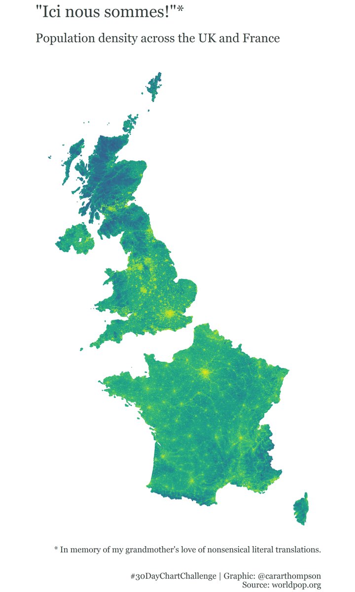
30DayChartChallenge - Day 16: Relationships | Trees
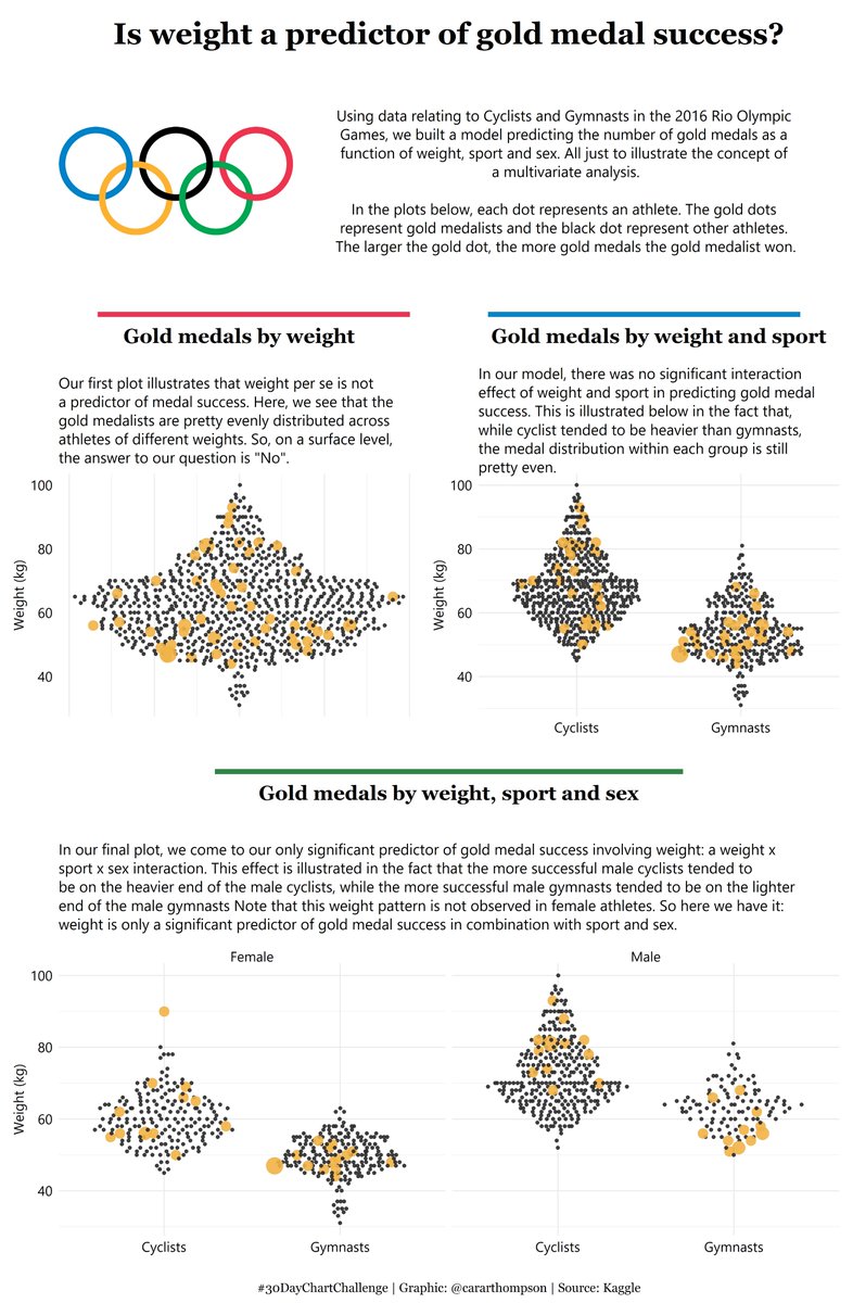
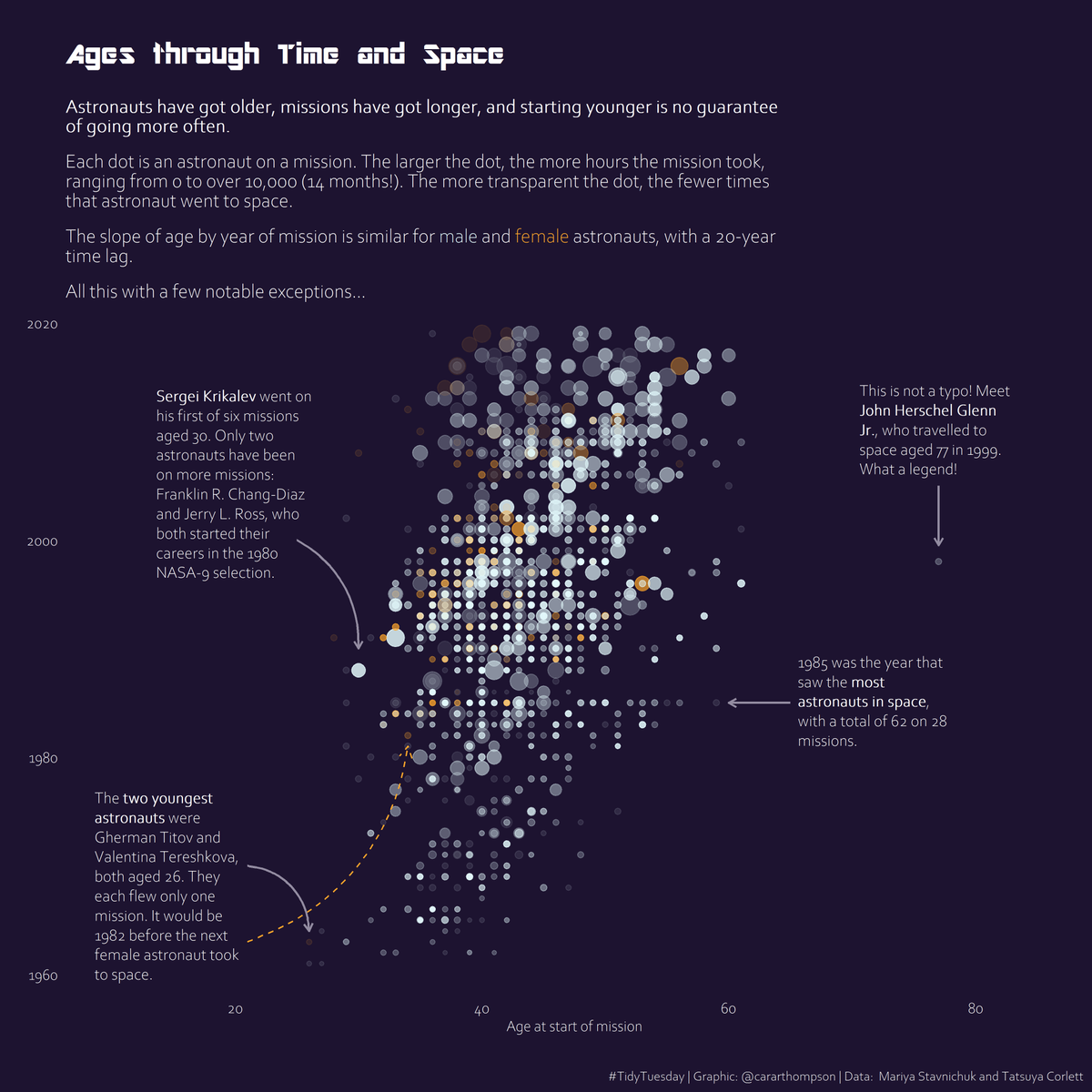
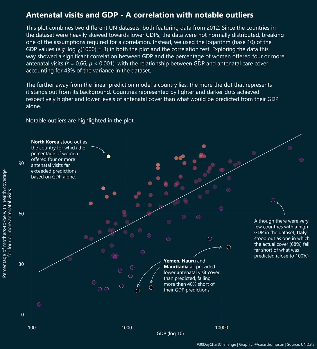
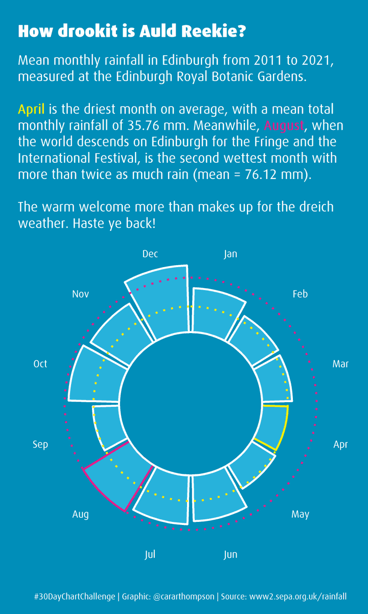
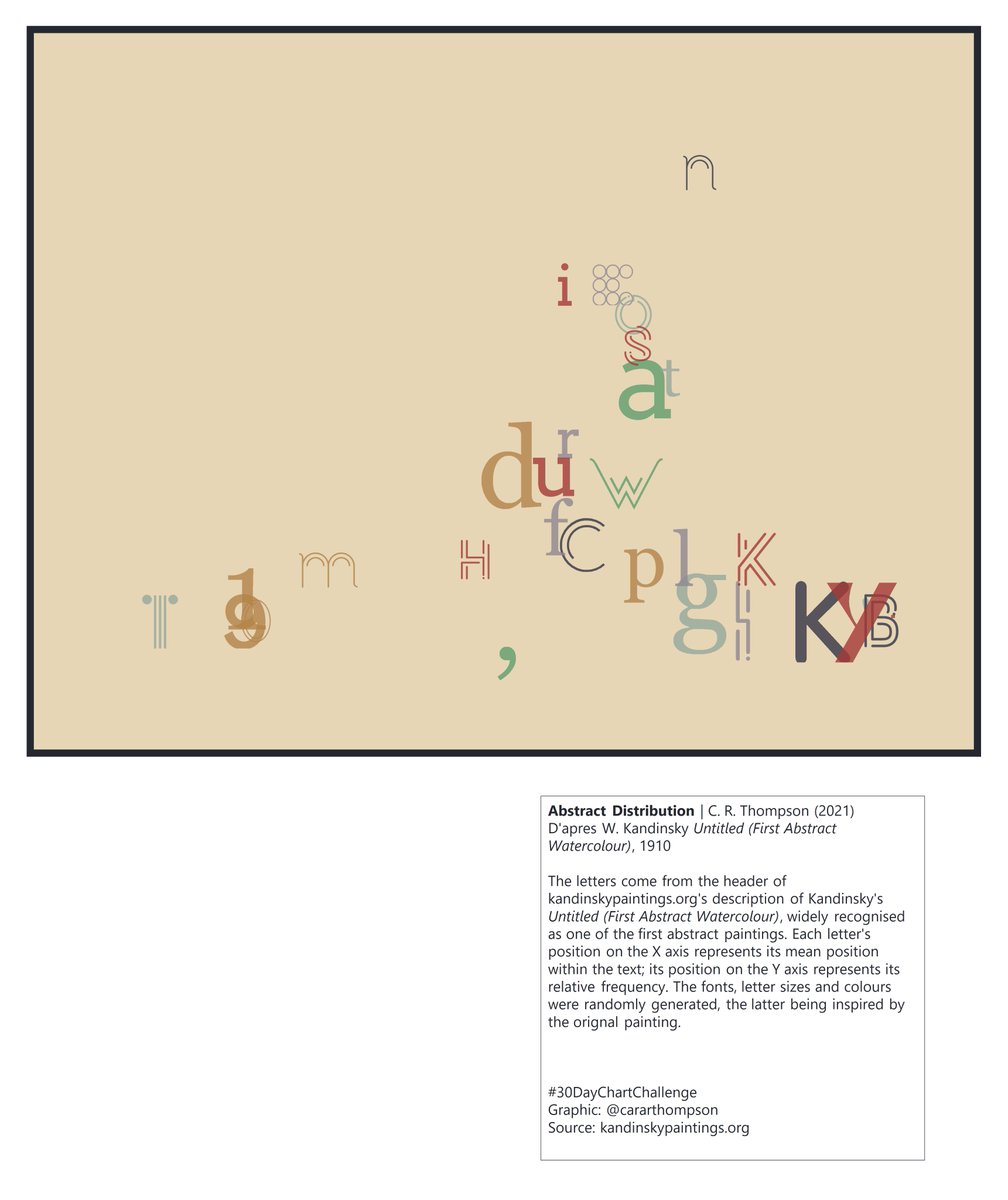

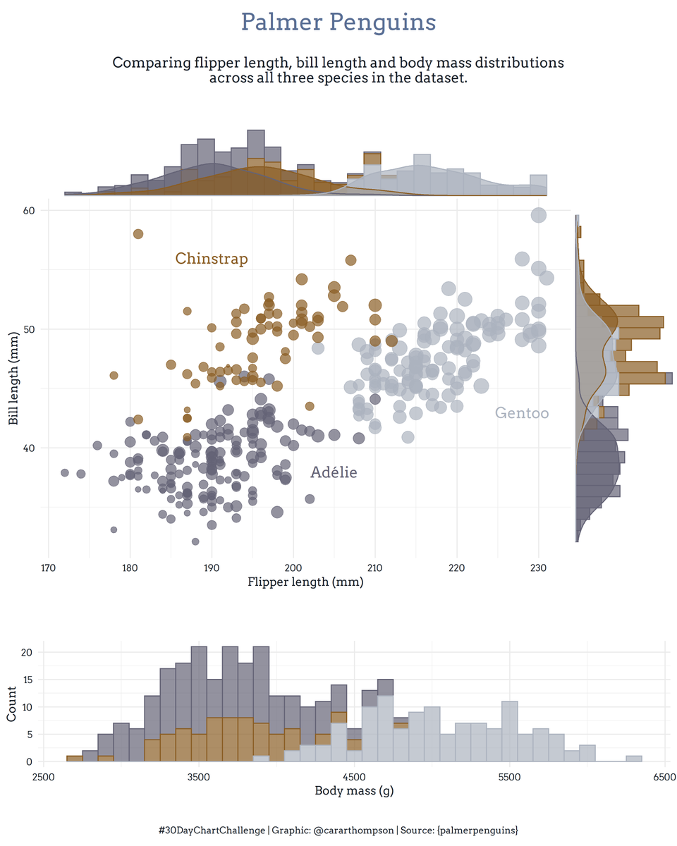
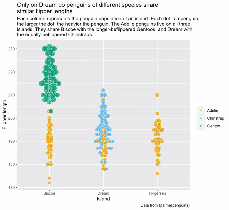
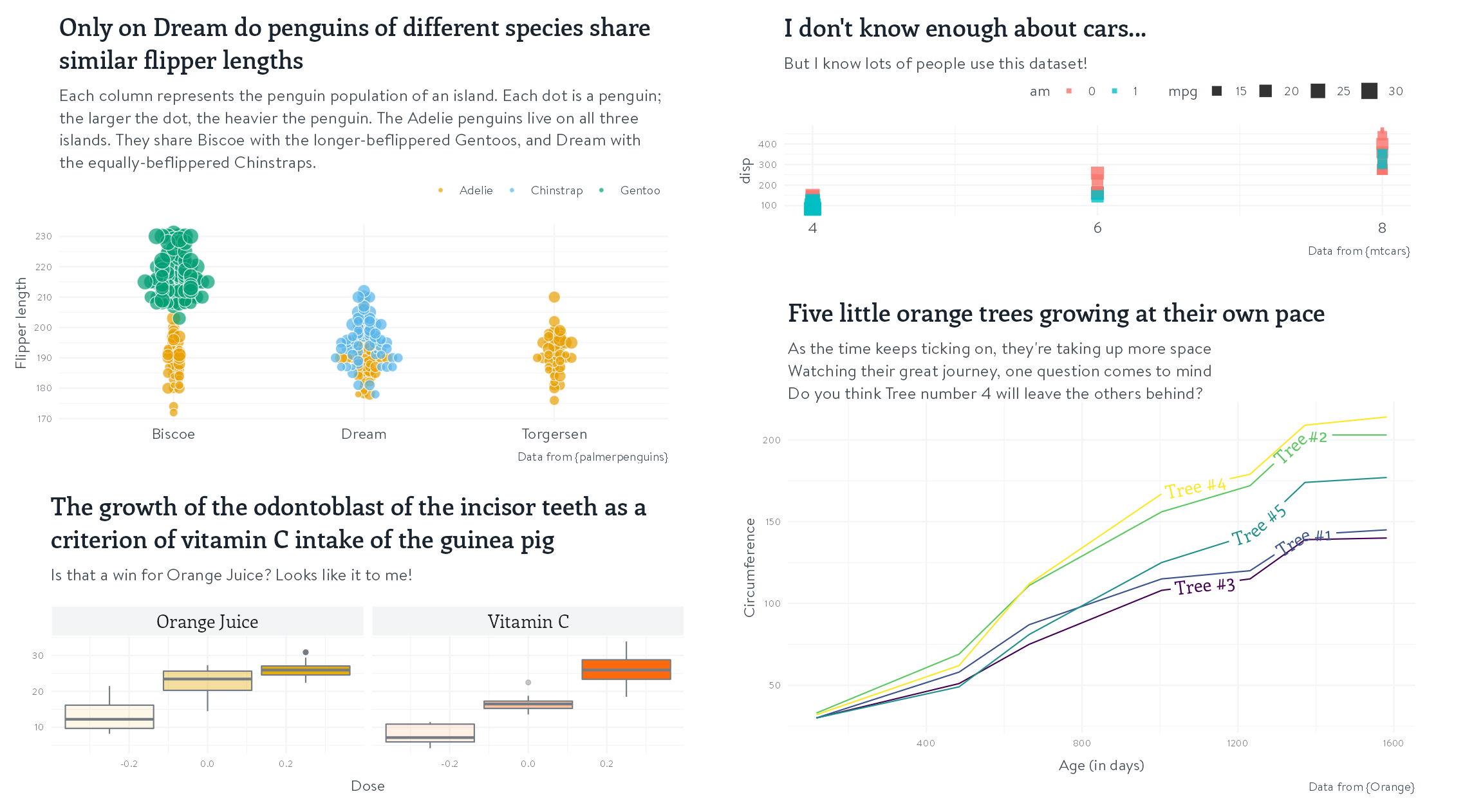
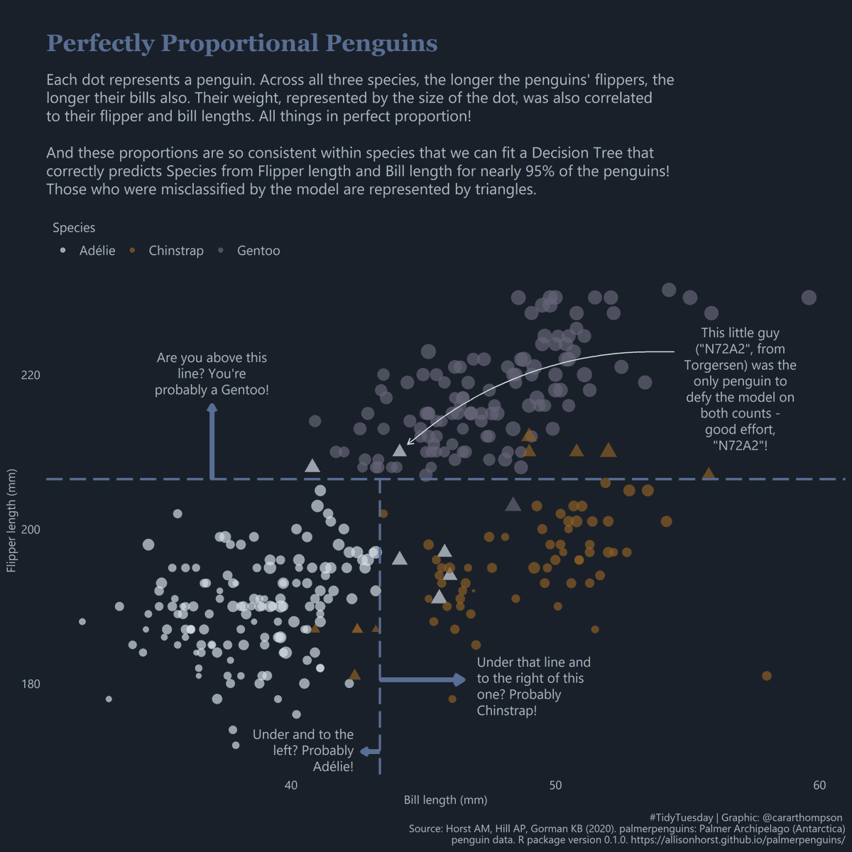
30DayChartChallenge - Day 8: Distributions | Animals


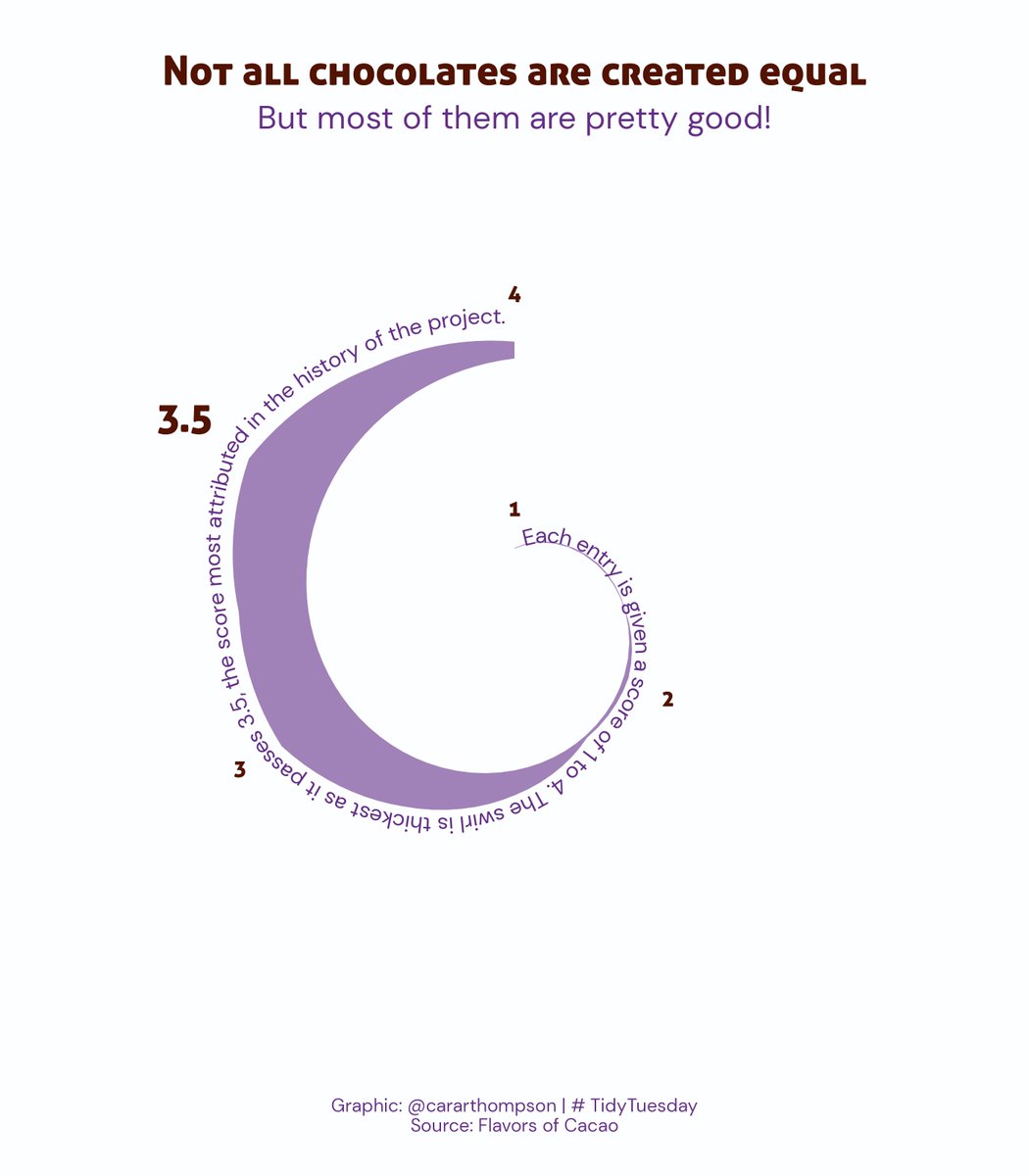
DuBois Challenge: Recreating his innovative spiral graph, and animating it!

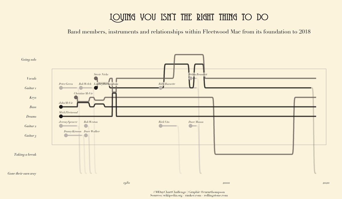
Arists, their lifespans, and their most productive times

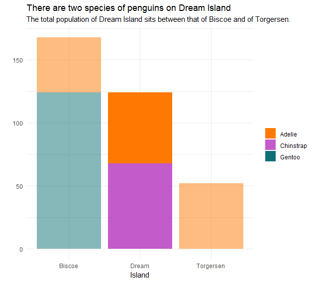
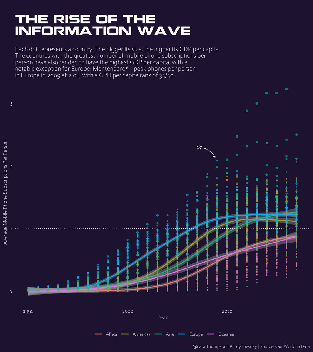
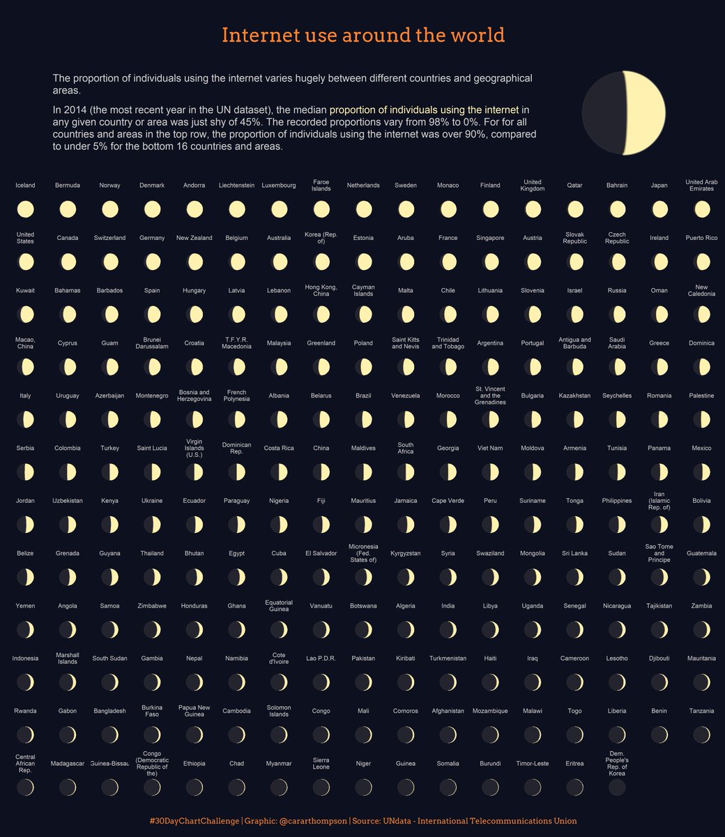
Visualising the rise of the use of mobile phones