Services
Services
Dataviz Design Systems
A dataviz design system is a bespoke set of colours, fonts, and rules, which can be combined to create data visualisations with a consistent aesthetic, taking into account colour semantics, accessibility, and design principles to help the stories in the data stand out. Investing in a dataviz design system for your team also brings about aesthetic unity, ensuring a clear visual identity across authors, papers, reports and conference talks.
Implemented as a fully documented bespoke R package with a robust test suite, as an Excel Add-on or as a PowerBI theme, the aim of the system is to save you time in decision making and implementation, so that you can focus on the aspects of data analysis and graph creation where your expertise adds most value.
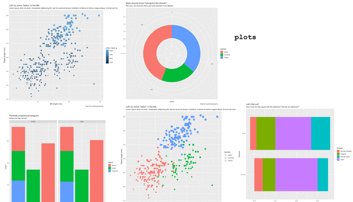
These are one of my favourite things to create, combining creativity with constraints to help data-driven teams maximise the visual impact of their work. I recently spoke at RMedicine about the process involved in creating a dataviz design system for a medical research group; you can rewatch the talk below.
Dataviz and Data-to-viz Commissions
You have some data to present, and your audience wants to understand it. Whether you’re looking for crystal clear communication of data insights, an artistic response to the data, or something in between the two, I enjoy putting together stand-out visuals which will keep the conversation going about your work.
From academic graphs to artistic commemorations, via interactive visualisations and animations with a sense of humour, my portfolio features a range of different styles, all coded straight from the data.


And if you find yourself making the same plot(s) time and time again, let’s work together on a data-to-viz solution, so that you only have to use one line of code next time. Your time is better spent on other things! We can package up a plot function to avoid all that copy-pasting, and give it as much flexibility as you need to get good use out of it.
Training, Consultation and Mentoring
You’re working on a new project, and feel you could do with a hand when it comes to dataviz? I genuinely enjoy helping people make the most of dataviz in their own context and would love to help.
The talks section on my website offers a few resources that you can make use of either for yourself or as an organisation. If you’re looking for something more bespoke, I enjoy meeting clients where their dataviz needs are, and look forward to hearing what you have in mind.
Here’s what I offer:
- One-to-one coaching calls - discuss a specific graph or graph series you’re working on
- Organisation-wide dataviz retainers - I’ll be on hand to give you a hand when required
- Team training sessions - including a review of the team’s current dataviz projects and team mentoring as they apply the training to upcoming projects
Tell me more about your context, where you feel you could do with a few pointers, and we’ll make a plan.
![]()
The folks I was with all agreed it was amazing how much value you’d packed into 8 minutes without it ever feeling rushed!
- Feedback from the 2022 NHS-R Conference
Here’s what they were talking about!
Skip to Dataviz Design Systems | Dataviz and Data-to-viz Commissions | Training, Consultation and Mentoring