DuBois Challenge: Recreating his innovative spiral graph, and animating it!
data-visualisation
ggplot2
Revisiting DuBois’ data visualisation was a masterclass in innovative techniques for creating compelling visualisations which push the boundaries of “normal” visualisations while being intuitive to their intended audience.
Dataviz redo
Here’s my #TidyTuesday #DuBoisChallenge contribution. Brute force trigonometry got me there in the end!

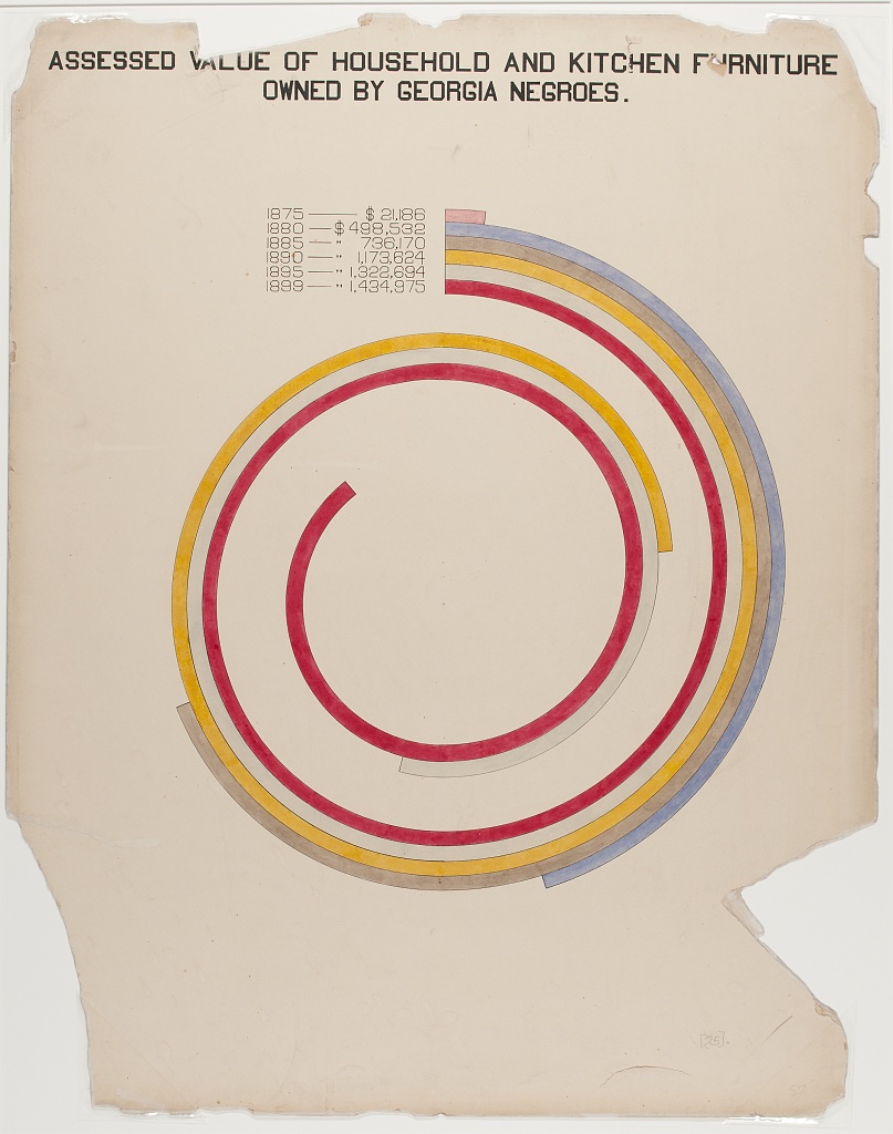
Here’s DuBois’ original.
Here’s how I did it.
For a far more elegant approach with coord_polar(), see @ijeamaka_a’s solution
Animating it
This doesn’t quite fit with the brief of the #DuBoisChallenge, but I added some {gganimate}. Having lost a battle with nframes and fps, I used an online tool to speed it up and trim the white space.
Reuse
Citation
For attribution, please cite this work as:
Thompson, Cara. 2021. “DuBois Challenge: Recreating His Innovative
Spiral Graph, and Animating It!” February 17, 2021. https://www.cararthompson.com/posts/2021-02-17-heres-my-tidy-tuesday-du-bois-challenge-contribution/.