#30DayChartChallenge - Day 1: Part-to-whole
data-visualisation
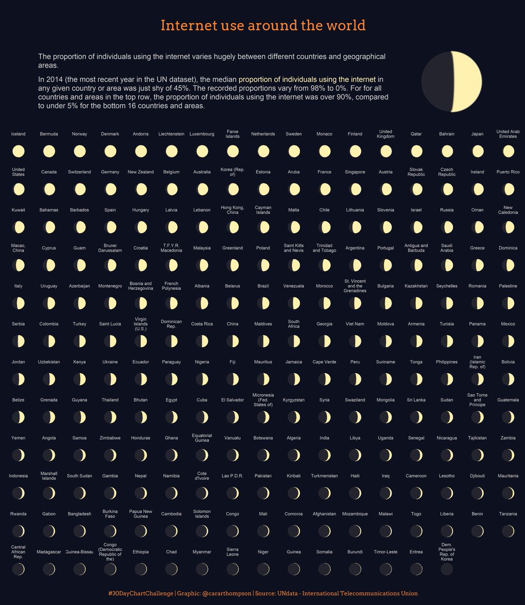
Data from UNdata on internet use around the world.
First time using geom_moon() and a subtle amount of {ggfx} to make the moon glow!
Code: github.com/cararthompson/30DayChartChallenge/
Reuse
Citation
For attribution, please cite this work as:
Thompson, Cara. 2021. “#30DayChartChallenge - Day 1:
Part-to-Whole.” April 1, 2021. https://www.cararthompson.com/posts/2021-04-01-x30day-chart-challenge-day-1-part-to-whole-data/.