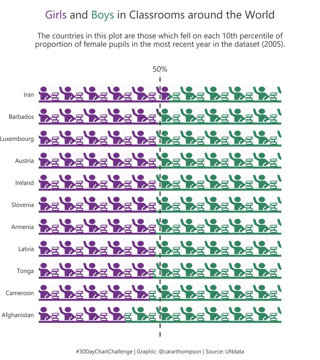
#30DayChartChallenge - Day 2: Pictogram
data-visualisation
Some more {ggfx} along with {ggimage}, exploring proportions of boys and girls in classrooms.
Code: github.com/cararthompson/30DayChartChallenge
Inspiration: geokaramanis’s masterful industries plot
Reuse
Citation
For attribution, please cite this work as:
Thompson, Cara. 2021. “#30DayChartChallenge - Day 2:
Pictogram.” April 3, 2021. https://www.cararthompson.com/posts/2021-04-03-x30day-chart-challenge-day-2-pictogram-some/.
