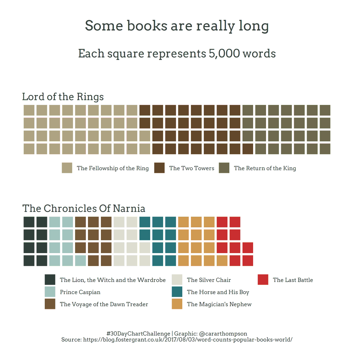
#30DayChartChallenge - Day 4: Comparisons - Magical
data-visualisation
A waffle graph that doesn’t always make me new friends
I read the trilogy in an attempt to better appreciate the films. It didn’t work. But at least I tried!
Some fun with geom_waffle()!
Code: github.com/cararthompson/30DayChartChallenge
In case anyone else is a tad concerned about the order of the Narnia books in the graph, here’s my source
Reuse
Citation
For attribution, please cite this work as:
Thompson, Cara. 2021. “#30DayChartChallenge - Day 4: Comparisons -
Magical.” April 4, 2021. https://www.cararthompson.com/posts/2021-04-04-x30day-chart-challenge-day-4-comparisons/.
