#30DayChartChallenge - Day 5: Comparisons - Slope
data-visualisation
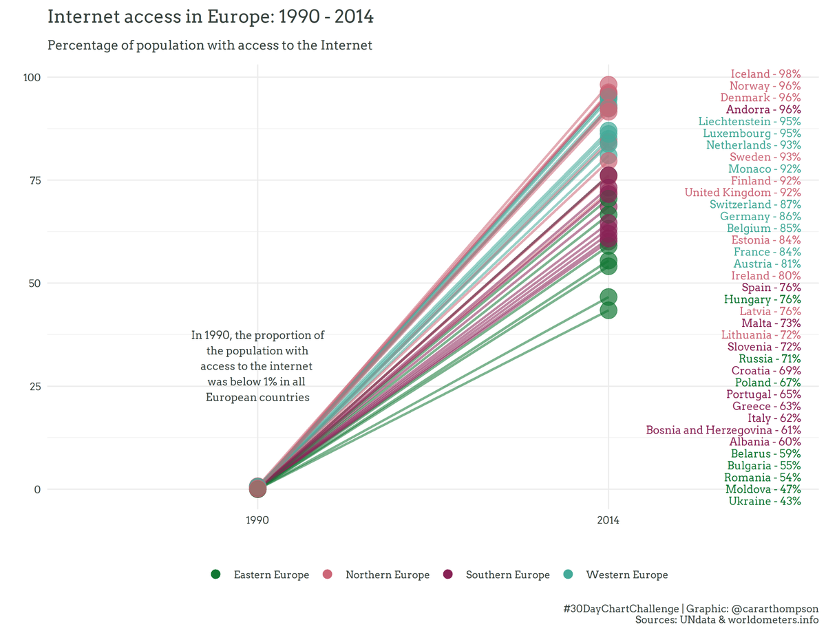
Back to the Internet access data from #UNData for a simple graph exploring how things have changed since 1990 in Europe.
Also back to {rvest} with html_table() for some more web scraping.
Code: github.com/cararthompson/30DayChartChallenge/blob/main/sc…
Reuse
Citation
For attribution, please cite this work as:
Thompson, Cara. 2021. “#30DayChartChallenge - Day 5: Comparisons -
Slope.” April 5, 2021. https://www.cararthompson.com/posts/2021-04-05-x30day-chart-challenge-day-5-comparisons/.