#30DayChartChallenge - Day 6: Comparisons - Experimental
data-visualisation
Revisiting one of my favourite undergrad Psychology experiments, the Stroop Effect.
Today’s chart was inspired by looking after my toddler while eating a ridiculous number of calories as I prepare for baby #2’s arrival.
Name the colour of the text at different hunger levels and see how the difficulty level compares.
Code: github.com/cararthompson/30DayChartChallenge/blob/main/sc…
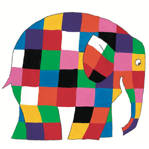
Here’s the colour palette inspiration!
Reuse
Citation
For attribution, please cite this work as:
Thompson, Cara. 2021. “#30DayChartChallenge - Day 6: Comparisons -
Experimental.” April 6, 2021. https://www.cararthompson.com/posts/2021-04-06-x30day-chart-challenge-day-6-comparisons/.

