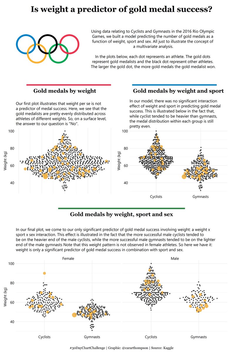
#30DayChartChallenge - Day 15: Relationships | Multivariate
data-visualisation
storytelling
Spent way too long on this one, looking for a good dataset to illustrate this concept!
I’ve found beeswarm plots to be a helpful way of intuitively communicating the patterns in the underlying data, allowing us to highlight different groups within a distribution.
Once I’d found the pattern I needed in the data, the main headache was the layout. Ended up with a combination of {cowplot} and {patchwork} in the end.
- 🔧 #rstats 🐝🐝
- 💻: github.com/cararthompson/30DayChartChallenge/blob/main/sc…
- 📦: 🐝🐮
Reuse
Citation
For attribution, please cite this work as:
Thompson, Cara. 2021. “#30DayChartChallenge - Day 15:
Relationships | Multivariate.” April 15, 2021. https://www.cararthompson.com/posts/2021-04-15-x30day-chart-challenge-day-15-relationships/.
