Visualising data from Billboard and Spotify
data-visualisation
ggplot2
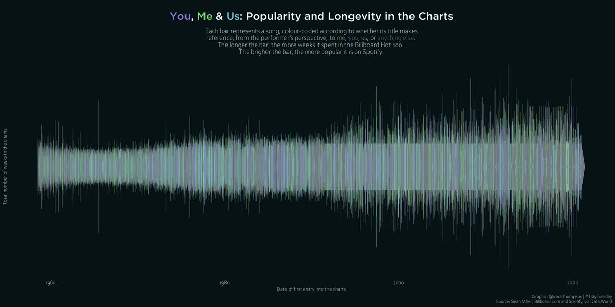
Making it look like a sound wave was a fun challenge with this one
Using data from #billboard and #spotify, I looked at popularity and longevity of songs referencing you, me, us, and everything else.
With more time, I’d explore the shift in pattern around the 90s!
- 🔧#rstats
- ⏱️3h
Here’s the making of and a link to the code! github.com/cararthompson/tidytuesdays
Reuse
Citation
For attribution, please cite this work as:
Thompson, Cara. 2021. “Visualising Data from Billboard and
Spotify.” September 15, 2021. https://www.cararthompson.com/posts/2021-09-15-my-first-tidy-tuesday-contribution-in/.
