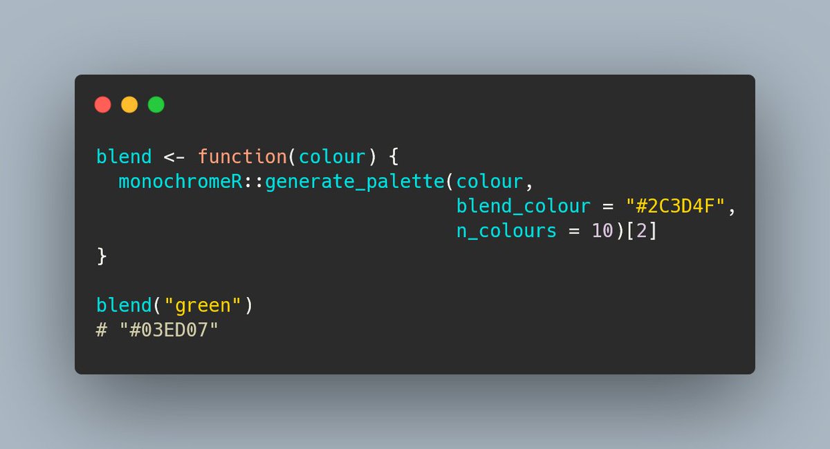
blend <- function(colour) {
  monochromeR::generate_palette(
    colour,
    blend_colour = "#2C3D4F",
    n_colours = 10
  )[2]
}

blend("green")
# "#03ED07"Five quick #rstats tips I’ve picked up in the plots I made for my second #30DayChartChallenge
The one I don’t mention here is that you definitely get faster as you go. These challenges are a great way of building up a library of code and skills you can draw on for future projects!
1. Need to plot a million points and ggplot() is taking too long but you want to stay within the tidyverse?
👉 Use 📦 {scattermore} with geom_scattermore() 🥳
2. Using several subplots together to tell a story and they each have their own colour scheme?
👉 Create a function to blend in a bit of the same colour into all the others to create a more unified look
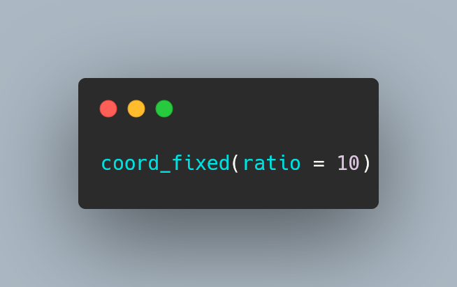
3. Struggling with squished images when using {ggimage}?
👉 Plot the data with a ratio of 1:1 and use coord_equal() 👉 If that’s not an option (e.g. x is categorical), adjust the ratio of the x to y increments within coord_fixed(), e.g.:
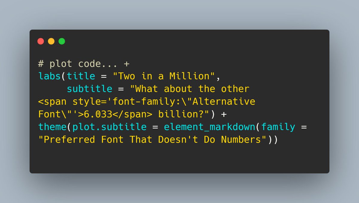
4. Picked a nice font and then realised it doesn’t do numbers?
👉If there’s a similar one that will do for numbers, change font on the fly with 📦{ggtext} and element_markdown(), e.g.:
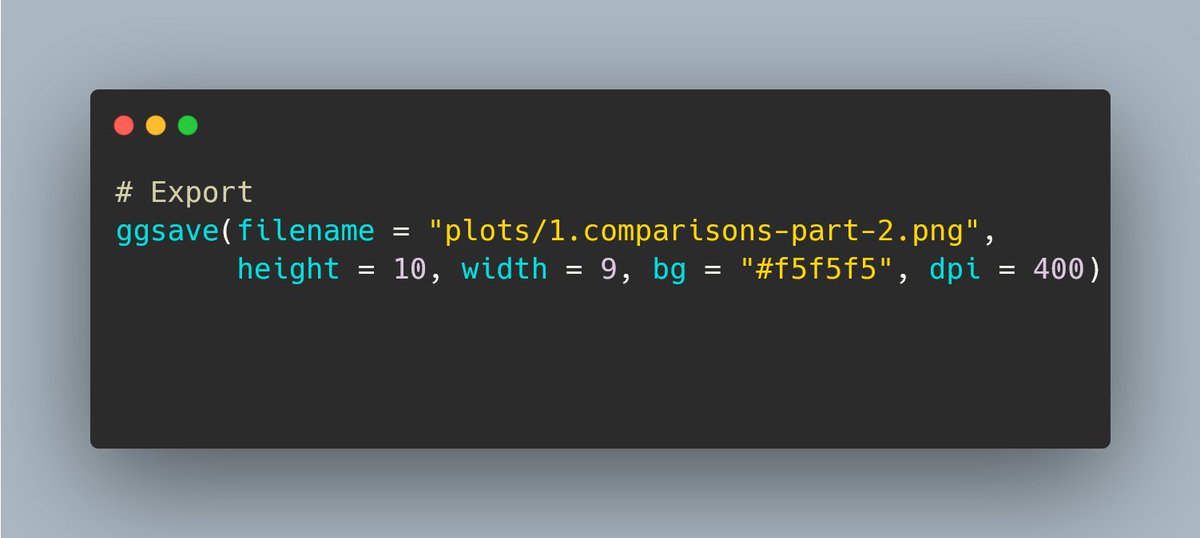
5. And finally, the one I really wish I’d known earlier. Want to change the background colour of your plot?
👉 No need to change everything within +theme()! Instead, pass the colour into ggsave! 🤯
Would have saved me a lot of time on so many #tidyTuesday plots!
Reuse
Citation
For attribution, please cite this work as:
Thompson, Cara. 2022. “Five Quick #Rstats Tips I’ve Picked up in
the Plots I Made for My Second #30DayChartChallenge.” April 6,
2022. https://www.cararthompson.com/posts/2022-04-06-five-quick-rstats-tips-ive/.