The joy of seeing another dataviz design system come together!
data-visualisation
dataviz-design-system
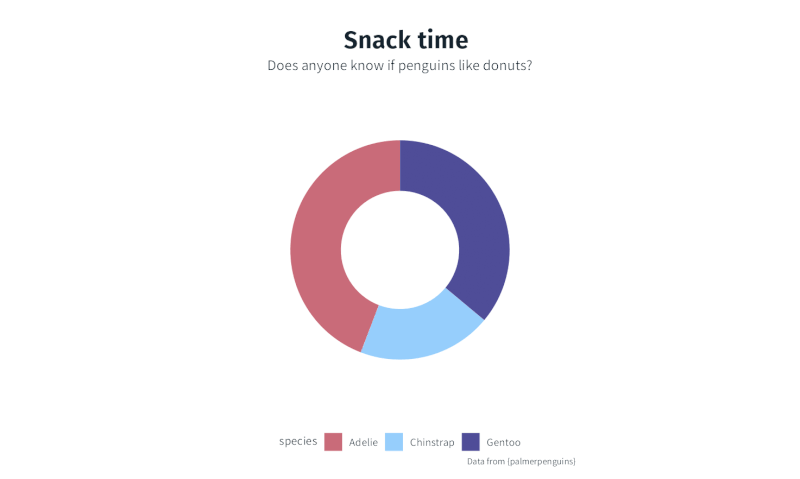
This is such a satisfying milestone in a project, when the dataviz design system comes together and I get to show the client what it looks like with demo plots.
Fonts, colours, meaningful palettes to suit the project, all with accessibility guidelines baked in from the start, and all built around their existing brand guidelines and personal tastes.
And it’s even more satisfying to know they can do this with two lines of code!
Next steps: wrap up the documentation, add in a trusty parameterised function for a visualisation they use a lot, give the client (they’re not really called “xyz”) access to the package and enjoy spotting their plots in the wild!
Reuse
Citation
For attribution, please cite this work as:
Thompson, Cara. 2024. “The Joy of Seeing Another Dataviz Design
System Come Together!” June 11, 2024. https://www.cararthompson.com/posts/2024-06-11-when-a-dataviz-design-system-comes-together/.