Reworking a standard graph into something more intuitive
data-visualisation
storytelling
“That’s a wrap for the #dataviz workshop sessions I’ve been leading yesterday and today for NSHG-PM’s 2025 conference in Copenhagen.”
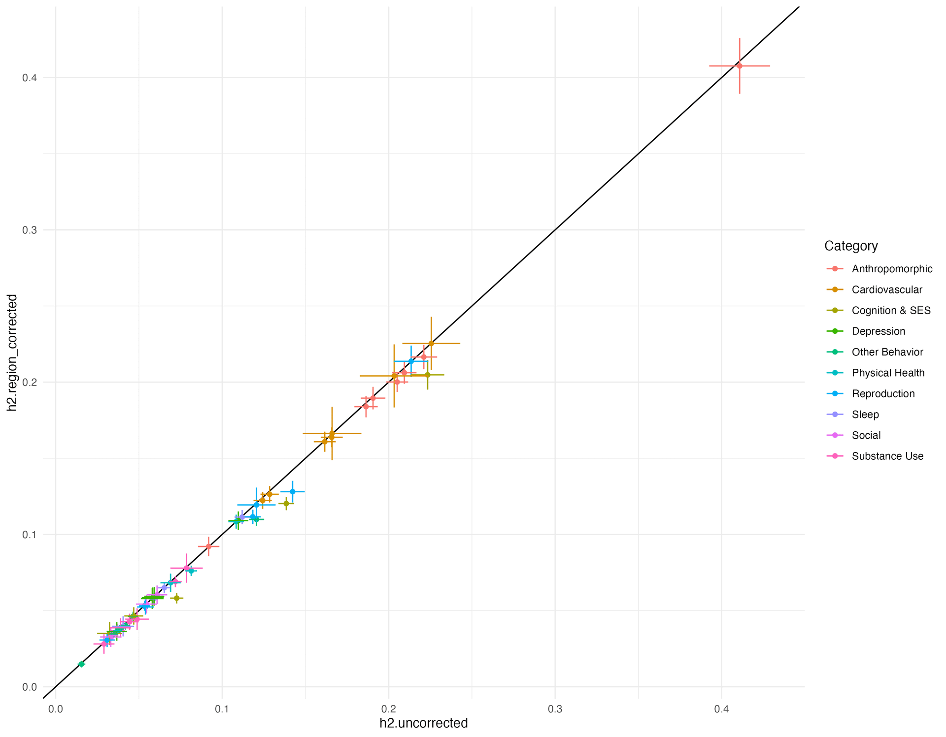
One of the challenges for this group is the complexity of the information they are presenting. In the run up to the session I was sent a graph that is typical in the field (published in Nature Genetics, one of Nature Portfolio’s journals) to see what we could do to make the graph easier to read.
Here’s what I did, using the data published in the paper’s supplementary materials:
- Recreate the original chart
- Shift to a dumbbell plot so that we can add more layers of information while telling the same story
- Remove the need for rainbow colours by grouping the categories
- Add axis text so that we can see what each trait is
- Making the “corrected” value stand out so that we can see here it differs from the “incorrected value”
- Order the traits by the size of the effect, so that we can see which one stands out (the heritability of height is a clear outlier, which I totally missed in the first graph because I was just looking for “is it above or below the line, and what does that mean?”), and which categories have stronger effects and more or less variability
- Use nicer colours (inspired by a walk around Copenhagen this afternoon!)
- Turn the grid lines into swim lanes for easier tracking of each line
- Add in gradient colours to show the strength of the effect (eta squared goes from small, to medium, to large at 0, 0.06 and 0.138 - at least according to a few sources!)
- Rework the text with a font that is designed to be read super small
- Give everything some space to breathe
And Tada!
Reuse
Citation
For attribution, please cite this work as:
Thompson, Cara. 2025. “Reworking a Standard Graph into Something
More Intuitive.” June 3, 2025. https://www.cararthompson.com/posts/2025-06-03-thats-a-wrap-for-nshg-pm-conference/.