Today’s visualisation challenge
On it! Parameterising graphs across different orders of magnitude in the data (the demo data has about 10 rows, so 10 data points per column, but we might end up with 150) has its challenges (hello axis limits, out-of-plot annotations and dot overcrowding) - but these are fun coding/maths challenges to solve!
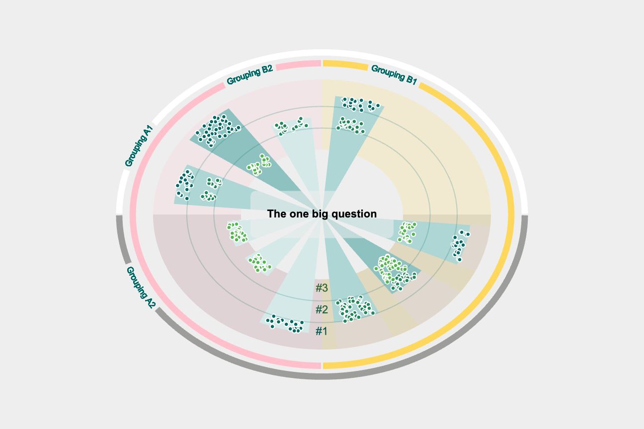
Current status: staring at a graph where it looks like bubbles are heading towards the edges of a circle - the further out the bubbles, the more this option was picked as a top priority, the darker the path of the bubbles, the more people picked that option as one of to the top 3 priorities.
So much fun. Thank you [Gavin Russell][www.linkedin.com/in/gavin-russell-48bb556/] for the challenge! Still a few steps to go, but we’re heading somewhere pretty exciting!
P.S. Yes, it’s squished vertically; theme(aspect.ratio) also works on radial plots. No, I haven’t put all the labels on, and yes that will help with interpretation! Work in progress…