In-house dataviz workshop for the British Heart Foundation
This morning, I joined the analysts from the [British Heart Foundation] (www.linkedin.com/company/british-heart-foundation/) for their away day, to speak about the work we’ve been doing to create intuitive dashboards and visualisations for different users.
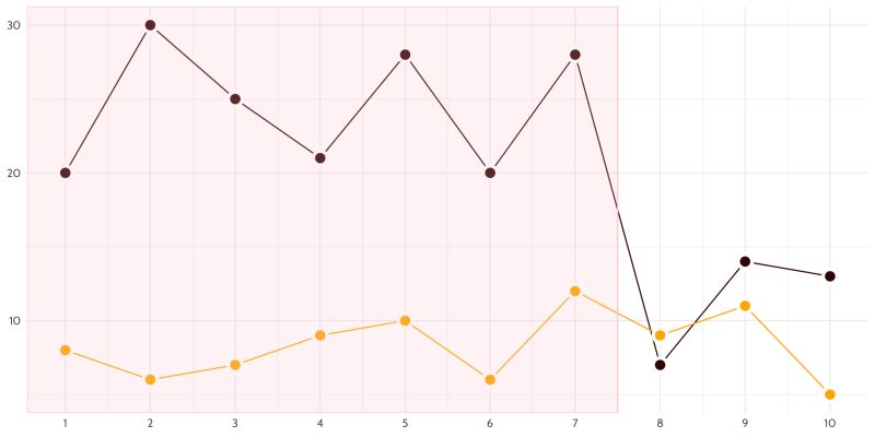
I set up a silly mission: let’s imagine that the BHF is hosting the next Great British Bake Off. One of our users was tasked with food supplies. She’d heard a rumour that one year the Bake Off had more bakes with oranges than with chocolate, so she wanted the evidence on that. We also wanted to see what might happen to our need for chocolate supplies if Mary Berry were to return to judge the next season.
I was only able to join them virtually, but hearing the chat in the room as they worked through the exercises was really fun. Laughter, concentration, and a good dose of creative problem solving.
Here’s the quick graph I built, to show how much we can do with simple uses of colour and a bit of “show, rather than tell” to provide context. Of course, we’d need an explanation somewhere (or some strong Bake Off knowledge!), but the idea was to reduce our reliance on reading by creating graphs where the story stands out.
What do we think, should we get more chocolate in if Mary Berry comes back?
Thank you Rony Arafin and team for the invitation. I hope you enjoyed the session as much as I did!