Picking semantic colours, then making them accessible and on-brand
I talk about colours a lot in dataviz: picking them so that they just make sense to your users. The second scenario I set up was around the Great British Bake Off hosts. One of the team members was in charge of maximising viewer numbers, and in our scenario he also happened to be friends with Sue Perkins’ agent - should he give them a call?
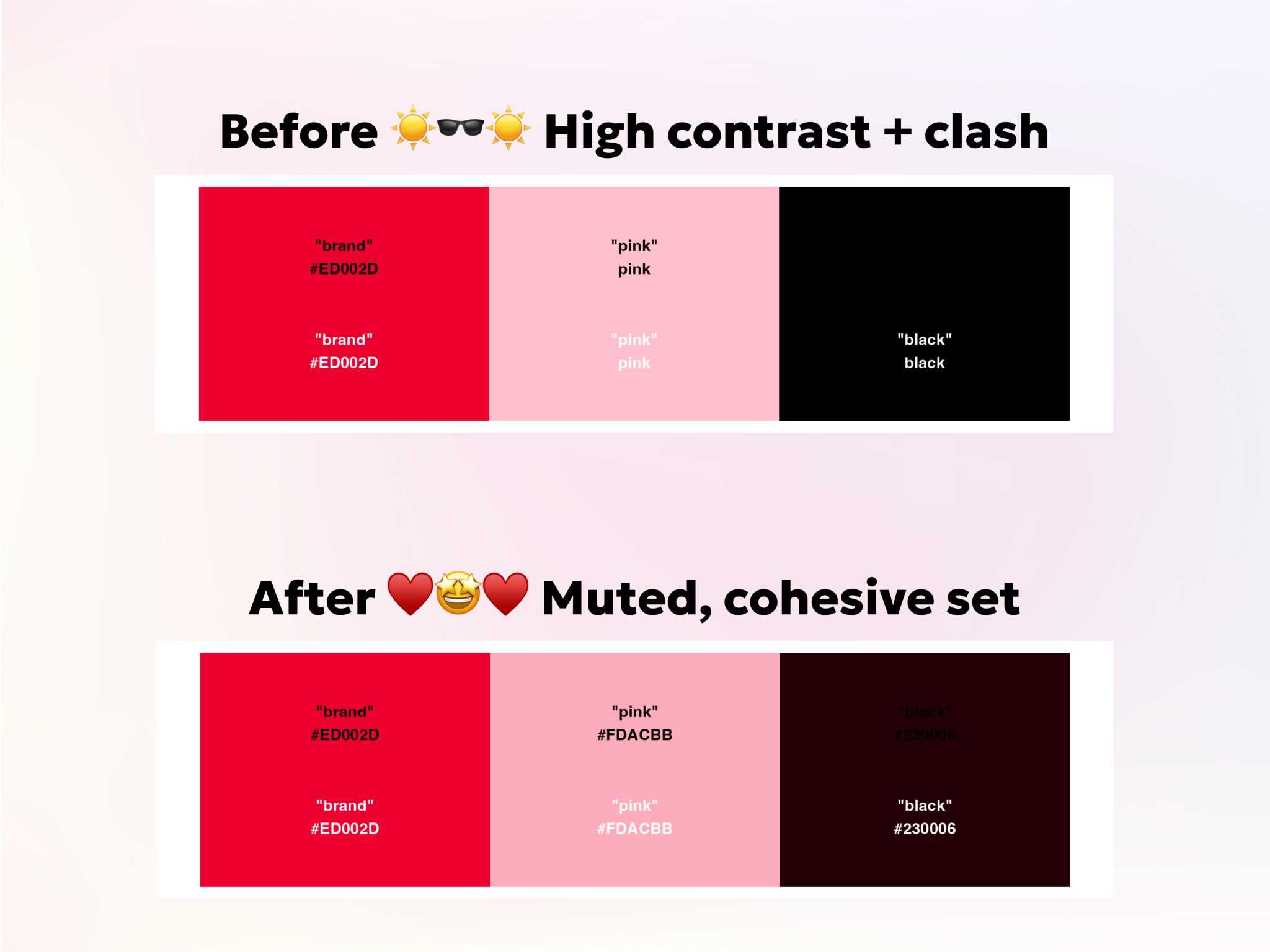
So, we needed a “Mel and Sue” colour, and a “Noel and Co” colour, but we wanted it all to still look on brand with the British Heart Foundation red.
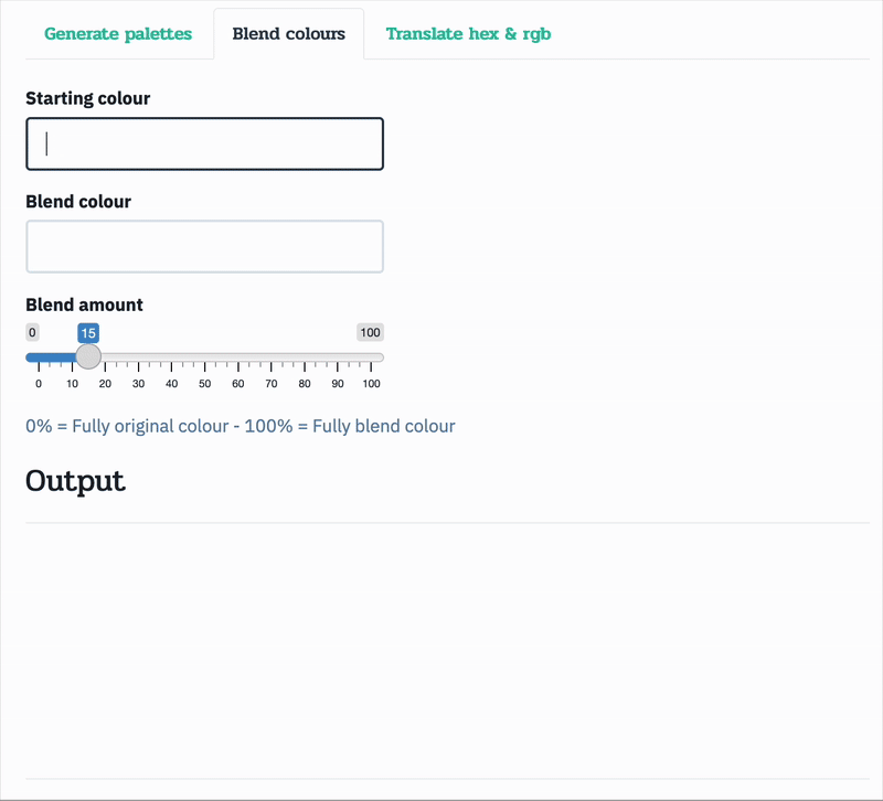
Enter {monochromeR}. I built this as an R package a few years ago, mostly to teach myself a few tricks, and then turned it into a Shiny App so that I could use it in workshops where people aren’t necessarily using R. I have ended up using it all the time in working on client projects, to come up with on-brand colour palettes that map to the semantics they’re needing.
We picked a basic “pink” and “black”, reflecting the different hosts’ fashion choices, and then simply blended in a bit of the BHF red to each of them. And… voila!
I’ll be picking this up again and adding the important component of how to make sure our colour palettes, and how we use them in our graphs, are also accessible, as part of a panel chaired by Claire Griffiths at the Royal Statistical Society conference in September.
But until then, here’s a sneaky preview:
- in doing this kind of colour blending, you end up with less stark/harsh colours, which can otherwise be overwhelming for some users
- we also end up with a cohesive set of colours which will make your report as a whole nicer to look at
- there are a few colour contrast tools we can use to check what these palettes look like for people with different types of colour blindness (but that’s only one part of accessibility!) so I’ll be sharing the ones I find most helpful
- adding in a contour will get us round the fact that the pink is too light to stand out against a light background
- we’ll look at how we can come up with text colours that work with the graph and see how we can use text to help orient our readers to make all the text less overwhelming too
Give the app a go here: cararthompson.shinyapps.io/monochromeR/ Or install the package from CRAN: install.packages("monochromeR")
I’m hoping to make some updates to it over the next few months, but for now, it does what it says on the tin!