A dataviz re-do from the Nordic Society of Human Genetics and Precision Medicine conference
Being the external dataviz person means I get to ask for forgiveness rather than permission when I create a graph that is very different from what the field normally uses to communicate the same information. It’s a fun way of exploring why we’re attached to the ways we do things normally, and to seeing whether alternatives could serve us better.
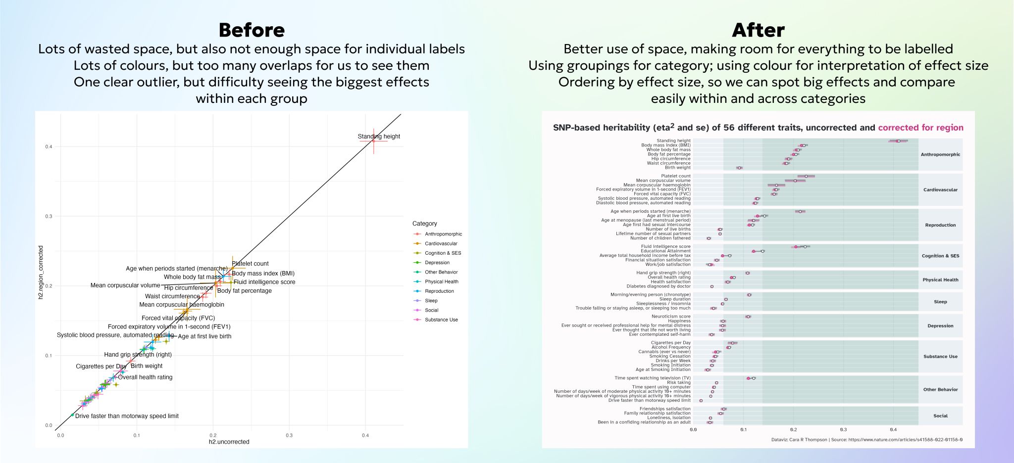
This redo used supplementary figures from a peer-reviewed paper in a high impact journal to reproduce a figure which was typical of the visualisations in the paper, and make it more accessible to folks outside the field: all the labels are there, the evolving background colour provides a guide for interpreting the effect sizes, and the overlaps between different measures are gone, which makes it so much easier to compare the different effects that the graph is wanting us to compare.
Two people this week have asked me in unrelated conversations what my favourite thing to do is between training, creating graphs, and equipping folks with tools that help them in their own dataviz workflows. The answer has to be a combination of all the above. Academic dataviz is tricky, but there are so many ways we can make it better - probably through said combination!