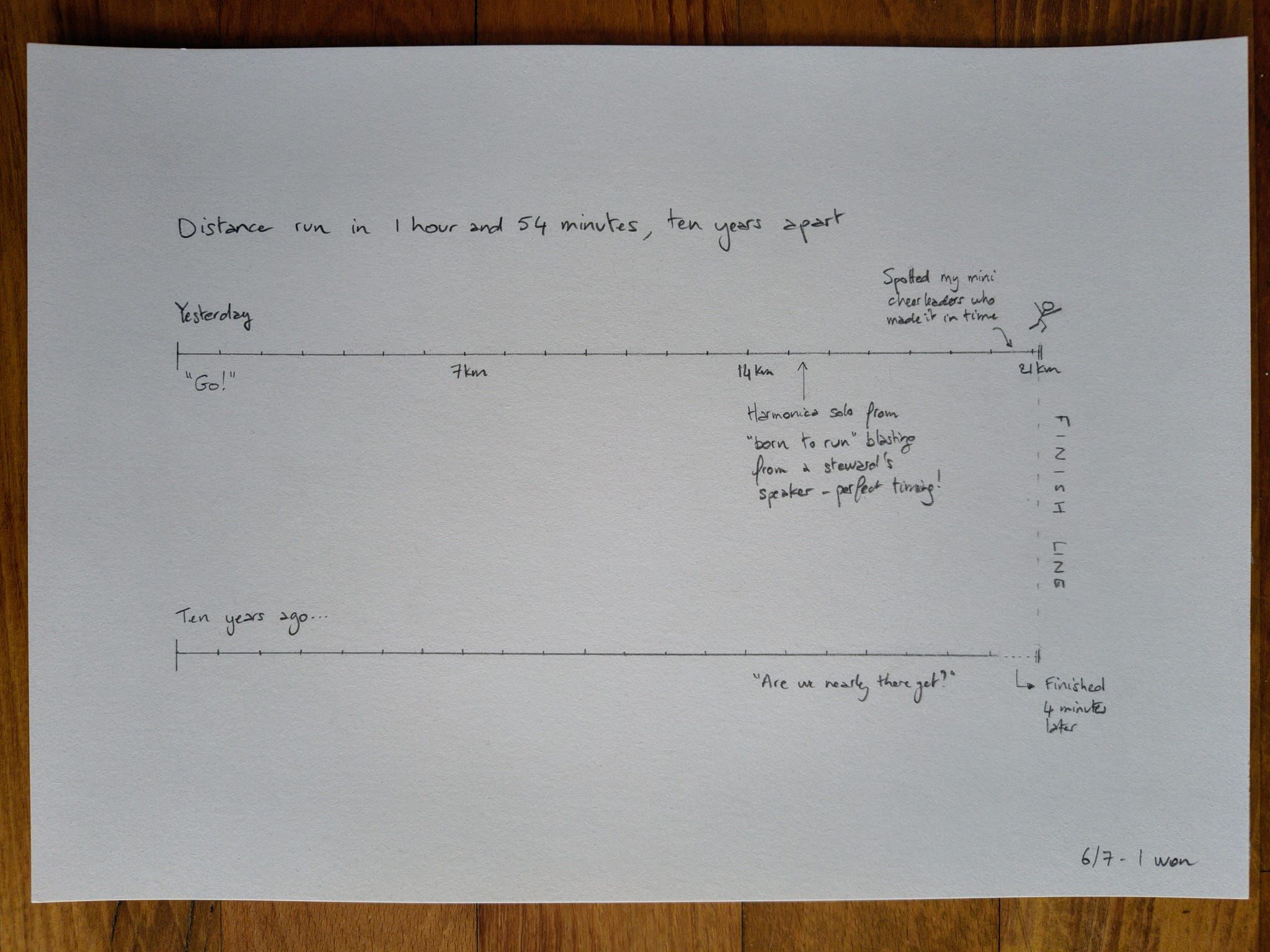
Yesterday’s #unpluggedViz reflecting on its own Yesterday (the race!)
… and a comparison with running the same distance 10 years ago. Pretty chuffed!
Pace is always a tricky one to depict because the faster you go, the smaller the number is, so the dataviz ends up looking the wrong way round. I went with distance travelled in the time, and I think that does the trick, showing I overtook my past self 🥳
Planning on having a play with the full results in due course, to try to depict where everyone is on the course compared to the finisher, which I think should give a good impression of ranks / speed as we all rush to the finish line. And give me a fun dataset to organise in different ways!
Reuse
Citation
For attribution, please cite this work as:
Thompson, Cara. 2025. “Yesterday’s #unpluggedViz Reflecting on Its
Own Yesterday (the Race!).” July 6, 2025. https://www.cararthompson.com/posts/2025-07-06-reflecting-on-yesterdays-race/.