From basic to Wow every time in no time with your own ggplot2 theme
data-visualisation
r-how-to
dataviz-design-system
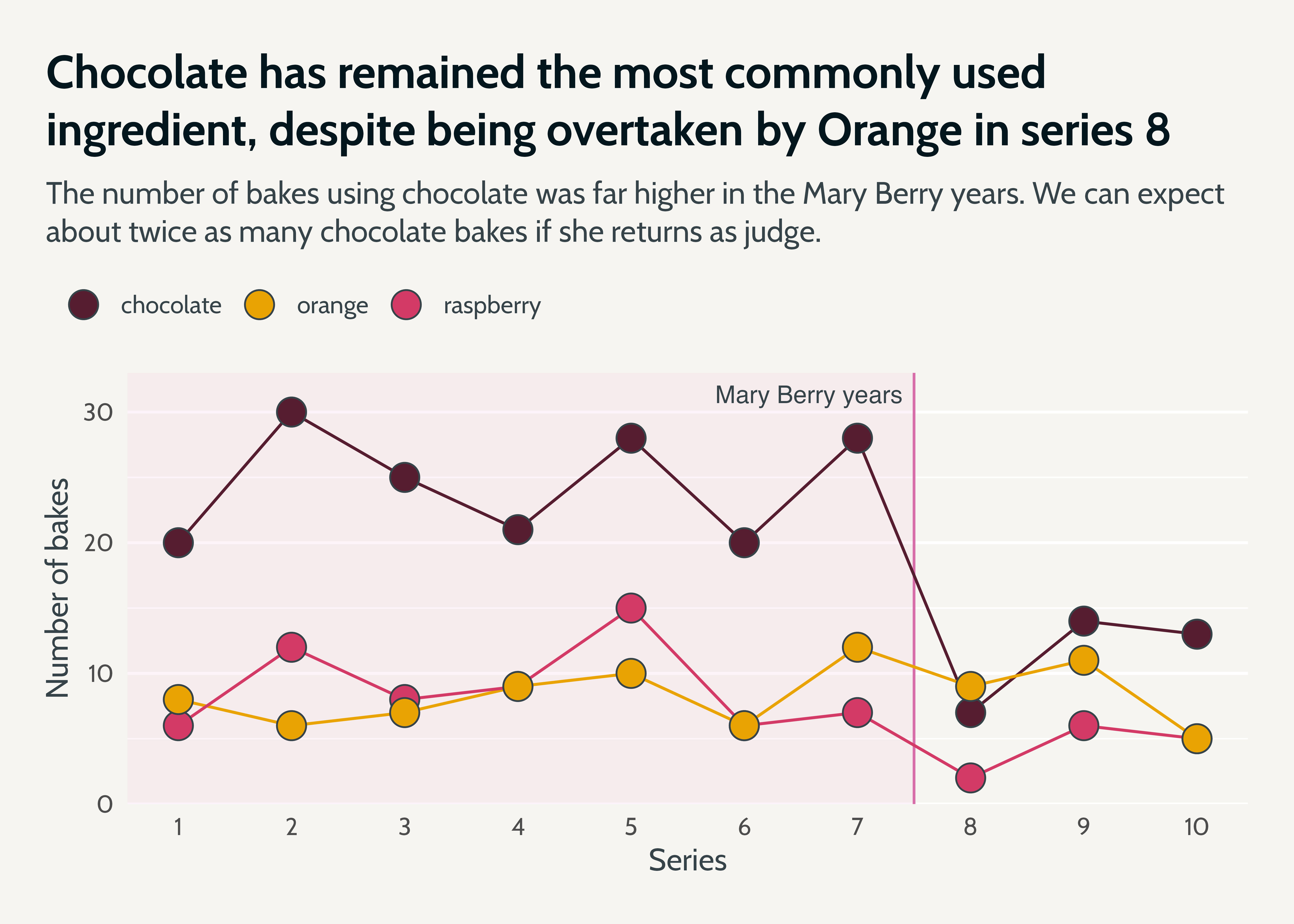
Talk given for the International Day of Women in Statistics and Data Science, as part of a panel on the topic of Coding is for everyone. We restyled a graph, and captured as much of the restyling as we could within a custom ggplot2 theme so that we could apply it to other graphs. Feel free to reuse the custom theme!
theme(geom = element_geom(family = "My font", fontsize = unit(12, "pt"))) (or replace with a text size that is calculated from your theme’s base text size… see below!)
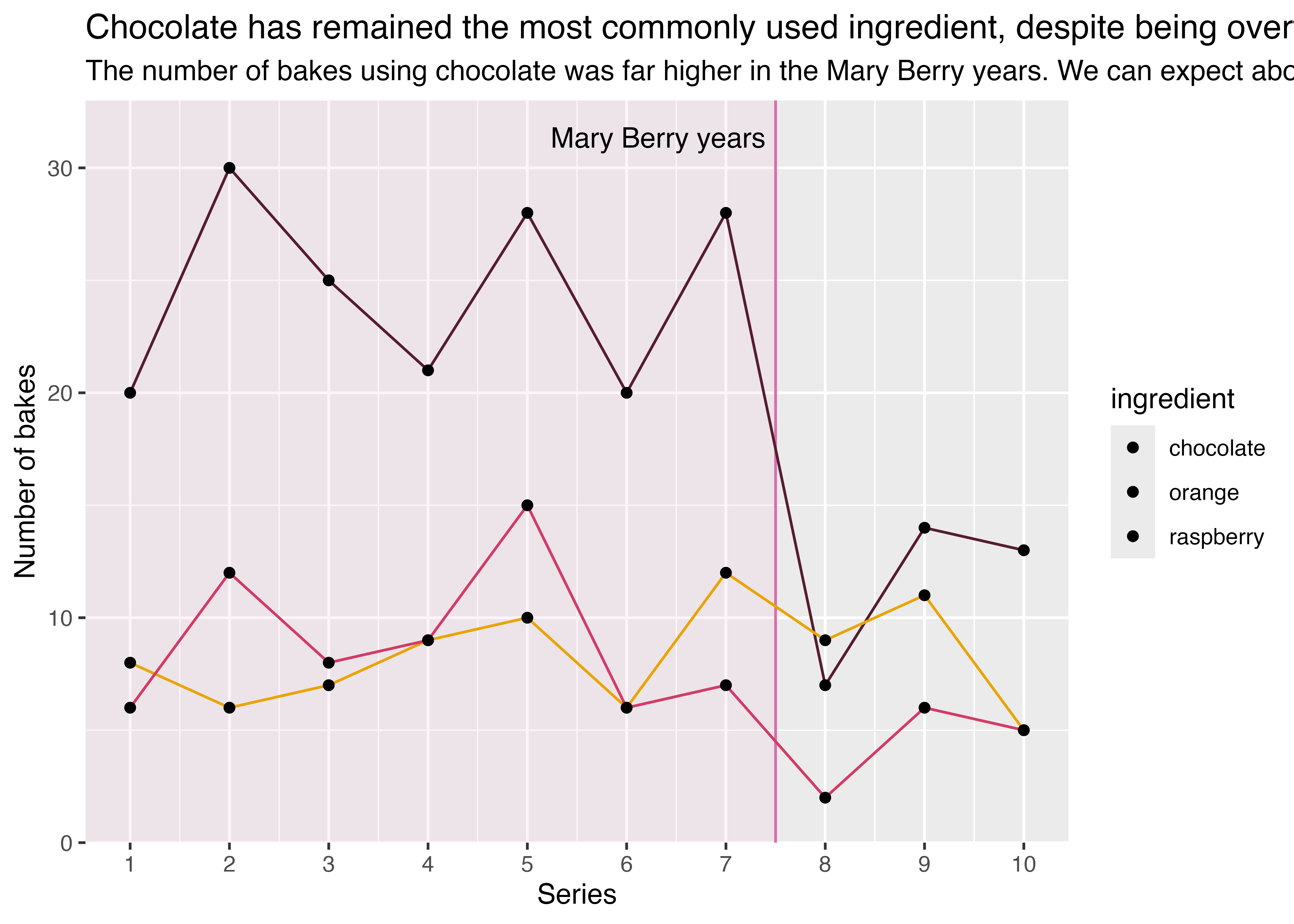
library(ggplot2)basic_plot <- all_the_bakes |>ggplot(aes(x = series,y = value,fill = ingredient )) +annotate(geom ="rect",xmin =-Inf,xmax =7.5,ymin =-Inf,ymax =Inf,fill = bakeoff_palette["mary"],colour ="transparent",alpha =0.2 ) +geom_vline(xintercept =7.5,linetype =1,linewidth =0.5,colour ="#d76ea9" ) +annotate("text",x =7.4,y =I(0.95),label ="Mary Berry years",hjust =1 ) +geom_line(aes(colour = ingredient ),show.legend =FALSE ) +geom_point() +labs(title ="Chocolate has remained the most commonly used ingredient, despite being overtaken by Orange in series 8",subtitle ="The number of bakes using chocolate was far higher in the Mary Berry years. We can expect about twice as many chocolate bakes if she returns as judge.",x ="Series",y ="Number of bakes" ) +scale_colour_manual(aesthetics =c("colour", "fill"),values = bakeoff_palette ) +scale_x_continuous(breaks = scales::breaks_width(1)) +scale_y_continuous(limits =c(0, NA),expand =expansion(add =c(0, 3)) )