Dataviz Design Systems
Dataviz Design Systems
A dataviz design system is a bespoke set of colours, fonts, and rules, which can be combined to create data visualisations with a consistent aesthetic, taking into account accessibility, colour semantics, and design principles to help the stories in the data stand out. Investing in a dataviz design system for your team also brings about aesthetic unity, ensuring a clear visual identity across authors, papers, reports and conference talks.
Implemented as an R package, a dataviz design system allows you to style your graphs with just two extra lines of code. But these automations aren’t reserved only for coders! If your team works in Excel or PowerBI, we can build automations that will apply the design system to their graphs and tables too.
Already sold on the idea and want to explore what’s involved? This form is designed to help you think through the different requirements of your system.
Want to keep exploring? Skip to examples | testimonials | FAQs
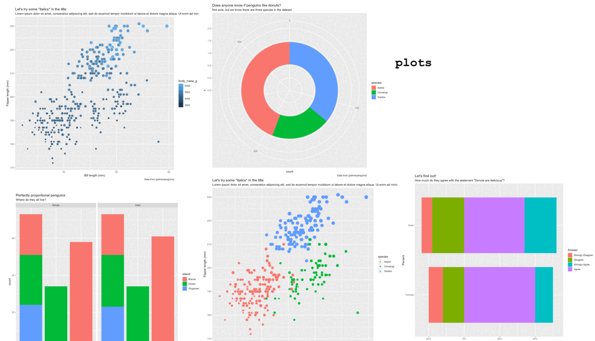
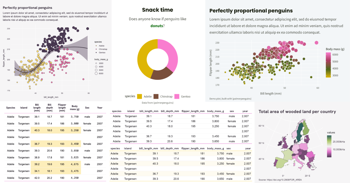
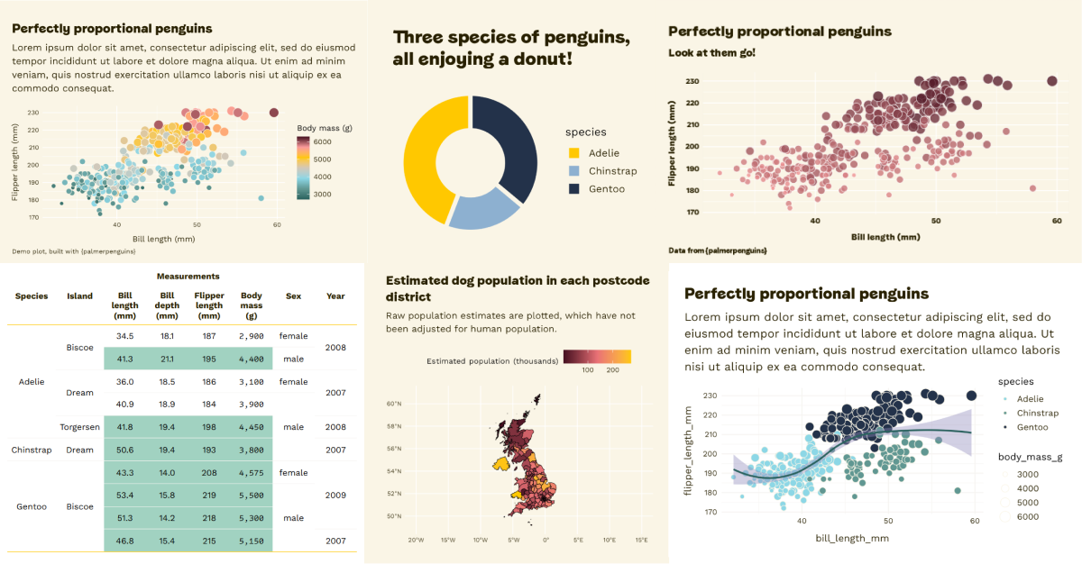
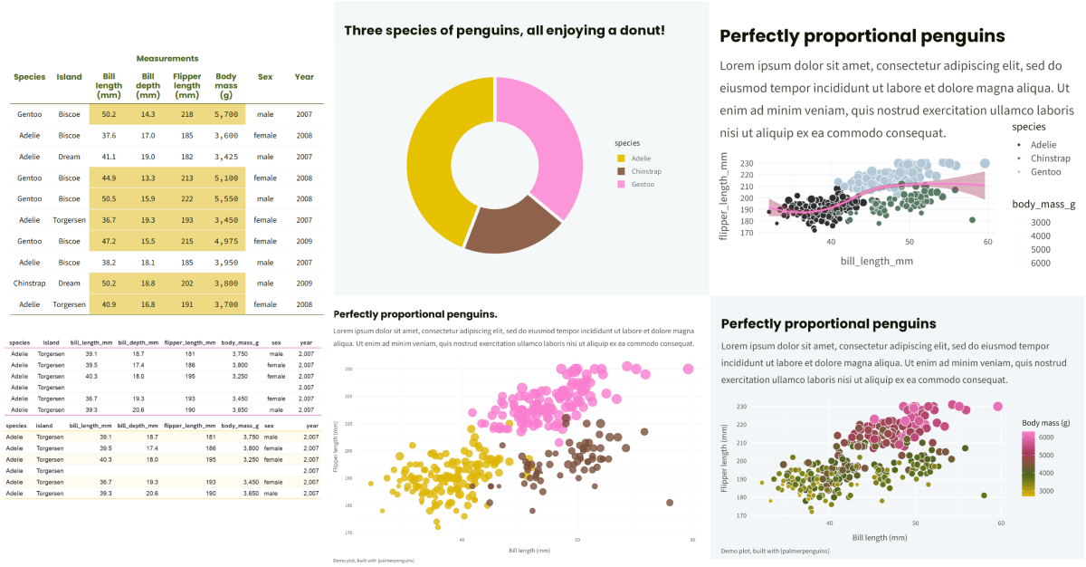
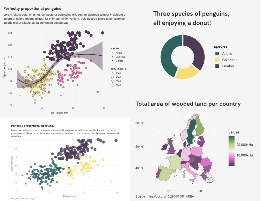
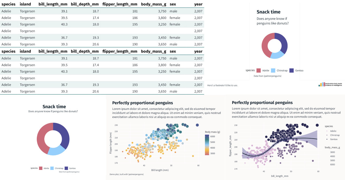
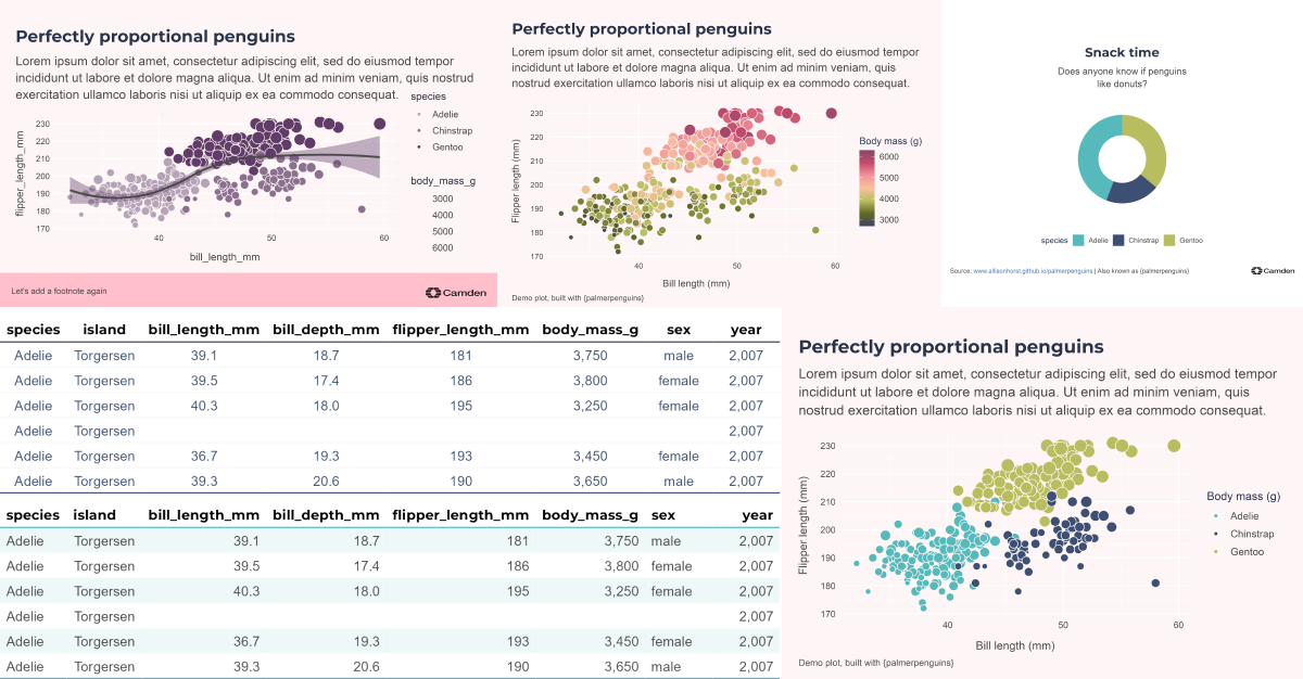
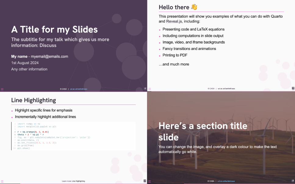
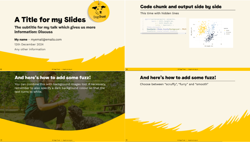
Recent examples
Scroll through this selection and see if you can recognise the organisations from their colours. The design systems are always built around any existing brand guidelines, with modifications where necessary to make them accessible and dataviz-friendly!
What did the design system do for them?
Jon Reades, Prof. of Geographic Data Science & Head of Department at CASA UCL
“What Cara’s work has given us is the foundation of a coherent visual ‘language’ rooted in the department’s identity and ‘brand’ as something distinct from the university as a whole — the library has improved the quality of output from those of us who had already adopted these FOSS frameworks and created an incentive for those still relying on proprietary software (such as PowerPoint) to switch over. So we’re expecting gains in terms of openness, reproducibility, and quality.
Cara managed the entire process very effectively so that it was one less thing on my plate. She quickly grasped the brief, understood what we were trying to achieve, and then ‘got on with the job’, sharing key milestones/deliverables and producing the codebase on time. For other data-driven organisations the obvious benefit is the capacity to quickly deliver a visually consistent and coherent set of outputs (from charts to reports) that remain essentially data-driven.”
Anna Ali, Regen
“We needed an expanded colour palette with some clear guidelines on how to use it to convey meaning and maintain the brand ‘feel’. Cue Cara Thompson. She built us a data viz guide and recently spent a day with the analyst team… helping us upskill in building stories with data. It was both inspiring and practical - Cara helped us dig into the real message we want to convey with our graphs and charts and introduced us to some really cool tools to help us bring those messages to life.
If your organisation works with data and wants to move with the times, ensuring things like accessibility while also exploring interactivity, or if you just have a five-colour palette that needs expanding into a coherent set of storytelling hues, I highly recommend reaching out to Cara.”
Ben Cooper, Dogs Trust
“Our organisation has long had visual branding guidelines, but these focus on presentations, animations and graphics, and what rules they did have for charts were liable to produce visualisations that were poorly accessible, and possibly misleading. Cara worked with us to produce a series of colour palettes for a range of our dataviz use cases, wrapped up in ggplot themes in an R package that also included implementations of our other visual assets as Markdown/Quarto templates.
Cara was brilliant to work with, and produced a final product that did exactly what we needed whilst remaining true to the organisation’s guidelines. The final system is robust, flexible and easy to use, and it’s been amazing to see how quickly it has been adopted across our team of 25+ people.”
What could this do for you?
FAQ
Is it really that easy to make graphs look good in R? Yes. You can find a few examples of how to make use of a design systems in the Ophelia package documentation. So long as you can make a basic ggplot, you just need to add two lines of code to make it instantly look so much better!
We have a lot of beginner R coders in our team. How will this help them? These design packages lower the barrier to making graphs, tables and documents that look professional. It short-cuts the process of getting from an idea to something presentable, which is hugely beneficial when learning to create new things. The package documentation also includes lots of tutorials and links to the documentation of any packages I use in the tutorials. You can make this package’s documentation a great on-boarding tool for new members looking to get to grips with visualisation with R.
Accessibility is important to us. How do you make sure that’s built in? We test every colour palette we provide against accessibility guidelines, with the help of colourblindness simulators, and also check the text-to-background contrasts meet Web Content Accessibility Guidelines (known as WCAG).
We make lots of tables. Can you help with that too? Yes, the packages include functions for styling static and interactive tables. These are built with {flextable} and {reactable} frameworks. If you are attached to a different way of creating tables, we’ll take your lead on which package you’d prefer as your starting point.
You’ve talked a lot about R. I use Excel and PowerBI. Can you still help? Yes! We can create bespoke Excel AddOns which you can install across the team, to style your graphs at the press of a button. We also build PowerBI themes, which mean any graph and table you create will have the same style applied to it automatically.
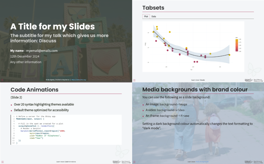
I also need to make nicely styled documents. Can you build us templates for those? Yes, happily! If you use Quarto, we can create a typst template, an html document template or an html (react) presentation template for you. These will all integrate nicely with the design system, allowing you to have a professional looking frame for your professional looking graphs and tables! If you’re using PowerBI, we can create PowerBI dashboards which look nothing like PowerBI but retain all the functionality you need.
My manager isn’t convinced this is useful. Isn’t this a lot of effort just to make something look nicer? When was the last time you disengaged from a document because it was a wall of text, or failed to understand a graph because the colours just didn’t help convey the story? This is about making things a lot more functional by making them look good. It’s also about baking in accessibility (which may be a legal requirement depending on your context), saving the whole team hours of soul searching about colours and fonts (we’ve all been there!) and speeding up your data-to-visualisation workflow so that the people who need the graphs get them quicker and in a format that makes them easier to read.
How long does it typically take to build one of these? Building a dataviz design package is a collaborative process. We want to make sure we give you time to gather requirements from the key end users, have plenty of opportunity for feedback, and can test any bespoke functions we’ve created on different datasets you’re currently working on. From start to finish, all this typically takes 6 weeks, but if you have a big deadline looming and are committed to responding quickly to requests for feedback, it can be much quicker than that!
You talked about a robust test suite. Why? Because we want to know when any changes to our code (and to the many dependencies present in any R package) have consequences for our outputs. Building tests is a great way to check assumptions about what each function is doing, so as the packages have evolved to include more and more tools, so has the test suite. In some industries, robust test coverage is a must. We use the {testthat} framework along with {vdiffr} to check the outputs from the functions are the ones we’re expecting.
Can my team build on the package after you’ve created it? Of course! Most of them do, adding new functions, adapting things as new dataviz needs arise, and generally using the package as a great shortcut to getting more stuff done. The in-built testing framework also gives them a headstart on building new tests, which speeds up development no end. I can either continue hosting the package, or can transfer ownership to your team.
Sounds good. What should I do next? If you’d like to explore what would be involved in pulling together a package that would work for you, I’ve shared the form I use to start gathering requirements here. Fill it in and have think about it for yourself, or submit the form and I’ll be in touch!