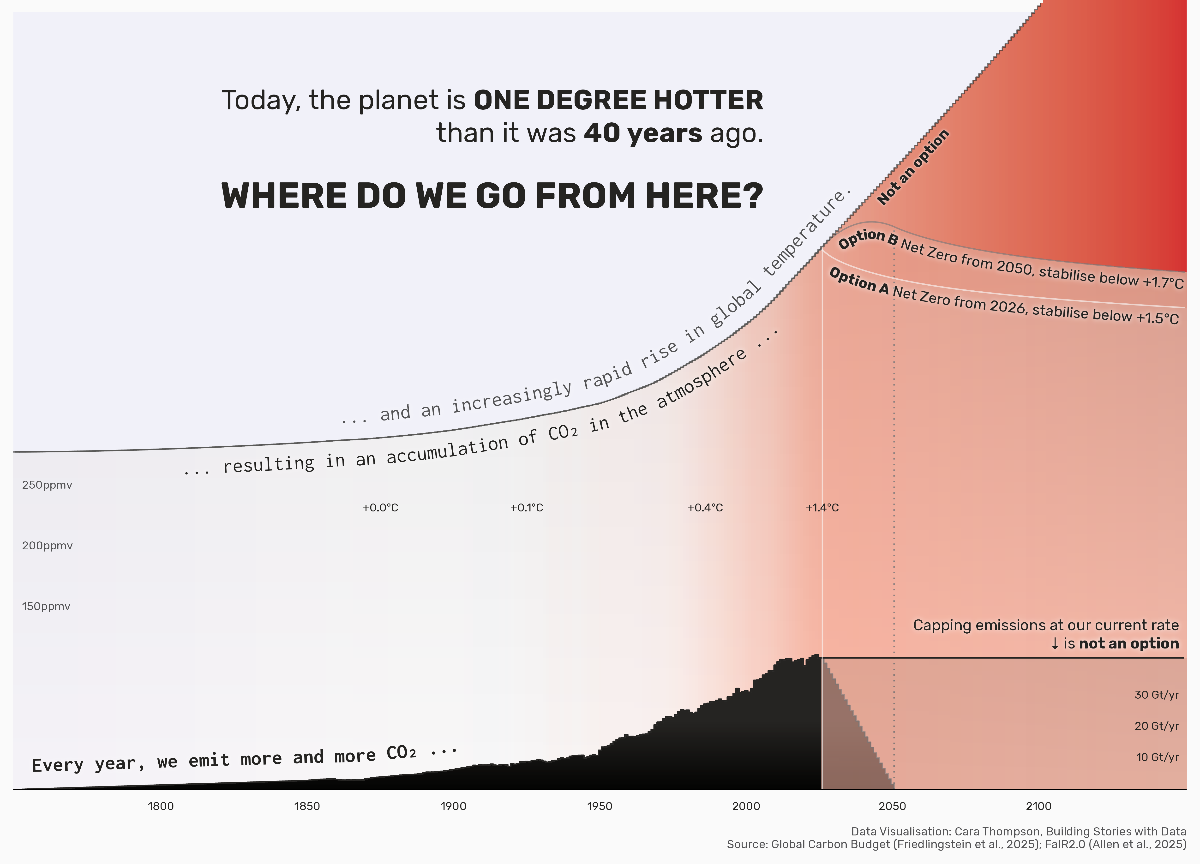
Visualising the interaction between emissions, capture, and temperature in a project for the Carbon Budget group. The graph was also presented as an iterative piece, in which each layer of information was added in turn, to build the narrative.
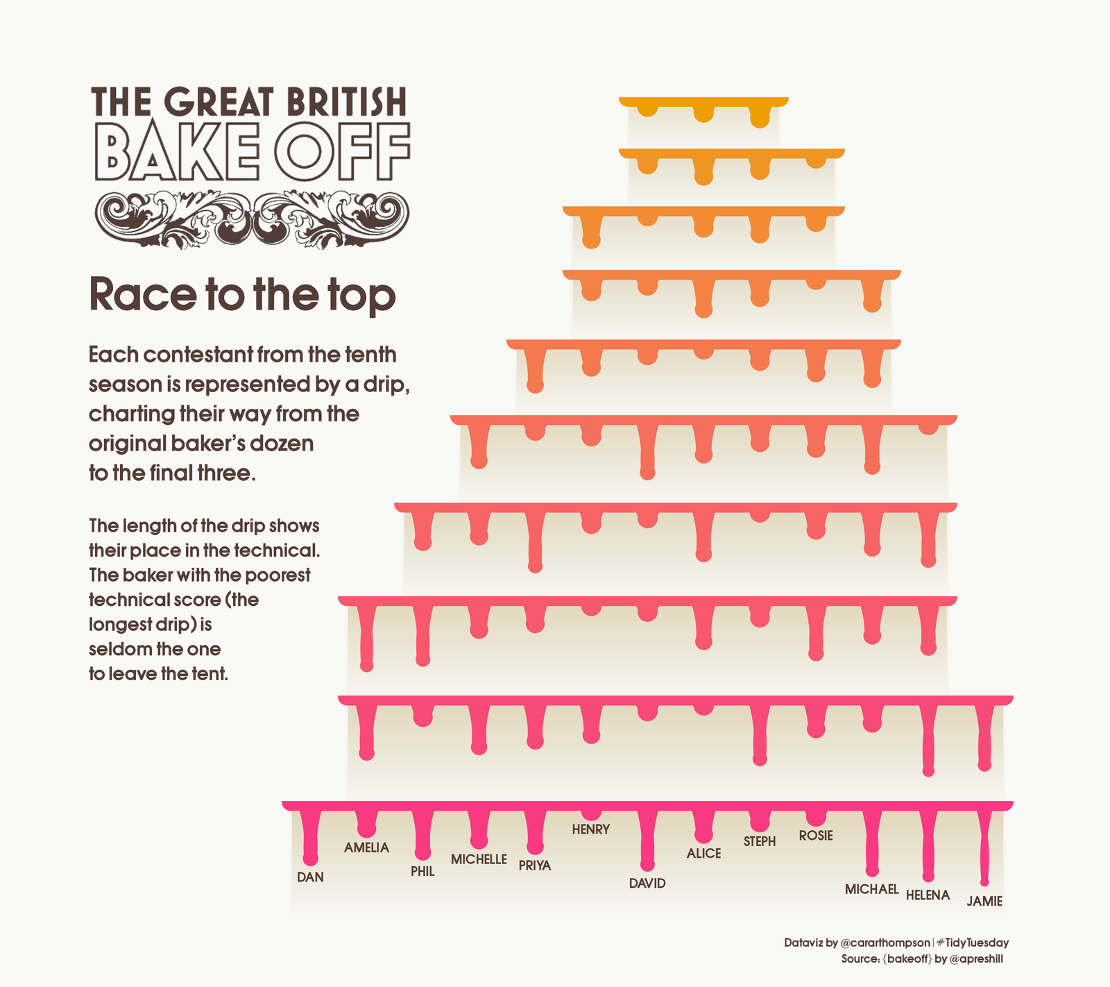
The race to the top: A data visualisation which looks like a cake with icing dripping from each tier, exploring how the contestants performed through each episode of a series.
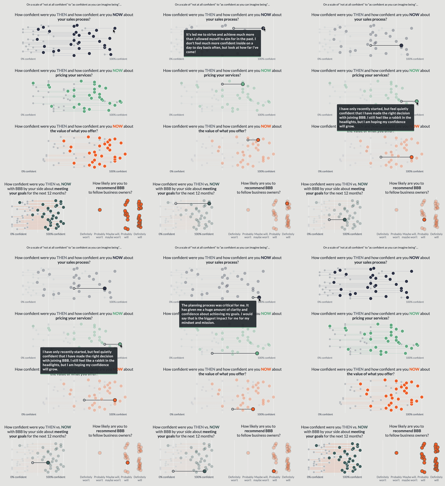
What did the programme achieve for its participants? This set of graphs shows progress from their confidence before the programme and after it. In each of the metrics there is a clear positive progression. The interactivity allowed me to include testimonials for each person, represented by one pair of before/after dots within each graph.
The race to the top: A data visualisation which looks like a cake with icing dripping from each tier, exploring how the contestants performed through each episode of a series.
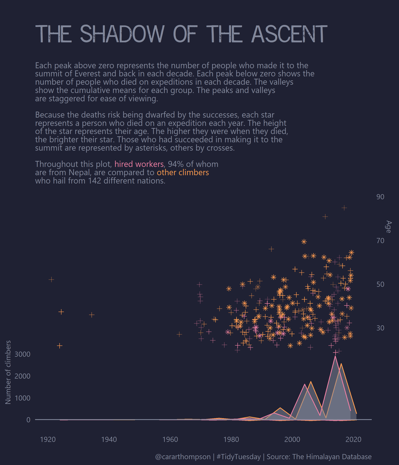
The shadow of the ascent: A visualisation made to look like a mountain range with a starry backdrop, in which the peaks of the mountains represent the number of climbers in each decade, and the stars represent those who lost their life on an expedition in each year.
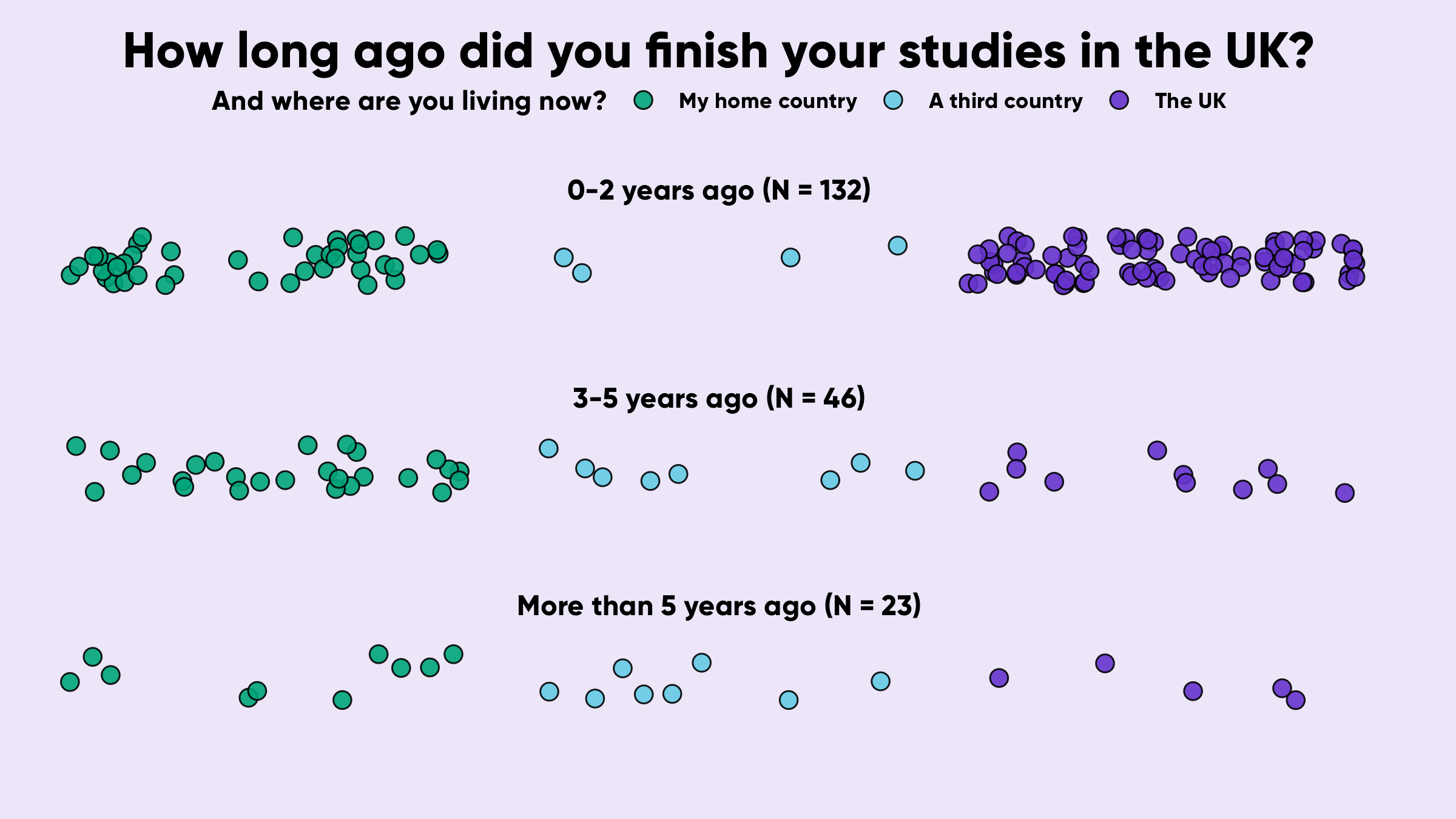
When did you finish studying and where are you now? From a project exploring the support needs of international alumni students. This technique not only humanises the data; it also allows us to visualise different aspects of a data story all at once.
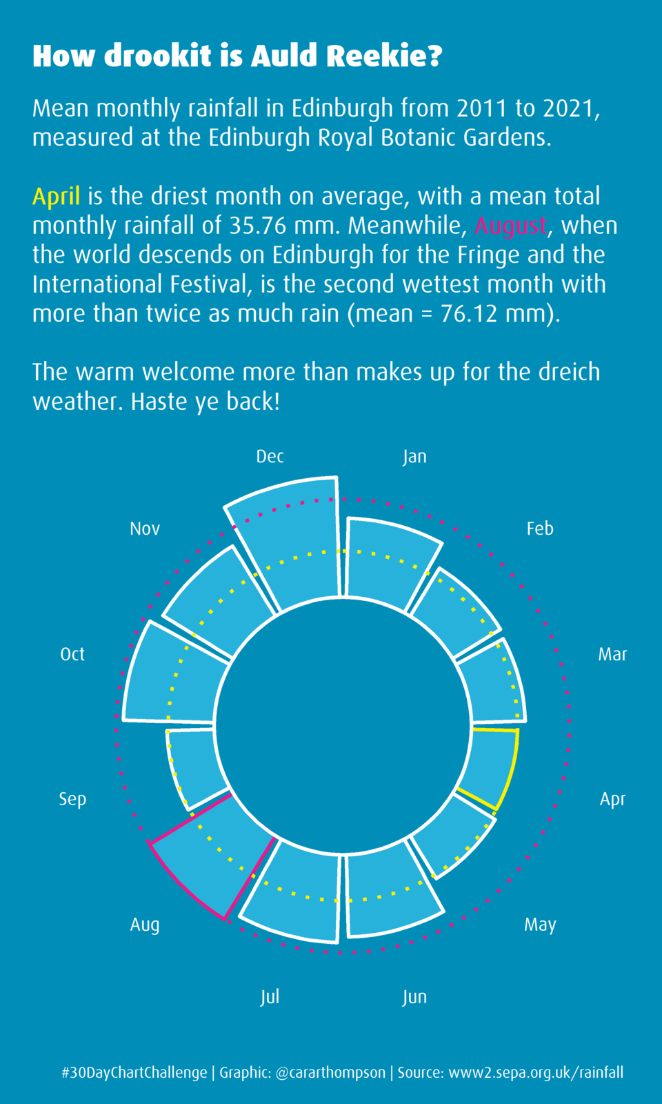
Auld Reekie: A data visualisation of the weather in Edinburgh, where it tends to be dry in April, and rainy just in time for the Fringe
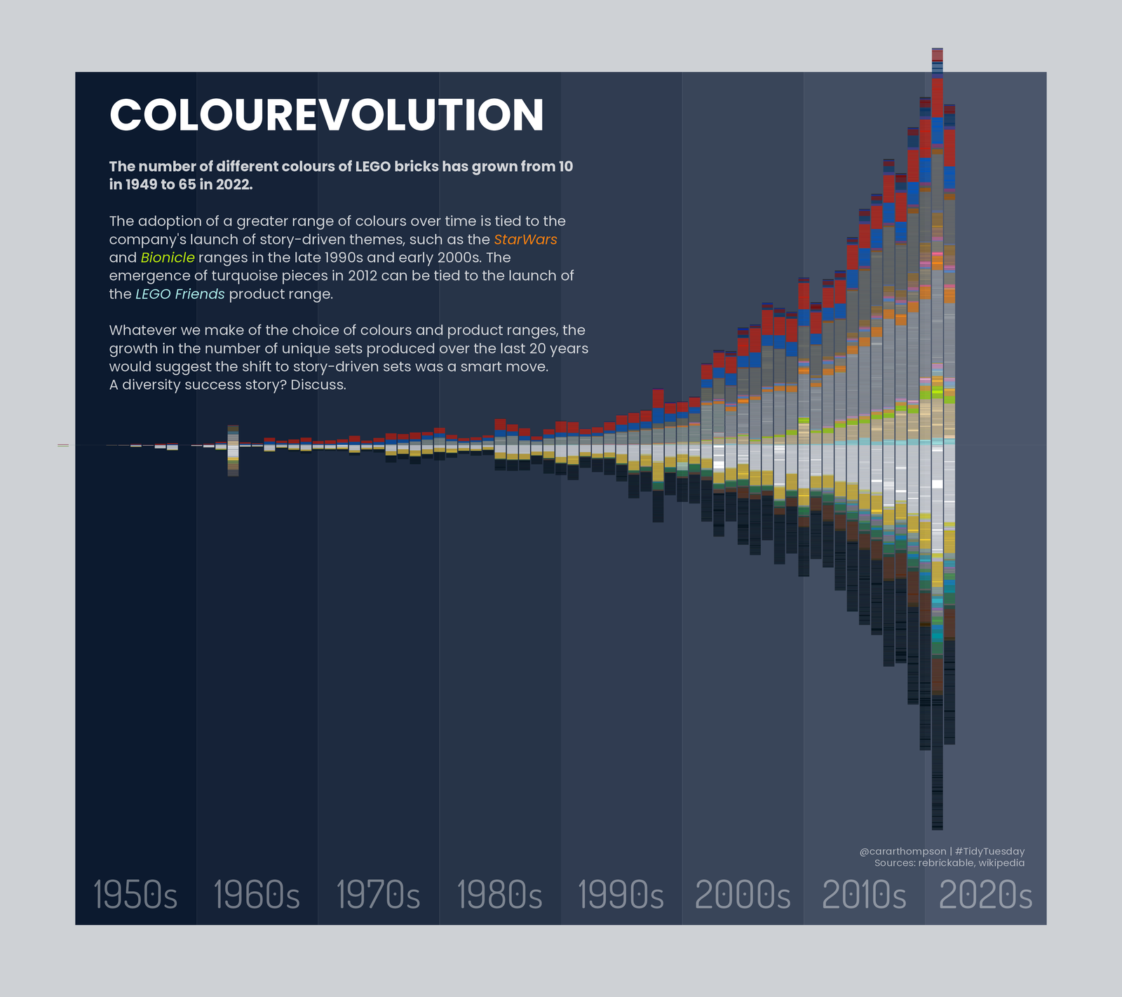
Colorevolution: Plotting the evolution of Lego colours over time in a dataviz made to look like stacked Lego
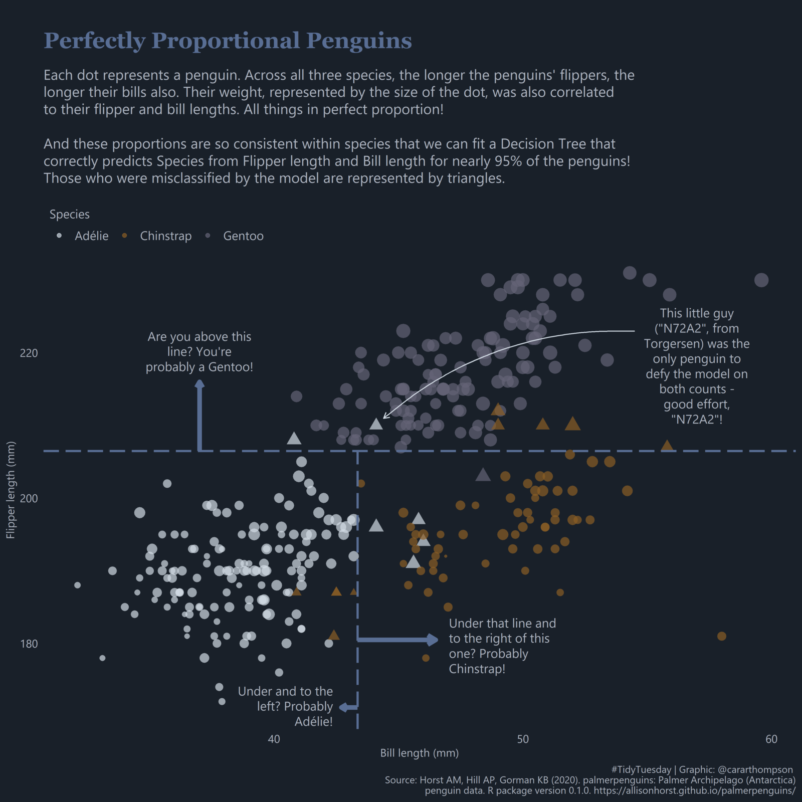
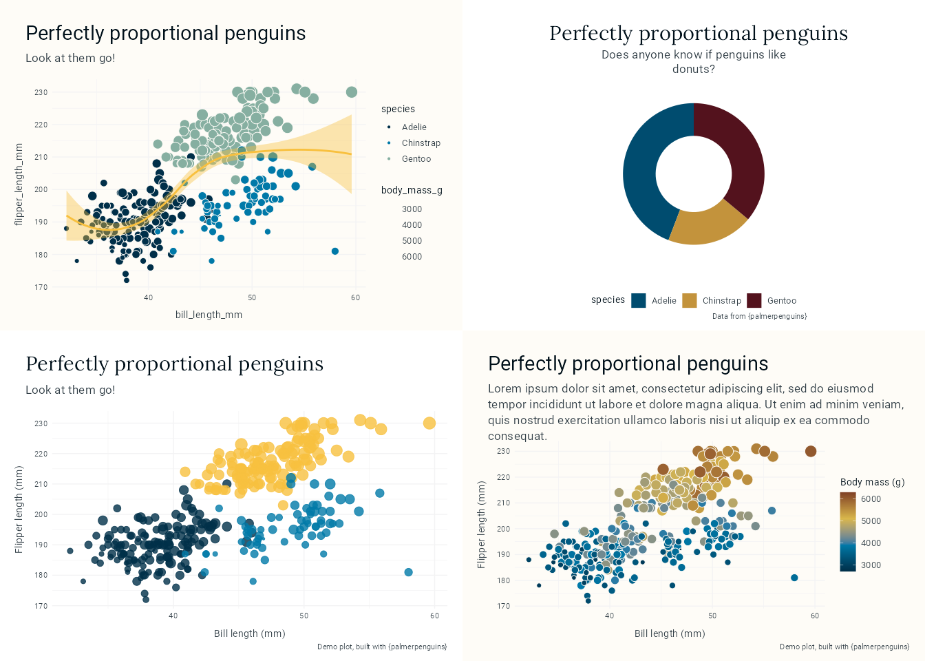
Perfectly proportional penguins: Visualising how a Decision Tree algorithm can guess the species of penguins based on bill length and flipper length
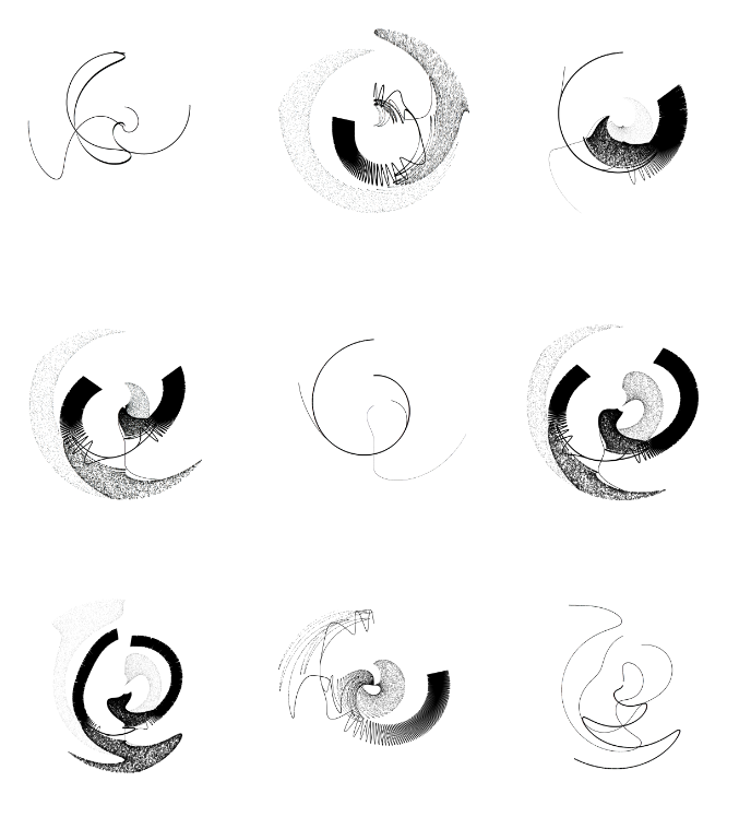
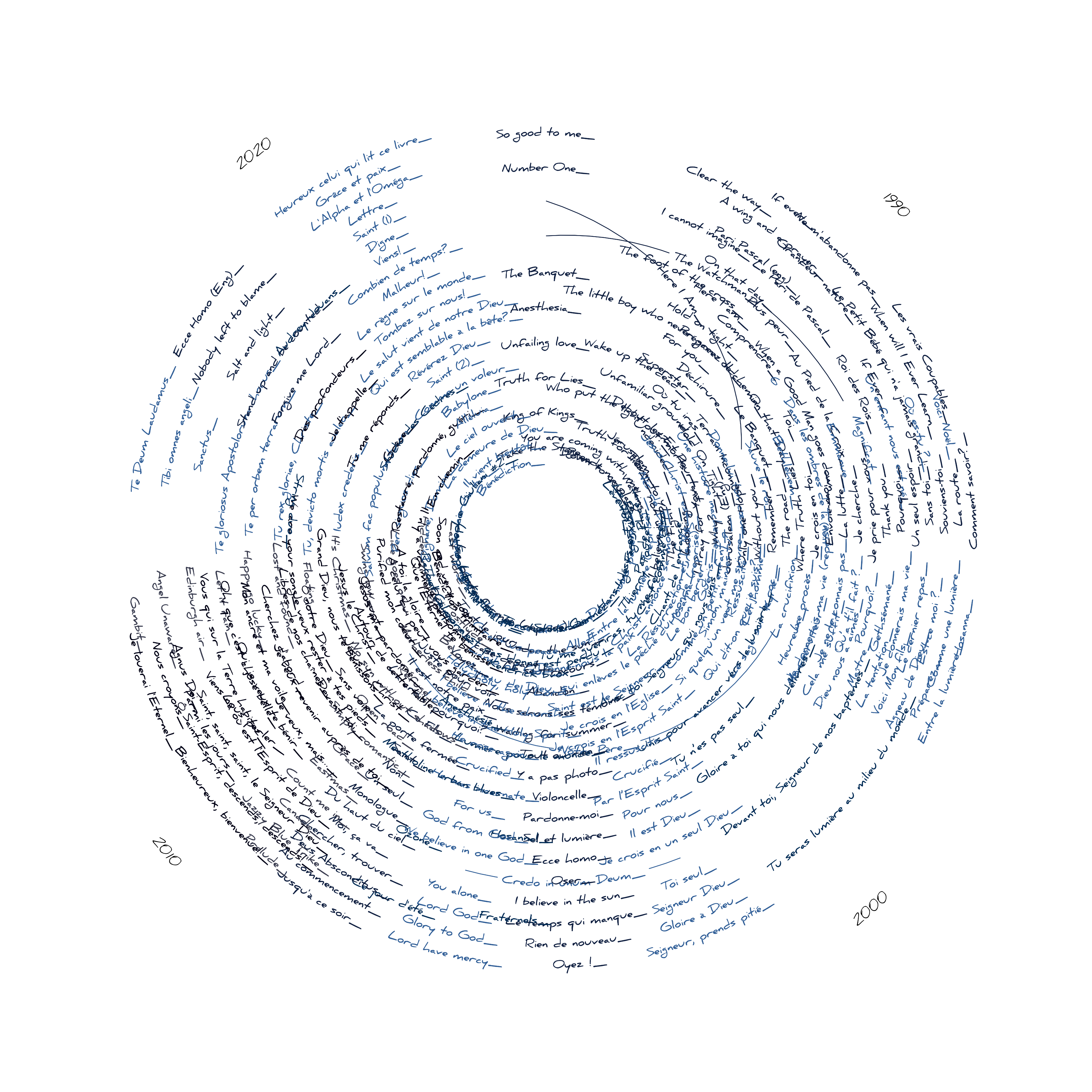
Record: A dataviz celebrating the songs written by John Featherstone in which handwritten song titles go round in a circle to look like a well used CD or vinyl
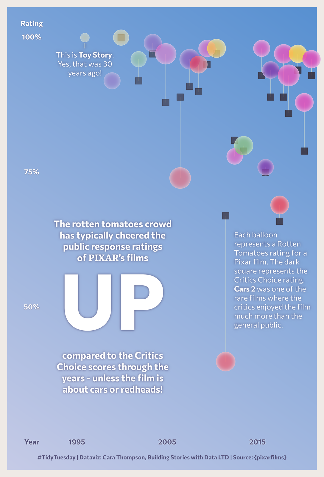
A visualisation of all the Pixar movie ratings, made to look like the UP poster. Each colourful balloon represents a film. The higher the balloon, the higher the rating it received. A handful of the balloons are upside down, where the critics’ score was higher than the public score.
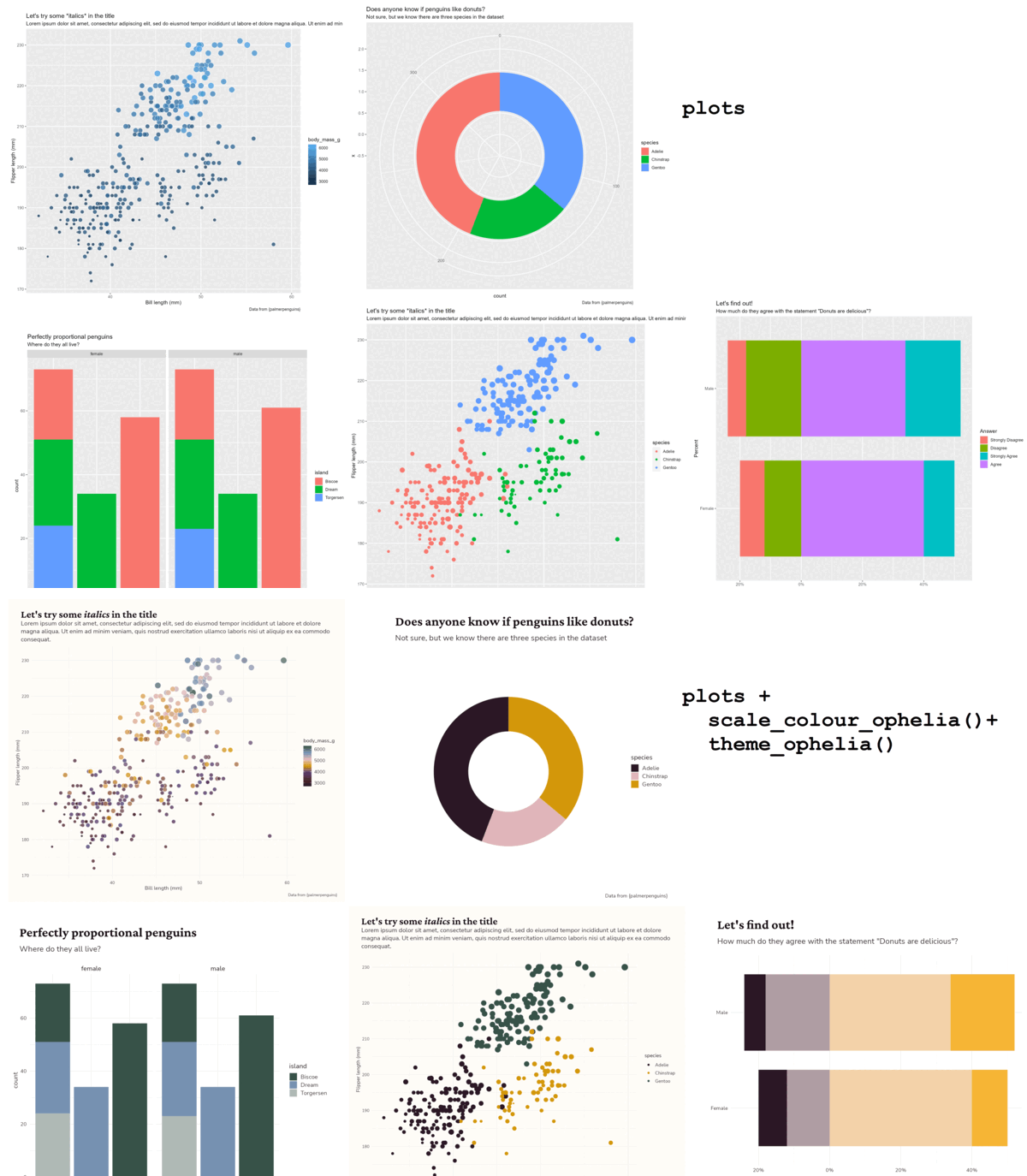
Ophelia dataviz design system. The colours and fonts reflect the ‘feminine but not sickly sweet’ vibe the researchers were after.
IVAC dataviz design system; collaboration with R for the Rest of Us. The colours and fonts reflect the colours and fonts in the IVAC logo and brand guidelines.
Recast dataviz design system. The colours reflect the earthy tones of the photos on the Recast ‘About us’ pages.
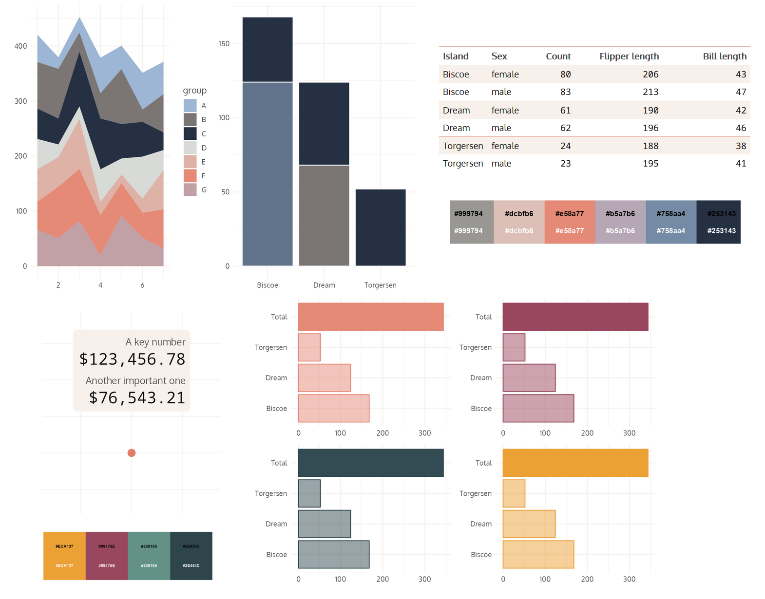
Teal Insights dataviz design system. The colours take inspiration from Van Gogh’s paintings and tie in with the teal colour from the company logo.
Data-to-viz solution created in collaboration with R for the Rest of Us for IVAC; these four figures were all produced with just one line of code using a bespoke data-to-viz plotting function written in R.
Data-to-viz solution created in collaboration with R for the Rest of Us for OHDC; these three figures, with dynamic axis labels and bar chart annotations, were all produced with just one line of code using a bespoke data-to-viz plotting function written in R.
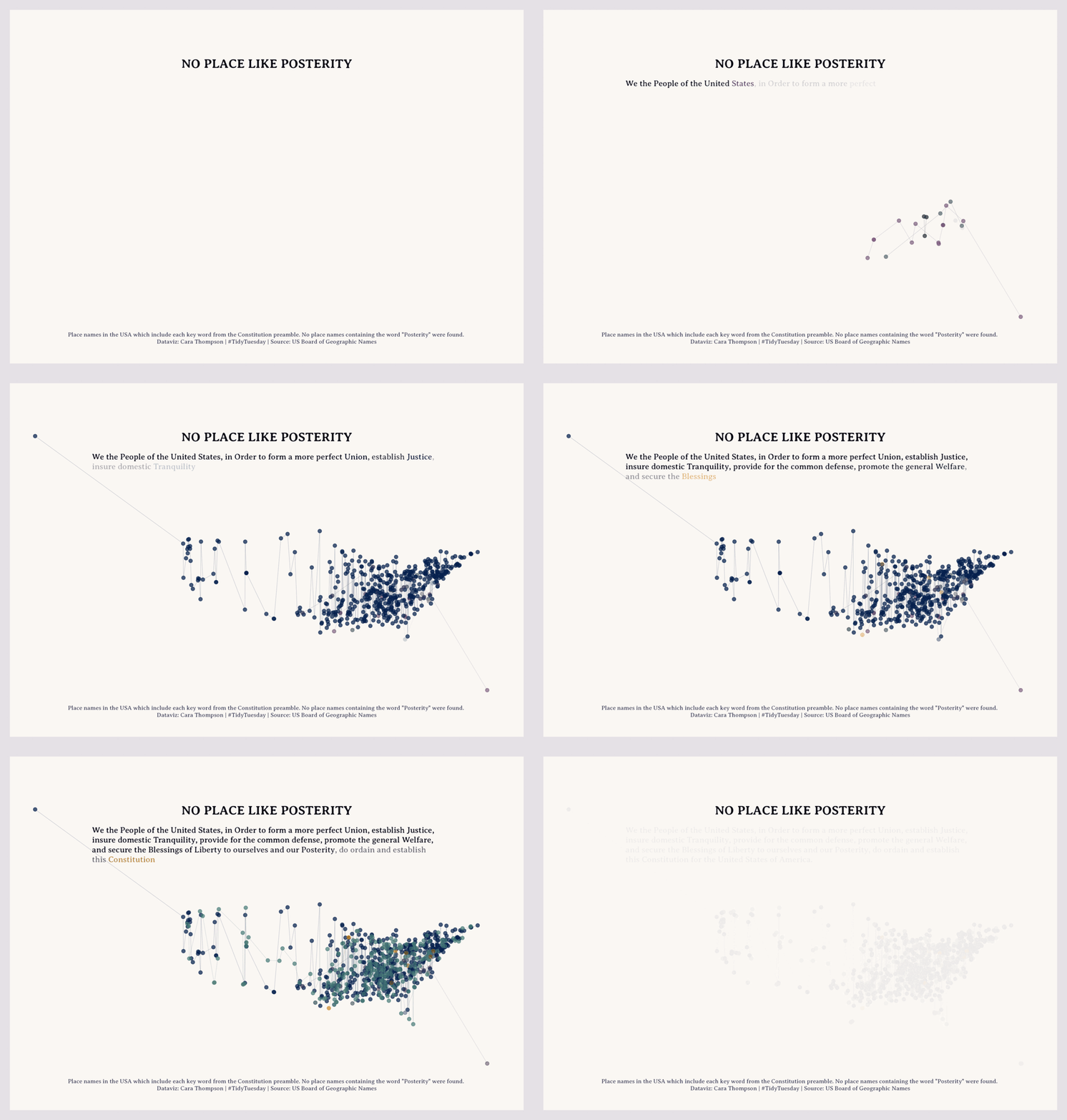
This animated data visualisation highlights places in the United States of America which are named after words in the constitution. It deliberately evolves slowly, gradually allowing the reader to understand what the different dots which appear represent, and giving pause for reflection as each key word is reached. Its title reflects the fact that while the other key words in the constitution are all echoed in place names, Posterity is nowhere to be found. This piece is a call to healing, peace and unity around core values.
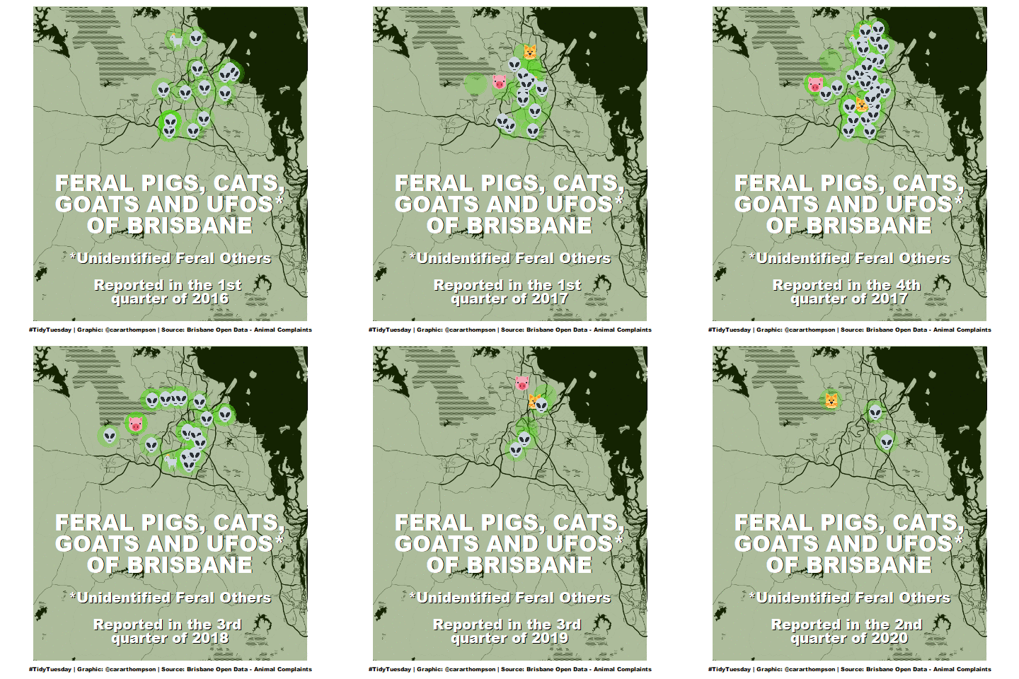
Feral pigs, cats, goats and UFOs of Brisbane: An animated map of where animals were spotted in Brisbane, styled like the old X-Files ‘I want to believe’ poster
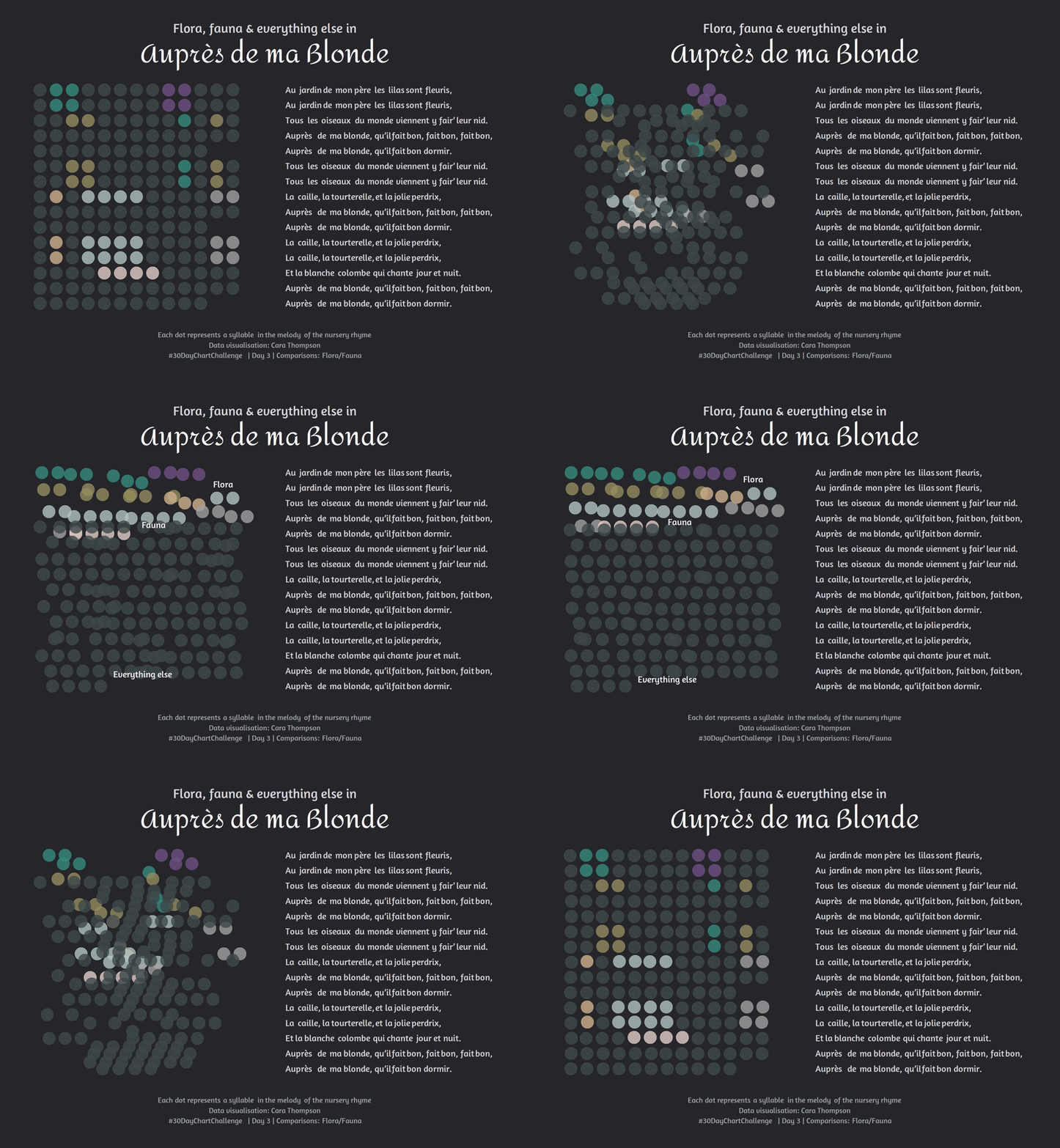
Flora, Fauna and everything else: An animated graph showing where syllables related to fauna and flora occur in a popular French nursery rhyme; the dots representing the syllables are rearranged in the animation to form bars representing how many syllables relate to fauna and flora across the entire song.
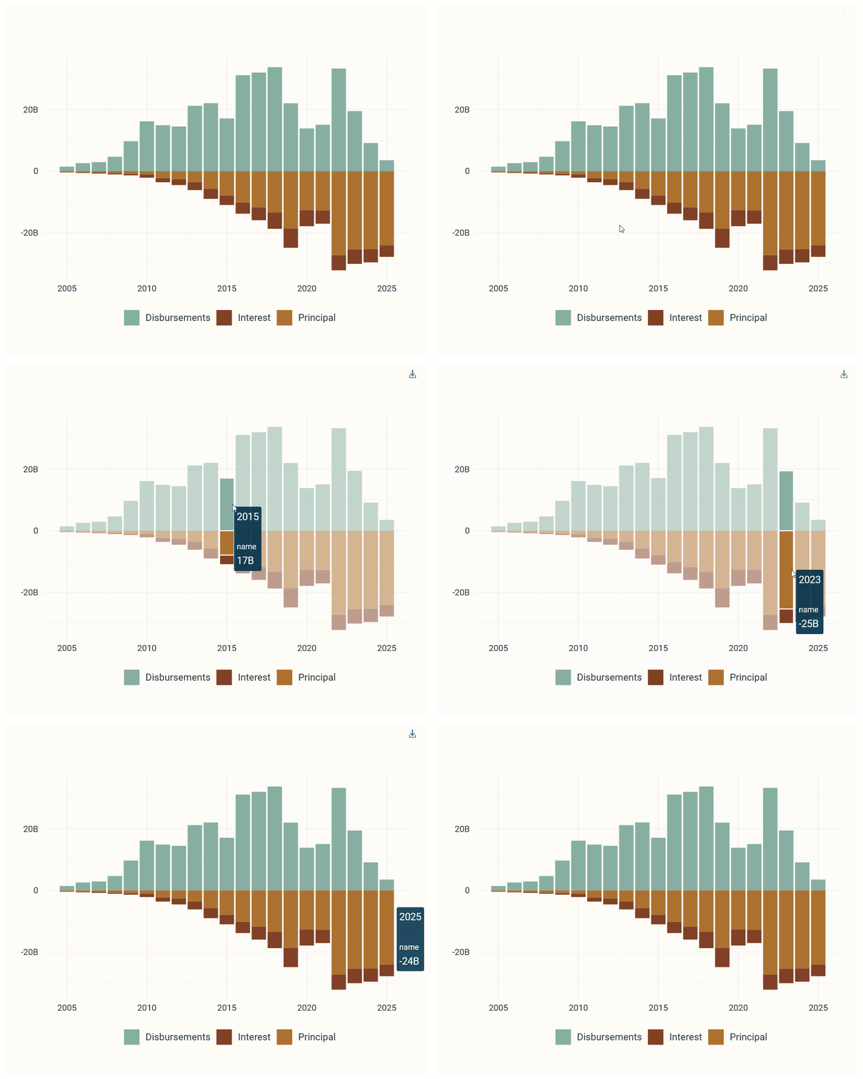
Interactive stacked bar graph with dymanically populated mouse-over and aesthetics from the Teal Insights dataviz design system.
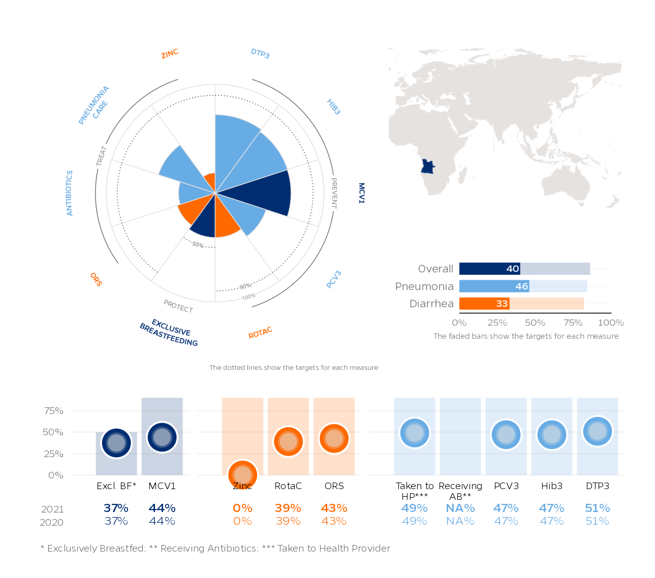
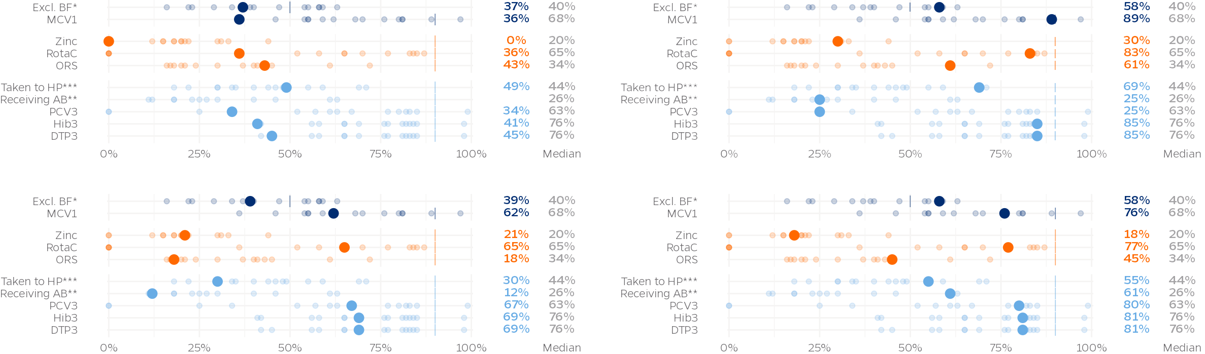
 for OHDC; these three figures, with dynamic axis labels and bar chart annotations, were all produced with just one line of code using a bespoke data-to-viz plotting function written in R.](assets/demo/data-to-viz-ohdc.png)