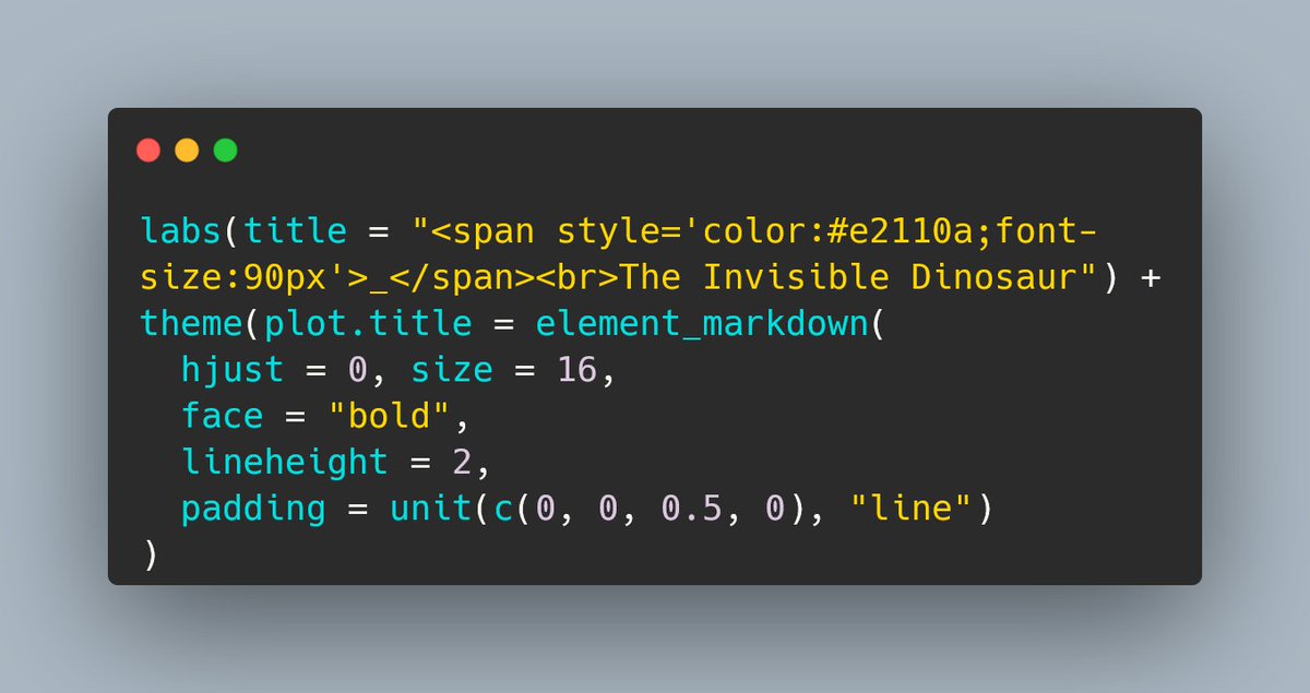
labs(title = "<span style='color:#e2110a;font-size:90px'>_</span><br>The Invisible Dinosaur") +
theme(plot.title = element_markdown(
  hjust = 0, size = 16,
  face = "bold",
  lineheight = 2,
  padding = unit(c(0, 0, 0.5, 0), "line")
)That signature red rectangle above the title
data-visualisation
How did everyone else tackle the challenge of recreating the iconic chart signature from the Econonist?
It’s been fun watching everyone’s solutions for creating the signature red rectangle above the title for the #30DayChartChallenge TheEconomist theme day.
Here’s mine: x.com/cararthompson/status/1514965008727298048
Reuse
Citation
For attribution, please cite this work as:
Thompson, Cara. 2022. “That Signature Red Rectangle Above the
Title.” April 15, 2022. https://www.cararthompson.com/posts/2022-04-15-its-been-fun-watching-everyones/.
