Level Up Your Labels
It was a privilege to present “Level Up Your Labels” at the #rstats _useRconf poster session this afternoon. Thanks for the good questions!
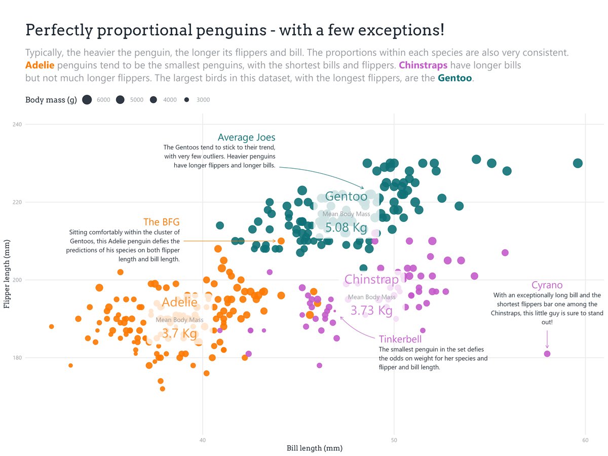
Here’s a link to the poster with the full code I used to create the plot. www.cararthompson.com/talks/user2022/
And here are the 5 tips in detail🧵👇
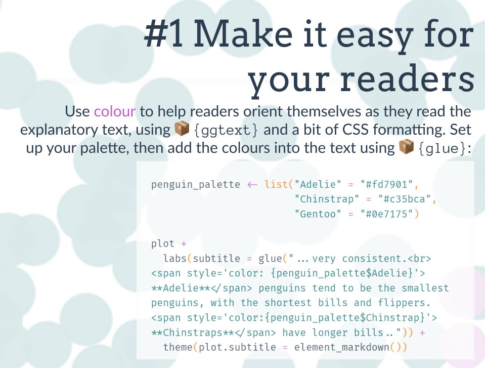
Tip #1: Make it easy for your readers, by using colour to help them orient themselves as they read the text introducing the plot.
- 📦
{ggtext}+{glue} - 🪄
<span style=colour:palette$relevant_colour>blah</span> - 🔧
theme(plot.title = element_markdown())
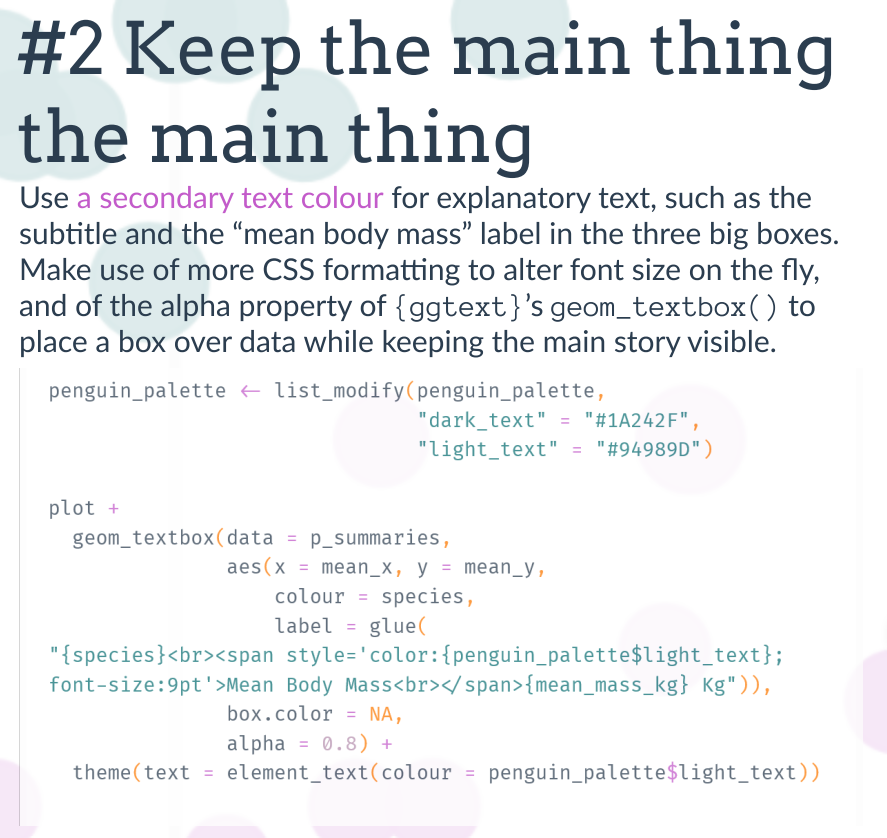
Tip #2: Keep the main thing the main thing, with a primary and secondary text colour
- 📦
{monochromeR}to get the colour variants +{ggtext} - 🪄 same
<span>trick as above, overriding the default colour of the text in the box which will followscale_colour_manual() - 🔧
geom_textbox()
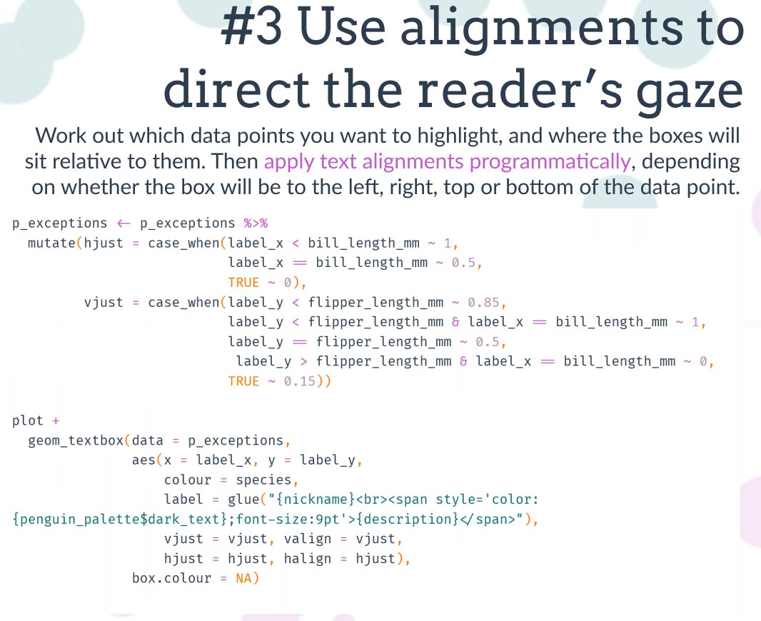
Tip #3: Use alignments to direct the reader’s gaze
Once you’ve decided where your boxes are going to sit, set the alignments programmatically with:
- 🔧
case_when()in the data, andaes(hjust, halign, vjust, valign)in the plot code.
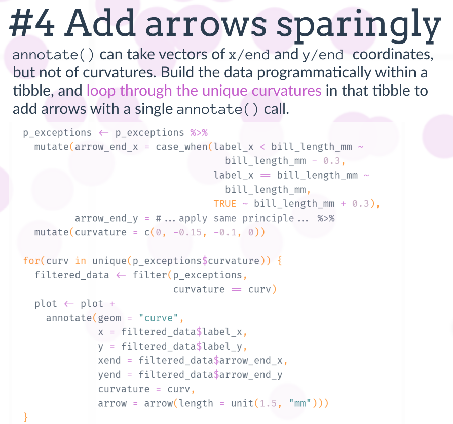
Tip #4: Add arrows sparingly
Narrow down the points you want to highlight, and add arrows going from the box coordinates to the points.
- 🔧
case_when()again to set end points programmatically - 🪄 loop through each unique curvature to add arrows with different curves
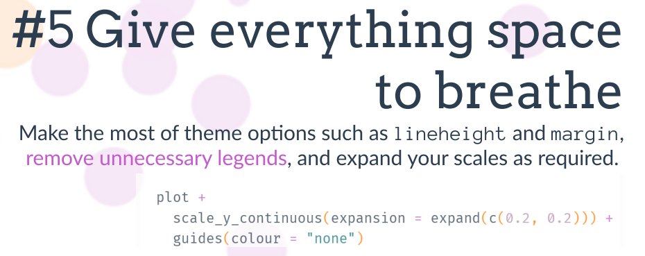
Tip #5: Give everything space to breathe
Get rid of unnecessary legends, and play around with lineheights and margins.
- 🔧
guides(colour = "none) - 🪄
scales_y_continuous(expansion = expand())for an expansion proportionate to the range in the data
 {fig-align=“center” fig-alt=“Tip on design:”Give everything space to breathe” with advice on using line height, margins, and removing unnecessary lege…“}
And voilà!
All done in #rstats with {ggplot} and the tips and tricks above.
Full code: www.cararthompson.com/talks/user2022/
Happy annotating!