This is the main thing we’ll demo in this post, but first, let’s backtrack a bit!
Dealing with long axis labels
Everyone likes a clearly labelled plot. And the axes are part of that! But when the data contains reeeeeeally long labels, things can get a bit unwieldy!
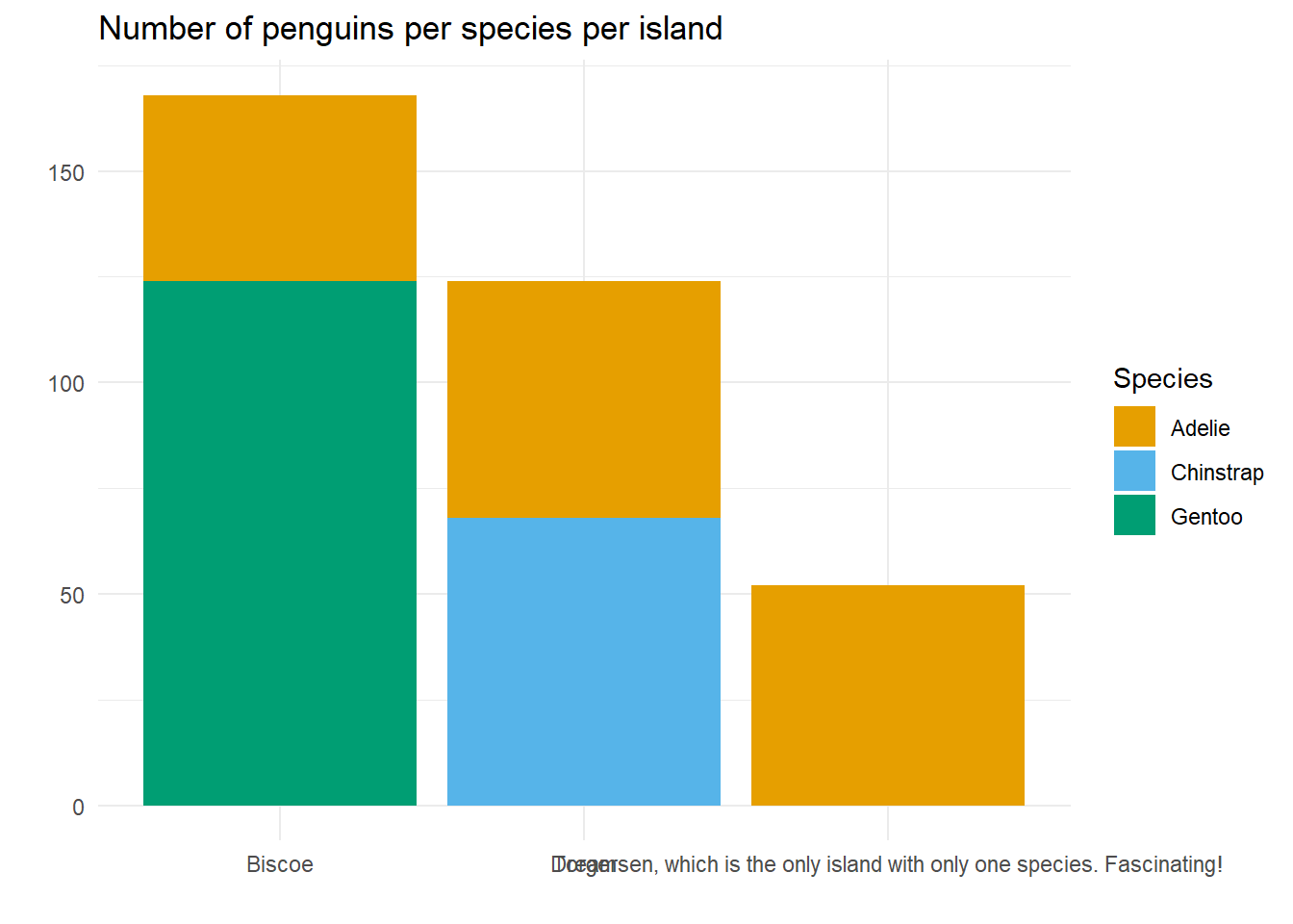
library(tidyverse)penguin_plot <- palmerpenguins::penguins %>%mutate(long_island_name =case_when(island =="Torgersen"~"Torgersen, which is the only island with only one species. Fascinating!",TRUE~paste(island))) %>%ggplot() +geom_bar(aes(x = long_island_name,fill = species)) +labs(x ="",y ="",title ="Number of penguins per species per island",fill ="Species") + colorblindr::scale_fill_OkabeIto() +theme_minimal() penguin_plot
We’ve deliberately modified the name of Torgersen to make it very long, and yes, in this case, that’s a bit forced! But this isn’t too far from what happened in our real dataset, where the x-axis labels were lists of produce grown in different geographical area.
The x-axis is illegible because the long label overlaps with the others. There are several things we could do here:
Put all the labels at a slight angle so they all have room? Yes, but then the axis labels will take up a lot of space and squish the plot; plus our readers might get sore necks.
Use abbreviations for the long label? Sometimes this works, but in the case our our produce example, that was not an option; plus, it’s nice to make things as easy as possible for the readers and forcing them to look up what abbreviations stand for goes against that.
Manually add line breaks through our label so that it is split onto several lines and takes up less left-to-right space? Getting closer! But if our dataset is huge, that’s going to take a while; plus, isn’t part of the beauty of R that we can automate this type of task?
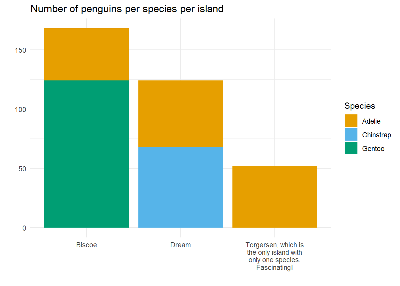
Use str_wrap to create a new column in our data which has line breaks? Closer still, but that creates a column that is only used for the purpose of plotting; can’t we do that on the fly?
Aha! Use str_wrap within the code that creates the labels? Bingo!
Much nicer! So now, let’s demo the next bit of the problem we need to solve.
Messy misaligned x-axes
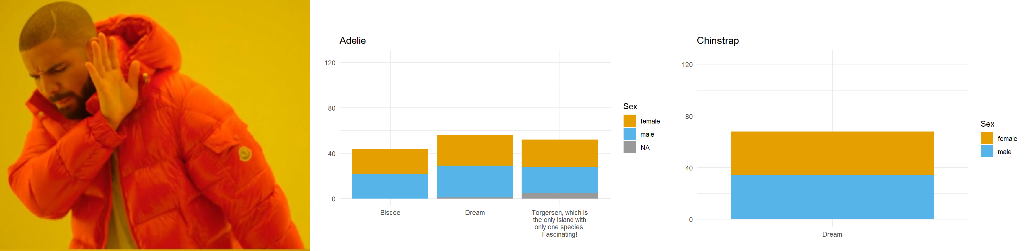
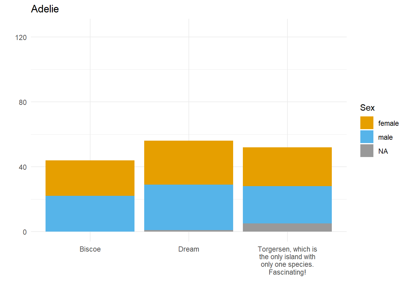
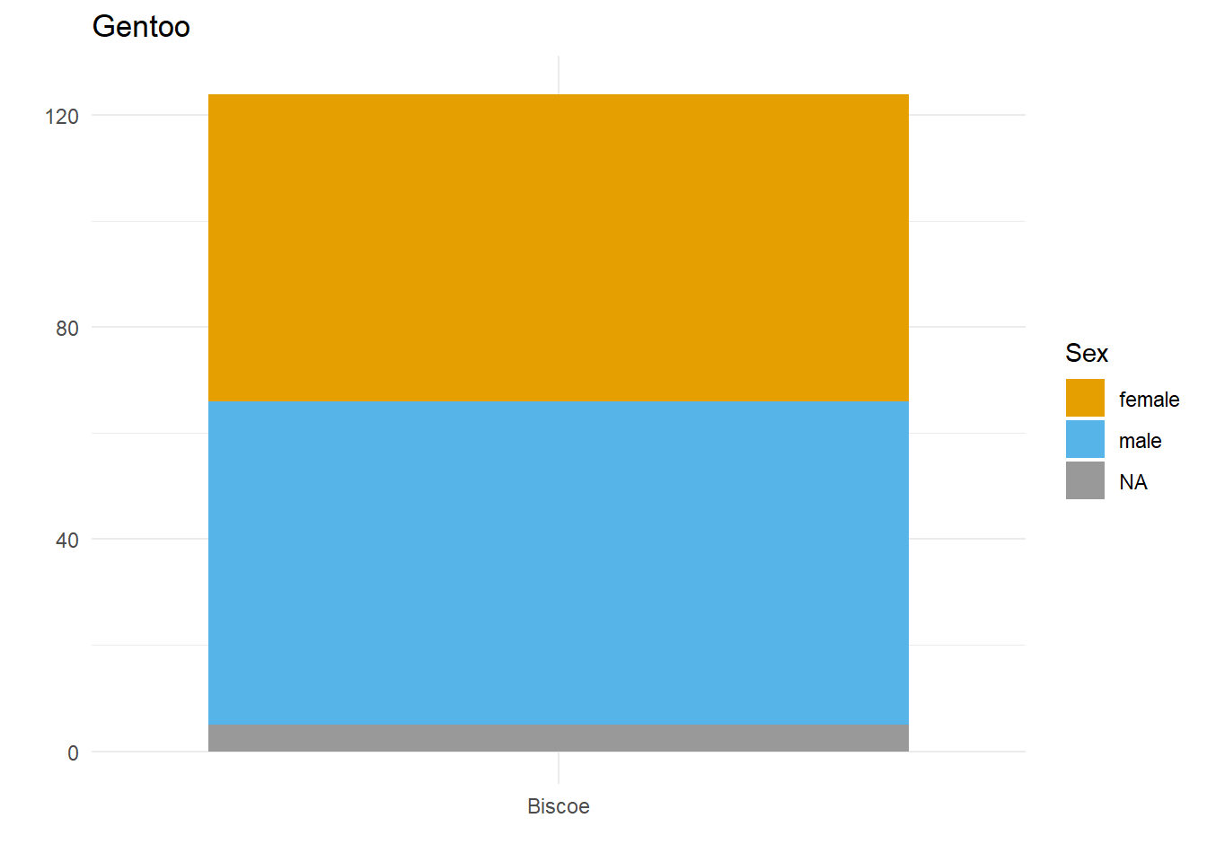
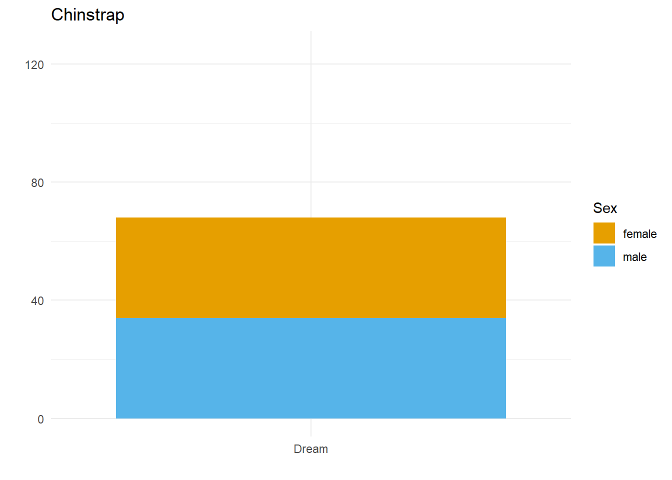
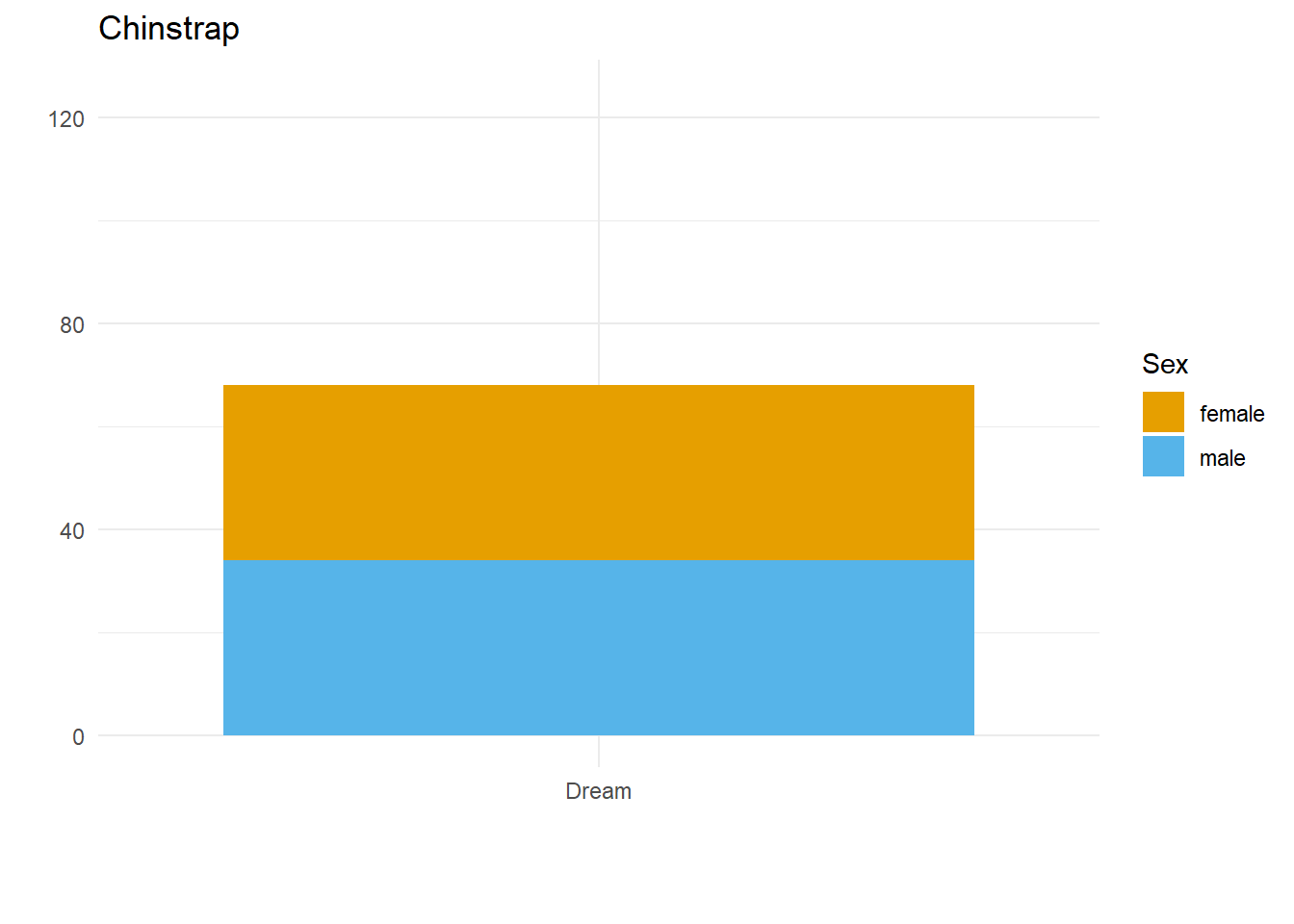
Let’s say we want to compare how many Male and Female penguins there are per species on each island. We have three species, so let’s split the data and make three plots. For them to be comparable, we want to fix the y axis, so first we need to work out what the maximum number of penguins of any given species is on any given island.
So, let’s fix the limits of the y axis to c(0, 125) and create our three plots.
long_named_penguins <- palmerpenguins::penguins %>%mutate(long_island_name =case_when(island =="Torgersen"~"Torgersen, which is the only island with only one species. Fascinating!",TRUE~paste(island)))for(unique_species inunique(palmerpenguins::penguins$species)) { species_plot <- long_named_penguins %>%filter(species == unique_species) %>%ggplot() +geom_bar(aes(x = long_island_name,fill = sex)) +labs(x ="",y ="",title = unique_species,fill ="Sex") +theme_minimal() + colorblindr::scale_fill_OkabeIto(na.value ="grey60") +ylim(c(0, 125)) +scale_x_discrete(labels =function(x) str_wrap(x, width =20))print(species_plot)}
Here we have three plots side by side, illustrating the same concept, and we’ve fixed the y axis to make them comparable, but they are still difficult to compare because the x-axis for the first plot is higher than the x-axes in the other two plots. Why? Because the long name of the Torgersen island is pushing the plot upwards.
Wait, why not just use something like facet_grid()?
Good point! That would fix the problem in this case. But doing it this way gives us more flexibility and control in the overall document layout. Plus, this approach allows us to work across different datasets, without resorting to other plot combining packages such as {cowplot} or {patchwork}.
Aligning the axes by applying the same number of line breaks programmatically
What we need to do is figure out the maximum number of line breaks, and apply that number to the other two plots. To do this, we created a function that adds extra line breaks to shorter strings, so that they all wrap the same number of times as the longest string. We can override that by specifying a maximum number of lines, for extra flexibility in using this across different datasets.
A custom function to create the right number of extra line breaks
wrap_to_max <-function(text_to_wrap, text_width =20, max_lines =NULL){tibble(text_to_wrap) %>%# Create a column where the text is wrappedmutate(wrapped_text =str_wrap(text_to_wrap, width = text_width)) %>%# Count the number of line breaks in the wrapped textmutate(line_count =str_count(wrapped_text, "\n")) %>% {# Add a column containing extra line breaks up to... if(is.null(max_lines)) {# ... the greatest number of line breaksmutate(., extra_breaks =strrep(x ="\n ", times = (max(.$line_count) - .$line_count))) } else {# ... or the number of line breaks we've specifiedmutate(., extra_breaks =strrep(x ="\n ", times = ((max_lines -1) - .$line_count))) } } %>%# Add those extra line breaks onto the end our our stringsunite("wrapped_to_max", wrapped_text, extra_breaks, sep ="") %>%# Return only the strings with added line breaks; the rest of the tibble# was just a handy way of manipulating the data!pull(wrapped_to_max)}
Why didn’t that work? Because the maximum number of lines to wrap is determined based on the subset of data we’re feeding into each plot! There are two solutions to this.
It works! But only if the starting point is a unique dataset. If we want to put plots side by side that come from different datasets, a better approach would be to work out the max number of lines and use the max_lines argument in the function we created.
Figure out the max number of lines needed, and apply that to each plot
max_penguin_lines <- long_named_penguins %>%pull(long_island_name) %>%unique() %>%wrap_to_max() %>%str_count("\n") %>%max() +1# +1 because \n indicates a line break, and there is no \n on the last line!max_penguin_lines
There we have it. Alignment problem solved in a way that is both flexible and quick, by creating just the right number of line breaks for the labels in our dataset(s)!