Building the Ophelia package
A look behind the scenes at the process involved in creating a bespoke ggplot theme package for a research group at Cambridge University.
It’s been an absolute privilege building a package for the Diabetes in Pregnancy research group at the Institute of Metabolic Science, University of Cambridge. This post shares some of the details of the design choices that went into creating theme_ophelia(), a ggplot theme which provides a unified and bespoke aesthetic to the plots created by the research group. The outcome of this work is a package which allows the team to go from a default ggplot plot to a nicely branded one with just two extra lines of code:
Finding a fitting aesthetic
Reading around their research and discussing the project with Dr Meek allowed me to get a good sense of the aesthetic they were after. They are researching Gestational Diabetes, and are after a feminine but not sickly pink vibe. Their website acts both as a portal to their research projects and as a way of recruiting patients; there is clear desire within the group for the research to have positive impacts on patients and be easily understandable by them.
Dr Meek showed me some plots she’d created in Excel and I have to say I was really impressed by what she’d managed to get Excel to do! A really lovely aesthetic of subtly feminine colours; she had added some icons as annotations which was a smart move to reduce text overload; the fonts were chosen to reflect the rest of the project - my job here was largely going to be one of building on what she had done to allow the R users in her team to apply this aesthetic to any ggplot with just a few extra lines of code, rather than all the manual tweaking she had had to do to get Excel do produce what was really a rather fantastic plot.
A few additional considerations
Since this package will be used to create plots for publication in peer-reviewed journals, I was keen to add a few extra constraints: - the fonts needed to be easily readable even in small print - the team need to be able to toggle a serif/sans-serif option on the theme so that the they can adapt the fonts to the aesthetics of the journal to which they submit their articles - the colours needed to work when printed in black and white - the colours also needed to be perceived as distinct by people with differing colour vision
A bespoke colour scheme
The first step was to create an appropriate colour scheme. To do this, I took inspiration from research group’s website. Their dusty pink colour was a good starting point, so I plugged their website into colorpicker.com and got this default palette. Nice, but we’d struggle to differentiate between the colours.
The creative brief I was given was: “feminine but not sickly sweet”. The dusty pink and the dark brown were good starting points…
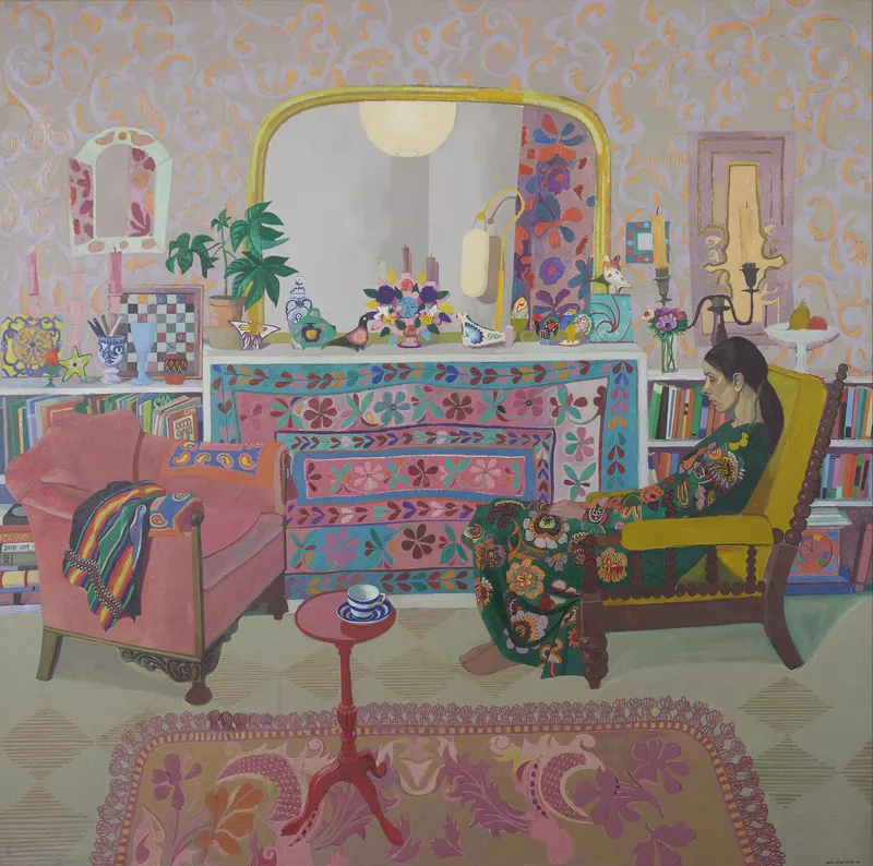
… but for creating a fuller palette, I took inspiration from this painting by Leon Morrocco.
Coming up with a sensible colour palette is the most labour-intensive bit of the package development. Finding anchor colours, blending them together to get extra colours, checking how they look in grey scale, checking other accessibilty requirements, tweaking, tweaking again! But I got there, and the result is in keeping with both the original aesthetic and the creative brief. Win!
After plugging these colours into colour scale functions, the team can now apply them easily to any plot.
I also created some continuous colour scales based on the anchor colors in the discrete scale.
We’re half way there. Next step: change the theme elements of the plot to align with the aesthetic!
Fonts, and other stylings
We need to go with a font which would not look out of place in an academic journal, while giving the text a polished but approchable vibe. Nunito seems to fit that bill. Very readable, friendly geometric shape, and rounded edges. Next step: find a serif equivalent either to use in its stead, or to pair with it. There are lots of ways to do this, and I’d highly recommend taking a look at Oliver Schöndorfer’s post on the font matrix. Essentially, I looked for a font which had a similar rounded form, but with sharper edges this time. Lora fits the bill nicely.
Having installed these fonts locally and plugged these and some light and dark text variables into a theme_ophelia() function, we’re now ready for the full effect.
Delivery to client
The final step is to package this all up into… a package! We’re calling this one {ophelia}. I’ve then uploaded it to GitHub as a private repo, from where Dr Meek and anyone on her team can install it using the authorisation key I sent them. This allows me to add new features, and share them easily with them, as the project develops.
Happy days. I’m looking forward to seeing what they produce with this!
P.S. Dr Meek has kindly allowed me to make the documentation public, so you can take a look at it here - I’ve added a few extra features and tutorials for the team!

