Crafting a data-driven fundraising campaign
Origin is an organisation close to my heart. I’ve taken part in their events as a musician, been on their organising committee, and seen first hand the joy their events bring to people, as well as the unifying power they have in a context where our divisions can sometimes speak louder than the hope that brings us together. Earlier this year, I met with their founder and director, Colin, to talk about how their work was going, and we talked about the impact that their lack of funding was having on current and future projects. I offered to put my dataviz and story telling skills to use in building them a data-driven fundraising campaign. Here’s a bit about what that entailed.
Building the context
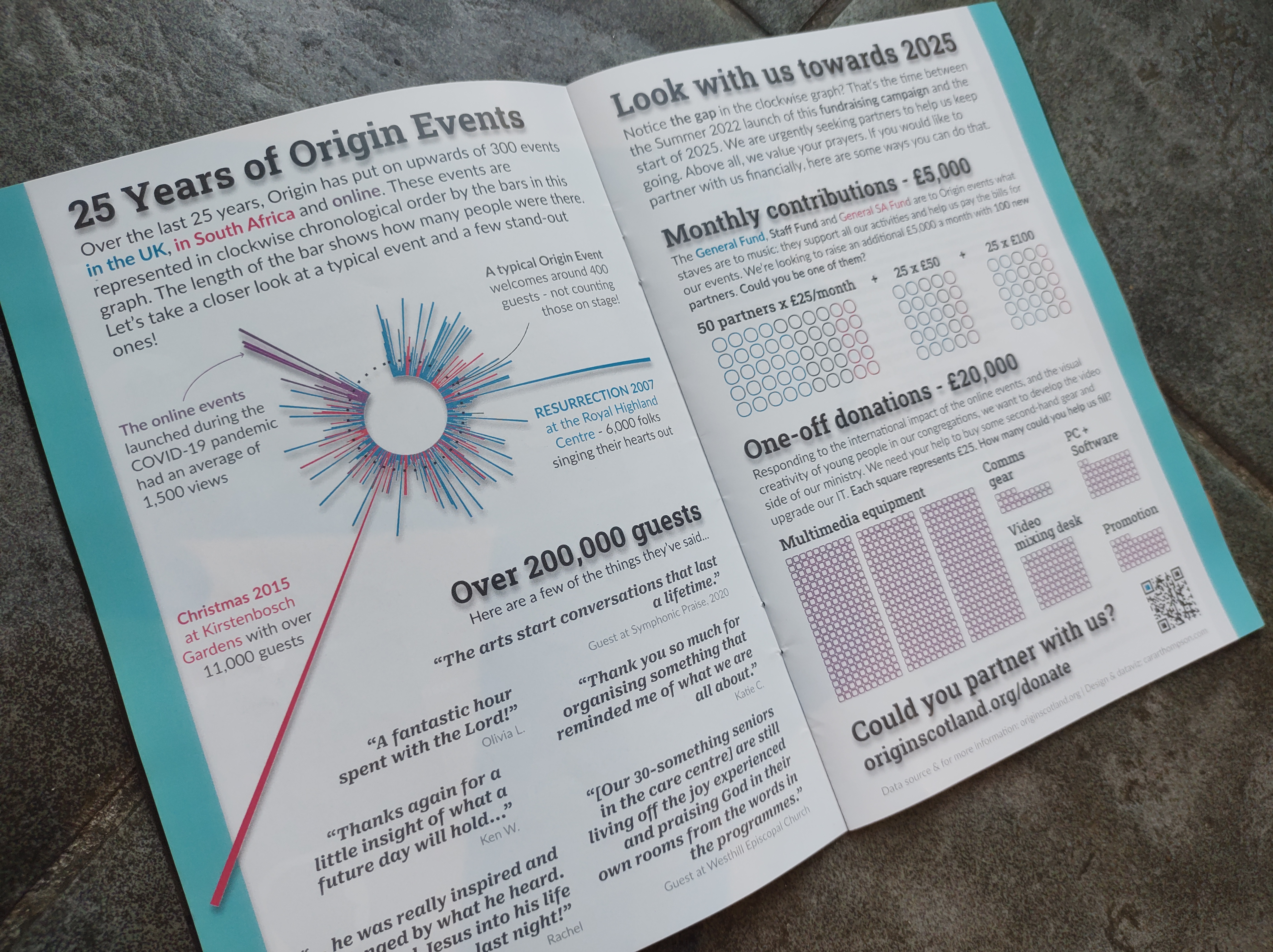
Origin have been around for 25 years. During that time, they have put on a phenomenal number of events considering there are only two people on staff (Colin and Norma)! The size of the events is very variable, but they estimate that over 200,000 people have been at these events. 200,000! That’s a big number. Time to visualise it to help readers grasp just how big it is.
Picking a colour scheme
The event have taken place in three spheres: UK (largely Scotland), South Africa and online. We needed three colours, and because all the work falls neatly into these three categories, I knew I could stick to those three for the rest of the campaign. Luckily, Origin’s brand guidelines feature two colours (blue and pink) which when blended together create a nice purple - that bit was easy!
Designing a “non graphy” dataviz
Next: how to represent that many events, with a sense of a timeline for a readership who might not be all that excited by graphs. I decided to use a polar bar chart, in which the events were presented clockwise. That gave us a sense of time. I then simply plotted how many people were at each event. I left a “gap” in the timeline which represents the time between the launch of the campaign and 2025 - a gap we later invite people to step into.
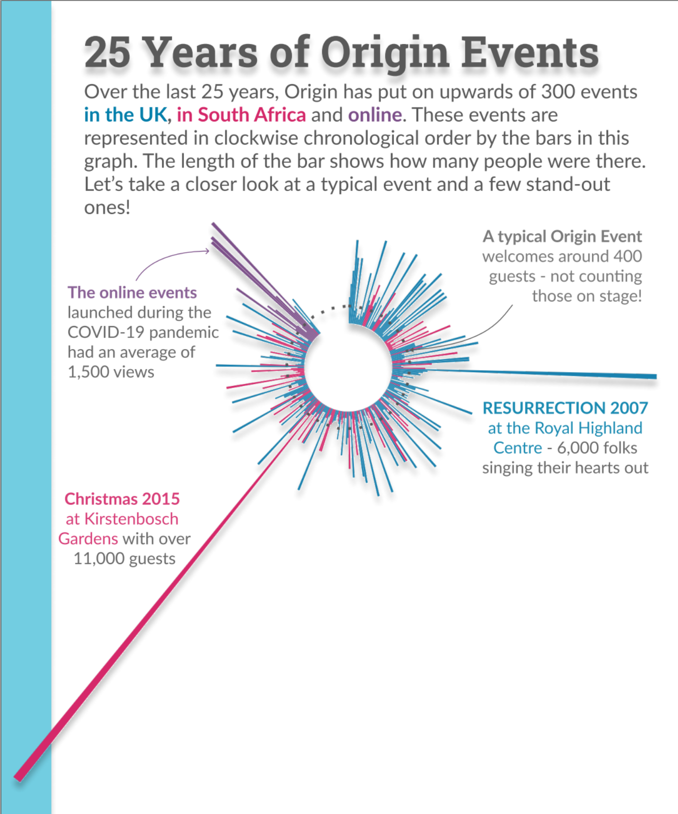
To highlighting typical and stand-out events, I drew a dotted line round the circle at the “median number of guests” level. This served to highlight that there is a wide spread of event attendance while helping reader anchor their estimate of the bars either side of the median number. I highlighted the two biggest events in the history of Origin, and deliberately drew attention to the online events, as they were newer and had had a bigger reach than many of the in-person events. We’ll come back to that later.
Celebrating what matters
The number of people attending the events is pretty mind-blowing, but what matters to the organisation is the impact of the events on each individual. Time to bring that into play. Thankfully, Norma has collected emails and hand-written notes they’ve received over the years. She sent me a document in which she had highlighted ones that really resonated with what their work was about - and I had plenty to work with! Next step: pick some that represent a broad spread of people and that highlight the different ways they have benefited from the events.
Less is more
It was great to be able to offer a range of quotes to the potential financial partners, with the underlying message of “for the events to keep going and keep having this impact, we need your help.” I chose to feature only a small number of quotes in large font, to encourage the readers to read all of them rather than presenting a barrage of positive takes that may be left unread.
Show me the number(s)
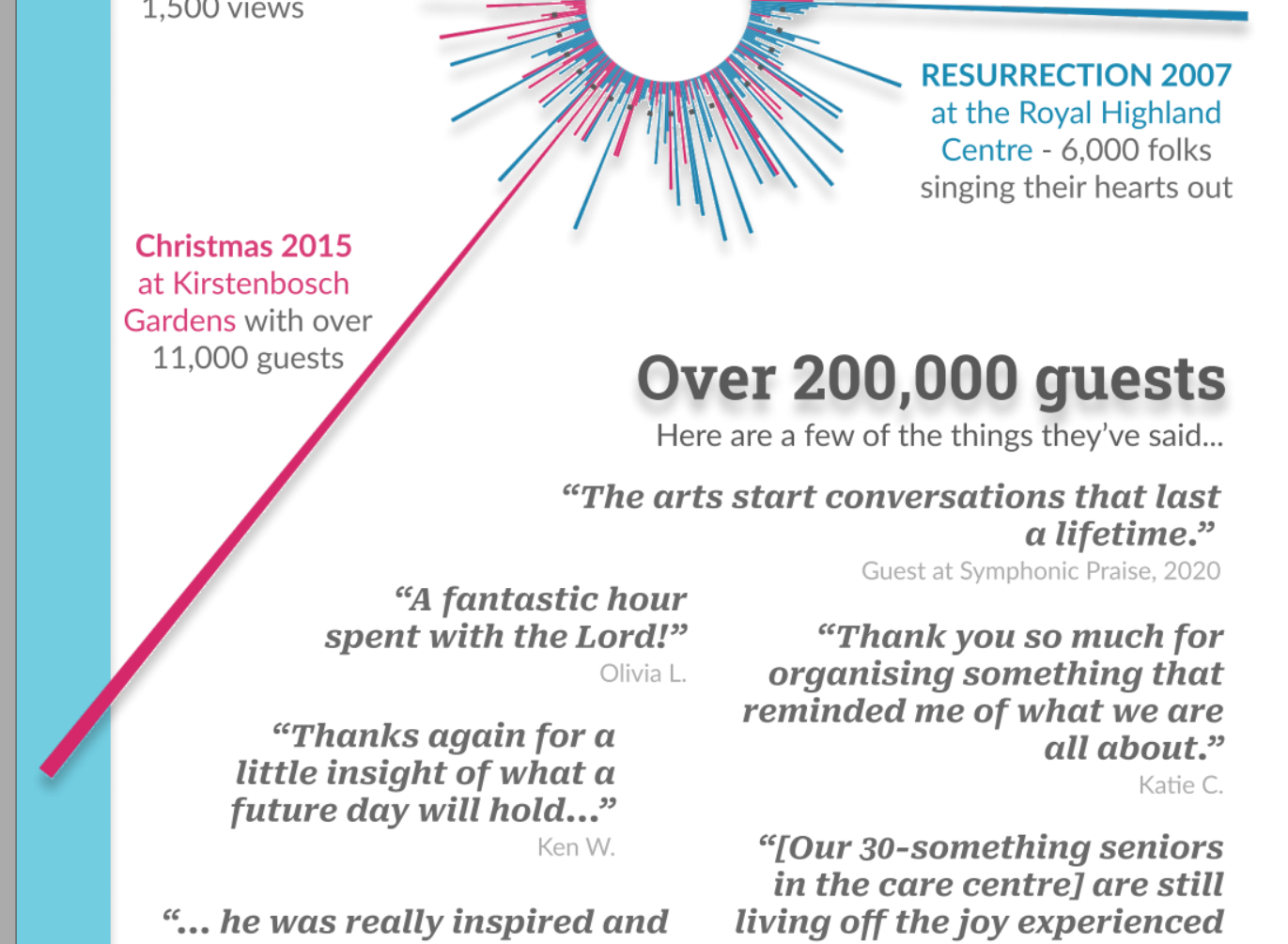
There are two ways in which Origin receives funds: one is through regular giving (standing orders) and one is through one-off donations. The events are free and we were keen to ensure that any fundraising campaign would be sensitive to the fact that many people may not have any additional funds they can donate - we wanted everyone to know they could be a valued partner in the future of the organisations. The line “Above all, we value your prayers” is genuine, and speaks to the core of what keeps Origin going.
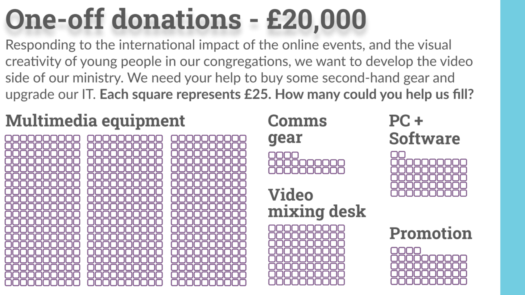
The actual numbers were estimated by Colin and Norma. They know what it takes to run the events, where and at what cost they can source the (second-hand) gear they need, and how much it would take to put things back on a more sustainable path. My task was simply to communicate the numbers in a way that encouraged potential givers to identify how they could help. It was a nice happenstance that the sum for one-off costs was £20,000 and the sum for regular giving was £5,000. This being launched at the 25 year anniversary of Origin, we decided to make good use of the number 25.
Making use of “viewer-identification”
The regular givers have typically been very small in number, but their giving provides the most predictable source of funding for events. Time to emphasise how helpful it would be for more people to give in this way. Keeping the variable levels of disposable income in mind, I broke down the total sum into a number of people each giving one of three amounts, all multiples of 25: £25, £50 and £100. These were then split across the different funds (highlighted with text and colour) - without overwhelming the readers with the extra information about specific amounts required in each fund.
The next step was to encourage people to identify as one of those potential givers. Origin are aiming for 100 people; the message needed to be “you could be one of them”. Here, I made use of the concept of viewer-identification as explored in Scott McCloud’s book Understanding Comics. The basic premise is that the more abstract the representation of a face is, the easier it is for a reader to picture their own face there, and thereby identify with the depicted character. I created a graph that looks a bit like groups of very heavily abstracted faces. It is in fact a waffle plot with a modified radius, but it does the trick nicely!
Breaking down big numbers
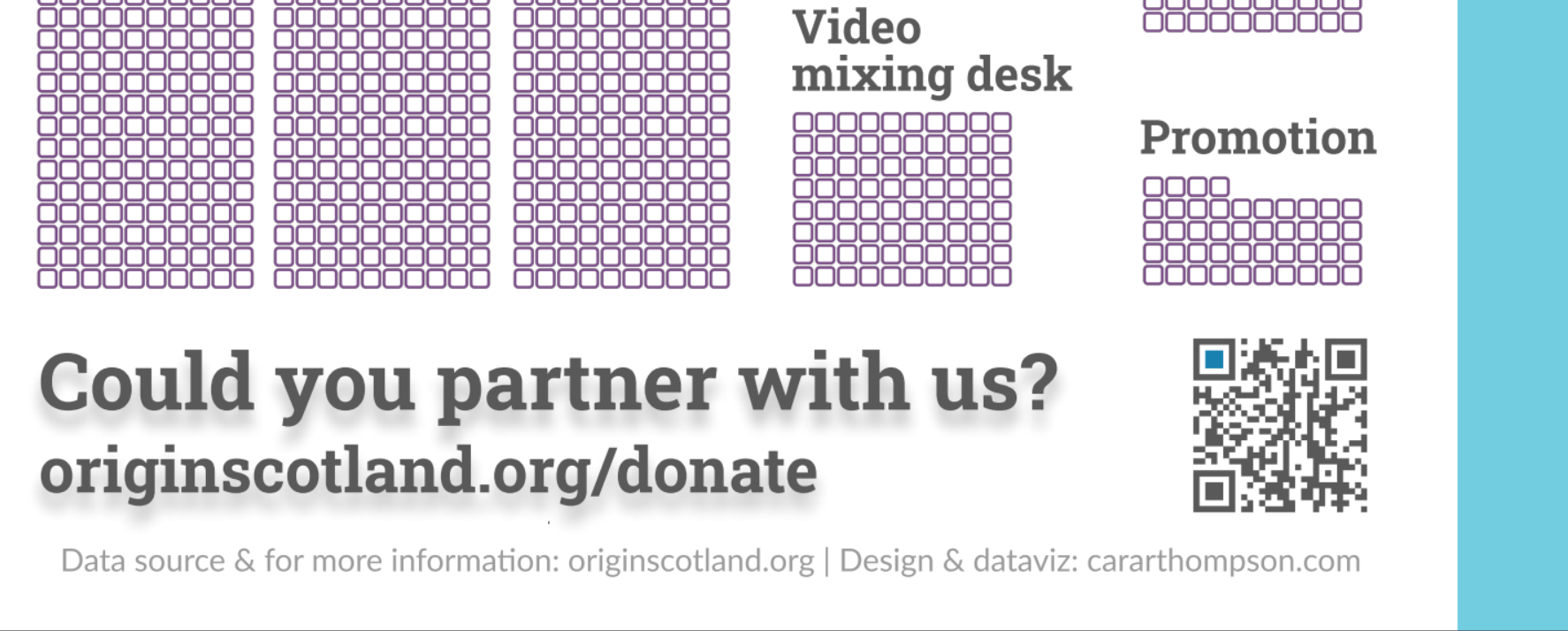
The danger in sharing a big number with potential fundraisers is that it can instantly seem unattainable. £20,000 is a lot of money. But I could maybe give £25 here and there, and if enough of us to do that over the course of the next three years suddenly it seems doable - this was the message I was aiming for. Using the question “How many boxes could you help us fill?” removes any arbitrary upper limit, and helps present the fundraising campaign as a group effort in which each person is only accountable for the amount they can chip in. No need for everyone to do the same, and no need for it all to happen at the same time.
Tying the funds to a rationale
The online events have been a recent development and we noted earlier that their reach was far greater than that of a typical in-person event. This is key to justifying the outlay of all the video-making gear. Colin has long wanted to develop the video side of Origin, but the way the online events took off made it clear to him that this was an important investment for the next few years. Giving funders a good grasp of how the money will be used (hint, it’s not about the gear or even about the videos, but about the impact on the people making them and viewing them) and anchoring that in data about the online events was key in making sure this wasn’t perceived as a frivolous expense.

From a visual point of view, I used the “online” colour to show these funds, as that’s the type of event they will be enabling. There’s a nice symetry to the document and the narrative, where we highlighted the online events at the start, and end with an appeal to help make more of them.
Paving the way for updates
The plan is to build on the visualisations from this campaign to update people at future events about how the fundraising is progressing. In events where they can be projected onto a screen, the organisers can highlight how much has already been pledged, and what they’d hope to raise as a result of the current event.
I wrote the code in such a way that that will be easy to do - clear variable names will definitely help my future self when revisiting this project!
Making it easy
Throughout this project, my goal was to make it easy for potential funders to see how they could contribute and what their contribution would achieve. The final step was to make it easy for them to give. Origin has a dedicated “giving” page, so it was just a question of pointing them there. Bearing in mind the wide demographic of the events I didn’t want to take using a QR code for granted, so I added both a QR code and the link for folks preferring to access the page that way.
A final bit of icing
I mad the QR code using QR Monkey which has nice colour customisation options, and also keeps you right by ensuring the contrast is sufficient for the QR code to be readable. A few easy steps, and we have ourselves a QR code which fits with the rest of the document but also clearly stands out for what it is.
Pulling it all together
Here’s the final product: a fundraising campaign aligned with the ethos (and branding!) of the organisation, which shows potential givers the positive impact their giving would have and encourages them to identify with different ways they can support the on-going work. It was a real pleasure building this, and I’m looking forward to seeing the funds put to good use!