Optimising the use of colours for storytelling in a spaghetti plot
data-visualisation
storytelling
ggplot2
One of my clients recently asked me for tips on optimising spaghetti plots. Those plots with multiple trend lines all superimposed on top of one another, where it can often be very difficult to figure out what is what… They are an important part of the dataviz vocabulary in his field, so the mission was to figure out how to make the most of them!
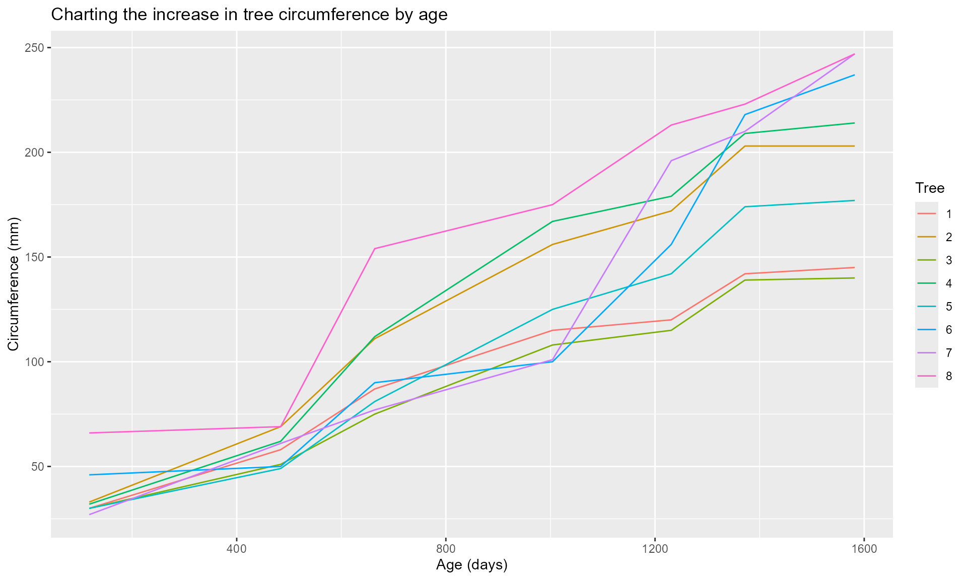
To illustrate the options below, I’m using the Orange dataset, which charts the growth of five orange trees, and comes pre-packaged in R. Because he tended to need 6-8 lines in his plots, I’ve added a few made up trees to the dataset. And we’ll add a few extra variables later on for illustration purposes also. Please do not derive any truths about orange trees from this post!
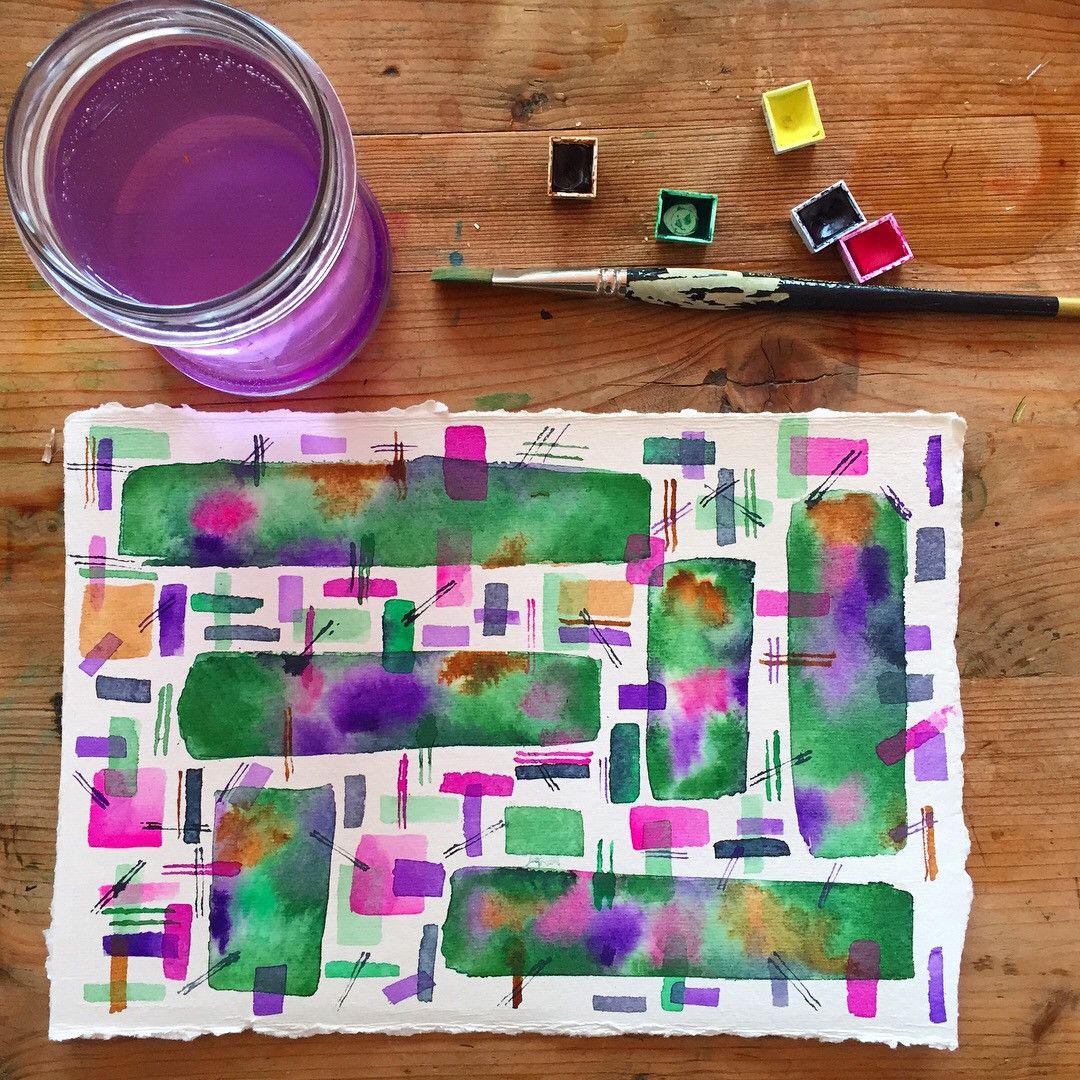
For colours, I’m taking inspiration from this beautiful painting by Piccia Neri, which she shared last week in a post about colours in design - good timing!
Let’s go! First, our data. In order to add more trees to the Orange dataset, we need to make the Tree variable a character column because otherwise we trip up over the fact that 6, 7 and 8 are not in the pre-determined levels of the Tree variable. Then we’re adding ages (the same as the other trees) and random (but sorted) circumferences for each new tree we’ve created.
# Setting the seed because we're doing some sampling below# I need the sampling to stay consistent as I work on the post!# This will also allow you to reproduce exactly the same plot as me.set.seed(202501)many_trees <- Orange |> dplyr::mutate(Tree =as.character(Tree)) |>rbind(dplyr::tibble(Tree =c(rep("6", 7), rep("7", 7), rep("8", 7)),age =rep(unique(Orange$age), 3),circumference =c(sort(sample(25:250, 7)),sort(sample(25:250, 7)),sort(sample(25:250, 7)) ) ))# Let's check we have 8 trees!many_trees |> dplyr::arrange(age) |>head(8)
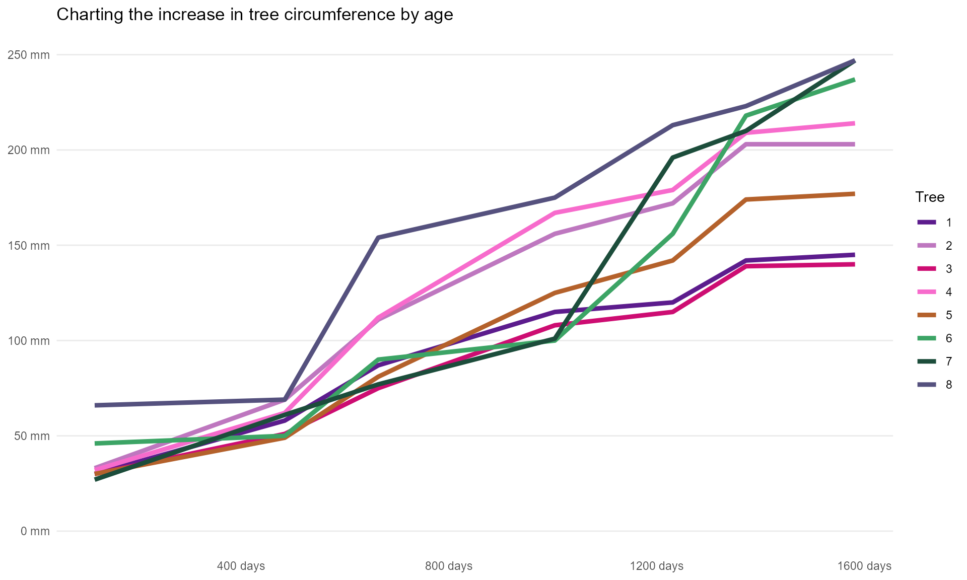
library(ggplot2)many_trees |>ggplot(aes(x = age, y = circumference, colour = Tree)) +geom_line() +labs(title ="Charting the increase in tree circumference by age",x ="Age (days)",y ="Circumference (mm)" )
All the plots in this article are made using R. I’m folding the code sections from here onwards to make this easier to read if folks are more interested in the principles than in the “how did she do that?” bit, but they are all an iteration on the code chunk above. If you want to see the code and find it useful, by all means reuse it in your own context!
Let’s see what we can do to make that spaghetti graph so much better…
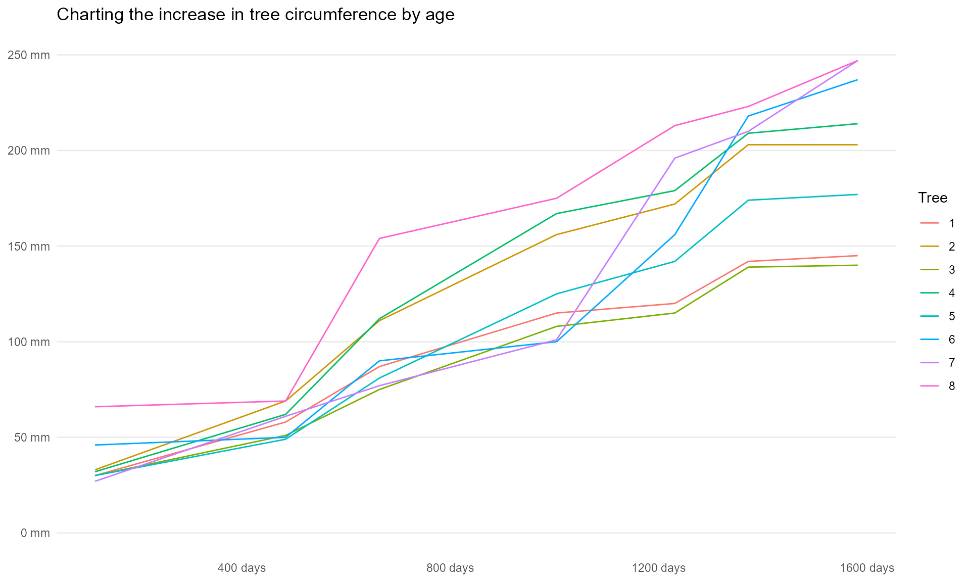
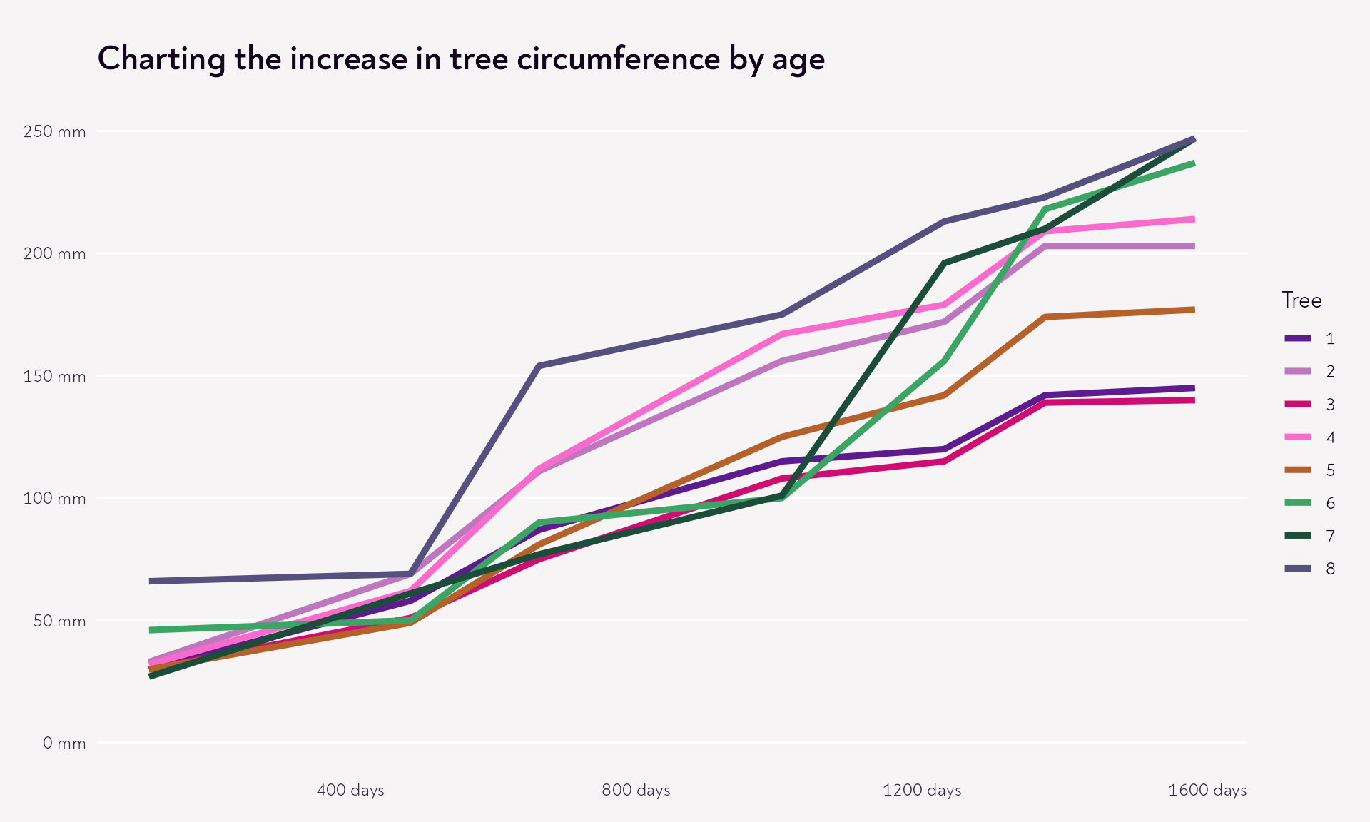
Step 1: Declutter
Remove unnecessary stuff
This is always a fun process. What can we get rid of without losing meaning? My list tends to include for starters:
the grey background
any grid lines that don’t really help
any words we’re reading several times (and which still leave us with questions)
And while were there, let’s remove some of the cognitive “interpretation” clutter by making it easy for readers to figure out what’s what, remember what’s on which axis, and give the numbers some sense of scale (hello, units - these trees are smaller than I initially thought they were!)
Code
many_trees |>ggplot(aes(x = age, y = circumference, colour = Tree)) +geom_line() +# Reworking the text to make it more informativelabs(title ="Charting the increase in tree circumference by age") +scale_x_continuous(labels =function(x) paste(x, "days")) +scale_y_continuous(labels =function(x) paste(x, "mm"),# because there is a meaningful zerolimits =c(0, 250) ) +# Removing the grey background, and adding some sensible defaultstheme_minimal() +# Removing the grid lines we don't needtheme(panel.grid.major.x =element_blank(),panel.grid.minor =element_blank(),axis.title =element_blank() )
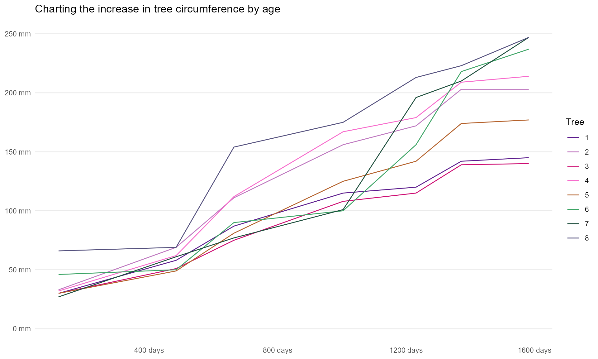
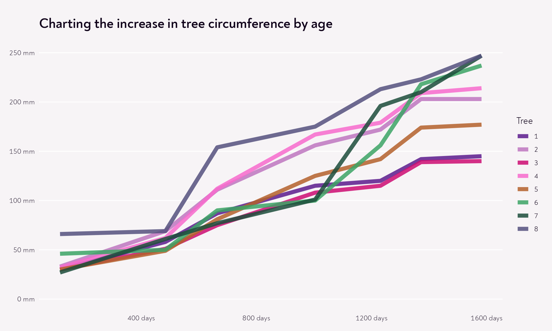
Pick/create a harmonious colour palette
There are lots of ways to do this. My favourite approach is to start with a painting or a photo in which I like the colour combination, pick out key colours, feed them into an accessibility checker, like viz4.net/palettes, and tweak them until the palette passes the checks. For more tips on creating colour palettes in a short amount of time, see my Palatable Palettes talk form the NHS-R conference.
Code
piccia_palette <-c(purple ="#5c1c8d",lilac ="#be77bf",dark_pink ="#cd0d72",light_pink ="#f76bcc",orange ="#b4612b",emerald ="#3ca465",forest_green ="#1c4d3b",blue_grey ="#55517e")many_trees |>ggplot(aes(x = age, y = circumference, colour = Tree)) +geom_line() +labs(title ="Charting the increase in tree circumference by age") +scale_x_continuous(labels =function(x) paste(x, "days")) +scale_y_continuous(labels =function(x) paste(x, "mm"), limits =c(0, 250)) +# We have to unname the colours, because we don't have a tree called e.g. "purple"scale_colour_manual(values =unname(piccia_palette)) +theme_minimal() +theme(panel.grid.major.x =element_blank(),panel.grid.minor =element_blank(),axis.title =element_blank() )
Now, any colour palette will struggle when the lines are super thin, so let’s make life a bit easier for our readers by making the lines thicker.
Code
many_trees |>ggplot(aes(x = age, y = circumference, colour = Tree)) +geom_line(linewidth =1.6) +labs(title ="Charting the increase in tree circumference by age") +scale_x_continuous(labels =function(x) paste(x, "days")) +scale_y_continuous(labels =function(x) paste(x, "mm"), limits =c(0, 250)) +scale_colour_manual(values =unname(piccia_palette)) +theme_minimal() +theme(panel.grid.major.x =element_blank(),panel.grid.minor =element_blank(),axis.title =element_blank() )
Remove the “why is that different?” clutter
Part of what makes Piccia’s painting work so nicely is the context of the colours, so let’s change a few things about our plot background to make this work nicely. Since the theme is now growing, I’ll create a simple custom theme function so we can apply just one line of code going forward and avoid cluttering up the plot code.
I’ll also align the font with what I’m using in the rest of this page, add the option of easily adding some on-the-fly styling to the title using ggtext::element_textbox_simple (it also automatically wraps the title to the width of the plot!) and make the text colour line up nicely with the colours I’m using in the plot.
Code
theme_piccia <-function() {theme_minimal(base_size =12) +# Align the font with the rest of the pagetheme(text =element_text(family ="Noah", colour ="#12051C"),# Make the title the main thing, and make it wrap to the width of the plot# by putting it inside a textboxplot.title = ggtext::element_textbox_simple(face ="bold",size =rel(1.5),margin =margin(12, 0, 12, 0, "pt") ),axis.text =element_text(family ="Noah", colour ="#372D40"),panel.grid =element_line(colour ="#FFFFFF"),panel.grid.major.x =element_blank(),panel.grid.minor =element_blank(),axis.title =element_blank(),plot.background =element_rect(colour ="#F7F4F6", fill ="#F7F4F6"),# Give everything a bit more space to breatheplot.margin =margin(rep(12, 4)) )}many_trees |>ggplot(aes(x = age, y = circumference, colour = Tree)) +geom_line(linewidth =1.6) +labs(title ="Charting the increase in tree circumference by age") +scale_x_continuous(labels =function(x) paste(x, "days")) +scale_y_continuous(labels =function(x) paste(x, "mm"), limits =c(0, 250)) +scale_colour_manual(values =unname(piccia_palette)) +theme_piccia()
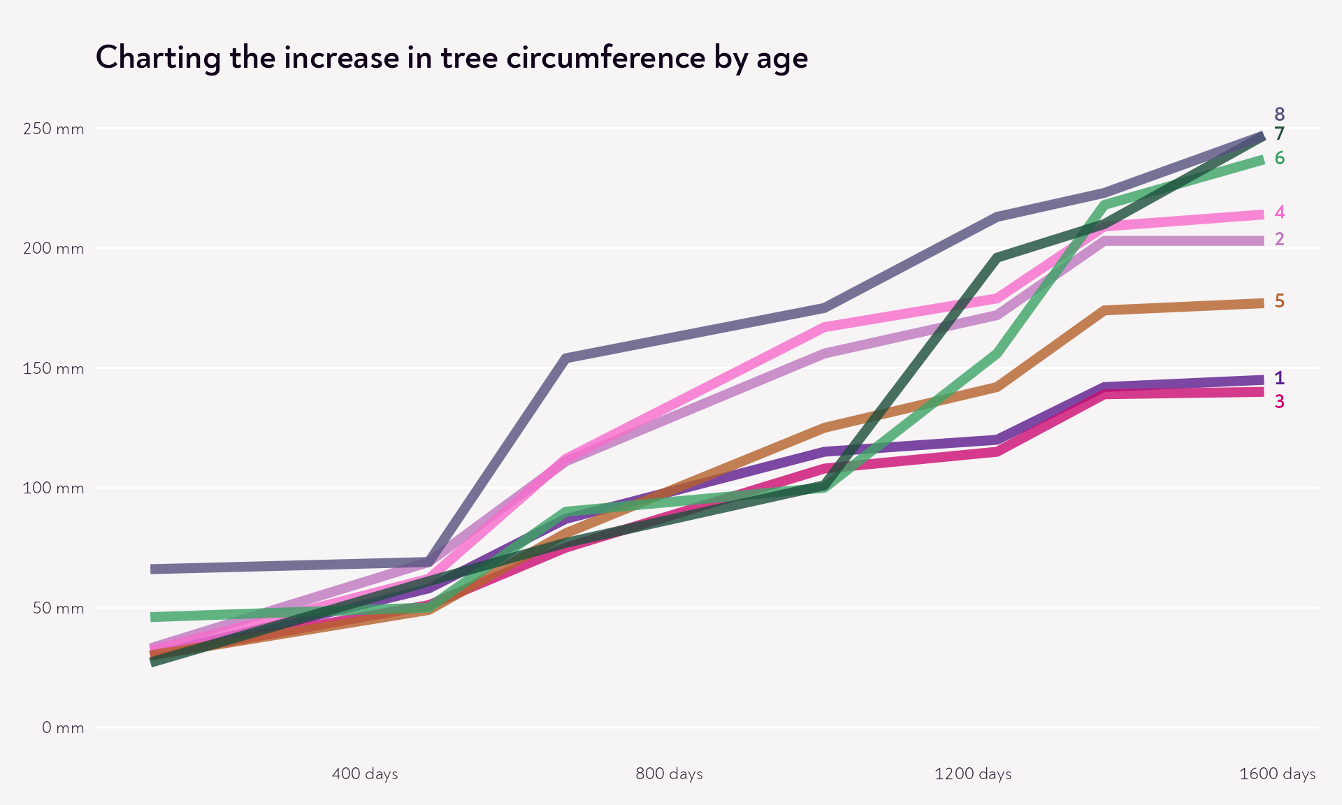
Make it easier to follow the lines
The other thing I really liked in the painting was the ways the different colours interacted when they crossed over each other, because they all have a bit of transparency. This is a useful feature for us to add to our graph, to help us follow the different lines, and not get too overwhelmed by the line which is “at the front”.
Code
many_trees |>ggplot(aes(x = age, y = circumference, colour = Tree)) +geom_line(linewidth =2.5, alpha =0.85) +labs(title ="Charting the increase in tree circumference by age") +scale_x_continuous(labels =function(x) paste(x, "days")) +scale_y_continuous(labels =function(x) paste(x, "mm"), limits =c(0, 250)) +scale_colour_manual(values =unname(piccia_palette)) +theme_piccia()
So now we have something that is nicer to look at, but it doesn’t really help tell much of a story.
Step 2: Use colour wisely
Option 1: Redundant encoding
The encoding is currently redundant, in that each line has its own colour, which is also specified in the legend. But the legend is in a different order to the lines, which makes this confusing.
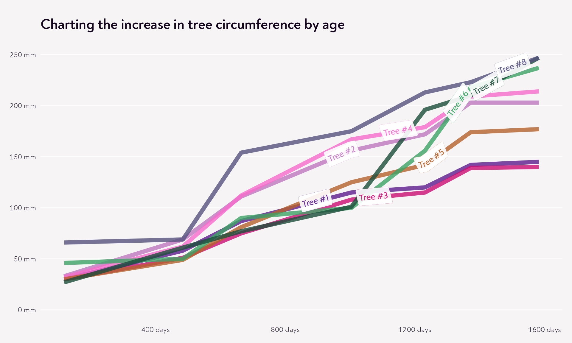
One option, if we want to keep the colours as is, we could make things easier by labelling the lines directly, either at the end of the path…
Code
many_trees |>ggplot(aes(x = age, y = circumference, colour = Tree)) +geom_line(linewidth =2.5, alpha =0.8) +labs(title ="Charting the increase in tree circumference by age") +scale_x_continuous(labels =function(x) paste(x, "days")) +scale_y_continuous(labels =function(x) paste(x, "mm"), limits =c(0, 250)) +scale_colour_manual(values =unname(piccia_palette)) +theme_piccia() +theme(legend.position ="none") + ggtext::geom_textbox(data = dplyr::filter(many_trees, age ==max(age)),aes(label = Tree,# Hard-coding these for ease; I recommend a different approach# for a more reproducible labelling process!vjust = dplyr::case_when(Tree =="8"~0, Tree =="3"~0.8, TRUE~0.5) ),family ="Noah",fontface ="bold",hjust =0,fill =NA,box.colour =NA )
… or on the path! This is a fun trick, but I’m not convinced that in the case of this story it makes it much easier to figure out what’s going on.
Code
many_trees |>ggplot(aes(x = age, y = circumference, colour = Tree)) +geom_line(linewidth =2.5, alpha =0.8) +labs(title ="Charting the increase in tree circumference by age") +scale_x_continuous(labels =function(x) paste(x, "days")) +scale_y_continuous(labels =function(x) paste(x, "mm"), limits =c(0, 250)) +scale_colour_manual(values =unname(piccia_palette)) +theme_piccia() +theme(legend.position ="none") +# Here I'm playing with scaling the tree numbers into a value for hjust# to avoid overlaps and also put the labels where the line are most distinct geomtextpath::geom_labelpath(aes(label =paste0("Tree #", Tree),hjust =scale(as.numeric(as.character(Tree)) /2,1,length(unique(Tree)) ) +0.6 ),text_only =TRUE,family ="Cabin",linewidth =0.05,alpha =0.9 )
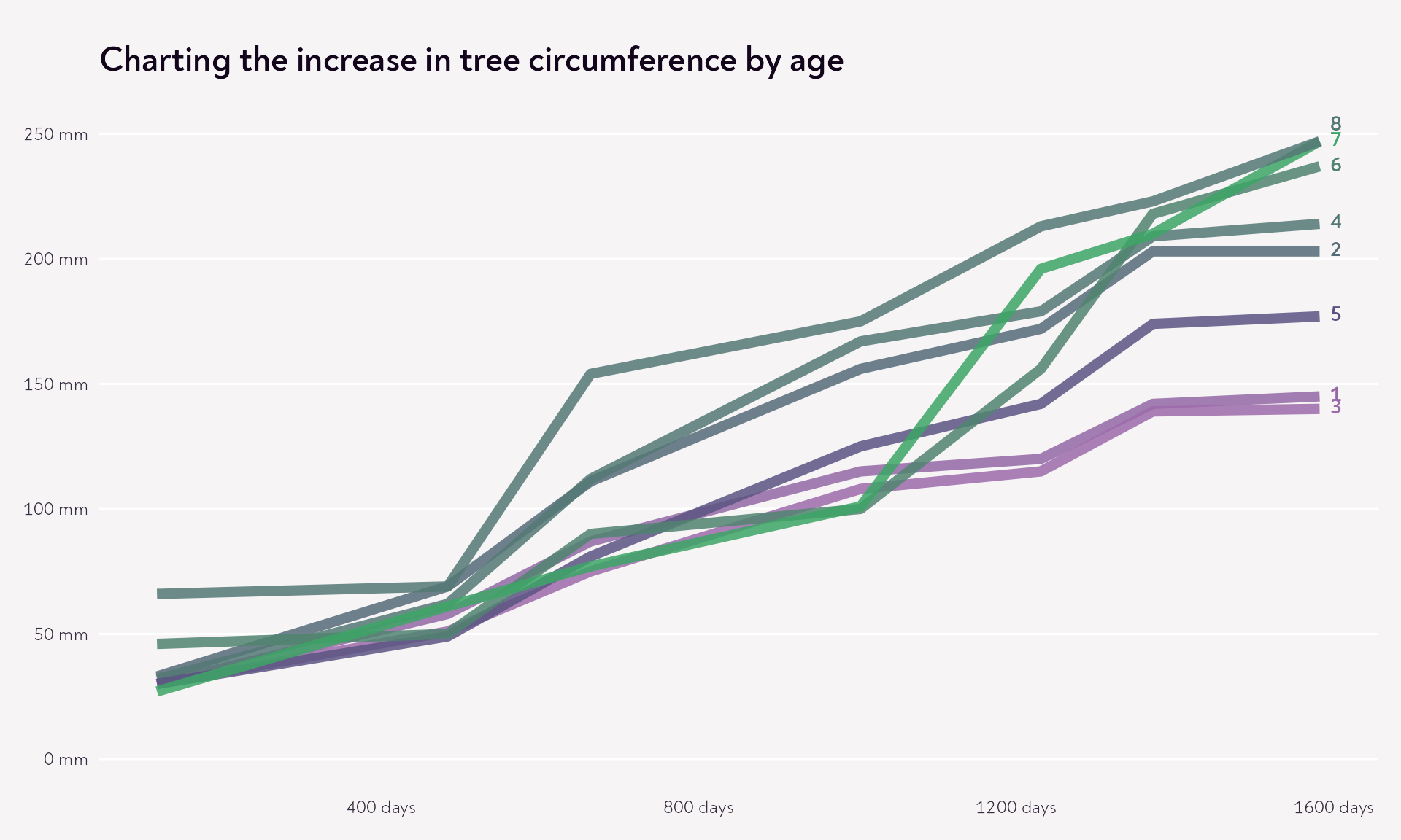
Option 2: Redundant but with meaning
A second option is to use redundant encoding in a way that emphasises the story. Say we want to talk about the relative growth of the trees. We could colour them in such a way that the colour reflects the difference between circumference at the start and at the end of the measurements.
For this, we want a gradual colour scale that makes sense of what we’re showing. I’m going to go from lilac to light green, via grey.
Code
many_trees <- many_trees |> dplyr::group_by(Tree) |> dplyr::mutate(total_growth =max(circumference) -min(circumference))many_trees |>ggplot(aes(x = age, y = circumference, colour = total_growth, group = Tree)) +geom_line(aes(), linewidth =2.5, alpha =0.85) +labs(title ="Charting the increase in tree circumference by age") +scale_x_continuous(labels =function(x) paste(x, "days")) +scale_y_continuous(labels =function(x) paste(x, "mm"), limits =c(0, 250)) +scale_colour_gradient2(midpoint =150,transform ="sqrt",low = piccia_palette["lilac"],mid = piccia_palette["blue_grey"],high = piccia_palette["emerald"] ) + ggtext::geom_textbox(data = dplyr::filter(many_trees, age ==max(age)),aes(label = Tree,# Hard-coding these for ease; I recommend a different approach# for a more reproducible labelling process!vjust = dplyr::case_when(Tree =="8"~0.1, TRUE~0.5) ),family ="Noah",fontface ="bold",hjust =0,fill =NA,box.colour =NA ) +theme_piccia() +theme(legend.position ="none")
Again, not necessarily the clearest, but it did bring to my attention the late bloomer that achieved subtanstial growth between the midpoint and the end - go Tree number 7!
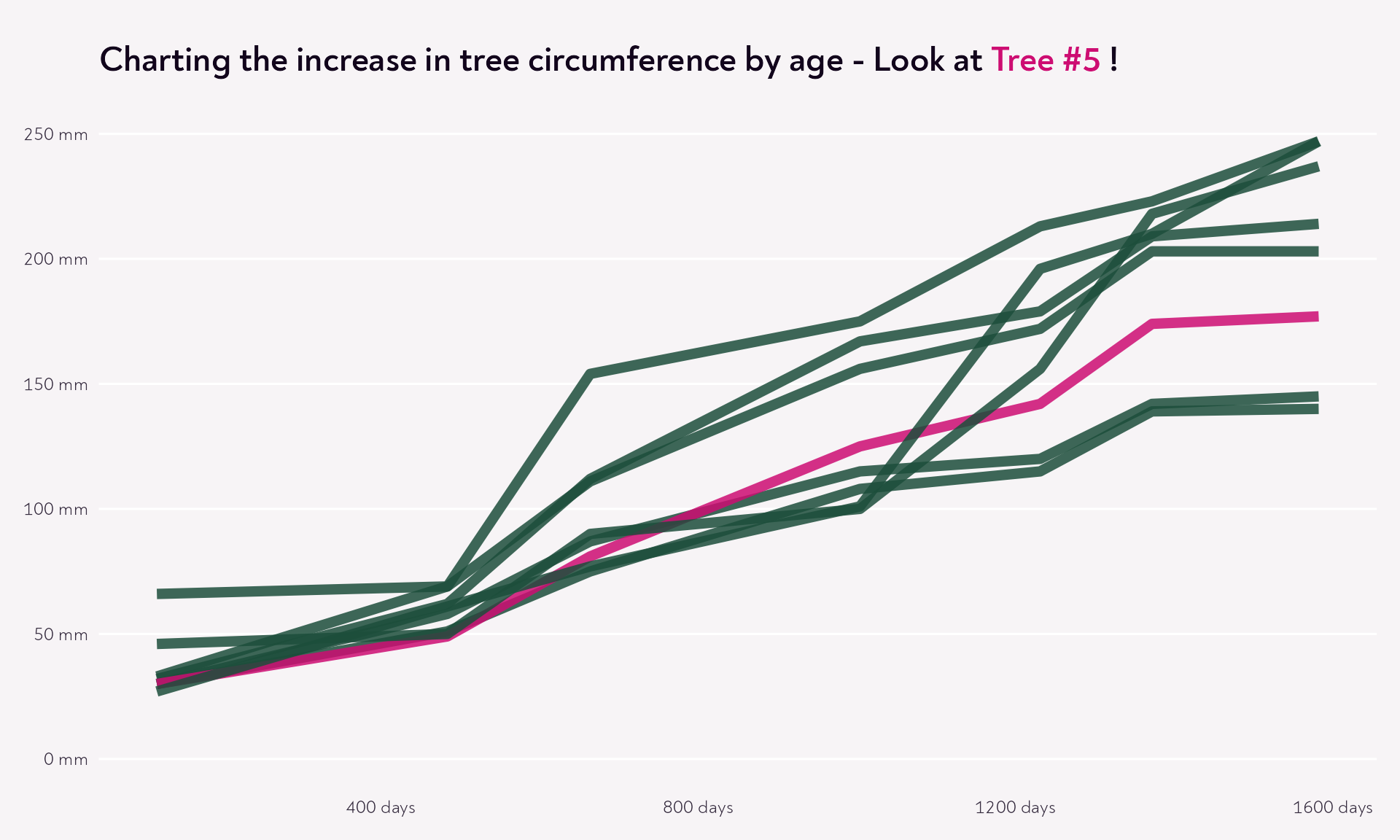
Option 3: Highlight a hero
Let’s say Tree number 5 is a special one, planted with different conditions, and we wanted to see how it compares to a more “standard” approach to orange tree planting.
Code
many_trees |> dplyr::group_by(Tree) |> dplyr::mutate(total_growth =max(circumference) -min(circumference)) |>ggplot(aes(x = age,y = circumference,colour = dplyr::case_when( Tree =="5"~ piccia_palette[["dark_pink"]],TRUE~ piccia_palette[["forest_green"]] ),group = Tree )) +geom_line(linewidth =2.5, alpha =0.85) +labs(title =paste0("Charting the increase in tree circumference by age - Look at ","<span style='color: ", piccia_palette[["dark_pink"]],"'>Tree #5 </span>!" ) ) +scale_x_continuous(labels =function(x) paste(x, "days")) +scale_y_continuous(labels =function(x) paste(x, "mm"), limits =c(0, 250)) +scale_colour_identity() +theme_piccia() +theme(legend.position ="none")
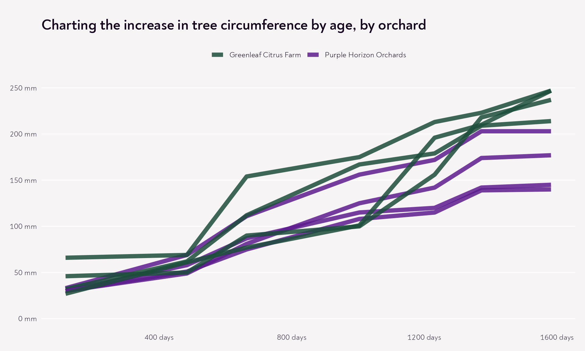
Option 4: Add an extra dimension
Let’s imagine that our orange trees were planted in two different groves. If we colour the trees by grove, we get some useful insights into how growth in Greenleaf Citrus Farm compares to growth in Purple Horizon Orchards. Maybe one is sunnier than the other, and maybe that has an effect on how the trees grow.
Yes, I have somewhat cherry-picked the trees to illustrate the point (and to add a fruit idiom into the mix!), but after all if we’re comparing A to B, we would hope to see something of a difference in the trends. I’ve seen this happen in a workshop and it completely transformed how useful the spaghetti plot was for the workshop attendee’s presentation.
Code
many_trees |> dplyr::group_by(Tree) |> dplyr::mutate(orchard = dplyr::case_when( Tree %in%c("8", "7", "6", "4") ~"Greenleaf Citrus Farm",TRUE~"Purple Horizon Orchards" ) ) |>ggplot(aes(x = age, y = circumference, colour = orchard, group = Tree)) +geom_line(linewidth =2.5, alpha =0.85) +labs(title ="Charting the increase in tree circumference by age, by orchard" ) +scale_x_continuous(labels =function(x) paste(x, "days")) +scale_y_continuous(labels =function(x) paste(x, "mm"), limits =c(0, 250)) +scale_colour_manual(values =c("Greenleaf Citrus Farm"= piccia_palette[["forest_green"]],"Purple Horizon Orchards"= piccia_palette[["purple"]] ) ) +theme_piccia() +theme(legend.position ="top", legend.title =element_blank())
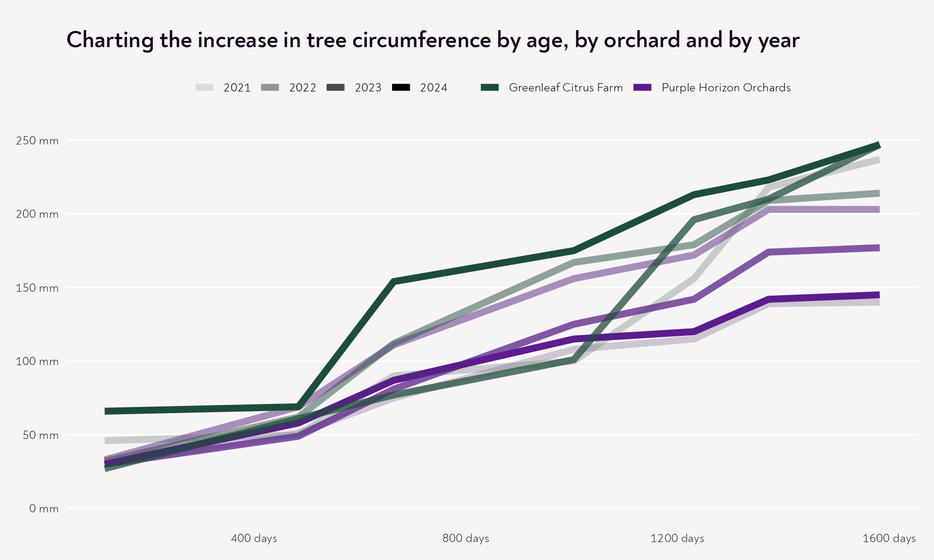
Option 5: Add two extra dimensions!
And let’s say that we know when the trees were planted, and that our methods around that changed over the course of four years. My top tip for this is to make the colours “go grey” as the years fade into the past.
In doing this, we need to pick our colours wisely so that there’s a clear distinction between the lightest (most faded) version of the colour and the darkest.
Code
many_trees |> dplyr::group_by(Tree) |> dplyr::mutate(total_growth =max(circumference) -min(circumference),orchard = dplyr::case_when( Tree %in%c("8", "7", "6", "4") ~"Greenleaf Citrus Farm",TRUE~"Purple Horizon Orchards" ),plantation_year = dplyr::case_when( Tree %in%c("6", "3") ~2021, Tree %in%c("4", "2") ~2022, Tree %in%c("7", "5") ~2023,TRUE~2024 ) ) |># A dplyr::arrange(plantation_year) |> dplyr::mutate(Tree =factor(Tree, levels =unique(Tree))) |>ggplot(aes(x = age, y = circumference, colour = orchard, group = Tree)) +# Quick hack! I've put an extra set of lines of the same width behind our# coloured lines to make them "fade" to grey when their transparency increasesgeom_line(linewidth =2.5, alpha =0.5, colour ="grey") +geom_line(linewidth =2.5, aes(alpha = plantation_year)) +scale_alpha_continuous(range =c(0.1, 1), transform ="identity") +labs(title ="Charting the increase in tree circumference by age, by orchard and by year" ) +scale_x_continuous(labels =function(x) paste(x, "days")) +scale_y_continuous(labels =function(x) paste(x, "mm"), limits =c(0, 250)) +scale_colour_manual(values =c("Greenleaf Citrus Farm"= piccia_palette[["forest_green"]],"Purple Horizon Orchards"= piccia_palette[["purple"]] ) ) +theme_piccia() +theme(legend.position ="top", legend.title =element_blank())
There we go, it looks like in Greenleaf Citrus Farm the most recent year led to stronger, more consistent growth, whereas Purple Horizon Orchards may wish to reconsider their changed methods to reinstate the stronger growth they observed in previous years.
Step 3: Consider additional ways to make this easier for your readers
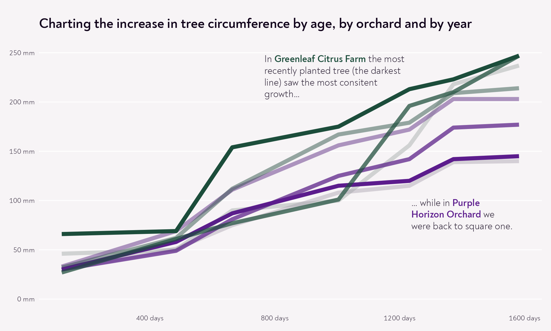
Annotations
We’ve already explored how we can annotate the lines, but what else could we do? I’m a big fan of putting text where it will be most useful to the readers, so how about something like this…
Code
many_trees |> dplyr::group_by(Tree) |> dplyr::mutate(total_growth =max(circumference) -min(circumference),orchard = dplyr::case_when( Tree %in%c("8", "7", "6", "4") ~"Greenleaf Citrus Farm",TRUE~"Purple Horizon Orchards" ),plantation_year = dplyr::case_when( Tree %in%c("6", "3") ~2021, Tree %in%c("4", "2") ~2022, Tree %in%c("7", "5") ~2023,TRUE~2024 ) ) |> dplyr::arrange(plantation_year) |> dplyr::mutate(Tree =factor(Tree, levels =unique(Tree))) |>ggplot(aes(x = age, y = circumference, colour = orchard, group = Tree)) +geom_line(linewidth =2.5, alpha =0.5, colour ="grey") +geom_line(linewidth =2.5, aes(alpha = plantation_year)) +scale_alpha_continuous(range =c(0.05, 1), transform ="identity") +labs(title ="Charting the increase in tree circumference by age, by orchard and by year" ) +scale_x_continuous(labels =function(x) paste(x, "days")) +scale_y_continuous(labels =function(x) paste(x, "mm"), limits =c(0, 250)) +scale_colour_manual(values =c("Greenleaf Citrus Farm"= piccia_palette[["forest_green"]],"Purple Horizon Orchards"= piccia_palette[["purple"]] ) ) + ggtext::geom_textbox(data =head(many_trees, 1),aes(x =1000,y =225,label =paste0("In <span style='color: ", piccia_palette[["forest_green"]],"'>**Greenleaf Citrus Farm**</span> the most recently planted tree (the darkest line) saw the most consitent growth..." ) ),family ="Noah",size =4.5,box.colour =NA,fill =NA,colour ="#372D40",width =unit(14, "lines") ) + ggtext::geom_textbox(data =head(many_trees, 1),aes(x =1400,y =85,label =paste0("... while in <span style='color: ", piccia_palette[["purple"]],"'>**Purple Horizon Orchard**</span> we were back to square one." ) ),family ="Noah",size =4.5,box.colour =NA,fill =NA,colour ="#372D40" ) +theme_piccia() +theme(legend.position ="none", legend.title =element_blank())
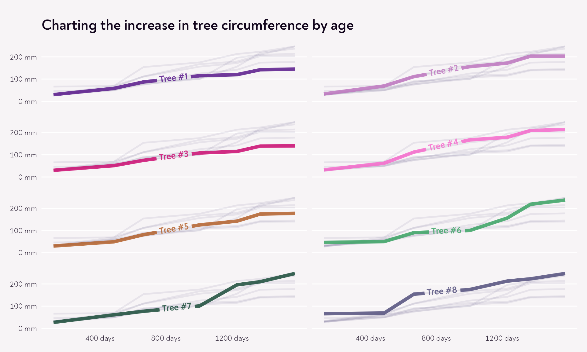
Small multiples
Ultimately, if there is no way of grouping the trees sensibly and you do need to compare each tree to its counterparts, small multiples is your friend. You can still apply the rest of the stuff we’ve talked about above!
{gghighlight} really comes into its own for this kind of plot, allowing us to show all the data, but also highlight one tree in each facet.
Code
many_trees |># This was the most straightforward way of labelling the lines with more# than just the tree's number dplyr::mutate(tree_label =factor(paste0("Tree #", Tree))) |>ggplot(aes(x = age, y = circumference, colour = Tree)) +geom_line(linewidth =2, alpha =0.85) +labs(title ="Charting the increase in tree circumference by age") +scale_x_continuous(labels =function(x) paste(x, "days"),breaks =c(400, 800, 1200) ) +scale_y_continuous(labels =function(x) paste(x, "mm"),limits =c(0, 250),# Let's reduce some of the axis clutterbreaks =c(0, 100, 200) ) +scale_colour_manual(values =unname(piccia_palette)) +theme_piccia() + gghighlight::gghighlight( tree_label == tree_label,label_key = tree_label,line_label_type ="text_path",label_params =list(family ="Cabin", fontface ="bold"),# Making the unhighlighted lines more transparent definitely helps!# Here I've also reduced the line width, and chosen our custom blue-grey colour.unhighlighted_params =list(alpha =0.1,linewidth =1,colour = piccia_palette[["blue_grey"]] ) ) +facet_wrap(. ~ tree_label, ncol =2) +# And since we're labelling our trees inside the facets, we don't# need facet titlestheme(strip.text =element_blank(),# And we can also space the facets out a bit, which reduces the overwhelmpanel.spacing.y =unit(18, "pt") )
Interactivity
Finally, the {ggiraph} package makes it super easy going from a static ggplot to an interactive plot. The only thing we need to think about is the content of our tooltips. {ggiraph} can only give us tooltip content that is tied to specific points we have plotted, or a summary for a whole line - it can’t give us values that update depending on where we’re hovering on the line. But actually, the measurements here are snapshots, and the lines are our interpretation of growth over time - trees don’t grow in such a perfectly linear way between measurements! So let’s bring it back to those, adding a bit of emphasis on the measurements and by the same token allowing us to add more fine-grained information into the tooltips.
Just don’t forget to apply all of the above to the tooltips: text hierarchy, colour contrast, easy-to-interpret numbers, consistent colour and fonts, and plenty of space to breathe!
Code
interactive_lines <- many_trees |> dplyr::group_by(Tree) |> dplyr::mutate(total_growth =max(circumference) -min(circumference),orchard = dplyr::case_when( Tree %in%c("8", "7", "6", "4") ~"Greenleaf Citrus Farm",TRUE~"Purple Horizon Orchards" ),plantation_year = dplyr::case_when( Tree %in%c("6", "3") ~2021, Tree %in%c("4", "2") ~2022, Tree %in%c("7", "5") ~2023,TRUE~2024 ),tooltip_text =paste0("<b>Tree #", Tree,"</b> planted in ", plantation_year,"<br>in ", orchard,"<br><br><b>Age</b> ",format(age, big.mark =",")," days | <b>Circumference</b> ", circumference,"mm" ) ) |>ggplot(aes(x = age, y = circumference, colour = orchard, group = Tree)) +geom_line(linewidth =2.5, alpha =0.5, colour ="grey") +geom_line(aes(alpha = plantation_year), linewidth =2.5) + ggiraph::geom_point_interactive(aes(tooltip = tooltip_text, data_id = Tree, alpha = plantation_year),shape =21,size =2.5,fill ="#FFFFFF",stroke =2 ) +scale_alpha_continuous(range =c(0.05, 1), transform ="identity") +labs(title ="Charting the increase in tree circumference by age, by orchard and by year" ) +scale_x_continuous(labels =function(x) paste(x, "days")) +scale_y_continuous(labels =function(x) paste(x, "mm"), limits =c(0, 250)) +scale_colour_manual(values =c("Greenleaf Citrus Farm"= piccia_palette[["forest_green"]],"Purple Horizon Orchards"= piccia_palette[["purple"]] ) ) + ggtext::geom_textbox(data =head(many_trees, 1),aes(x =1000,y =225,label =paste0("In <span style='color: ", piccia_palette[["forest_green"]],"'>**Greenleaf Citrus Farm**</span> the most recently planted tree (the darkest line) saw the most consitent growth..." ) ),family ="Noah",size =4.5,box.colour =NA,fill =NA,colour ="#372D40",width =unit(14, "lines") ) + ggtext::geom_textbox(data =head(many_trees, 1),aes(x =1400,y =85,label =paste0("... while in <span style='color: ", piccia_palette[["purple"]],"'>**Purple Horizon Orchard**</span> we were back to square one." ) ),family ="Noah",size =4.5,box.colour =NA,fill =NA,colour ="#372D40" ) +theme_piccia() +theme(legend.position ="none", legend.title =element_blank())ggiraph::girafe(ggobj = interactive_lines,options =list( ggiraph::opts_tooltip(opacity =0.92,css ="background-color:#372D40;font-size:0.9em;color:#f9f9f7;padding:0.9em;letter-spacing:0.03em;border-radius:10px;font-family:Noah;max-width:350px;" ), ggiraph::opts_hover(css ="r:4pt;") ))
Wrapping up
There we go. One set of (partly made up!) data, lots of different stories, and among them a few extra options for next time you need to use a spaghetti graph. I’m always keen to see real world examples of these, and learn from what others are doing, so if you’ve found this useful for your own context, please send a plot my way!