monochromeR::view_palette(c("#ffccff", "#76ad9d", "#2c3d4f", "#4c6dc6"))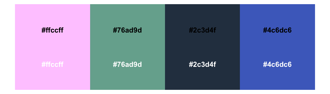
One of my favourite things to do is create colour palettes for clients. On brand, accessible (colourblind and neurodivergent friendly), meaningful in the context of the data stories, and (though I say so myself) nice to look at.
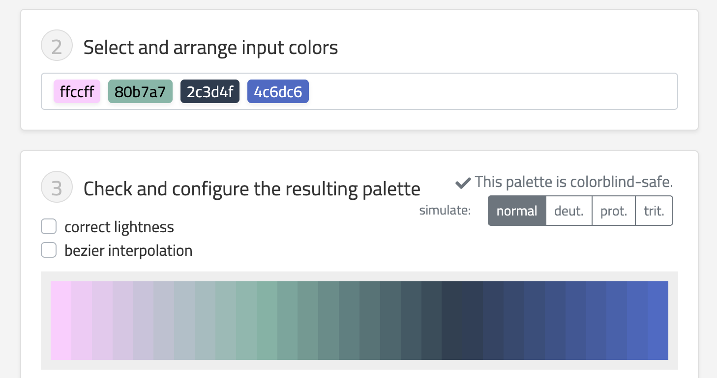
One issue we need to wrestle with is that light colours in a palette aren’t distinguishable against a white/light backdrop. We know that we need a foreground/background ratio of 3:1 for graphical elements, and a sense of panic quickly sets in when we realise this isn’t mathematically possible for more than a handful of colours if we want them to also be easy to distinguish from each other. The light-to-dark variation within the palette is what makes the colour combinations colourblind friendly, but it’s also what makes us fail the 3:1 ratio test.
Thankfully, there’s a relatively straightforward solution! Add a contour. I’ve talked about this in recent presentations, and, as a means of checking I hadn’t made it up, returned Frank Elavsky’s super helpful Chartability Workbook. I highly recommend a read, regardless of what tools you’re using. Frank has really clear illustrations of the issues he addresses, and it’s worth checking your dataviz against the criteria he lays out.
So, what does this look like?
First, an accessible colour palette. We can tell already from the white text that some of the colours are too light to be distinguished from the background.
monochromeR::view_palette(c("#ffccff", "#76ad9d", "#2c3d4f", "#4c6dc6"))
But we know that the colours are colourblind friendly, not only as they stand, but also when we interpolate them:
So, here’s our original graph, where the lighter colours aren’t clear enough against their background.
library(ggplot2)
penguins |>
  ggplot(aes(x = flipper_len, y = bill_len, colour = species)) +
  geom_point(size = 5) +
  scale_colour_manual(
    values = c(
      "Chinstrap" = "#ffccff",
      "Gentoo" = "#76ad9d",
      "Adelie" = "#4c6dc6"
    )
  ) +
  theme_minimal()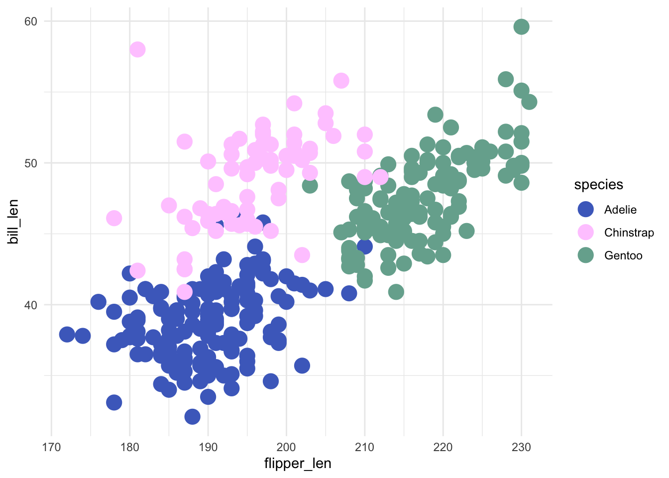
And here it is again with a contour added to the dots, which allows us to use the lighter colours because they are now encapsulated from their background, and maintain the colourblind-friendly palette 🥳.
penguins |>
  ggplot(aes(x = flipper_len, y = bill_len, fill = species)) +
  geom_point(size = 5, shape = 21, colour = "#2c3d4f") +
  scale_fill_manual(
    values = c(
      "Chinstrap" = "#ffccff",
      "Gentoo" = "#76ad9d",
      "Adelie" = "#4c6dc6"
    )
  ) +
  theme_minimal()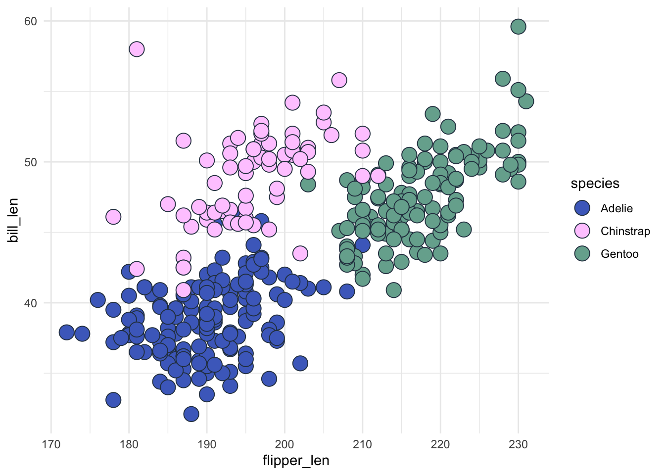
Let’s check that works:
colorblindr::cvd_grid()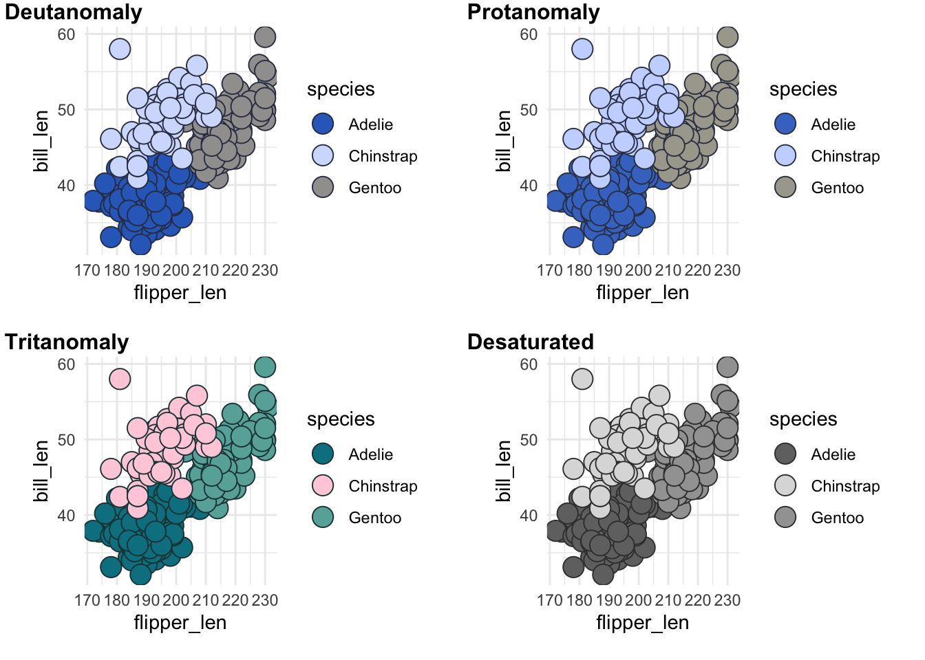
With ggplot2’s theme(geom = element_geom()) we can also set it by default within our custom theme! Note that we can’t just use shape =, we need to use pointshape =. The same applies to how we set a default size for out points.
my_theme <- function() {
  theme_minimal() +
    theme(
      text = element_text(family = "Noah", face = "bold"),
      plot.background = element_rect(fill = "#E7E7F1", colour = "#E7E7F1"),
      plot.margin = margin_auto(11),
      geom = element_geom(
        pointshape = 21,
        pointsize = 5,
        ink = "#2c3d4f"
      ),
      panel.grid = element_line(colour = "white")
    )
}
We can now just use geom_point() and let the theme do the heavy lifting.
penguins |>
  ggplot(aes(x = flipper_len, y = bill_len, fill = species)) +
  geom_point() +
  scale_fill_manual(
    values = c(
      "Chinstrap" = "#ffccff",
      "Gentoo" = "#76ad9d",
      "Adelie" = "#4c6dc6"
    )
  ) +
  my_theme() # This sets the shape, size and contour colour of our dots - no more copy-pasting across graphs!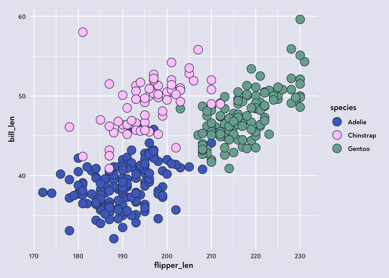
One last thing to check… Does this also apply to bars?
penguins |>
  ggplot(aes(x = island, fill = species)) +
  geom_bar(stat = "count") +
  scale_fill_manual(
    values = c(
      "Chinstrap" = "#ffccff",
      "Gentoo" = "#76ad9d",
      "Adelie" = "#4c6dc6"
    )
  ) +
  my_theme()
Checking this graph with the colorblindr::cvd_grid() helps illustrate the problem. The Chinstraps basically disappear!
colorblindr::cvd_grid()
To fix this, we can either specify a colour for our geom_bar(), or we can add the colour argument to our theme’s geom definitions:
my_theme <- function() {
  theme_minimal() +
    theme(
      text = element_text(family = "Noah", face = "bold"),
      plot.background = element_rect(fill = "#E7E7F1", colour = "#E7E7F1"),
      plot.margin = margin_auto(11),
      geom = element_geom(
        pointshape = 21,
        pointsize = 5,
        ink = "#2c3d4f",
        # This is what we've added 👇
        colour = "#2c3d4f"
      ),
      panel.grid = element_line(colour = "white")
    )
}
Let’s give that another go…
penguins |>
  ggplot(aes(x = island, fill = species)) +
  geom_bar(stat = "count") +
  scale_fill_manual(
    values = c(
      "Chinstrap" = "#ffccff",
      "Gentoo" = "#76ad9d",
      "Adelie" = "#4c6dc6"
    )
  ) +
  my_theme()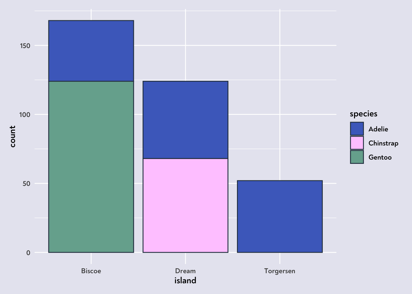
colorblindr::cvd_grid()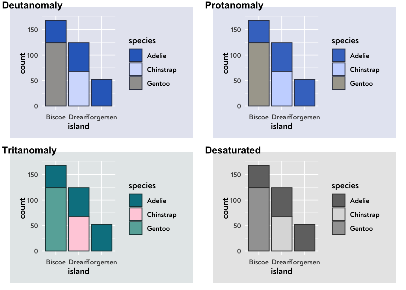
It worked! 🥳
So there we go, an easy fix for applying colourblind-friendly colour combinations to our graphs, and a way to automate it in R and ggplot.
Happy vizzing!
P.S. It is more tricky for spaghetti graphs, but that’s where dataviz design systems come in handy, clarifying which colours can be used for what!