library(tidyverse)

# You will also need to install: ggtext, geomtextpath, bakeoff, systemfonts

# For fonts to work, you need to install them locally. Enriqueta and Cabin
# (used in this demo) and both available on Google Fonts.

# Our colour palette (see slides for how we landed here!)
vit_c_palette <- c("Vitamin C" = "#E93603",
                   "Orange Juice" = "#fab909",
                   light_text = "#323A30",
dark_text = "#0C1509")Using colour and annotations for effective storytelling
data-visualisation
storytelling
annotations
ggplot2
r-how-to
Workshops for Ukraine | A 2-hour code-along workshop
The aim of this workshop, delivered as part of the Workshops for Ukraine series was to equip attendees with some design tips and coding tricks to enhance the storytelling capabilities of their plots.
Recording
The recording is accessible via the Workshops for Ukraine page, for a donation of 20 Euros towards one of the charities linked to this initiative. For full details, please visit the link and scroll to “Previous Workshops”.
Slides
Flick through the slides to watch how the plots evolved as we applied these principles to visualising the ToothGrowth dataset (build into R for easy code-alongability!). Follow the links at the bottom of the slides for stuff we didn’t have time to cover in depth!
Full code
Setting things up
Bar graph
ToothGrowth %>%
mutate(supplement = case_when(supp == "OJ" ~ "Orange Juice",
supp == "VC" ~ "Vitamin C",
TRUE ~ as.character(supp))) %>%
group_by(supplement, dose) %>%
summarise(mean_length = mean(len)) %>%
mutate(categorical_dose = factor(dose)) %>%
ggplot(aes(x = categorical_dose,
y = mean_length,
fill = supplement)) +
geom_bar(aes(alpha = dose),
stat = "identity",
colour = "#FFFFFF",
size = 2) +
scale_alpha(range = c(0.33, 1)) +
coord_flip() +
facet_wrap(supplement ~ ., ncol = 1) +
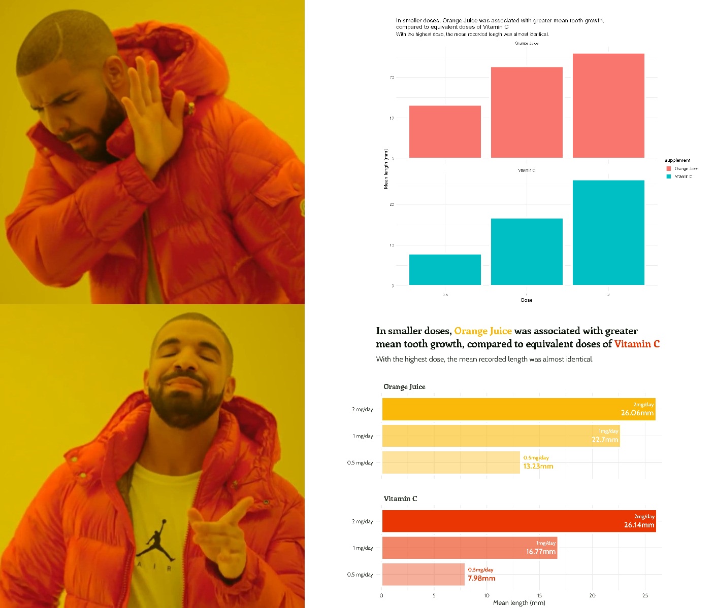
labs(y = "Mean length of odontobast cells (mm)",
title = paste0("In smaller doses, <span style='color:",
vit_c_palette["Orange Juice"], "'>Orange Juice</span>
was associated with greater mean tooth growth,
compared to equivalent doses of <span style='color:",
vit_c_palette["Vitamin C"], "'>Vitamin C</span>"),
subtitle = "With the highest dose, the mean recorded length was almost identical.") +
ggtext::geom_textbox(aes(
label = paste0("<span style=font-size:9pt>", dose, "mg/day</span><br>", mean_length, "mm"),
hjust = case_when(mean_length < 15 ~ 0,
TRUE ~ 1),
halign = case_when(mean_length < 15 ~ 0,
TRUE ~ 1),
colour = case_when(mean_length > 15 ~ "#FFFFFF",
TRUE ~ vit_c_palette[supplement])),
fill = NA,
fontface = "bold",
box.colour = NA,
family = "Cabin") +
scale_colour_identity() +
scale_fill_manual(values = vit_c_palette) +
scale_x_discrete(breaks = c("0.5", "1", "2"), labels = function(x) paste0(x, " mg/day")) +
scale_y_continuous(expand = c(0, 0.5)) +
theme_minimal(base_size = 14) +
theme(legend.position = "none",
axis.title.y = element_blank(),
axis.title.x = element_text(face = "bold"),
text = element_text(family = "Cabin", colour = vit_c_palette["light_text"]),
plot.title = ggtext::element_textbox_simple(family = "Enriqueta", size = rel(1.5), lineheight = 1.3,
margin = margin(0.5, 0, 1, 0, "lines"),
face = "bold",
halign = 0, colour = vit_c_palette["dark_text"]),
plot.subtitle = ggtext::element_textbox_simple(family = "Cabin", size = rel(1.1), lineheight = 1.3,
margin = margin(0, 0, 1, 0, "lines"),
halign = 0),
strip.text = element_text(family = "Enriqueta", face = "bold",
hjust = 0.03,
size = rel(1.1), margin = margin(2, 0, 0.5, 0, "lines"),
colour = vit_c_palette["light_text"]),
panel.grid = element_blank())Scatterplot
# To pick the same names every time within the sample() call below
set.seed(2302)

ToothGrowth %>%
  mutate(guinea_pig_name = sample(unique(bakeoff::bakers$baker), 60),
         supplement = case_when(supp == "OJ" ~ "Orange Juice",
                                supp == "VC" ~ "Vitamin C",
                                TRUE ~ as.character(supp))) %T>%
  {
    {
      # Double assign to jump out of the pipe!
      min_max_gps <<- group_by(., supplement, dose) %>%
        filter(., len == min(len) | len == max(len)) %>%
        mutate(min_or_max = case_when(len == max(len) ~ "max",
                                      TRUE ~ "min"))
    }
  } %>%
  ggplot(aes(x = dose, y = len, fill = supplement,
             colour = supplement)) +
  geom_point(shape = 21,
             colour = "#FFFFFF",
             size = 5,
             alpha = 0.8) +
  labs(x = "Dose",
       y = "Length (mm)",
       title = "Increased dose was associated with greater tooth growth across both Orange Juice and Vitamin C, with diminishing returns for Vitamin C.",
       subtitle = "Vitamin C was also associated with greater variability at the highest dose.") +
  geomtextpath::geom_textline(stat = "smooth", aes(label = supplement),
                              hjust = 0.1,
                              vjust = 0.3,
                              fontface = "bold",
                              family = "Cabin") +
  ggtext::geom_textbox(data = filter(min_max_gps,
                                     dose == 2),
                       aes(x = case_when(dose < 1.5 ~ dose + 0.05,
                                         TRUE ~ dose - 0.05),
                           y = case_when(min_or_max  == "max"~ len * 1.1,
                                         TRUE ~ len * 0.9),
                           label = paste0("**<span style='font-family:Enriqueta'>", guinea_pig_name,
                                          "</span>** - ", len, " mm"),
                           hjust = case_when(dose < 1.5 ~ 0,
                                             TRUE ~ 1),
                           halign = case_when(dose < 1.5 ~ 0,
                                              TRUE ~ 1)),
                       family = "Cabin",
                       size = 4,
                       fill = NA,
                       box.colour = NA) +
  geom_curve(data = filter(min_max_gps,
                           dose == 2 &
                             min_or_max == "max"),
             aes(x = case_when(dose < 1.5 ~ dose + 0.05, TRUE ~ dose - 0.05),
                 y = case_when(min_or_max  == "max"~ len * 1.1, TRUE ~ len * 0.9),
                 xend = case_when(dose < 1.5 ~ dose + 0.02, TRUE ~ dose - 0.02),
                 yend = case_when(min_or_max  == "max"~ len + 0.5,TRUE ~ len - 0.5)),
             curvature = -0.1,
             arrow = arrow(length = unit(0.1, "cm")),
             alpha = 0.5) +
  geom_curve(data = filter(min_max_gps,
                           dose == 2 &
                             min_or_max == "min"),
             aes(x = case_when(dose < 1.5 ~ dose + 0.05, TRUE ~ dose - 0.05),
                 y = case_when(min_or_max  == "max"~ len * 1.1, TRUE ~ len * 0.9),
                 xend = case_when(dose < 1.5 ~ dose + 0.02, TRUE ~ dose - 0.02),
                 yend = case_when(min_or_max  == "max"~ len + 0.5, TRUE ~ len - 0.5)),
             curvature = 0.1,
             arrow = arrow(length = unit(0.1, "cm")),
             alpha = 0.5) +
  scale_colour_manual(values = vit_c_palette) +
  scale_x_continuous(breaks = c(0.5, 1.0, 2.0), labels = function(x) paste0(x, " mg/day")) +
  scale_fill_manual(values = vit_c_palette) +
  scale_fill_manual(values = vit_c_palette) +
  theme_minimal() +
  theme(legend.position = "none",
        text = element_text(family = "Cabin", colour = vit_c_palette["light_text"]),
        plot.title = ggtext::element_textbox_simple(family = "Enriqueta", size = 16, face = "bold",
                                                    lineheight = 1.3,
                                                    margin = margin(0.5, 0, 1, 0, "lines"),
                                                    halign = 0, colour = vit_c_palette["dark_text"]),
        plot.subtitle = ggtext::element_textbox_simple(family = "Cabin", size = 12, lineheight = 1.3,
                                                       margin = margin(0, 0, 1, 0, "lines"),
                                                       halign = 0.9),
        axis.text = element_text(family = "Cabin", colour = vit_c_palette["light_text"]),
        axis.title = element_text(face = "bold"),
        strip.text = element_text(family = "Enriqueta", face = "bold",
                                  hjust = 0.03,
                                  size = 12, margin = margin(2, 0, 0, 0, "lines"),
                                  colour = vit_c_palette["light_text"]),
        panel.grid = element_line(colour = "#F0F0F0"))
Reuse
Citation
For attribution, please cite this work as:
Thompson, Cara. 2023. “Using Colour and Annotations for Effective
Storytelling.” April 20, 2023. https://www.cararthompson.com/talks/colour-and-annotations/.