My contribution to the RSS panel on Accessibility at the 2025 RSS Conference in Edinburgh.
Published
September 4, 2025
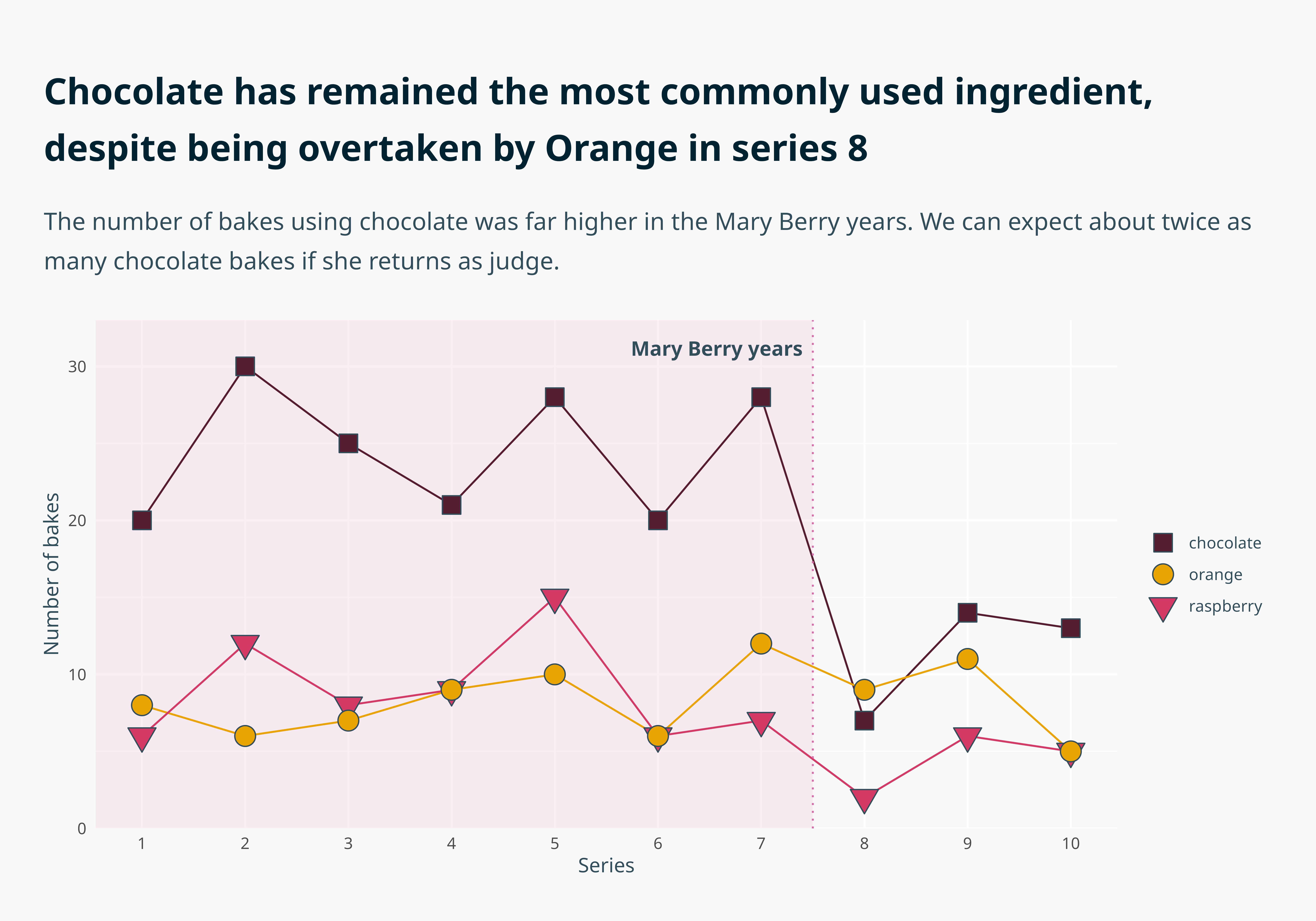
In this talk we take a “basic but functional” graph and improve it in 10 successive ways, illustrating how accessibility and creativity go hand in hand in crafting intuitive data visualisations. These are the steps I go through in developing dataviz design systems for my clients, which allow them to apply accessibility principles in creating on-brand publication-ready graphs with just a two extra lines of code.
The talk was delivered in person, but I decided to re-record it here. Below, I’ve listed the ten steps, the tools I highlighted, and the supporting evidence.
This list is a combination of 🛠️ resources and 📚 further reading. These are my go-to resources when building bespoke Dataviz Design Systems for my clients. For this graph, we used data from the 📦 {bakeoff}.
Note that for the text to look like this when you run the code, you’ll need to have installed Noto Sans on your device. Here’s a blog post to help you do that and get it working nicely within R!
Code
library(tidyverse)# Organise the dataall_the_bakes <- bakeoff::challenges |>select(-technical) |>pivot_longer(c(signature, showstopper)) |>group_by(series) |>mutate(chocolate_count =sum(grepl("[Cc]hocolat", value)),raspberry_count =sum(grepl("[Rr]aspberr", value)),orange_count =sum(grepl("[Oo]range", value)) ) |>select(series, chocolate_count, raspberry_count, orange_count) |>unique() |>pivot_longer(-series) |>mutate(rank =rank(-value, ties.method ="min"),mary_berry =case_when(series <8~"yes", TRUE~"no") ) |>pivot_wider(names_from = name, values_from =c(rank, value)) |>rename(choc_bakes = value_chocolate_count,rasp_bakes = value_raspberry_count,orange_bakes = value_orange_count ) |>select(series, mary_berry, choc_bakes, rasp_bakes, orange_bakes) |>pivot_longer(-c(series, mary_berry))# Set up the coloursbranded_palette <-c("chocolate"="#561c2f","orange"="#e9a403","raspberry"="#d33b66","mary"="#f0c9df")# Make the graphall_the_bakes |>mutate(name =case_when(grepl("choc", name) ~"chocolate",grepl("orange", name) ~"orange",grepl("rasp", name) ~"raspberry" ) ) |>ggplot(aes(x = series,y = value,colour = name,fill = name )) +annotate(geom ="rect",xmin =-Inf,xmax =7.5,ymin =-Inf,ymax =Inf,fill = branded_palette["mary"],alpha =0.3 ) +geom_line(show.legend =FALSE) +geom_vline(xintercept =7.5, linetype =3, colour ="#d76ea9") + ggtext::geom_textbox(data =data.frame(),aes(x =7.5, y =31, label ="**Mary Berry years**"),hjust =1,halign =1,box.colour =NA,colour ="#324e5a",family ="Noto Sans",fill =NA ) +geom_point(aes(shape = name), size =5, colour ="#324e5a") +labs(title ="**Chocolate has remained the most commonly used ingredient, despite being overtaken by Orange in series 8**",subtitle ="The number of bakes using chocolate was far higher in the Mary Berry years. We can expect about twice as many chocolate bakes if she returns as judge.",x ="Series",y ="Number of bakes" ) +scale_shape_manual(values =c("chocolate"=22, "orange"=21, "raspberry"=25), ) +scale_fill_manual(values = branded_palette) +scale_colour_manual(values = branded_palette) +scale_y_continuous(limits =c(0, 31), expand =expansion(add =c(0, 2))) +scale_x_continuous(breaks =c(1:10)) +theme_minimal() +theme(text =element_text(family ="Noto Sans", colour ="#324e5a"),plot.title.position ="plot",plot.title = marquee::element_marquee(width =1,margin =margin(c(12, 0, 12, 0)),size =rel(1.8),lineheight =1.15,family ="Noto Sans",colour ="#002332" ),plot.subtitle = marquee::element_marquee(width =1,vjust =0,size =rel(1.2),family ="Noto Sans",colour ="#324e5a",lineheight =1.2,margin =margin(c(6, 0, 24, 0)) ),legend.title =element_blank(),panel.grid =element_line(colour ="white"),panel.grid.minor.x =element_blank(),plot.margin =margin(rep(24, 4)),plot.background =element_rect(fill ="#f8f8f8", colour ="#f8f8f8") )