systemfonts::system_fonts()Getting fonts to work in R
data-visualisation
annotations
r-how-to
ggplot2
Getting fonts to work in R and RStudio can be tricky! This post walks through the different steps we need to follow to give ourselves the best chance of success.
I’ve talked about choosing fonts and optimising text hierarchy in a several workshops recently, but in crafting documentation for a client whose visualisations require a font which isn’t typically installed as a default on a user’s computer, I found myself retracing the steps I’ve taken in my projects to get new fonts to work. For me, 2023 was the year of finally getting fonts to work smoothly 99% of the time in R (there’s always an exception!), so I thought I’d share this step-by-step guide more widely, in the hope of saving others a lot of the font frustration I experienced in getting to this point.
Let’s go!
Choose a font
I won’t go into detail on what makes a good dataviz font here, because I’ve talked about that elsewhere and this article is about the mechanics of getting a chosen font into your visualisations, but here are a quick few tips to get you going:
- Make sure it reads well when the letters are small (try squinting at the letters
ceo- do they look distinct enough?) - Make sure it is neither too wide (takes too long to look across all the information you need to see at once) nor too narrow (everything looks a bit cramped together and you’ll struggle with the
ceotask) - Make sure the font has additional readability features such as
qpanddbnot being perfect mirror images, andI1l(capital i, number 1, small l) are distinct from each other - Make sure it looks on-brand for you! Whether that’s super serious, super quirky, or somewhere in between, fonts are an easy way to add a bit of personality to your visualisations.
For this post, I’m using the Karla font family. It has a modern feel, and the letters are nicely spaced out which makes it a good fit for small text in dataviz and tables.
Check {systemfonts} is installed
The world of fonts in R has changed quite substantially over the last few years. The current received wisdom is to use {systemfonts}. So that’s step 1. An easy way to check it is installed is to try to use it. Type:
This should bring up with a tibble in your console output showing you which fonts are installed on your device. If that didn’t work, or you got a message saying there is no package called ‘systemfonts’, then you need to install it:
install.packages("systemfonts")It will ask you about dependencies. Say yes. You need to install the packages that {systemfonts} depends on.
Check the font you want to use is installed
Now that we’re sure {systemfonts} is installed, we can use it to check we have the font we need. Type:
systemfonts::system_fonts() |> View()This should bring up a dataframe for you to look at. Use the search bar to look for your font (in this case, we’re looking for “Karla”).
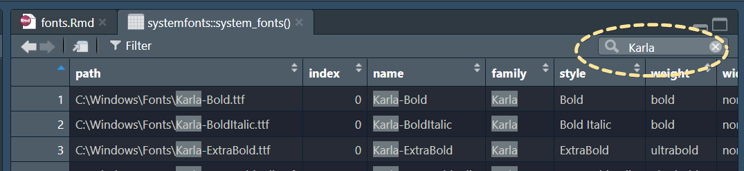
If you don’t find the font there, you need to install it. If it’s a google font, navigate to Google Fonts, search for the font, select it to go to its own page, and click on “Download family”. Once it has downloaded, unzip the file, select all the .ttf files and, if you’re on a Windows device, right click and select “Install for all users”. If you’re on a mac, follow this guide. R tends to play nicer with .ttf fonts than other types of fonts. There are ways round that, but things will be easier if you choose a static font that has .ttf files!
Restart RStudio, and try to search for your font again, as we did above using systemfonts::system_fonts() |> View(). It should now be there! The dataframe gives us additional information about font properties such as weight, width and style (which can be called different things across Windows and Mac devices - we’ll come back to that).
Set your graphics device to AGG
In your Global options, navigate to your graphics options, and set the graphics device to AGG using the dropdown menu.
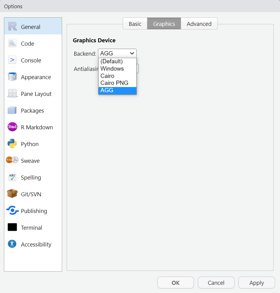
Your font should now render nicely within your RStudio plot viewer pane when you create a plot using your specified font. Let’s give it a go.
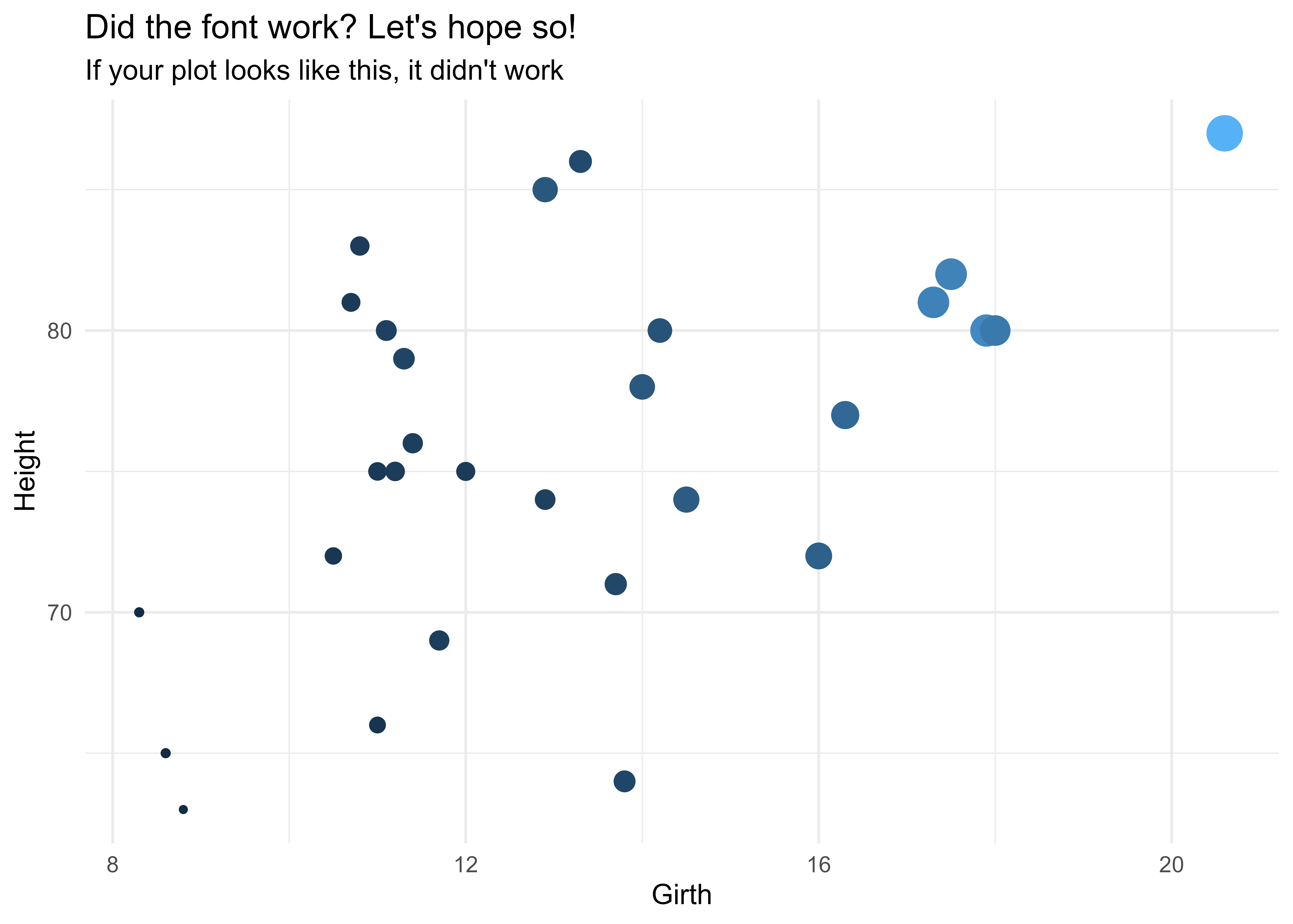
library(ggplot2)
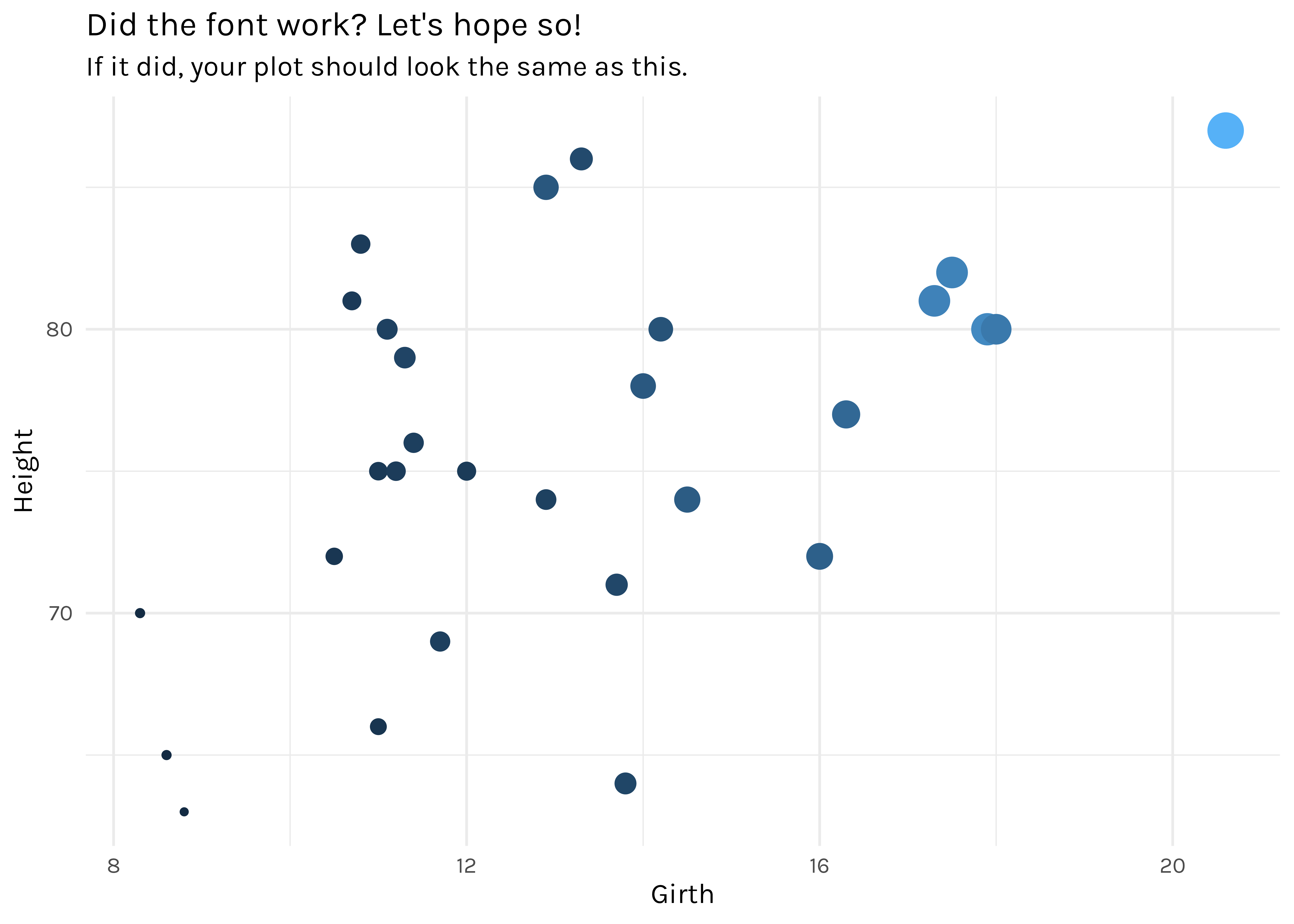
trees |>
ggplot(aes(x = Girth, y = Height, size = Volume, colour = Volume)) +
geom_point() +
labs(
title = "Did the font work? Let's hope so!",
subtitle = "If it did, your plot should look the same as this."
) +
theme_minimal() +
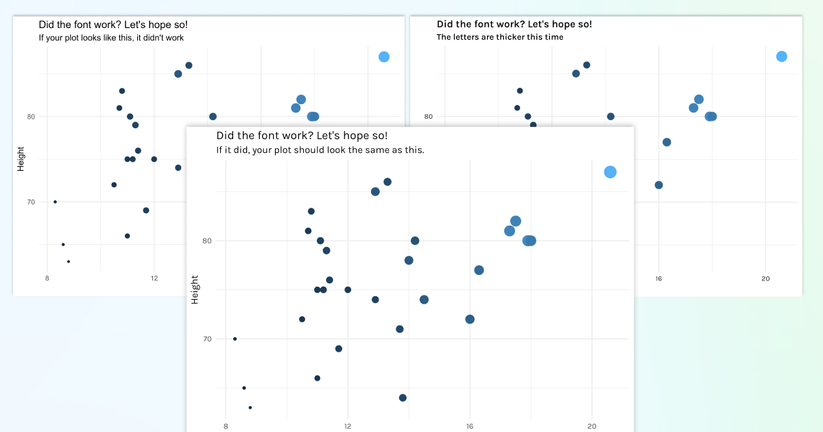
theme(text = element_text(family = "Karla"), legend.position = "none")Here what that should look like…
And here is the same graph with the default ggplot fonts, which would indicate the font you chose didn’t get used…
Check everything works when you ggsave()
At this point, your font should be working nicely in your Plot panel in RStudio. You also want it to work when you export a plot using ggsave(). The steps above should mean that it already does, but let’s check that!
In exporting plot, I recommend using a resolution of 300 or higher (I typically go with 400). Remember to also give your plots a background, otherwise they are transparent (take a look at a plot you’ve exported while you’re using dark mode and you’ll see what I mean). Here, I have gone for a white background ("#FFFFFF").
ggsave(
  filename = "path/to/file.png",
  dpi = 400,
  height = 5,
  width = 8,
  bg = "#FFFFFF"
)
In .Rmd and .qmd files, also set the graphics device within the file!
This was the bit that took me the longest to figure out. I could get plots to look great within the viewer panel, and when I exported them, but when I compiled the document they were in, they just reverted back to default fonts. Gah! Thankfully, there’s an easy fix, once you know - phew!
If you are creating plots directly within an RMarkdown (.Rmd) or a Quarto file (.qmd), you also need to specify the graphics device within your knitr::opts_chunk$set() at the start of the file. I typically do this within my first r code chunk:
knitr::opts_chunk$set(
  echo = TRUE,
  ..., # any other options you want to specify
  dev = "ragg_png",
  dpi = 400,
)
Register font variants
If you’ve decided to use a font variant (e.g. “Karla Medium”), there’s another step we need to take to get it to work. In our case, I actually chose the semibold weight, because the medium weight wasn’t heavy enough. I’m telling my device to name Karla in semibold weight “Karla Medium”. We can call it “Custom Font” or anything we like, but calling it “Karla Medium” makes things clearer when we’re writing code!
systemfonts::register_variant(
  name = "Karla Medium",
  family = "Karla",
  weight = "semibold"
)
This means I can then use this “Karla Medium” font for visualisations. See how the font is heavier than in the previous example.
trees |>
  ggplot(aes(x = Girth, y = Height, size = Volume, colour = Volume)) +
  geom_point() +
  labs(
    title = "Did the font work? Let's hope so!",
    subtitle = "The letters are thicker this time"
  ) +
  theme_minimal() +
  theme(text = element_text(family = "Karla Medium"), legend.position = "none")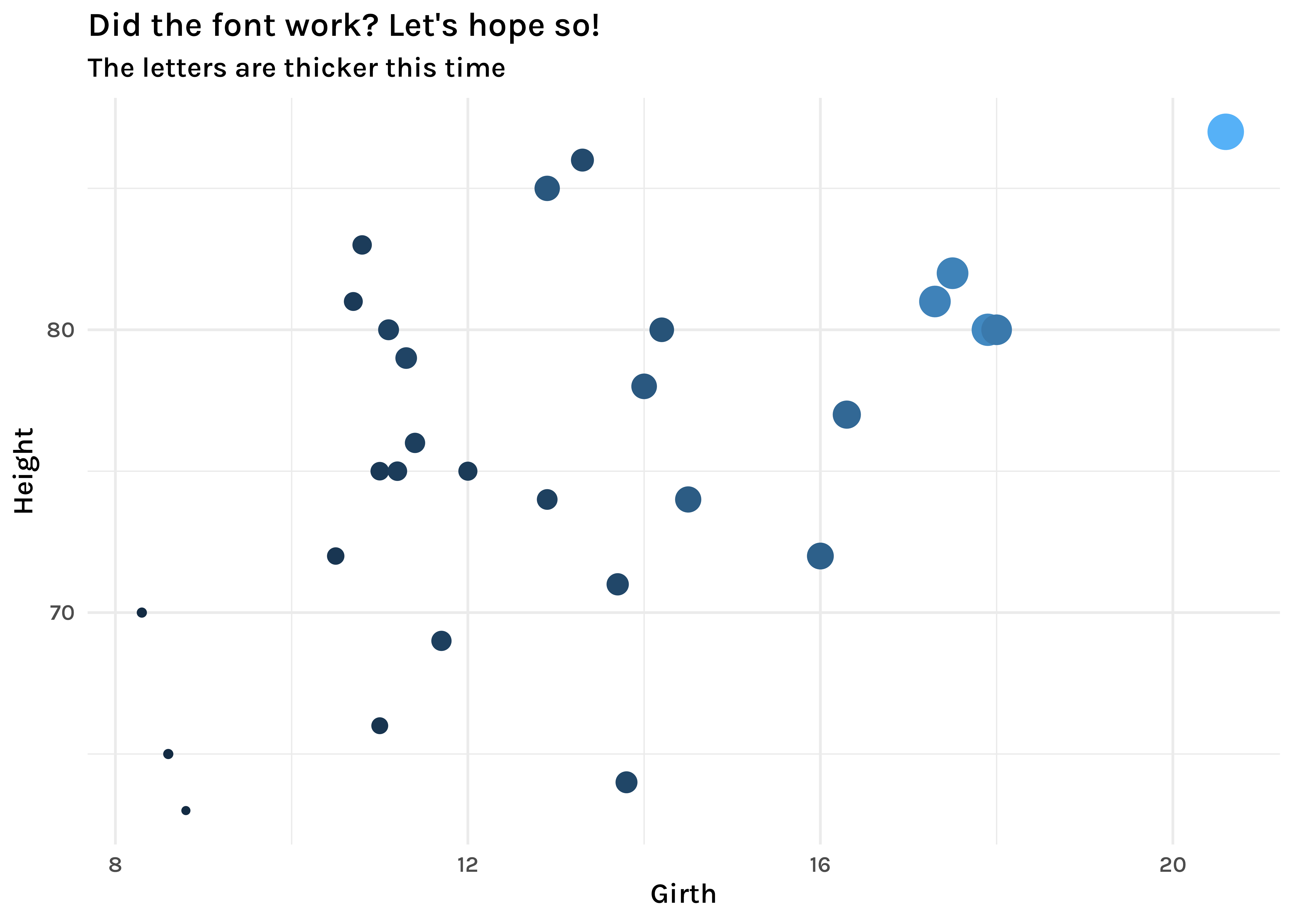
We need to do this font registering step whenever we want to use the font. I’ve either done that via an .onLoad() function within packages I’ve created for my clients, or popped the font-registering line of code at the start of a script / qmd file where I know I’m going to need it.
If the “semibold” font weight isn’t working, we need to look at what that weight is called in your system. Use systemfonts::system_fonts() |> View() to bring up the fonts dataframe again, and take a look at the weight column for the Karla family to see if we need to make a change to how we point systemfonts to it within the register_variant() call. Once you have aligned what you’re calling with weight with what it’s called on your device, you should be good to go!
If you’ve got this far, and your chosen font still doesn’t work, give me a shout and we’ll add a section to this post once we’ve figured out why together!
Additional resources
In creating this post, I’m indebted to June Choe for his work in demystifying fonts. He has a great blog post with lots of other fun font tricks to explore.
I’m also grateful for the patience and perseverance of David Keyes and the band of merry consultants at R for the Rest of Us for all the troubleshooting we have done over the years to get fonts to work across different devices for different client projects. David’s upcoming book “R Without Statistics” is sure to be a great resource!
If you are looking for font inspiration for your next project, I highly recommend Oliver Schöndorfer’s resources. Designing for dataviz is similar to designing for UI: readability is key, and we need to make the most of text hiearchy.
Finally, if you want to see for yourself the difference that paying attention to typography makes in visualisations and tables, I gave a talk about it at the 2023 Shiny in Production conference, which you can rewatch here for some before/after comparisons using data from the Great British Bake Off. The slides are also on this page - feel free to reuse as much of the code as you like!
Reuse
Citation
For attribution, please cite this work as:
Thompson, Cara. 2024. “Getting Fonts to Work in R.” January
12, 2024. https://www.cararthompson.com/posts/2024-01-12-using-fonts-in-R-for-dataviz/.