library(tidyverse)

# You wil also need to install: ggtext, geomtextpath, bakeoff, systemfonts

# For fonts to work, you need to install them locally. Enriqueta and Cabin
# (used in this demo) and both available on Google Fonts.

# Our colour palette (see slides for how we landed here!)
vit_c_palette <- c("Vitamin C" = "#E93603",
                   "Orange Juice" = "#fab909",
                   light_text = "#323A30",
dark_text = "#0C1509")Beautifully Annotated: Enhancing your ggplots with Text
data-visualisation
r-how-to
annotations
parameterised-plots
R-Ladies Cambridge | Inaugural lunchtime dataviz meetup
In this talk, I cover five tips and a bonus track for making good use of annotations in ggplots. Here’s the outcome, for which you can find the code below!
TLDR? Here are my five tips:
- Use colour and orientation purposefully to be less dependent on annotations
- Add text hierarchy to direct your readers to the main story
- Reduce unnecessary eye movement, making use of conditional alignments
- Highlight important patterns with textboxes and arrows
- See how much you can declutter
Follow the links at the bottom of the slides for stuff we didn’t have time to cover in depth!
Slides
Full code
Setting things up
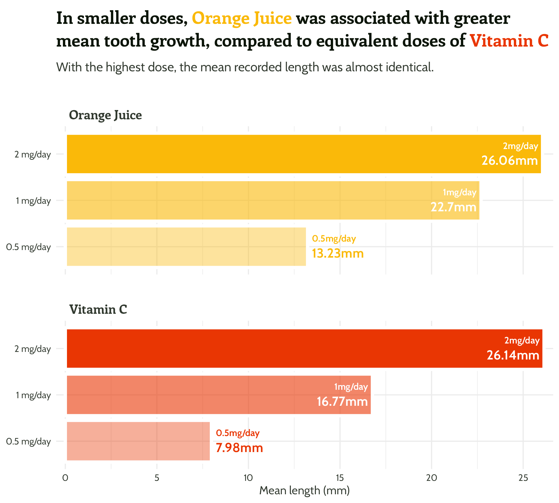
Bar graph
ToothGrowth %>%
mutate(supplement = case_when(supp == "OJ" ~ "Orange Juice",
supp == "VC" ~ "Vitamin C",
TRUE ~ as.character(supp))) %>%
group_by(supplement, dose) %>%
summarise(mean_length = mean(len)) %>%
mutate(categorical_dose = factor(dose)) %>%
ggplot(aes(x = categorical_dose,
y = mean_length,
fill = supplement)) +
geom_bar(aes(alpha = dose),
stat = "identity",
position = "dodge",
colour = "#FFFFFF",
size = 2) +
scale_alpha(range = c(0.33, 1)) +
coord_flip() +
facet_wrap(supplement ~ ., ncol = 1) +
labs(y = "Mean length of odontobast cells (mm)",
title = paste0("In smaller doses, <span style='color:",
vit_c_palette["Orange Juice"], "'>Orange Juice</span>
was associated with greater mean tooth growth,
compared to equivalent doses of <span style='color:",
vit_c_palette["Vitamin C"], "'>Vitamin C</span>"),
subtitle = "With the highest dose, the mean recorded length was almost identical.") +
ggtext::geom_textbox(aes(
label = paste0("<span style=font-size:9pt>", dose, "mg/day</span><br>", mean_length, "mm"),
hjust = case_when(mean_length < 15 ~ 0,
TRUE ~ 1),
halign = case_when(mean_length < 15 ~ 0,
TRUE ~ 1),
colour = case_when(mean_length > 15 ~ "#FFFFFF",
TRUE ~ vit_c_palette[supplement])),
fill = NA,
fontface = "bold",
box.colour = NA,
family = "Cabin") +
scale_colour_identity() +
scale_fill_manual(values = vit_c_palette) +
scale_x_discrete(breaks = c("0.5", "1", "2"), labels = function(x) paste0(x, " mg/day")) +
scale_y_continuous(expand = c(0, 0.5)) +
theme_minimal(base_size = 14) +
theme(legend.position = "none",
axis.title.y = element_blank(),
axis.title.x = element_text(face = "bold"),
text = element_text(family = "Cabin", colour = vit_c_palette["light_text"]),
plot.title = ggtext::element_textbox_simple(family = "Enriqueta", size = rel(1.5), lineheight = 1.3,
margin = margin(0.5, 0, 1, 0, "lines"),
face = "bold",
halign = 0, colour = vit_c_palette["dark_text"]),
plot.subtitle = ggtext::element_textbox_simple(family = "Cabin", size = rel(1.1), lineheight = 1.3,
margin = margin(0, 0, 1, 0, "lines"),
halign = 0),
strip.text = element_text(family = "Enriqueta", face = "bold",
hjust = 0.03,
size = rel(1.1), margin = margin(2, 0, 0.5, 0, "lines"),
colour = vit_c_palette["light_text"]),
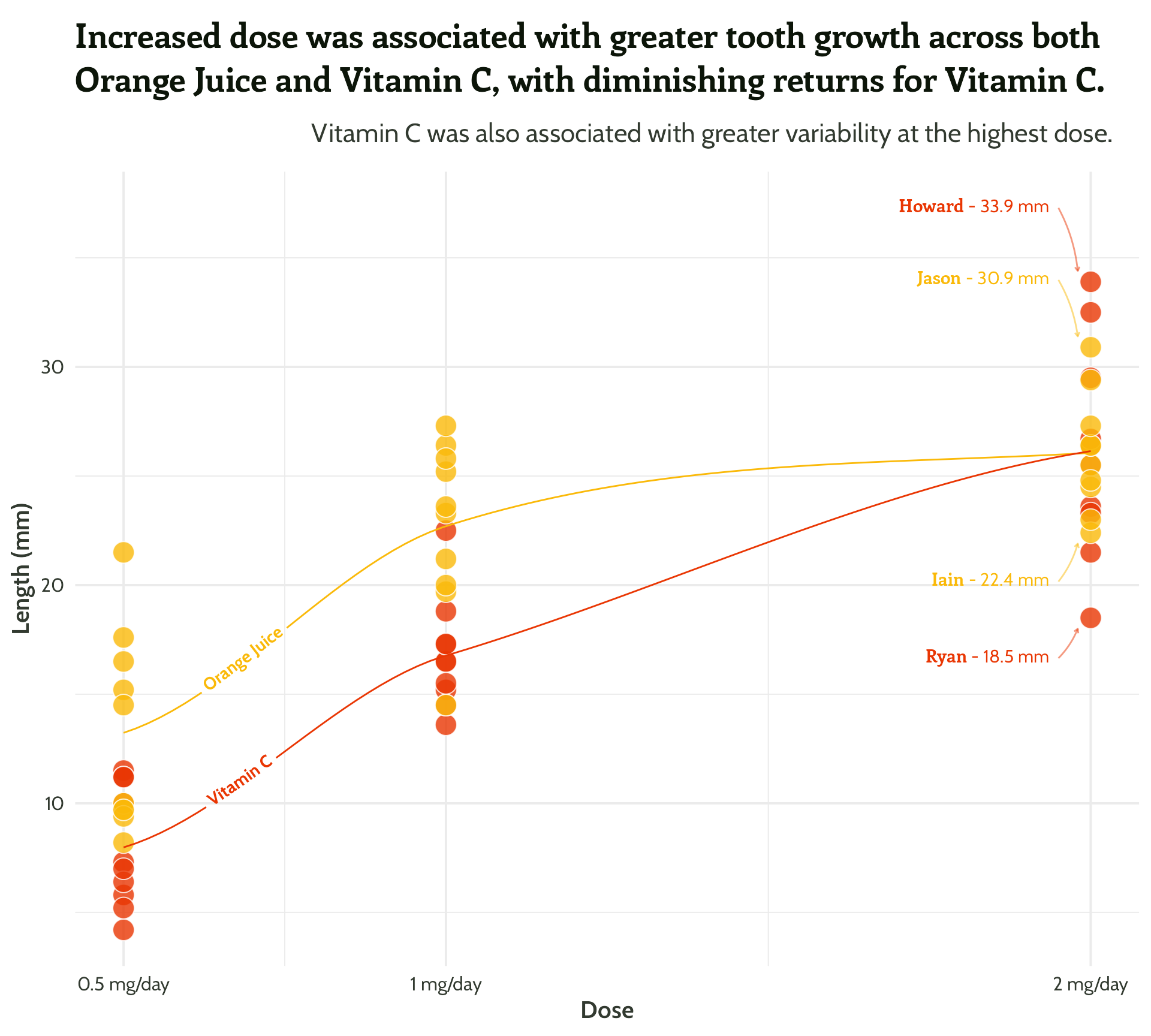
panel.grid = element_blank())Scatterplot
# To pick the same names every time within the sample() call below
set.seed(2302)

ToothGrowth %>%
  mutate(guinea_pig_name = sample(unique(bakeoff::bakers$baker), 60),
         supplement = case_when(supp == "OJ" ~ "Orange Juice",
                                supp == "VC" ~ "Vitamin C",
                                TRUE ~ as.character(supp))) %T>%
  {
    {
      # Double assign to jump out of the pipe!
      min_max_gps <<- group_by(., supplement, dose) %>%
        filter(., len == min(len) | len == max(len)) %>%
        mutate(min_or_max = case_when(len == max(len) ~ "max",
                                      TRUE ~ "min"))
    }
  } %>%
  ggplot(aes(x = dose, y = len, fill = supplement,
             colour = supplement)) +
  geom_point(shape = 21,
             colour = "#FFFFFF",
             size = 5,
             alpha = 0.8) +
  labs(x = "Dose",
       y = "Length (mm)",
       title = "Increased dose was associated with greater tooth growth across both Orange Juice and Vitamin C, with diminishing returns for Vitamin C.",
       subtitle = "Vitamin C was also associated with greater variability at the highest dose.") +
  geomtextpath::geom_textline(stat = "smooth", aes(label = supplement),
                              hjust = 0.1,
                              vjust = 0.3,
                              fontface = "bold",
                              family = "Cabin") +
  ggtext::geom_textbox(data = filter(min_max_gps,
                                     dose == 2),
                       aes(x = case_when(dose < 1.5 ~ dose + 0.05,
                                         TRUE ~ dose - 0.05),
                           y = case_when(min_or_max  == "max"~ len * 1.1,
                                         TRUE ~ len * 0.9),
                           label = paste0("**<span style='font-family:Enriqueta'>", guinea_pig_name,
                                          "</span>** - ", len, " mm"),
                           hjust = case_when(dose < 1.5 ~ 0,
                                             TRUE ~ 1),
                           halign = case_when(dose < 1.5 ~ 0,
                                              TRUE ~ 1)),
                       family = "Cabin",
                       size = 4,
                       fill = NA,
                       box.colour = NA) +
  geom_curve(data = filter(min_max_gps,
                           dose == 2 &
                             min_or_max == "max"),
             aes(x = case_when(dose < 1.5 ~ dose + 0.05, TRUE ~ dose - 0.05),
                 y = case_when(min_or_max  == "max"~ len * 1.1, TRUE ~ len * 0.9),
                 xend = case_when(dose < 1.5 ~ dose + 0.02, TRUE ~ dose - 0.02),
                 yend = case_when(min_or_max  == "max"~ len + 0.5,TRUE ~ len - 0.5)),
             curvature = -0.1,
             arrow = arrow(length = unit(0.1, "cm")),
             alpha = 0.5) +
  geom_curve(data = filter(min_max_gps,
                           dose == 2 &
                             min_or_max == "min"),
             aes(x = case_when(dose < 1.5 ~ dose + 0.05, TRUE ~ dose - 0.05),
                 y = case_when(min_or_max  == "max"~ len * 1.1, TRUE ~ len * 0.9),
                 xend = case_when(dose < 1.5 ~ dose + 0.02, TRUE ~ dose - 0.02),
                 yend = case_when(min_or_max  == "max"~ len + 0.5, TRUE ~ len - 0.5)),
             curvature = 0.1,
             arrow = arrow(length = unit(0.1, "cm")),
             alpha = 0.5) +
  scale_colour_manual(values = vit_c_palette) +
  scale_x_continuous(breaks = c(0.5, 1.0, 2.0), labels = function(x) paste0(x, " mg/day")) +
  scale_fill_manual(values = vit_c_palette) +
  scale_fill_manual(values = vit_c_palette) +
  theme_minimal() +
  theme(legend.position = "none",
        text = element_text(family = "Cabin", colour = vit_c_palette["light_text"]),
        plot.title = ggtext::element_textbox_simple(family = "Enriqueta", size = 16, face = "bold",
                                                    lineheight = 1.3,
                                                    margin = margin(0.5, 0, 1, 0, "lines"),
                                                    halign = 0, colour = vit_c_palette["dark_text"]),
        plot.subtitle = ggtext::element_textbox_simple(family = "Cabin", size = 12, lineheight = 1.3,
                                                       margin = margin(0, 0, 1, 0, "lines"),
                                                       halign = 0.9),
        axis.text = element_text(family = "Cabin", colour = vit_c_palette["light_text"]),
        axis.title = element_text(face = "bold"),
        strip.text = element_text(family = "Enriqueta", face = "bold",
                                  hjust = 0.03,
                                  size = 12, margin = margin(2, 0, 0, 0, "lines"),
                                  colour = vit_c_palette["light_text"]),
        panel.grid = element_line(colour = "#F0F0F0"))
Reuse
Citation
For attribution, please cite this work as:
Thompson, Cara. 2023. “Beautifully Annotated: Enhancing Your
Ggplots with Text.” February 23, 2023. https://www.cararthompson.com/talks/rl-cambridge-beautifully-annotated/.