Building a Dataviz Design System for a Medical Research Project
RMedicine 2023 | Lightening talk
A dataviz design system is a bespoke set of colours, fonts, and rules, which can be combined to create data visualisations with a consistent aesthetic, taking into account colour semantics, accessibility, and design principles to help the stories in the data stand out.
This lightening talk gives a “behind-the-scenes” glimpse of what was involved in creating a dataviz design system, and implementing it as an R package, for the Ophelia research project, led by Dr Claire Meek.
The end product was a bespoke R package — {ophelia} — which the team can install from a private GitHub repo and use to easily create publication-ready Ophelia-styled graphs, ensuring a clear visual identity across authors, papers, reports and conference talks.
Recording
Find out more
This is about so much more than pretty graphs. Aside from saving time deciding which colours and fonts to use, and repeatedly testing for clarity and accessibility, a dataviz design system brings a consistent visual identity to the visualisations associated with a project across all the different publication outlets.
When implemented as an R package, a dataviz design system allows a team in which people are able to create a basic ggplot to create publication-ready plots with just two extra lines of code. You can read the package documentation here to see a few examples of how to create plots using this package.
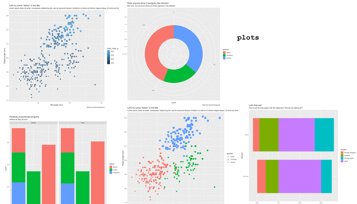
These are one of my favourite things to create, combining creativity with constraints to help data-driven teams maximise the visual impact of their work. If you’d like to find out more about the process, feel free to get in touch at hello@cararthompson.com. I’d love to hear from you!