# Load ggplot
library(ggplot2)

# Create a custom theme
theme_penguins <- function() {
  theme_minimal() +
    theme(
      plot.title = element_text(
        family = "Poppins",
        face = "bold",
        size = 16,
        hjust = 0.5,
        margin = margin(15, 0, 10, 0)
      ),
      text = element_text(family = "Cabin"),
      plot.margin = margin(rep(10, 4)),
      panel.grid.minor = element_blank()
    )
}

penguin_colours <- c(Adelie = "pink", Chinstrap = "orange", Gentoo = "#1A4C2F")Parameterising a multi-part plot
data-visualisation
r-how-to
ggplot2
Today’s #rstats exercise in building parameterised plots is brought to you by my desire to avoid copy-pasting and making minor edits to 200+ lines of code in order to create two variants of a set of interactive graphs for a client. I decided to blog my way through the process to highlight a few tips and tricks I’ve picked up along the way.
The visualisation I’m working on comprises 5 graphs, all interactive (and connected to each other in their interactivity), and all created straight from the data using R. That’s handy, because we’ve just had the final batch of data arrive, so I can go and update the plots by re-running the code on the updated data. But for this project, we also need two separate sets of graphs, because the data comes from two different survey groups who answered two different sets of questions. I’ve got the feedback I needed from from the client on the first set, so I need to adapt the code to create the second set of graphs.
So, I need to turn my script into a function that takes a “questionnaire_group” argument, and that will change the columns that the plot code looks for in the data as well as the titles of the plots and the colour of the bottom border in the tooltips accordingly.
I blogged my way through the process of creating a parameterised plot, using a different dataset (yes, the penguins again!). I’ll leave the interactivity and tooltip styling for another post, so here are the three main tasks ahead of us:
- Create a function that takes the data we give it, and a few arguments
- Inside the function, add some if statements to grab the right columns and make sure the titles and axis labels are aligned with what we’re plotting
- Add a few safety checks to protect us from our future selves
Let’s go!
First, let’s set up a few things we’ll need for all the plots
If you want to find out more about creating themes, you watch me building one bit by by while talking about the benefit of having a custom theme for your plots in an 8-minute lightening talk at the NHS-R Conference here.
Create a function that takes the data we give it and the survey group argument
This part of it is relatively straightforward. Any chunk of ggplot code can be turned into a function like this.
Here’s the original plot code:
flippers <- palmerpenguins::penguins |>
  ggplot() +
  geom_point(
    aes(x = body_mass_g, y = flipper_length_mm, colour = species),
    size = 5,
    alpha = 0.9,
    show.legend = FALSE
  ) +
  labs(
    title = "Flipper lengths are proportional to body mass within each species",
    x = "Body mass (g)",
    y = "Bill length (mm)"
  ) +
  theme_penguins() +
  scale_colour_manual(values = penguin_colours)

bills <- palmerpenguins::penguins |>
  ggplot() +
  geom_smooth(aes(
    x = body_mass_g,
    y = bill_length_mm,
    colour = species,
    fill = species
  )) +
  labs(title = "... and so are bill lengths!") +
  theme_penguins() +
  scale_colour_manual(values = penguin_colours) +
  scale_fill_manual(values = penguin_colours)

cowplot::plot_grid(flippers, bills, nrow = 2)
And here’s the function version, which produces exactly the same output:
# Set up the function
make_penguin_plots <- function(
  df = palmerpenguins::penguins,
  colours = penguin_colours
) {
  flippers <- df |>
    ggplot() +
    geom_point(
      aes(x = body_mass_g, y = flipper_length_mm, colour = species),
      size = 5,
      alpha = 0.9,
      show.legend = FALSE
    ) +
    labs(
      title = "Flipper lengths are proportional to body mass within each species",
      x = "Body mass (g)",
      y = "Bill length (mm)"
    ) +
    theme_penguins() +
    scale_colour_manual(values = colours)

  bills <- df |>
    ggplot() +
    geom_smooth(aes(
      x = body_mass_g,
      y = bill_length_mm,
      colour = species,
      fill = species
    )) +
    labs(title = "... and so are bill lengths!") +
    theme_penguins() +
    scale_colour_manual(values = colours) +
    scale_fill_manual(values = colours)

  cowplot::plot_grid(flippers, bills, nrow = 2)
}

# Call the function to create the plot
make_penguin_plots()
Those two chunks of code give us exactly the same outcome. Only one of them now means that next time we want to create those plots, we just need one line of code:
make_penguin_plots()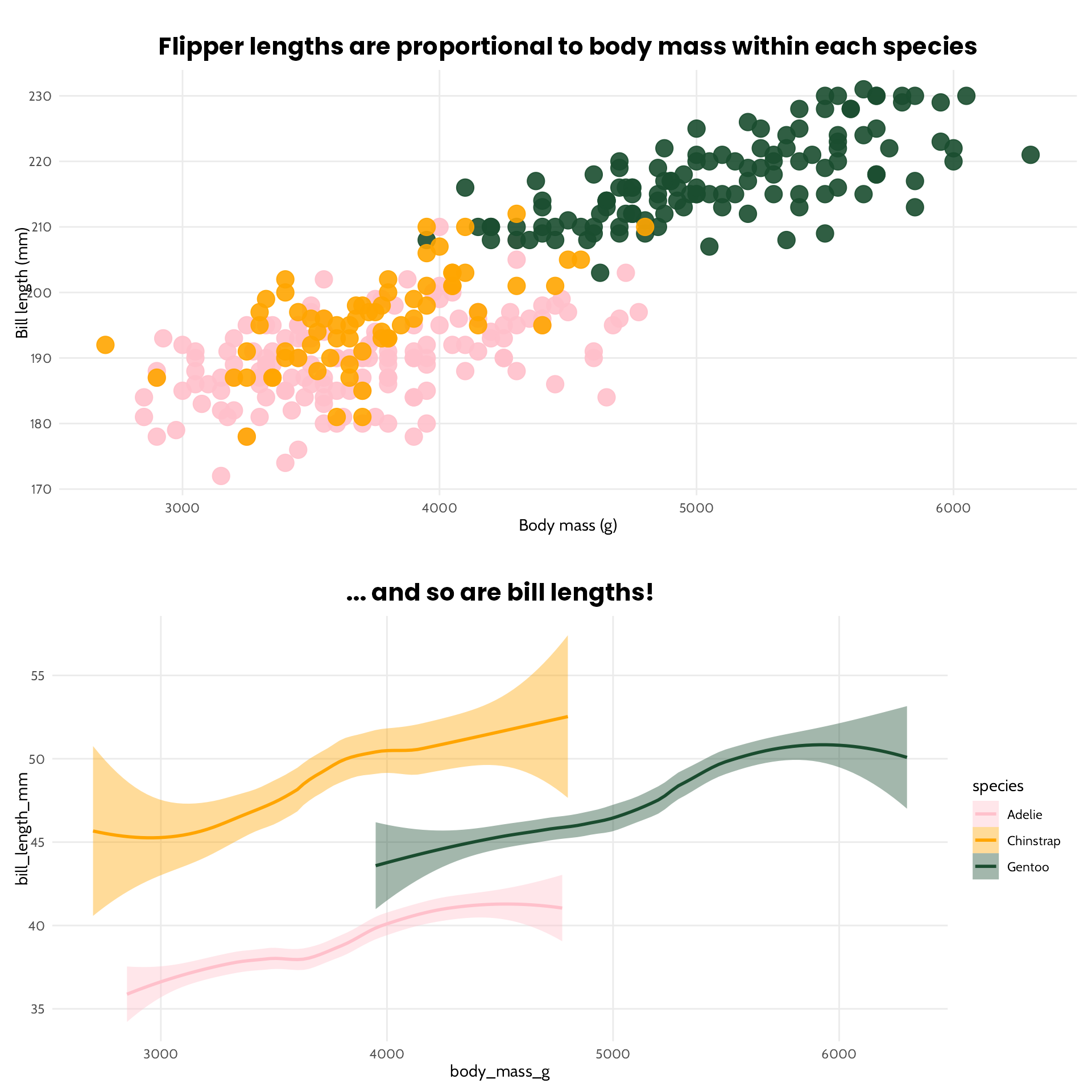
Note three things about the function I created. The first is that I didn’t actually need to give it an argument. We could just grab palmerpenguins::penguins from within the function. But doing it this way means we can now do this:
make_penguin_plots(dplyr::filter(palmerpenguins::penguins, island == "Biscoe"))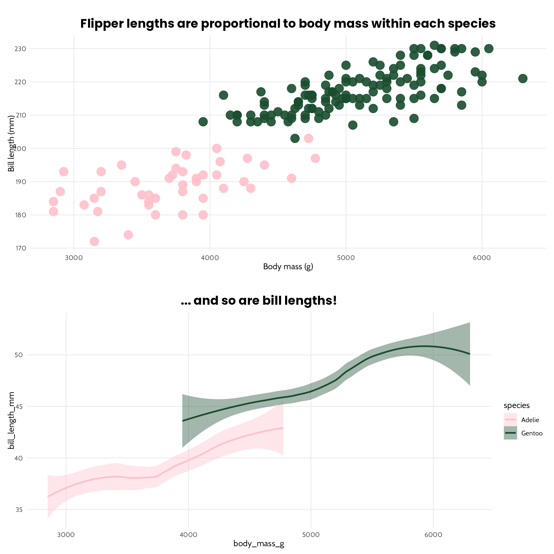
Because we only have two species of penguins living on Biscoe, we only have two colours. And this is where our penguins_colours come in handy. If we had just used scale_colour_manual(values = c("pink", "orange", "#1A4C2F")), we would now have orange Gentoos, which would be confusing because they were definitely green earlier! (More on that, and other tips on choosing and applying colours in this talk.)
The second thing to note, is that I also added the penguin colours as an argument. This isn’t strictly necessary (the function still works without that, provided the colours are in the global environment), but it’s good practice when writing functions to now allow them to just grab values from outside of what we’ve directly given them. And if I clear the environment and “Render” this document, it can’t find the colours unless they’re specified as a function argument - avoid your future self a lot of troubleshooting when compiling documents by making sure the functions are given all the arguments they need in order to work with an empty global environment!
The final thing to note is that I provided default values for each of those arguments, which means we don’t need to type them in every time (see, the colours aren’t specified, but we could change them if we want to!). Only do this if you do have a default!
make_penguin_plots(colours = c("red", "blue", "green"))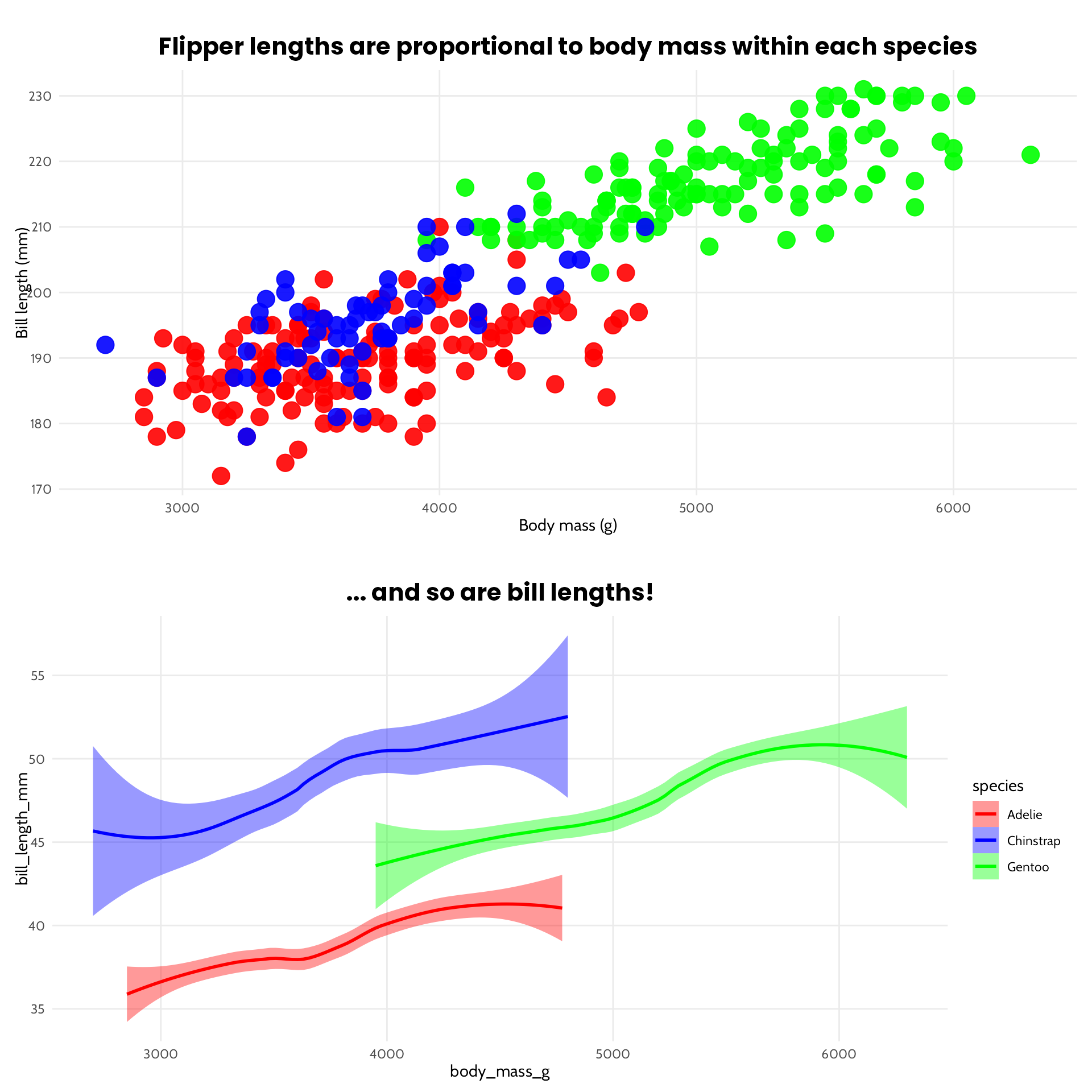
Inside the function, add some if statements to grab the right information
If we wanted to, we could add an island argument to the function above, and have it filter the data accordingly inside the function. Instead, let’s make things a bit more interesting, and say we want to compare different measurements for the Male and Female penguins. This means we’ll need to find a different column to use as the y axis! Let’s reduce the function to one plot.
make_penguin_plots <- function(
  df = palmerpenguins::penguins,
  colours = penguin_colours,
  penguin_group
) {
  # Provide the text strings required, and the names of the columns
  if (penguin_group == "Male") {
    measurement <- "Bill depths"
    y_axis_col <- "bill_depth_mm"
  } else {
    measurement <- "Flipper lengths"
    y_axis_col <- "flipper_length_mm"
  }

  first_comparison <- df |>
    ggplot() +
    geom_point(
      aes(
        x = body_mass_g,
        # use get() to turn the string into a column name
        y = get(y_axis_col),
        colour = species
      ),
      size = 5,
      alpha = 0.9,
      show.legend = FALSE
    ) +
    labs(
      title = paste0(
        "In ",
        penguin_group,
        " penguins, ",
        measurement,
        "\nare proportional to Body Mass within each species"
      ),
      x = "Body mass (g)",
      y = paste0(measurement, " (mm)")
    ) +
    theme_penguins() +
    scale_colour_manual(values = colours)

  bills <- df |>
    ggplot() +
    geom_smooth(aes(
      x = body_mass_g,
      y = bill_length_mm,
      colour = species,
      fill = species
    )) +
    labs(
      title = "... and so are bill lengths!",
      x = "Body mass (g)",
      y = "Bill length (mm)"
    ) +
    theme_penguins() +
    scale_colour_manual(values = colours) +
    scale_fill_manual(values = colours)

  cowplot::plot_grid(first_comparison, bills, nrow = 2)
}
Now we can go ahead and create our plot variants.
make_penguin_plots(penguin_group = "Male")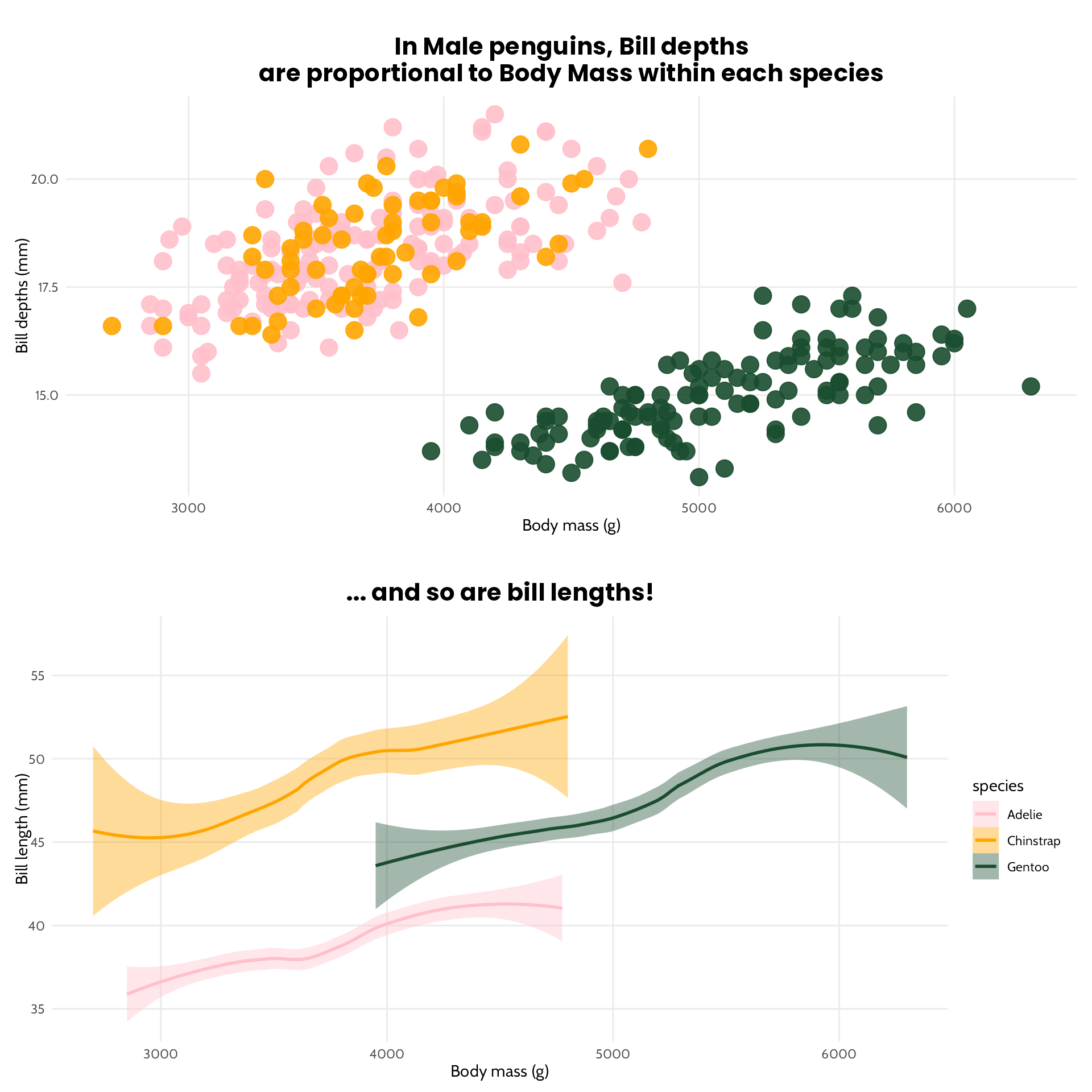
make_penguin_plots(penguin_group = "Female")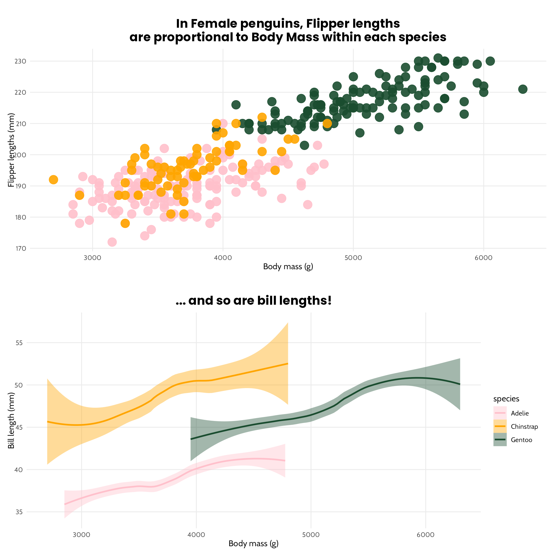
Wait a minute!
There are a few things we should do now, to prevent easy mistakes. Firstly, we forgot the filter the data so it only includes the group we’re reporting on. There are two ways to do this: we could filter the data when we feed it into the function (make_penguin_plots(dplyr::filter(palmerpenguins::penguins, sex == "male"), penguin_group = "Male")), but that doesn’t prevent us from two mistakes:
make_penguin_plots(dplyr::filter(palmerpenguins::penguins, sex == "Male"), penguin_group = "Male")doesn’t work, because the male penguins are labelled asmalenotMale, so this returns an empty plotmake_penguin_plots(dplyr::filter(palmerpenguins::penguins, sex == "female"), penguin_group = "Male")still works, and give us a plot which is labelled as Male - oops
It also doesn’t prevent us from this, which leads to a plot with data (all the penguins) and a title with a typo that highlights an non existing group. Definitely not what we want.
make_penguin_plots(penguin_group = "Typo")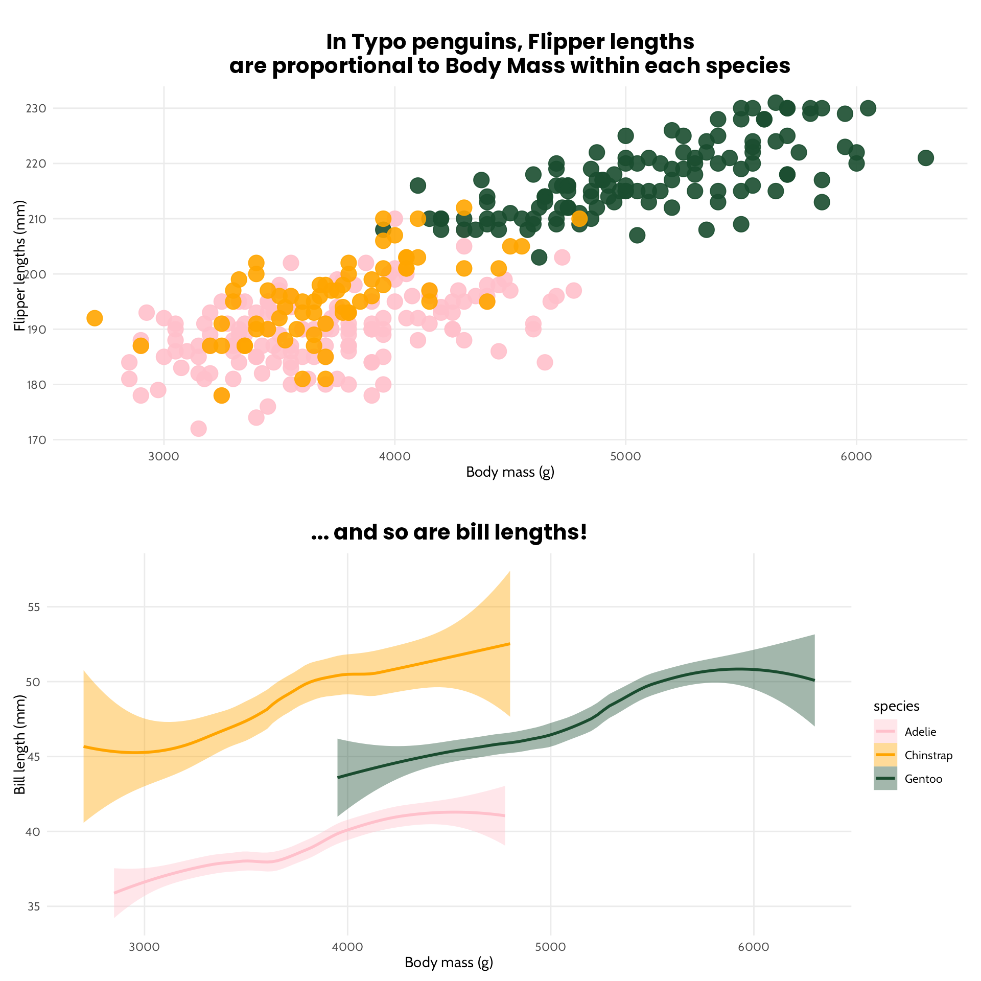
You’ll also note that the x axis limits change depending on the group - this may be the desired effect, but I’m going to fix those limits because I wasted a bunch of time trying to figure out why the female penguins were heavier than the male penguins. They aren’t, the axis changed.
Let’s protect ourselves from our future selves from typos, silly mistakes, and plot misinterpretations…
make_penguin_plots <- function(
  df = palmerpenguins::penguins,
  colours = penguin_colours,
  penguin_group
) {
  # We only want to compare Male and Female penguins, so let's stop at the start if
  # we've made a mistake in the group. And we'll be kind by allowing a capital or lower case.
  if (!tolower(penguin_group) %in% c("male", "female")) {
    stop(
      "You have entered a penguin group other than Male or Female. Please check for typos and try again."
    )
  }

  # Figure out the min and max within the overall data we've fed into the plot,
  # to keep the axes consistent regardless of the penguin_group we're plotting
  x_limits <- c(
    min(df$body_mass_g, na.rm = TRUE),
    max(df$body_mass_g, na.rm = TRUE)
  )

  # Make it more forgiving if we forget whether or not we need a capital
  if (tolower(penguin_group) == "male") {
    measurement <- "Bill depths"
    y_axis_col <- "bill_depth_mm"
    # Filter the data within the function, according to the group we've selected
    filtered_df <- df |>
      # Just in case the data has a few inconsistencies (it doesn't, but future data might?)
      dplyr::filter(tolower(sex) == tolower(penguin_group))
  } else {
    measurement <- "Flipper lengths"
    y_axis_col <- "flipper_length_mm"
    filtered_df <- df |>
      # Filter the data within the function
      dplyr::filter(tolower(sex) == tolower(penguin_group))
  }

  first_comparison <- filtered_df |>
    ggplot() +
    geom_point(
      aes(x = body_mass_g, y = get(y_axis_col), colour = species),
      size = 5,
      alpha = 0.9,
      show.legend = FALSE
    ) +
    labs(
      title = paste0(
        "In ",
        # Again, do the right thing, restore the capital to emphasise the group
        stringr::str_to_title(penguin_group),
        " penguins, ",
        measurement,
        "\nare proportional to Body Mass within each species"
      ),
      x = "Body mass (g)",
      y = paste0(measurement, " (mm)")
    ) +
    # Set the axis limits to the ones we calculated above
    xlim(x_limits) +
    theme_penguins() +
    scale_colour_manual(values = colours)

  # Since we're plotting bill lengths in both plots, let's fix that axis also
  y_limits_bills <- c(
    min(df$bill_length_mm, na.rm = TRUE),
    max(df$bill_length_mm, na.rm = TRUE)
  )

  bills <- filtered_df |>
    ggplot() +
    geom_smooth(aes(
      x = body_mass_g,
      y = bill_length_mm,
      colour = species,
      fill = species
    )) +
    labs(
      title = "... and so are bill lengths!",
      x = "Body mass (g)",
      y = "Bill length (mm)"
    ) +
    theme_penguins() +
    ylim(y_limits_bills) +
    scale_colour_manual(values = colours) +
    scale_fill_manual(values = colours)

  cowplot::plot_grid(first_comparison, bills, nrow = 2)
}
This gives an error an error.
make_penguin_plots(penguin_group = "Typo")Error in `make_penguin_plots()`:
! You have entered a penguin group other than Male or Female. Please check for typos and try again.This should produce an empty plot, because we’ve mismatched our groups.
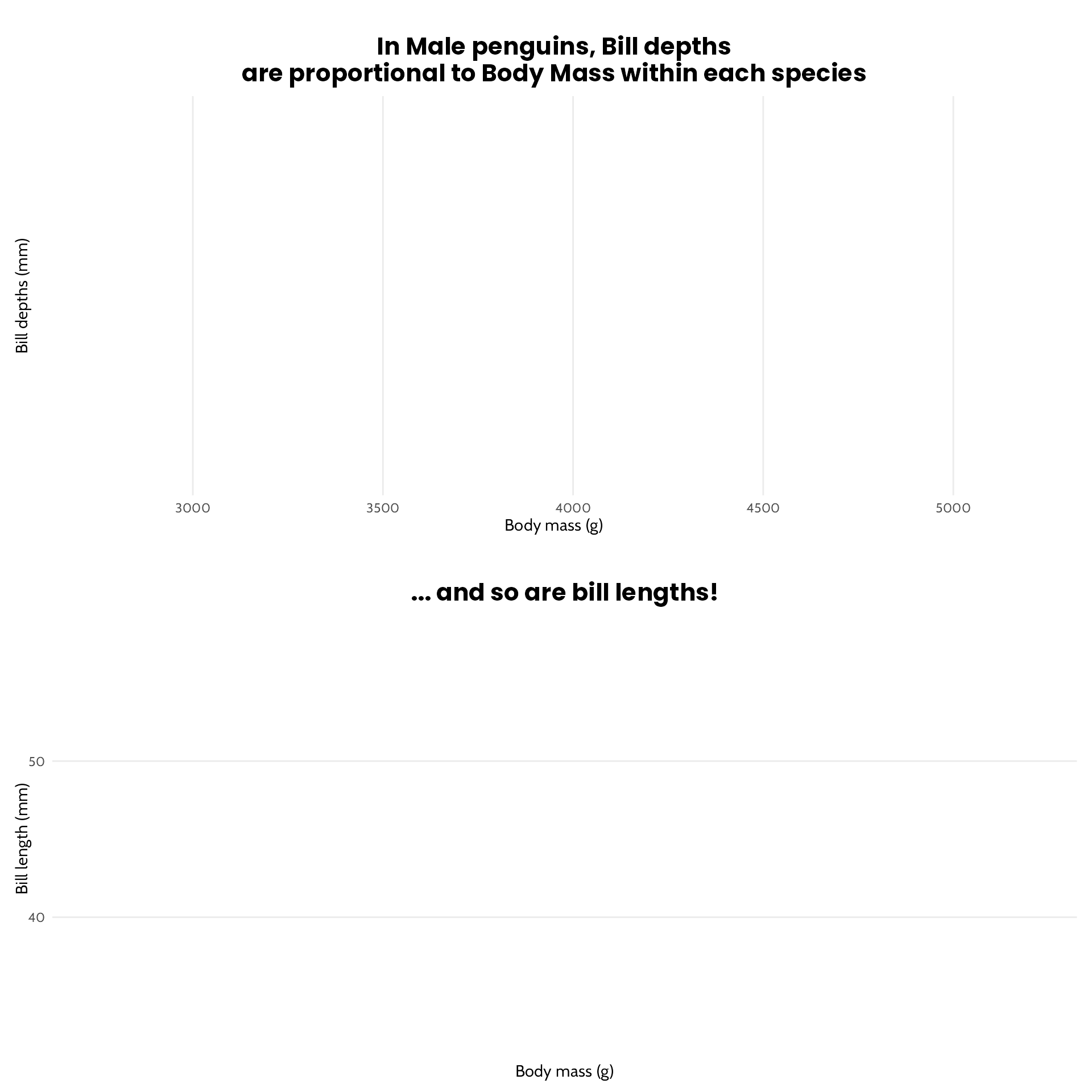
make_penguin_plots(
  penguin_group = "Male",
  df = dplyr::filter(palmerpenguins::penguins, sex == "female")
)
This should work, despite the lowercase m…
make_penguin_plots(penguin_group = "male")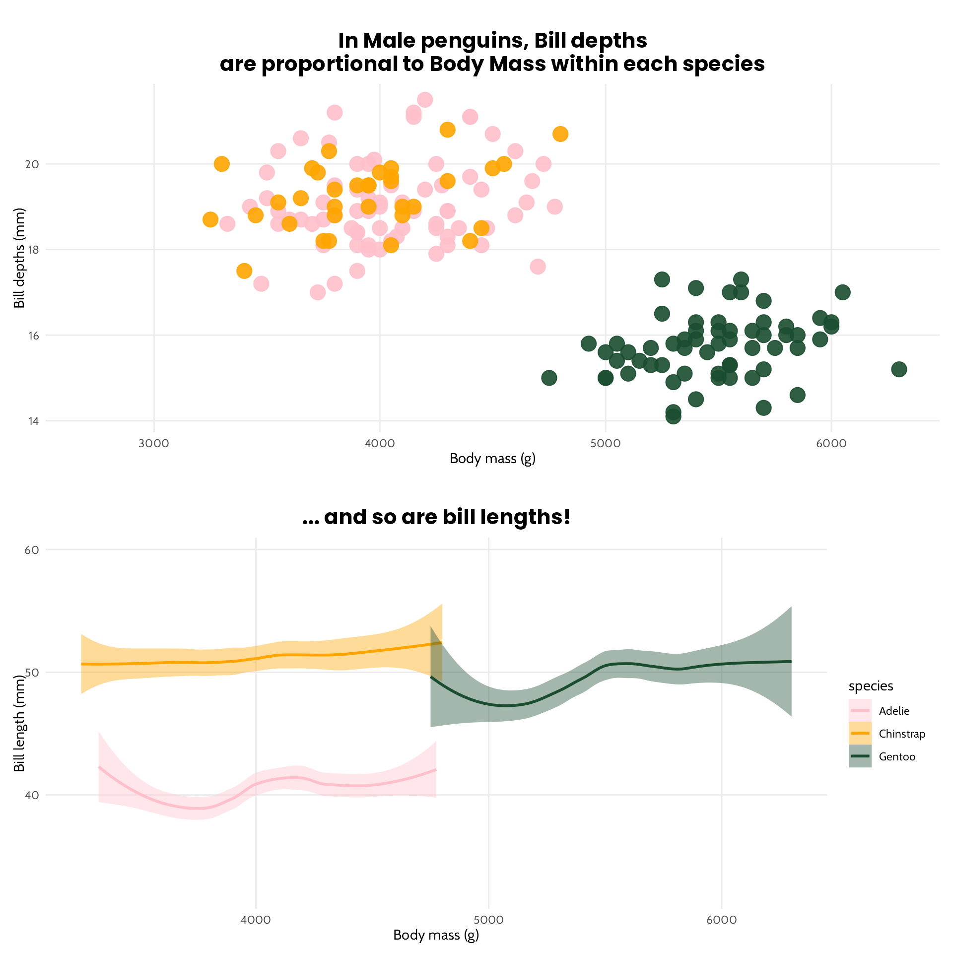
… and should look different to this (but keep the x axis identical!), because both plots have automatically filtered the data to the relevant group.
make_penguin_plots(penguin_group = "Female")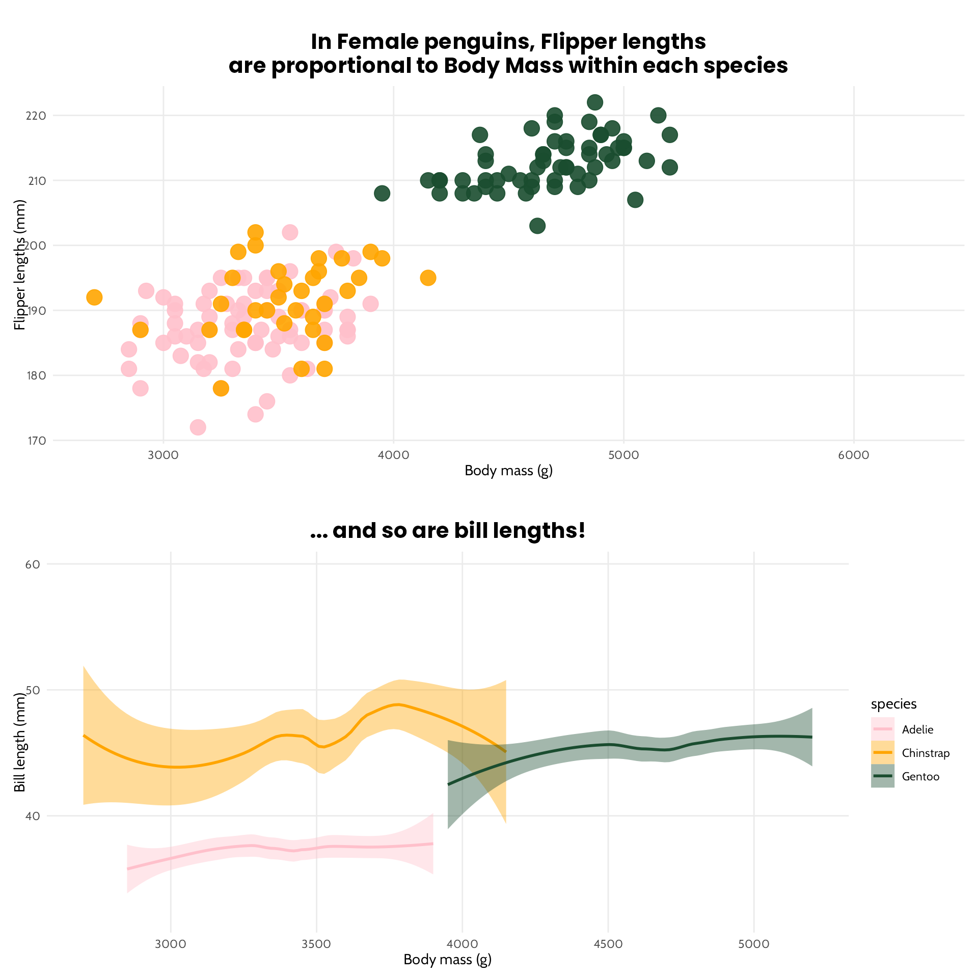
So there we have it, a parameterised plotting function, with a few safety checks, which allows us to quickly create variants of the same plot with different columns based on what we want to show within each group.

Reuse
Citation
For attribution, please cite this work as:
Thompson, Cara. 2024. “Parameterising a Multi-Part Plot.”
March 14, 2024. https://www.cararthompson.com/posts/2024-03-14-parameterising-a-multi-part-plot/.