Adapting ggplot2 legend shapes when using the dark contour trick
data-visualisation
ggplot2
r-how-to
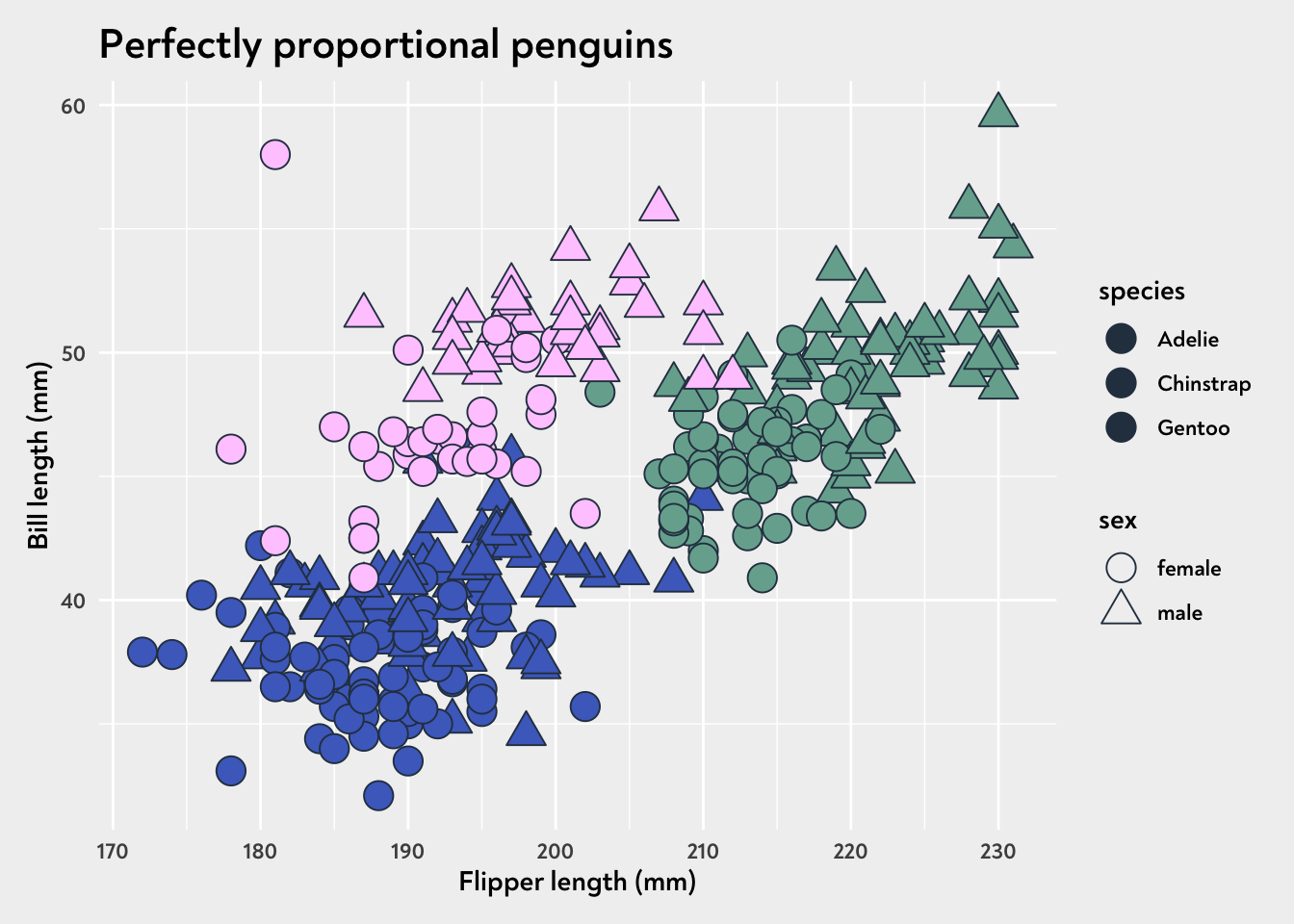
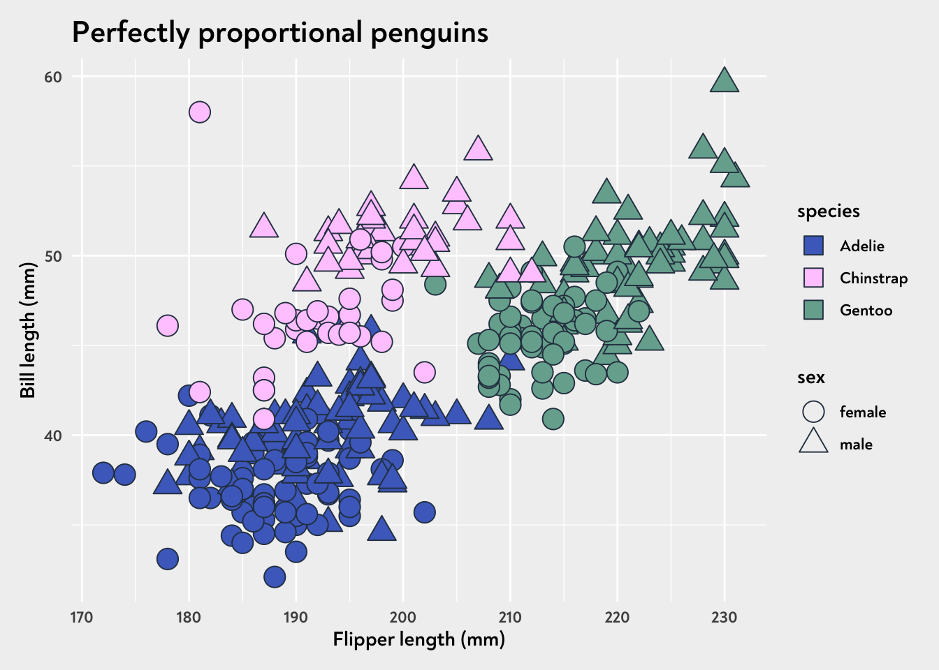
If you’ve given this trick a go, you may end up with a legend that doesn’t show the colours. We can fix this either with guides() or with a carefully chosen default shape in our custom ggplot2 theme!
Say you have two different shapes to indicate whether a penguin is male or female, and the fill colour is tied to their species. What you end up with using all the normal tricks is this plot.
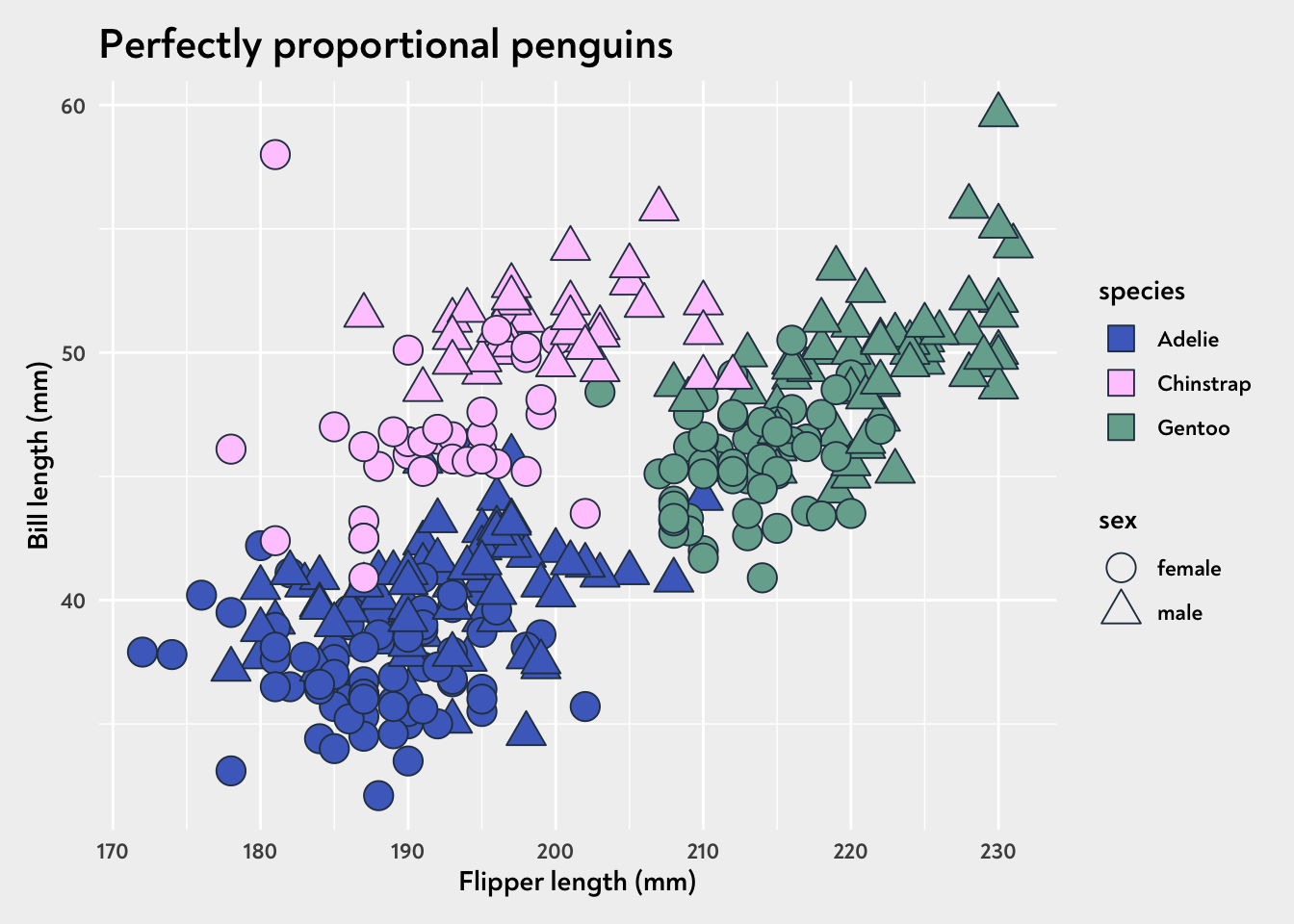
Because our geom_point is specifiying a shape per species, and our scale_shape_manual determines which point gets assigned to which species, we actually don’t see any squares (our default pointshape) within the plot - the default shape is overridden by the shapes we assign elsewhere in the plot code, but it stays there for the legend. I personally like the square for the colour legend, and other shapes within the graph, so I’ll be adding that trick to future dataviz design system packages by default!
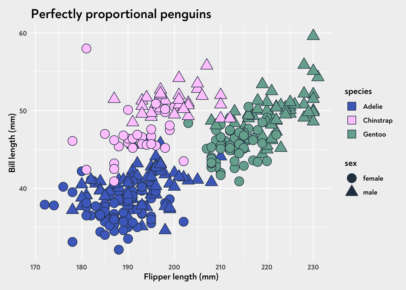
By the same token, we can apply a fill colour within our legend by default, without it affecting the fill colour of our points within the graph.
demo_plot +theme(geom =element_geom(pointshape =22, fill ="#2c3d4f"))
Happy days! The key is making sure the default shape matches the way we’re using colour/fill in the rest of the graph!